Date: Wed May 18 2011 - 21:51:57 MDT
Hi,
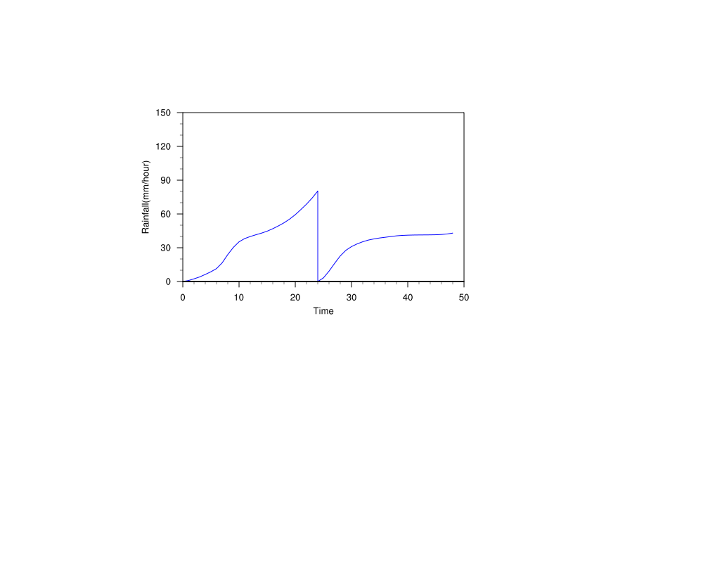
The attached figure is plotted from 48 hrs wrf output, but the plot look
like not okay. Actually I combine the two files through ncrcat and every
file is 24 hrs. Could anyone give me some suggestion, how to make it better?
Thanks and regards,
wei
_______________________________________________
ncl-talk mailing list
List instructions, subscriber options, unsubscribe:
http://mailman.ucar.edu/mailman/listinfo/ncl-talk