Date: Thu Aug 18 2011 - 10:37:31 MDT
Hi Mark,
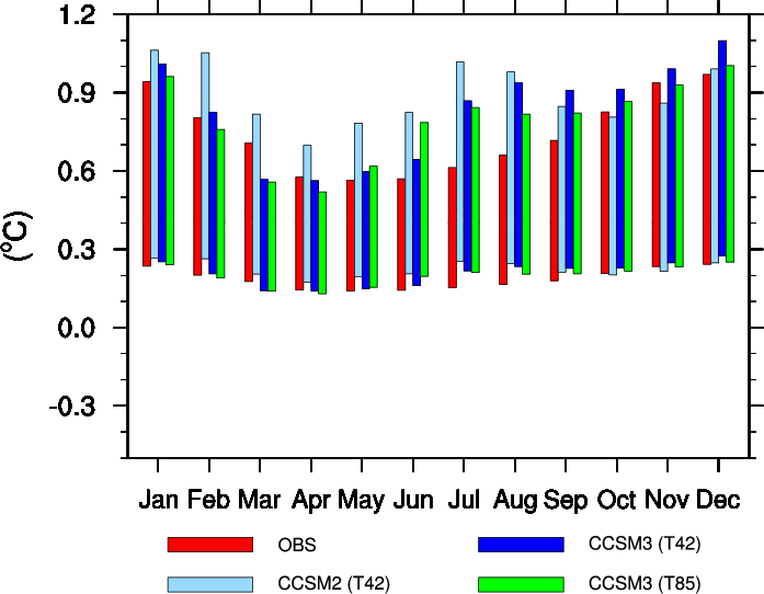
Yes, it is possible. I took bar_9.ncl and modified it to do what (I
think) you want.. The result is attached.
The first key is to draw 2 sets of bars, one for the maximum, and one
for the minimum. The second key is to set the gsnYRefLine. (In the
original example it is not set, and as such it is assumed to be = 0.)
Here's the additions to the code:
stdarr2 = stdarr*0.25
sres@gsnYRefLine = 0.4
sres@gsnYRefLineColor = "transparent"
<snip>
; done after plot4 is created and before lbres resources are set up.
sres@gsnXYBarChartColors = (/"red"/)
plot1a=gsn_csm_xy(wks,fspan(.775,11.775,12),stdarr2(:,0),sres)
sres@gsnXYBarChartColors = (/"lightblue"/)
plot2a=gsn_csm_xy(wks,fspan(.925,11.925,12),stdarr2(:,1),sres)
sres@gsnXYBarChartColors = (/"blue"/)
plot3a=gsn_csm_xy(wks,fspan(1.075,12.075,12),stdarr2(:,2),sres)
sres@gsnXYBarChartColors = (/"green"/)
plot4a = gsn_csm_xy(wks,fspan(1.225,12.225,12),stdarr2(:,3),sres)
The problem with what I did is that I set a standard gsnYRefLine Value
for all 12 months. It sounds like you don't want to do that. What I
would thus recommend is to start out with an array containing maximum
values, an array containing minimum values, and an array containing the
average of the min and max values that will be used to set gsnYRefLine.
Then, draw each +/- bar separately, which isn't as painful as it sounds:
plotmax = new(12,graphic)
plotmin = plotmax
do gg = 0,11
sres@gsnYRefLine = arr_avg(gg)
plotmax(gg)=gsn_csm_xy(wks,gg+.75,arr_max(gg),sres)
plotmax(gg)=gsn_csm_xy(wks,gg+.75,arr_min(gg),sres)
end do
I just ran a simple test here and it worked, so I'd give that a shot.
Good luck,
Adam
On 08/17/2011 08:25 PM, mark collier wrote:
> hi,
>
> is it possible to use the standard bar chart approach (gsn_csm_xy) to
> generate bars that have different minimum (maximum) values in addition
> to maximum (minimum) values? And so, like in example script bar_9.ncl
> rather than starting each bar from a y value of 0.4, it would be a
> function of month?
>
> This is of course a bit like a box plot but I'm hoping to keep the bar
> chart look and feel?
>
> Or is the only way to build up polygons? I guess one way might be to
> overlay a short white bar over each coloured bar to produce the same
> effect?
>
> One application might be to show the observations as the standard
> coloured bar but to show a model (multi-ensemble) range beside it.
>
> Regards,
> Mark.
> _______________________________________________
> ncl-talk mailing list
> List instructions, subscriber options, unsubscribe:
> http://mailman.ucar.edu/mailman/listinfo/ncl-talk
--
______________________________________________________________
Adam Phillips                                asphilli@ucar.edu
NCAR/Climate and Global Dynamics Division       (303) 497-1726
P.O. Box 3000
Boulder, CO 80307-3000    http://www.cgd.ucar.edu/cas/asphilli
_______________________________________________
ncl-talk mailing list
List instructions, subscriber options, unsubscribe:
http://mailman.ucar.edu/mailman/listinfo/ncl-talk