Hi Jeff,
Thanks for providing your files. Dave will probably look into this further, but one thing I tried was "raster" fill instead of the default "area" fill:
opts@cnFillMode = "RasterFill"
opts@cnRasterSmoothingOn = True
You can try setting cnRasterSmoothingOn to False (the default behavior) to see the "blocky" rasters.
BTW, you can use the special "short2flt" function on your raw data to have it automatically apply the scale and offset:
val_low_raw = short2flt(raw->lowResCh)
val_high_raw = short2flt(raw->highResCh)
However, this won't get you the results that your script expects, because "short2flt" actually *multiples* the scale factor rather than divide by it.
--Mary
On Mar 26, 2012, at 8:27 PM, Jeff Steward wrote:
> I have uploaded my file as "plotBT-raw.ncl" and my example HDF file as
> "1B11.20100831.72869.7.HDF" under the incoming directory. Thank you.
> Best wishes, Jeff
>
> On Mon, Mar 26, 2012 at 4:57 PM, David Brown <dbrown@ucar.edu> wrote:
>> You would need to send us your script and the necessary data (or a link to an accessible data server) for us to help you.
>> See the "Report bugs" page under Support on the NCL web site for instructions on uploading scripts and dasta.
>> -dave
>>
>>
>> On Mar 26, 2012, at 4:11 PM, Jeff Steward wrote:
>>
>>> Hello,
>>>
>>> I need to plot level 1B data (brightness temperatures) from TRMM/TMI,
>>> and I have had some measure of success using gsn_csm_contour_map.
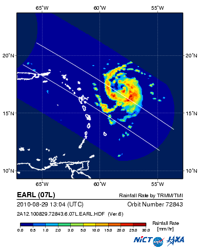
>>> However, each scan by TRMM is conical, and thus it creates a
>>> non-convex path, like this:
>>>
>>> http://sharaku.eorc.jaxa.jp/ADEOS2/JAXA_TYP_DB/TYP_DB_TRMM/201008/07L/2A12.100829.72843.6.07L.EARL.png
>>>
>>> However, when I plot this with gsn_csm_contour_map, the concave
>>> portion of the scan (the "U" shape at the back of the swath) is filled
>>> in with interpolated, very poor quality values; I would much rather
>>> just leave those values out. As an example, over land the values
>>> should obviously be around 300 K; with the interpolated values, the
>>> temperature of the ocean and the land are mixed together. Any ideas
>>> about how I can make my plot more like the sharaku link above?
>>>
>>> Thank you for your time. Best wishes,
>>>
>>> Jeff
>>> _______________________________________________
>>> ncl-talk mailing list
>>> List instructions, subscriber options, unsubscribe:
>>> http://mailman.ucar.edu/mailman/listinfo/ncl-talk
>>
> _______________________________________________
> ncl-talk mailing list
> List instructions, subscriber options, unsubscribe:
> http://mailman.ucar.edu/mailman/listinfo/ncl-talk
_______________________________________________
ncl-talk mailing list
List instructions, subscriber options, unsubscribe:
http://mailman.ucar.edu/mailman/listinfo/ncl-talk
Received on Tue Mar 27 08:47:33 2012
This archive was generated by hypermail 2.1.8 : Tue Mar 27 2012 - 08:50:24 MDT