Date: Wed Apr 03 2013 - 11:46:08 MDT
Hi Sharon,
We've had a backlog of graphics issues and we are working through them.
We apologize for the long delay. I think I have solved all three of your
issues. See below.
On 03/22/2013 07:03 PM, Sharon Shearer wrote:
> Hi,
>
> I am working from example xy_23.ncl to fit my data. I've used created
> variables in the code below for illustrative purposes. I am running
> into three problems:
>
> 1) Explicit y-axis tick mark labeling does not seem to work properly
> (I have tested x-axis tick mark labeling using "gsn_csm_xy" for
> similar "attached at x-axis plots" which does work, but explicit
> y-axis tick mark labeling does not work for those plots either.) I
> have tried using the universal "res" for all seven plots as shown in
> code below, and creating a different set of resolutions for each graph.
>
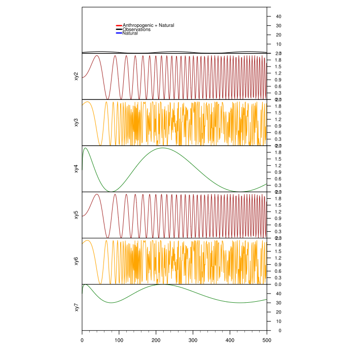
The solution to this was to set trYMinF and trYMaxF to set the range of
the Y-axis. In your first xy plot, your data values hovered between 0
and 2, and you were setting labels of 0->50 by 10. NCL was ignoring your
calls and doing it's own thing. (I don't know why NCL wasn't returning
an warning message though.)
> 2) On the seventh plot, the y-axis string is a little further to the
> left than the six other plots. For some reason, this is even more
> distinct (to the point of being unpresentable) when I am using my
> actual imported data.
>
This appears to be a bug, although it is one that we can get around.
First, and this is true generally as well, do not set gsnMaximize to
True in the individual plot resource lists IF if you are attaching plots
or paneling. I removed the gsnMaximize calls in your res and ref
resource lists, and set resf@tiYAxisOffsetXF = .0045 to nudge the Y-axis
title over.
> 3) I am unable to manually create and attach a legend to the top plot.
> I inserted text from example xy_18.ncl, but nothing shows up. (Also
> tested this using a different set of resolutions for xy1, and it did
> not work.)
>
The reason why the legend was not appearing is because you were
specifying X values that were out of range of the plot. When using
gsn_csm_y the x-axis runs from 0 to the number of timesteps-1. You were
specifying 1910 when you only have 500 timesteps. Changing 1907/1910 to
110 fixed this. I also changed your Y settings..
I have attached the code and the resulting plot. If you have any further
issues please let ncl-talk know.
Adam
> I've copied the code below. Any tips would be much appreciated! Thanks,
>
> Sharon Shearer
>
> ; xy_23.ncl
> ;
> ; Concepts illustrated:
> ; - Attaching multiple XY plots along the X axes
> ; - Turning off tickmarks on the left Y axis
> ; - Turning on tickmarks on the right Y axis
> ; - Moving tickmark labels away from axis
> ;
> ;*****************************************************
> load "$NCARG_ROOT/lib/ncarg/nclscripts/csm/gsn_code.ncl"
> load "$NCARG_ROOT/lib/ncarg/nclscripts/csm/gsn_csm.ncl"
> ;*****************************************************
> ;
> ; This example illustrates the creation of a set of 4
> ; of 'stacked' XY plots. Each plot has the same X axis.
> ; By using gsn_attach_plots, all four plots can be
> ; manipulated as a unit through the base plot.
> ;
> ; To demonstrate this concept, the base plot is resized
> ; in the second frame.
> ;
> ; Each plot draws a variation of sinusoidal curve.
> ;
>
> begin
>
> ;
> ; Define the number of points in each curve.
> ;
> NPTS = 500
> PI100 = 0.031415926535898
> EXP = 2.7182818
> ;
> ; Create data for the four XY plots.
> ;
> theta = PI100*ispan(0,NPTS-1,1)
> y1 = sin(theta)+1
> y2 = sin(theta * theta)+1
> y3 = sin(EXP^theta)+1
> y4 = sin(3*sqrt(fabs(theta)))+1
>
> ;***Sharon added three more sets of data
> y5 = sin(theta * theta)+1
> y6 = sin(EXP^theta)+1
> y7 = 10*sin(3*sqrt(fabs(theta)))+40
> ;***
>
> wks = gsn_open_wks("pdf","xy")
>
> res = True
> res@gsnMaximize = True
> res@gsnDraw = False
> res@gsnFrame = False
>
> res@vpWidthF = 0.8 ; Make plots wider than
> res@vpHeightF = 0.2 ; they are high.
>
> res@tmYUseLeft = False ; Make right axis independent of left
> res@tmYLOn = False ; Turn off left tickmarks
> res@tmYROn = True ; Turn on right tickmarks
> res@tmXTOn = False ; Turn off top tickmarks
> res@tmYLLabelsOn = False ; Turn off left labels
> res@tmYRLabelsOn = True ; Turn on right labels
> res@tmYRMinorOn = False ; Turn off minor ticks on Y axis
> res@tmYRLabelFontHeightF = 0.015 ; Increase font height
> res@tmYRLabelDeltaF = 2.0 ; Increase space b/w ticks and labels
> res@tmYRLabelJust = "CenterRight" ; right-justify labels
>
> res@xyLineThicknessF = 2.0 ; Twice as thick
>
> ;***Sharon added - but does not work, if commented out results in bottom
> ;*** tick label from upper graphs overlapping top label from lower graphs
> ; res@tmYRMode = "Explicit"
> ; res@tmYRValues = (/ 0, 10, 20, 30, 40, 50/)
> ; res@tmYRLabels = (/"0","10","20","30","40"," "/)
> ;***
> resf = True
> resf@gsnMaximize = True
> resf@gsnDraw = False
> resf@gsnFrame = False
>
> resf@vpWidthF = 0.8 ; Make plots wider than
> resf@vpHeightF = 0.2 ; they are high.
>
> resf@tmYUseLeft = False ; Make right axis independent of
> left
> resf@tmYLOn = False ; Turn off left tickmarks
> resf@tmYROn = True ; Turn on right tickmarks
> resf@tmXTOn = False ; Turn off top tickmarks
> resf@tmYLLabelsOn = False ; Turn off left labels
> resf@tmYRLabelsOn = True ; Turn on right labels
> resf@tmYRMinorOn = False ; Turn off minor ticks on Y axis
> resf@tmYRLabelFontHeightF = 0.015 ; Increase font height
> resf@tmYRLabelDeltaF = 2.0 ; Increase space b/w ticks and
> labels
> resf@tmYRLabelJust = "CenterRight" ; right-justify labels
>
> resf@xyLineThicknessF = 2.0 ; Twice as thick
>
> ;***Sharon added - but does not work, if commented out results in bottom
> ;*** tick label from upper graphs overlapping top label from lower graphs
> resf@tmYRMode = "Explicit"
> resf@tmYRValues = (/ 0, 10, 20, 30, 40, 50/)
> resf@tmYRLabels = (/"0","10","20","30","40"," "/)
>
> ; Change y axis string and color for each plot.
> res@tiYAxisString = "xy1"
> res@xyLineColor = "Purple"
> xy1 = gsn_csm_y(wks,y1,resf) ; Create the four plots.
>
> res@tiYAxisString = "xy2"
> res@xyLineColor = "Brown"
> xy2 = gsn_csm_y(wks,y2,res) ; They won't be drawn yet.
>
> res@tiYAxisString = "xy3"
> res@xyLineColor = "Orange"
> xy3 = gsn_csm_y(wks,y3,res)
>
> res@tiYAxisString = "xy4"
> res@xyLineColor = "ForestGreen"
> xy4 = gsn_csm_y(wks,y4,res)
>
> ;*** last three added by Sharon
> res@tiYAxisString = "xy5"
> res@xyLineColor = "Brown"
> xy5 = gsn_csm_y(wks,y5,res) ; They won't be drawn yet.
>
> res@tiYAxisString = "xy6"
> res@xyLineColor = "Orange"
> xy6 = gsn_csm_y(wks,y6,res)
>
> resf@tiYAxisString = "xy7"
> resf@xyLineColor = "ForestGreen"
> xy7 = gsn_csm_y(wks,y7,resf)
> ;***
> ;*****************************************************
> ; Manually create and attach legend - 26lines: Sharon copied in from
> Example xy_18.ncl
> ;*****************************************************
> res_text = True ; text mods desired
> res_text@txFontHeightF = 0.015 ; change text size
> res_text@txJust = "CenterLeft" ; text justification
>
> res_lines = True ; polyline mods
> desired
> res_lines@gsLineDashPattern = 0. ; solid line
> res_lines@gsLineThicknessF = 5. ; line thicker
> res_lines@gsLineColor = "red" ; line color
> xx = (/1893,1907/)
> yy = (/0.79,0.79/)
> dum1 = gsn_add_polyline(wks,xy1,xx,yy,res_lines) ; add
> polyline
> dum2 = gsn_add_text(wks,xy1,"Anthropogenic +
> Natural",1910,0.79,res_text); add text
>
> yy = (/0.79,0.79/)
> res_lines@gsLineColor = "blue"
> ; change to blue
> dum3 = gsn_add_polyline(wks,xy1,xx,yy,res_lines) ; add polyline
> dum4 = gsn_add_text(wks,xy1,"Natural",1910,0.79,res_text) ; add text
>
> yy = (/0.875,0.875/)
> res_lines@gsLineColor = "black"
> ; change to black
> dum5 = gsn_add_polyline(wks,xy1,xx,yy,res_lines) ; add polyline
> dum6 = gsn_add_text(wks,xy1,"Observations",1910,0.875,res_text) ;
> add text
> ;***********************************************************
>
> ; Set up resource lists for attaching the plot.
> ; The res1 will apply to the base plot, and the
> ; res2 to the plots being attached. These resources
> ; lists are *not* for changing things like line color,
> ; but for changing things like whether the plots
> ; are maximized, and which axis they are attached on.
> ;
> res1 = True
> res2 = True
> res1@gsnMaximize = True
> res2@gsnAttachPlotsXAxis = True
>
> ; xy1 will be the base plot.
> amid = gsn_attach_plots(xy1,(/xy2,xy3,xy4,xy5,xy6,xy7/),res1,res2)
>
> draw(xy1) ; All four plots will be drawn.
> frame(wks)
>
> ;**Sharon comment out-do not need for testing
> ; Resize base plot and watch how other plots follow.
> ; setvalues xy1
> ; "vpWidthF" : 0.4
> ; "vpHeightF" : 0.15
> ; end setvalues
> ;
> ; draw(xy1) ; All four plots will be smaller.
> ; frame(wks)
> end
>
>
> _______________________________________________
> ncl-talk mailing list
> List instructions, subscriber options, unsubscribe:
> http://mailman.ucar.edu/mailman/listinfo/ncl-talk
--
______________________________________________________________
Adam Phillips                                asphilli@ucar.edu
NCAR/Climate and Global Dynamics Division       (303) 497-1726
P.O. Box 3000
Boulder, CO 80307-3000    http://www.cgd.ucar.edu/cas/asphilli
_______________________________________________
ncl-talk mailing list
List instructions, subscriber options, unsubscribe:
http://mailman.ucar.edu/mailman/listinfo/ncl-talk
- text/plain attachment: test9.ncl