Date: Fri Mar 14 2014 - 03:33:53 MDT
Hi,
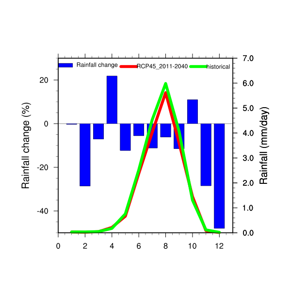
I would like to do a panel of 3 plots like the one joined. If I use plot = new(3,graphic), and replace ba_plot, xy_plot,and xy_plot1 by plot(0), plot(1), and plot(2), it doesn't not work. Here is the script I use to generate this figure (with 3 plots):
month=ispan(1,12,1)
wks = gsn_open_wks("x11","toto")
;---Set resources common to both plots
res = True
res@gsnFrame = False
res@gsnDraw = False
res@trXMinF = 0
res@trXMaxF = 13
;----------------------------------------- Bar chart ----------------------------------------------------------------------------
bres = res
bres@gsnXYBarChart = True
bres@gsnXYBarChartBarWidth = 0.77
bres@gsnXYBarChartColors = "blue"
bres@tmYROn = False
bres@gsnYRefLine = 0.
bres@trYMaxF = 30
bres@trYMinF = -50
bres@tiMainFontHeightF = 0.03
bar_plot = gsn_csm_xy (wks,month,pr1,bres)
;--- for the legend
lbres = True
lbres@lbLabelFontHeightF = 0.015
lbres@lbFillColors = "blue"
lbres@vpHeightF = .015
lbres@vpWidthF = .15
lbres@lbPerimOn = False
lbres@lbFillPattern = "SolidFill"
lbres@lbMonoFillPattern = True
label= "Rainfall change"
gsn_labelbar_ndc(wks,1,label,0.2,0.78,lbres)
;---Get viewport values for bar plot
getvalues bar_plot
"vpXF" : vpx
"vpYF" : vpy
"vpWidthF" : vpw
"vpHeightF" : vph
end getvalues
;--------------------------XY curve resources seasonal cycle---------------------------------------------------------------
xyres = res
xyres@xyLineThicknessF = 6.0
xyres@xyLineColor = "red"
xyres@trYMaxF = 7.
xyres@trYMinF = 0
;---Turn off bottom, top, and left tickmarks
xyres@tmXBOn = False
xyres@tmXTOn = False
xyres@tmYLOn = False
xyres@tmYROn = True
xyres@tmYRLabelsOn = True
;---Set a title on right Y axis seasonal cycle
xyres@tiYAxisString = "Rainfall (mm/day)"
xyres@tiYAxisSide = "Right"
; Make sure XY curve is drawn in same viewport space as bar plot
; Note there is no attempt to mathematically map the left and
; right Y axis to each other.
xyres@vpXF = vpx
xyres@vpYF = vpy
xyres@vpWidthF = vpw
xyres@vpHeightF = vph
xyres@pmLegendDisplayMode = "Always"
xyres@pmLegendSide = "Top"
xyres@pmLegendParallelPosF = 0.55
xyres@pmLegendOrthogonalPosF = -0.148
xyres@pmLegendWidthF = 0.1
xyres@pmLegendHeightF = 0.1
xyres@lgLabelFontHeightF = .015
xyres@lgPerimOn = False
xyres@xyLineThicknesses = "12.0"
xyres@xyExplicitLegendLabels ="RCP45_2011-2040"
xy_plot = gsn_csm_xy (wks,month,pr2,xyres)
;============= Add a second curve on the right==============================
xyres@pmLegendDisplayMode = "Always"
xyres@pmLegendSide = "Top"
xyres@pmLegendParallelPosF = 0.87
xyres@pmLegendOrthogonalPosF = -0.148
xyres@pmLegendWidthF = 0.1
xyres@pmLegendHeightF = 0.1
xyres@lgLabelFontHeightF = .015
xyres@lgPerimOn = False
xyres@xyLineThicknesses = "12.0"
xyres@xyExplicitLegendLabels ="historical"
xyres@xyLineColor = "green"
xy_plot1 = gsn_csm_xy (wks,month,pr3,xyres)
;=============================================================
pres = True
pres@gsnMaximize = True
maximize_output(wks,pres)
I would just want to know how to panel this, and after I will add 2 others like this plot at the same page.
Best Regards,
Mamadou
_______________________________________________
ncl-talk mailing list
List instructions, subscriber options, unsubscribe:
http://mailman.ucar.edu/mailman/listinfo/ncl-talk