HI,
Here is the NCL official example plot
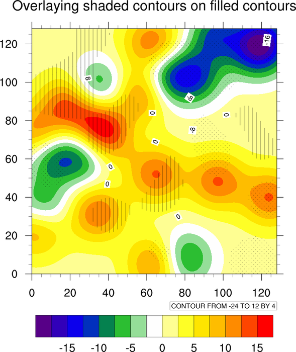
http://www.ncl.ucar.edu/Applications/Images/overlay_5_lg.png
I have a question about the color bar. The negative values are in green,
blue colors (cold color) and the positive values are in yellow, red colors ( hot color).
They are divided by white color (-2.5 to 0).
Is the color bar made accidentally or controlled by some NCL parameters?
Thanks.
Yongzuo
_______________________________________________
ncl-talk mailing list
List instructions, subscriber options, unsubscribe:
http://mailman.ucar.edu/mailman/listinfo/ncl-talk
Received on Sat Feb 5 12:34:52 2011
This archive was generated by hypermail 2.1.8 : Fri Feb 11 2011 - 16:11:42 MST