Apologies...the first link in my email should be as below...
http://www.atmos.albany.edu/student/kgriffin/maps/6hrprecip_namer_55.png
-----------------------------------------------------
Kyle S. Griffin
Dept. of Atmospheric and Environmental Sciences
University at Albany, SUNY
1400 Washington Ave, Albany, NY 12222
Office: ES-218 Email: kgriffin@atmos.albany.edu
http://www.atmos.albany.edu/student/kgriffin/
---------- Forwarded message ----------
From: Kyle Griffin <kgriffin@atmos.albany.edu>
Date: Mon, Feb 13, 2012 at 11:35 AM
Subject: cnLineLabelBackgroundColor behavior
To: ncl-talk@ucar.edu
Hello...
After quite a bit of exploring and experimenting, I have been unable to
find a method to edit line label background colors so they behave in a
manner similar to GEMPAK, which many users find to
be aesthetically pleasing. Specifically, if a line is contoured on top of a
fill, its line labels have two options: either be color filled and blocking
out all useful data behind the line label, or be transparent, where the
label becomes essentially unreadable due to the fact that the line does not
break around its own labels. You can find an example of both of these
behaviors at:
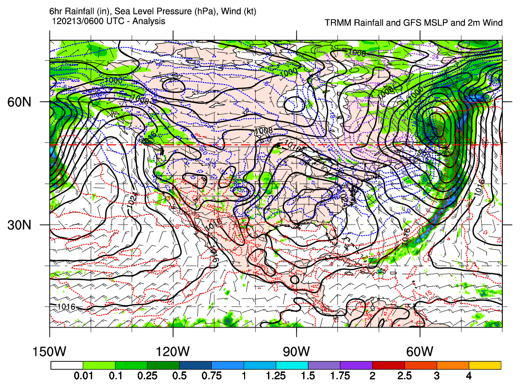
http://www.atmos.albany.edu/student/kgriffin/maps/6hrprecip/6hrprecip_namer_55.png
where the black lines (MSLP) are labeled with background color = -1
(transparent) and the 850 hPa temperature lines (dotted, various colors)
are labeled with background color = 0 (white). The labels on MSLP contours
are virtually unreadable everywhere, whereas the labels on temperature
contours are readable due to their white boxes, but block out all data
(filled or contoured) beneath them.
What I'm hoping to find is a method where the cnLineLabelBackgroundColor =
-1 will serve to create a transparent box around the label which allows
data underneath the label to be visible while still breaking/hiding the
contour that is being labeled. For an example of this type of behavior, see:
http://www.atmos.albany.edu/student/kgriffin/maps/6hrprecip/6hrprecip_namer_55.gif
You'll notice all of the contours are broken around their respective lines
and let the data underneath remain visible. Is there a way to do this with
NCL? It would make visualization and labeling of all plot types (not just
horizontal maps) look quite nicer.
Thanks,
Kyle
-----------------------------------------------------
Kyle S. Griffin
Dept. of Atmospheric and Environmental Sciences
University at Albany, SUNY
1400 Washington Ave, Albany, NY 12222
Office: ES-218 Email: kgriffin@atmos.albany.edu
http://www.atmos.albany.edu/student/kgriffin/
_______________________________________________
ncl-talk mailing list
List instructions, subscriber options, unsubscribe:
http://mailman.ucar.edu/mailman/listinfo/ncl-talk
Received on Mon Feb 13 09:43:25 2012
This archive was generated by hypermail 2.1.8 : Fri Feb 17 2012 - 08:50:10 MST