Date: Tue Mar 27 2012 - 13:07:55 MDT
Jeff,
I took one last stab to add a label bar. I also added some margins around your map area to leave room for the label bar:
opts@mpLeftCornerLatF = min(lat(scanStart:scanEnd,0:npixel-1:2))-0.5
opts@mpLeftCornerLonF = min(lon(scanStart:scanEnd,0:npixel-1:2))-0.5
opts@mpRightCornerLatF = max(lat(scanStart:scanEnd,0:npixel-1:2))+2
opts@mpRightCornerLonF = max(lon(scanStart:scanEnd,0:npixel-1:2))+2
See attached.
--Mary
On Mar 27, 2012, at 12:24 PM, Jeff Steward wrote:
> Hi Mary,
>
> Very impressive. This looks perfect. Thank you so much!
>
> Best wishes,
>
> Jeff
>
> On Tue, Mar 27, 2012 at 9:49 AM, Mary Haley <haley@ucar.edu> wrote:
>>
>> On Mar 27, 2012, at 10:09 AM, Jeff Steward wrote:
>>
>>> Hi Mary,
>>>
>>> Thank you. This looks quite a bit better. There is still about half
>>> of the concave area filled in, but I could probably live with this
>>> amount if we can't find a better solution.
>>>
>>> Alternately I may go to plotting colored scatter data to avoid
>>> contouring altogether. It won't be as pretty, but it will be more
>>> accurate. Do you have any suggestions about the best function to use
>>> for this purpose?
>>>
>>> Thank you again very much for your time. Best wishes,
>>
>>
>> Jeff,
>>
>> I put together a scatter plot quickly and attached a sample image. You will likely need to change the code to get the colors and levels to your liking.
>> Also, I used NhlNewMarker to define a filled square as a marker. You can use any one of the characters in our font tables as a marker
>> (the filled square was font table #35, character "y").
>>
>> http://www.ncl.ucar.edu/Document/Graphics/font_tables.shtml
>>
>> Click on any font table line to see all the characters for that table. Or, you can use one of our predefined markers:
>>
>> http://www.ncl.ucar.edu/Document/Graphics/Images/markers.png
>>
>> Also, I didn't have time to create a label bar, but there are some examples at
>>
>> http://www.ncl.ucar.edu/Applications/labelbar.shtml
>>
>> Example 11 might be the best one.
>>
>> --Mary
>>
>>
>>
>>
>>
>>>
>>> Jeff
>>>
>>> On Tue, Mar 27, 2012 at 7:47 AM, Mary Haley <haley@ucar.edu> wrote:
>>>> Hi Jeff,
>>>>
>>>> Thanks for providing your files. Dave will probably look into this further, but one thing I tried was "raster" fill instead of the default "area" fill:
>>>>
>>>> opts@cnFillMode = "RasterFill"
>>>> opts@cnRasterSmoothingOn = True
>>>>
>>>>
>>>> You can try setting cnRasterSmoothingOn to False (the default behavior) to see the "blocky" rasters.
>>>>
>>>> BTW, you can use the special "short2flt" function on your raw data to have it automatically apply the scale and offset:
>>>>
>>>> val_low_raw = short2flt(raw->lowResCh)
>>>> val_high_raw = short2flt(raw->highResCh)
>>>>
>>>> However, this won't get you the results that your script expects, because "short2flt" actually *multiples* the scale factor rather than divide by it.
>>>>
>>>> --Mary
>>>>
>>>>
>>>> On Mar 26, 2012, at 8:27 PM, Jeff Steward wrote:
>>>>
>>>>> I have uploaded my file as "plotBT-raw.ncl" and my example HDF file as
>>>>> "1B11.20100831.72869.7.HDF" under the incoming directory. Thank you.
>>>>> Best wishes, Jeff
>>>>>
>>>>> On Mon, Mar 26, 2012 at 4:57 PM, David Brown <dbrown@ucar.edu> wrote:
>>>>>> You would need to send us your script and the necessary data (or a link to an accessible data server) for us to help you.
>>>>>> See the "Report bugs" page under Support on the NCL web site for instructions on uploading scripts and dasta.
>>>>>> -dave
>>>>>>
>>>>>>
>>>>>> On Mar 26, 2012, at 4:11 PM, Jeff Steward wrote:
>>>>>>
>>>>>>> Hello,
>>>>>>>
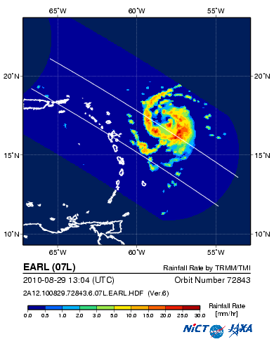
>>>>>>> I need to plot level 1B data (brightness temperatures) from TRMM/TMI,
>>>>>>> and I have had some measure of success using gsn_csm_contour_map.
>>>>>>> However, each scan by TRMM is conical, and thus it creates a
>>>>>>> non-convex path, like this:
>>>>>>>
>>>>>>> http://sharaku.eorc.jaxa.jp/ADEOS2/JAXA_TYP_DB/TYP_DB_TRMM/201008/07L/2A12.100829.72843.6.07L.EARL.png
>>>>>>>
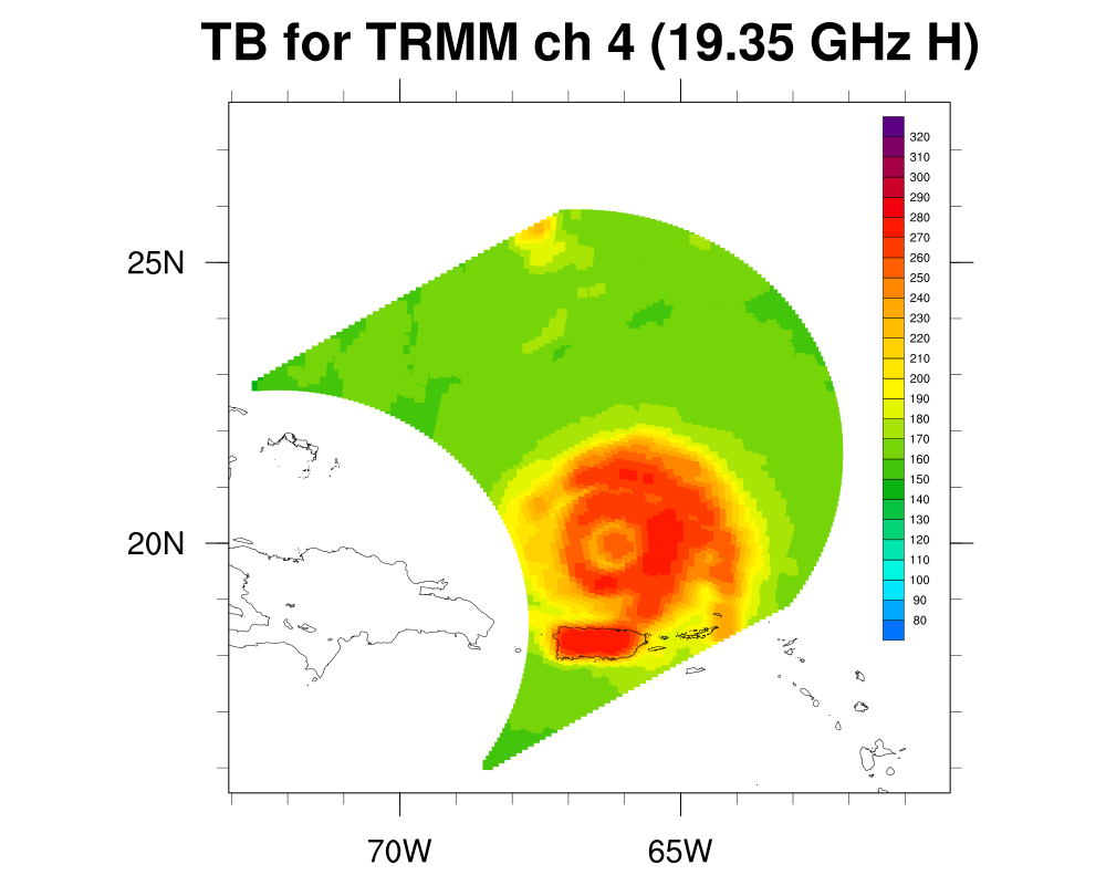
>>>>>>> However, when I plot this with gsn_csm_contour_map, the concave
>>>>>>> portion of the scan (the "U" shape at the back of the swath) is filled
>>>>>>> in with interpolated, very poor quality values; I would much rather
>>>>>>> just leave those values out. As an example, over land the values
>>>>>>> should obviously be around 300 K; with the interpolated values, the
>>>>>>> temperature of the ocean and the land are mixed together. Any ideas
>>>>>>> about how I can make my plot more like the sharaku link above?
>>>>>>>
>>>>>>> Thank you for your time. Best wishes,
>>>>>>>
>>>>>>> Jeff
>>>>>>> _______________________________________________
>>>>>>> ncl-talk mailing list
>>>>>>> List instructions, subscriber options, unsubscribe:
>>>>>>> http://mailman.ucar.edu/mailman/listinfo/ncl-talk
>>>>>>
>>>>> _______________________________________________
>>>>> ncl-talk mailing list
>>>>> List instructions, subscriber options, unsubscribe:
>>>>> http://mailman.ucar.edu/mailman/listinfo/ncl-talk
>>>>
>>> _______________________________________________
>>> ncl-talk mailing list
>>> List instructions, subscriber options, unsubscribe:
>>> http://mailman.ucar.edu/mailman/listinfo/ncl-talk
>>
>>
> _______________________________________________
> ncl-talk mailing list
> List instructions, subscriber options, unsubscribe:
> http://mailman.ucar.edu/mailman/listinfo/ncl-talk
_______________________________________________
ncl-talk mailing list
List instructions, subscriber options, unsubscribe:
http://mailman.ucar.edu/mailman/listinfo/ncl-talk
- application/octet-stream attachment: plotBT-raw-scatter.ncl