Date: Wed Oct 30 2013 - 23:12:48 MDT
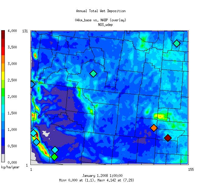
Hi, sorry for the newbie question. I am trying to create a similar plot
like attached using NCL. Notice that the observational data are presented
in diamonds, which are overlaying a gridded model results over a certain
region (map).
Both observation and model data are already in netcdf file formats. The
observation data have the time-stamped values and associated lat/lon info
for each station.
Any existing NCL examples or pointers on how to create such an overlay plot
are greatly appreciated.
Thanks,
Chao-Jung
_______________________________________________
ncl-talk mailing list
List instructions, subscriber options, unsubscribe:
http://mailman.ucar.edu/mailman/listinfo/ncl-talk