Date: Sun Mar 09 2014 - 09:19:36 MDT
Hello,
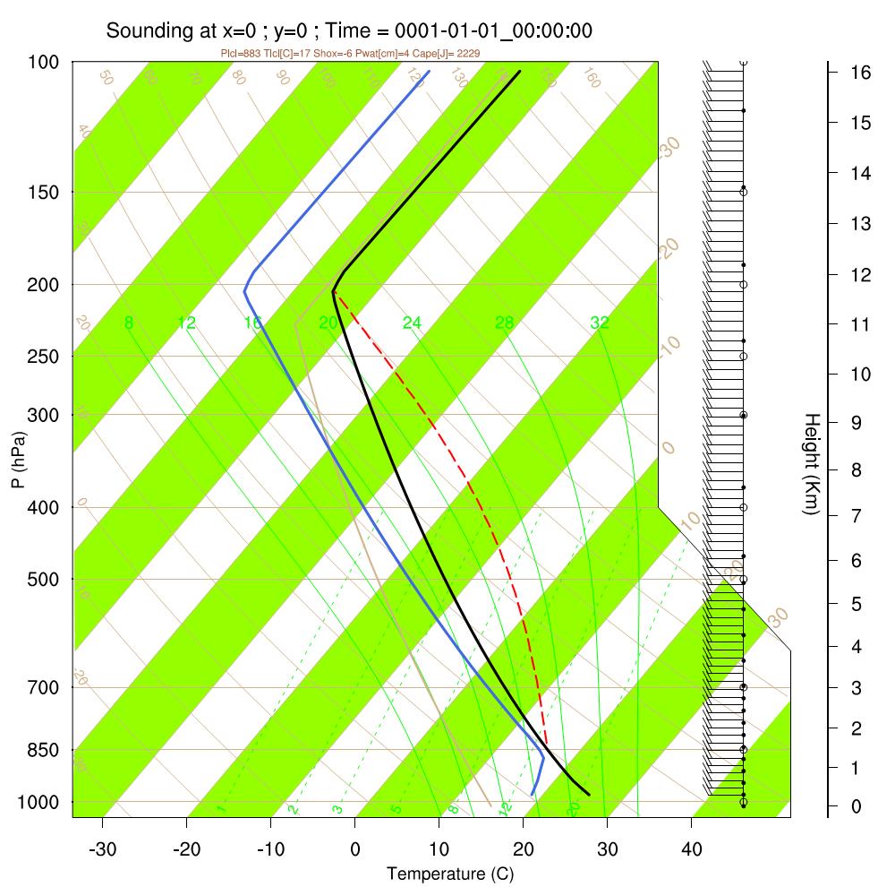
I have some questions about a Skew-T Log-P plot produced in NCL. Consider
the attached Weisman and Klemp (1982) type sounding as a reference, created
from an idealized WRF simulation output.
1) How to set y-axis upper limit to, say 10 mb instead of the default 100
mb?
2) How to change the green-white alternating background to white only?
3) The input data before calling skewT_PlotData are interpolated (using 100
vertical levels instead of 50) in my case, otherwise CAPE estimation seems
to be off by a couple hundred J/kg. However, as an artifact, there are so
many wind barbs are plotted. Is there a way to plot barbs, say at every 5
points?
4) How to move the barb axis or height axis so that the plot looks more
compact? I am only interested in u-wind, so these two axes really can be
combined.
5) What is the straight grey line ascending from in between 8-12 g/kg
mixing ratio lines up above? Is there a way to suppress it?
6) Is there a way to save SkewT plot directly to png or jpg? It's easy to
save in PDF, however I couldn't figure out a way to directly saving as a
png or jpg.
Many thanks.
--
Gökhan
_______________________________________________
ncl-talk mailing list
List instructions, subscriber options, unsubscribe:
http://mailman.ucar.edu/mailman/listinfo/ncl-talk