Date: Wed Jun 04 2014 - 09:56:33 MDT
Dear NCL,
Adam, thanks,,
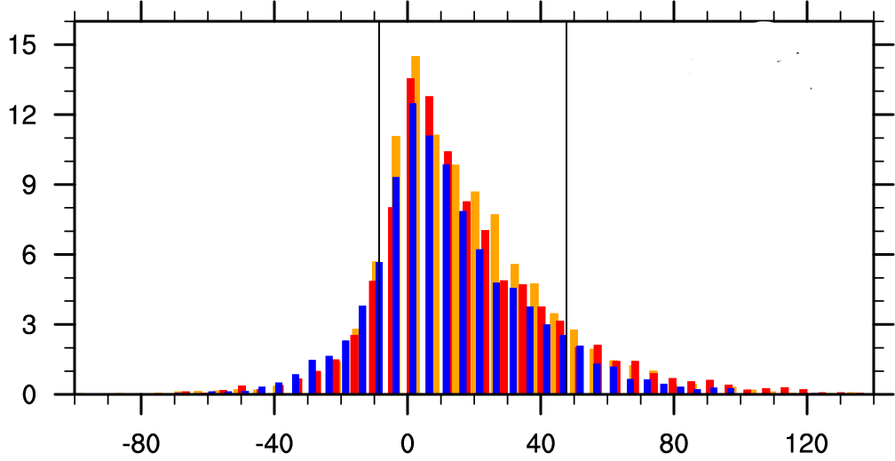
I tried to do it again as your suggestion. The plot is attached,
I think I still have a problem, as you can see where the bar charts are
still overlapped, is there any trick
how to manage this, at least to shift the overlapping bar?
I am really sure, this issue comes from the pdfx function, where the "bin
centers" are different from these
3 distribution, is there any way around how to solve this proble, I just
want at least get the bar attached one to another.
Thanks for your help. Regards.
On Wed, Jun 4, 2014 at 5:08 AM, Adam Phillips <asphilli@ucar.edu> wrote:
> Hi Erika,
> There's two things going on here:
> 1) The bin centers for your three bar charts are all different and each
> bar chart has different bin sizes. This makes lining them up in a nice
> fashion nearly impossible.
> 2) res@gsnXYBarChartColors does not work the way you are trying to use
> it. It applies the colors set in res@gsnXYBarChartColors sequentially to
> each bin. Thus, setting res@gsnXYBarChartColors =
> (/"orange","red","black"/) will set the first bar of your first bar chart
> orange, the second bar red, the third bar black, the fourth bar orange and
> so on. It will not set the first bar chart entirely to orange, the second
> to red, and the third to black.
>
> Take a look at example #9 here:
> http://www.ncl.ucar.edu/Applications/bar.shtml#ex9
>
> Note that the input x-axis values differ for each bar chart when each of
> the four plots is created.
>
> Also note that gsn_labelbar_ndc is used to create the labelbar, and that's
> the way I would recommend creating the legend using this method. I have
> attached a modified version of your script along with the resulting plot. I
> did not add coding to put the legend in.
>
> Hope that helps. If you have any further questions please reply to
> ncl-talk.
> Adam
>
>
> On 06/03/2014 12:41 PM, Erika Folova wrote:
>
> Hallo NCL,
>
> Lately Im trying to generate a plot by combining three distributions
> (bar chart) from the output of pdf function.
> The figure that I want to have is attached (expected_figure.png). I
> experimented to try it using a simple script provided in
> example 2, but when i turn on the barchart options it seems like all the
> bars are overlapped.
> Is there any nice trick to do this kind of task (output of pdf function) ?
> I really appreciate for your nice help
>
> Best.
> Erika
>
>
> _______________________________________________
> ncl-talk mailing list
> List instructions, subscriber options, unsubscribe:http://mailman.ucar.edu/mailman/listinfo/ncl-talk
>
>
> --
> ______________________________________________________________
> Adam Phillips asphilli@ucar.edu
> NCAR/Climate and Global Dynamics Division (303) 497-1726
> P.O. Box 3000
> Boulder, CO 80307-3000 http://www.cgd.ucar.edu/staff/asphilli
>
>
_______________________________________________
ncl-talk mailing list
List instructions, subscriber options, unsubscribe:
http://mailman.ucar.edu/mailman/listinfo/ncl-talk