Date: Fri Jun 07 2013 - 12:23:06 MDT
Hi all,
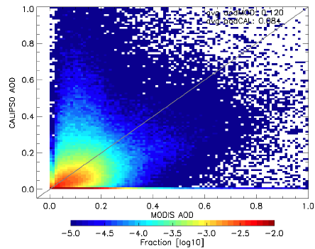
I want to make a scatter plot like the example plot shown below, i.e.
scatter plot with the different colors representing the frequency
distributions of specific ranges of values. I wonder if ncl has a function
to make such plot, or if not, how to modify the currently available
functions to make such plot. Does anyone has any idea? thanks in advance.
Xiaoyan
[image: Inline image 2]
_______________________________________________
ncl-talk mailing list
List instructions, subscriber options, unsubscribe:
http://mailman.ucar.edu/mailman/listinfo/ncl-talk