Date: Thu May 09 2013 - 03:54:53 MDT
Dear all,
I have two questions on the design of my plots:
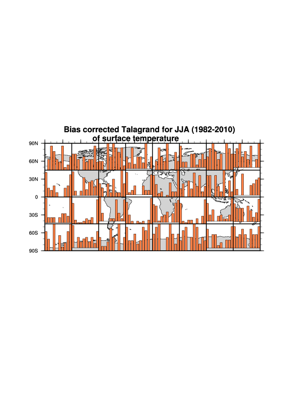
1. I want to display a panel of statistical plots over a map and I am confronted with the different size of the barcharts which results in "hopping figures", see the colored plot. I searched for a possibility of a fixed y-axis but could not find such a ressource.
is there any trick? If possible I want to avoid plotting a transparent dummy bar because this seems to me making the code a bit "intransparent".
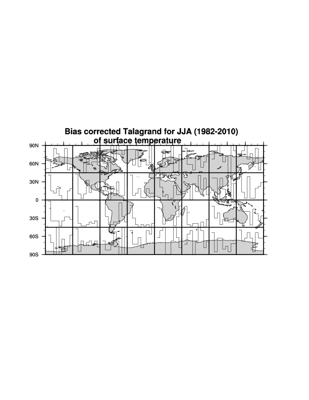
2. I tried to display the same figure drawing only the outlines of the bars. Here, I was not able to control neither the linethickness nor a line color, although I applied the following ressources
tres@gsnXYBarChartOutlineOnly= True
tres@gsnXYBarChartOutlineThicknessF=4.
tres@gsnXYBarChartFillLineThicknessF=10.
Since I plan to overlay later two,..., of such statistics for comparison I would be happy to get a solution for this
Thanks in advance, Kristina
_______________________________________________
ncl-talk mailing list
List instructions, subscriber options, unsubscribe:
http://mailman.ucar.edu/mailman/listinfo/ncl-talk