Dear Xin,
Did you follow the example I created for putting curves on a bar chart?
See example 14 at:
http://www.ncl.ucar.edu/Applications/bar.shtml
This uses gsn_add_annotation to add the XY plot as an annotation of the bar chart.
You should try this with the xy_plot and bar_plot objects you created. Something like:
amid(i) = gsn_add_annotation(bar_plot(i),xy_plot(i),False)
You will need to set res@gsnFrame and res@gsnDraw to False for both sets of plots before you
do this, and then draw them later with:
draw(bar_plot(i))
If you need more help, I can't do this just based on your NCL script alone. If you can provide me with
all the data files, then I might be able to fix your script.
--Mary
On Mar 20, 2012, at 12:41 AM, Xin Xi wrote:
> Hi Mary,
> I followed your example but have a problem of getting the precipitation and temperature data on same individual plots. I have two sets of data, so it adds some complications. Please see the attached ncl script and eps file.
> Thanks a lot!
> Xin
>
>
> On Mon, Mar 19, 2012 at 4:46 PM, Mary Haley <haley@ucar.edu> wrote:
> I took this example a little further. See example 8 at:
>
> http://www.ncl.ucar.edu/Applications/annotate.shtml#ex8
>
> --Mary
>
> On Mar 19, 2012, at 11:28 AM, Mary Haley wrote:
>
> >
> > Dear Xin Xi,
> >
> > You are correct, gsn_add_annotation is a function you need to use in order to attach plots to other plots.
> >
> > To add little map plots as "annotations" of a bigger map, and then draw a line between them, please see example 7 at:
> >
> > http://www.ncl.ucar.edu/Applications/annotate.shtml#ex7
> >
> > I'll try to come up with a bar chart example that also has lines. Are you actually drawing histograms, or bar charts? There's a difference:
> >
> > http://www.ncl.ucar.edu/Applications/bar.shtml
> > http://www.ncl.ucar.edu/Applications/histo.shtml
> >
> > --Mary
> >
> > On Mar 18, 2012, at 9:11 AM, Xin Xi wrote:
> >
> >> Hi,
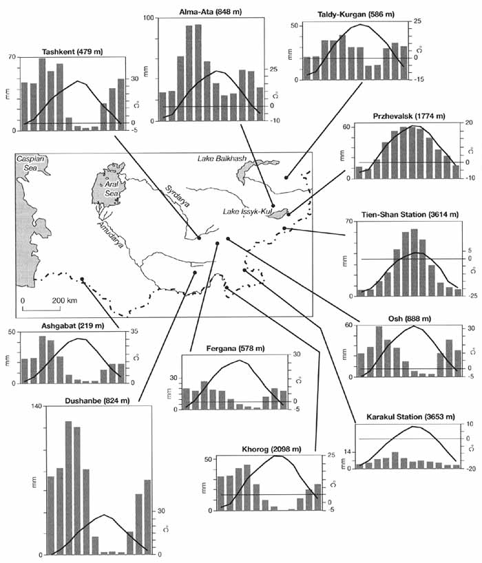
> >> I am trying to make a plot like this one : http://www.rusnature.info/reg/f16-5.jpg
> >> I have looked through relevant examples on ncl website. I suppose I need to use gsn_add_annotation to control the position of each plot on the map (please let me know if there is a better way). How do I draw the line from the position of each station to the plot?
> >>
> >> Also, I have two sets of data for each station. Two sets of histograms using left y-axis, and two curves using right y-axis. How can I set the left vs. right y-axis for the histograms vs. curves?
> >>
> >> Thanks!
> >> _______________________________________________
> >> ncl-talk mailing list
> >> List instructions, subscriber options, unsubscribe:
> >> http://mailman.ucar.edu/mailman/listinfo/ncl-talk
> >
> > _______________________________________________
> > ncl-talk mailing list
> > List instructions, subscriber options, unsubscribe:
> > http://mailman.ucar.edu/mailman/listinfo/ncl-talk
>
>
>
>
> --
> Xin Xi
> School of Earth and Atmospheric Sciences
> Georgia Institute of Technology
> 311 Ferst Drive, Atlanta, GA 30332-0340
>
> <domain.ncl><domain.eps>
_______________________________________________
ncl-talk mailing list
List instructions, subscriber options, unsubscribe:
http://mailman.ucar.edu/mailman/listinfo/ncl-talk
Received on Tue Mar 20 12:16:00 2012
This archive was generated by hypermail 2.1.8 : Tue Mar 20 2012 - 15:27:15 MDT