NCL Home>
Application examples>
Plot techniques ||
Data files for some examples
Example pages containing:
tips |
resources |
functions/procedures
NCL Graphics: Adding annotations to a plot or frame

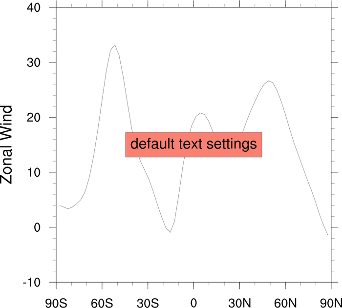
You can annotate an NCL plot with text strings, markers,
lines, polygons, labelbars, legends, and even other plots.
The functions to use are:
gsn_add_annotation
gsn_add_polygon
gsn_add_polyline
gsn_add_polymarker
gsn_add_text
Functions for creating (not drawing) text strings, labelbars, and
legends---so you can attach them to another plot later---are:
gsn_create_labelbar
gsn_create_legend
gsn_create_text
See example "ESMF_regrid_21.ncl" below for
an example of putting annotation on a frame, rather than a plot.
The gsn_add_annotation function can
be used to attach any plot object as an annotation of another
plot (base) object. When you draw the base object, then, the
annotation will get drawn as well. If you resize the base object, the
annotation will resize accordingly.
The three main resources for determining where to attach an
annotation are amJust,
amOrthogonalPosF
and amParallelPosF.
amJust indicates what corner of
the annotation will be used to position it, based on the other two
resources. It can take one of nine possible values:
| "TopLeft"
| "CenterLeft"
| "BottomLeft"
|
| "TopCenter"
| "CenterCenter"
| "BottomCenter"
|
| "TopRight"
| "CenterRight"
| "BottomRight"
|
Here's a table showing a sample of values to use for the
orthogonal/parallel resources. Whatever
amJust is set to will be the corner of
the object that is placed according to the values in this table:
| amParallelPosF/amOrthogonalPosF
|
| 0.0/ 0.0
| position in dead center of plot
|
| 0.5/ 0.5
| position at bottom right of plot
|
| 0.5/-0.5
| position at top right of plot
|
| -0.5/-0.5
| position at top left of plot
|
| -0.5/ 0.5
| position at bottom left of plot
|
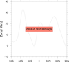
 annotate_3.ncl
: This example
is similar to the first one, except a filled contour plot
is created, and is additionally annotated with text and boxes.
The functions gsn_add_polyline
and gsn_add_text are used
to add lines and text.
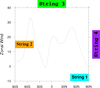
 text_9.ncl
: This example shows how to
use
gsn_create_text to create text
strings and
gsn_add_annotation to attach text items to a
plot.
The final frame shows how you can resize the base plot and the
annotations will resize automatically.
 annotate_5.ncl
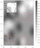
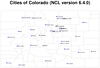
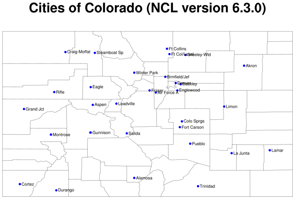
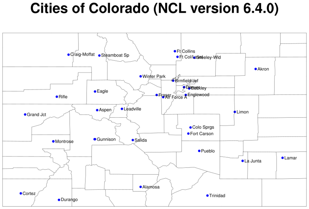
: This example
shows how to attach an array of text strings to a map using
gsn_add_text. It reads data from a small
ASCII file, "
annotate5.txt", using
the
str_get_field and
str_get_cols functions.
Note that no effort is being made to remove overlapping strings. See
example 10 on the text page on how to do
this.
Note: the left image is from running
NCL V6.3.0 on this
script. The right image is from running
NCL V6.4.0.
In NCL versions 6.3.0 and earlier, the NCL outlines will not show the
county of Broomfield or the updated counties around Denver. In NCL
version 6.4.0, the NCL map databases were updated to reflect the
current Colorado counties.
 annotate_7.ncl
: This example
is similar to the previous one, except it shows how to draw
a line between two plots.
You must use datatondc to convert the line
coordinates to NDC coordinates before you draw it in NDC space
with gsn_polyline_ndc.
 annotate_8.ncl
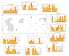
: This example
is similar to the previous one, except it shows how to draw
multiple bar charts around a map with connector lines between
the plots.
 annotate_9.ncl
: This example is
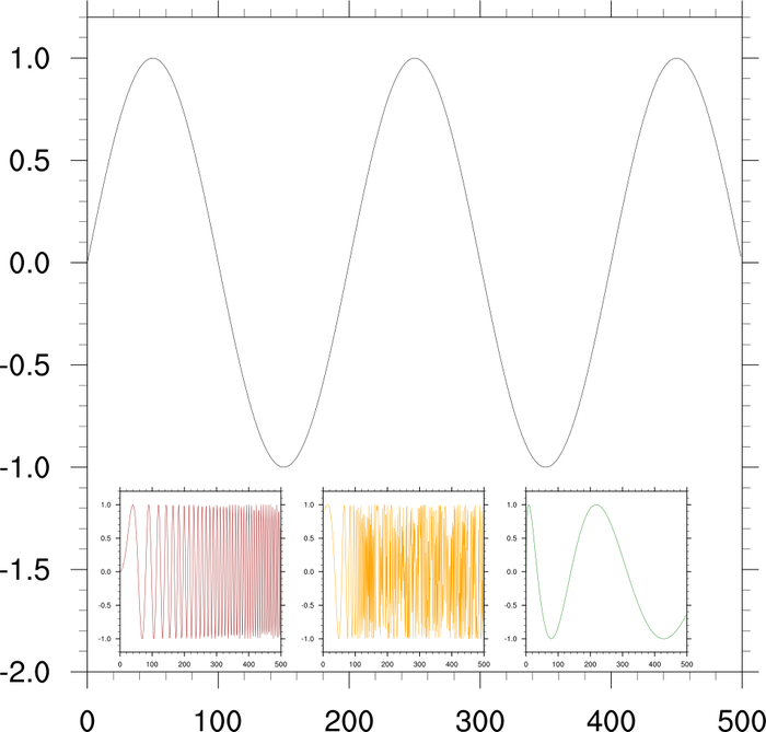
similar to the first two examples in that it shows how to add a
smaller plot to the inside of a bigger plot. In this case,
the
trYMinF resource is being
set to a smaller value than the actual minimum of the Y axis,in order
to get some extra white space at the bottom of the plot. The three
smaller plots are then attached using
gsn_add_annotation.

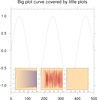 annotate_10.ncl
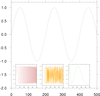
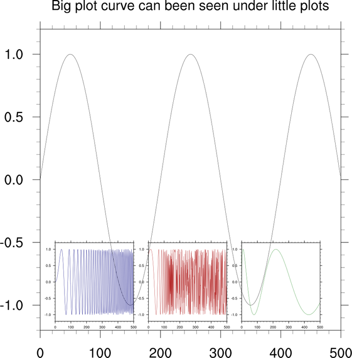
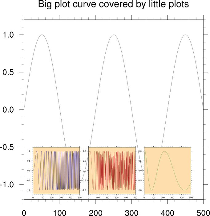
: This example is
very similar to the previous example, except it shows how to
fill in the background of the three small plots so they
cover the curve in the big plot. In this case, the Y minimum is
NOT being set, because we want to force the plots to overlap.
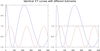
 ESMF_regrid_21.ncl
: This
example is taken from the
ESMF regridding
page. It shows how to use a blank plot as part of a paneled set
of plots in order to add additional text to the frame.
The blank plot is created
using gsn_blank_plot. The size of
the blank plot is made the same as the other three plots by using
getvalues
to retrieve vpWidthF and
vpHeightF and then setting these two
resources to the same value as the other three plots.
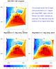
 annotate_11.ncl
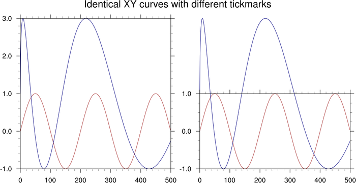
: This example
shows how to use
gsn_blank_plot to
create a custom set of tickmarks for an XY plot. In this case,
it's used to create tickmarks around the smaller of two XY
curves that are in the same plot.
The original XY plot and the custom one are drawn in a panel for
comparison purposes only.
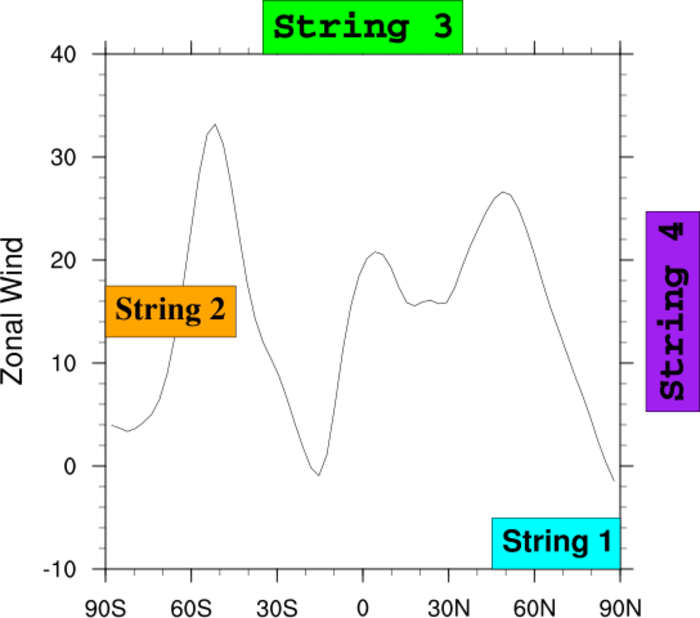
 annotate_12.ncl
: This example
shows how to use
gsn_add_annotation
to attach text strings outside of a plot, in three locations.
gsn_create_text is used to create
the same text string three times, and then
amOrthogonalPosF is used to place
these strings at the top, middle, and bottom of the plot, right next
to the labelbar.
 annotate_13.ncl
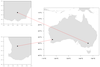
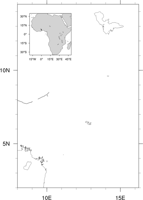
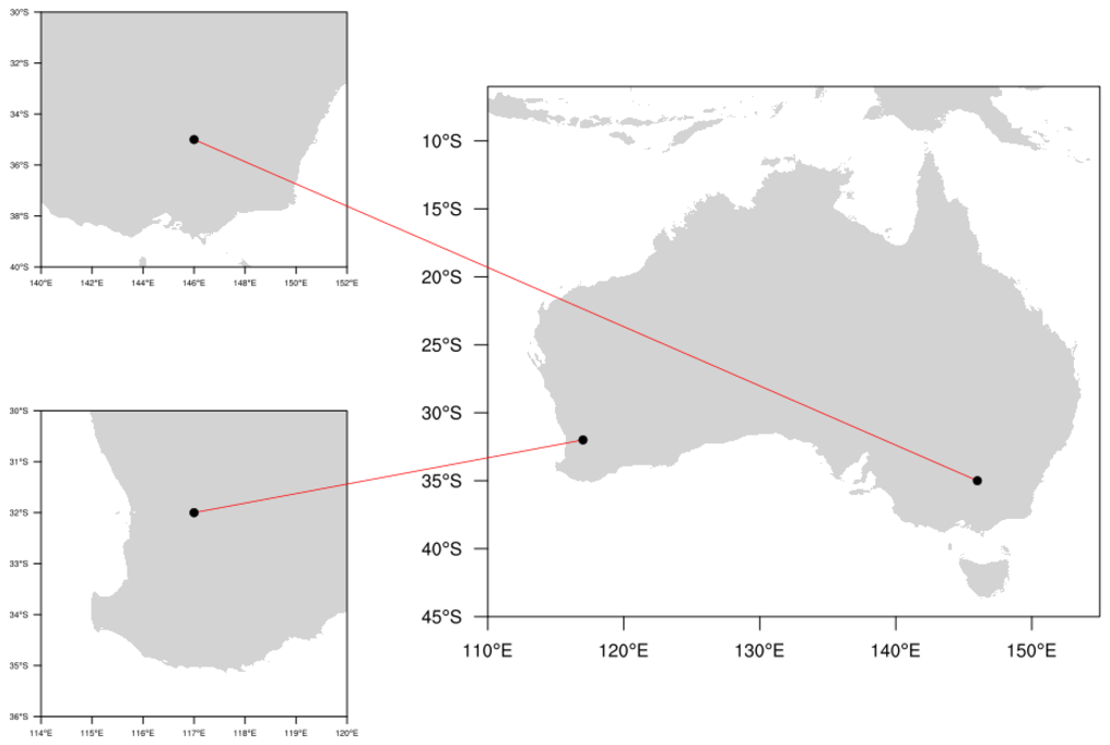
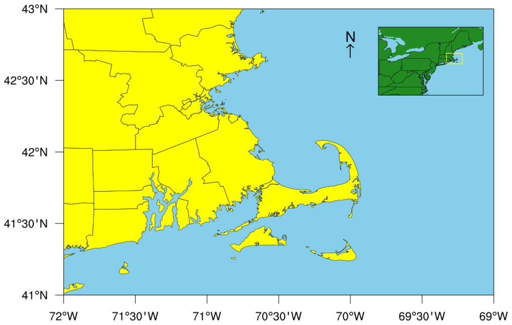
: This script shows how to draw a smaller map as an annotation of a larger map.
The size and position of the larger map is retrieved using
getvalues on the viewport resources
vpYF,
vpXF,
vpWidthF,
and
vpHeightF. These values help determine the location of the smaller map.
A special "up arrow" symbol is added with gsn_add_text, using symbol '-' from
font table 34.
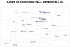
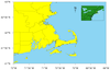
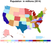 polyg_19.ncl
: This script
shows how to draw a map of mainland United States with Alaska, Hawaii,
and Puerto Rico added as annotations at the bottom. Each state is
colored based on population in 2014, using shapefiles downloaded
from
gadm.org. The "states.shp" set
of files is available on our
data page.


