What's new in the application examples
24 February 2019
Added a new page that documents three routines added in NCL V6.6.0 for calculating interpolations and cross-sections of WRF-ARW 2D and 3D fields using lines and planes as slices.
20 February 2019
Added several examples showing how to use an updated version of gsn_coordinates to draw the edges and centers of hexagonal meshes. This capability was added in NCL V6.6.0:
5 February 2019
Added a page of NCL-to-Python examples, which serve as a companion to the NCL to Python Transition Guide, both developed by Karin Meier-Fleischer of DKRZ.
12 January 2018
Added example goes_6.ncl showing how to plot GOES-16 data.
27 July 2017
Added a new application page for showing various ways to zoom in on WRF map plots.
19 June 2017
Added a new application page for drawing data locations as lines or grids on an existing plot.
4 June 2017
Added a new application page for customizing WRF titles.
10 March 2017
Many new example pages were created before this date, but not announced here yet:
- Australian Community Climate and System Simulator (ACCESS) Data
- Global Fire Emissions Database (GFED)
- NCL User Guide (NUG) examples
- Regression & Trend
- Task parallelism
24 July 2016
- Added new examples pages:
- Added example shapefiles_21.ncl showing how to mask data based on shapefile outlines, using two different methods.
14 June 2016
- Added a new page that describes the basic concepts behind
plotting data on a map
using NCL.
- Added several individual examples:
- Added examples polyg_19.ncl
and polyg_2.ncl showing
how to add maps as annotations of other maps.
- Added example bar_19.ncl
showing how to force bars s to be the same width in a series of
bar plots.
- Added examples polyg_19.ncl
and polyg_2.ncl showing
how to add maps as annotations of other maps.
17 October 2015
- Complex Demodulation
- Crop: Evapotranspiration; Penman-Monteith
- Eliassen-Palm flux (EP-flux)
- Heat Index/Stress
13 October 2015
Added examples "mask_14.ncl" and "mask_15.ncl" to the mask examples page showing how to use masking to show areas of interest.
2 October 2015
- Added examples "panel_36.ncl" and "panel_vp_36.ncl"
to the panel examples page
showing how to panel plots with a mix of individual
and common labelbars.
- Added example "panel_37.ncl" to
the panel examples page
showing how to panel 4 rows and 3 columns of plots, with each row
having its own vertical labelbar.
- Added example "lcnative_latlon_1.ncl" showing how to draw
native lambert conformal data on a different map projection.
23 August 2015
- Added a new page that describes how to
write CSV (comma-separated
values) files.
- Added example (conLab_8) to show how to format contour line labels and labelbar labels.
11 August 2015
Added example "text_19.ncl" to the text examples page, showing how to draw curved text on a map.
7 August 2015
Added example "interp1d_2.ncl" to the interpolators for one-dimensional curves page, showing how to apply different tension values to get different smoothed effects with ftcurv.
31 July 2015
Added an animation example showing how to speed up the creation of individual plots in an animation by using "setvalues".
9 July 2015
- Added another NCL
editor enhancement for the
Atom editor, contributed by Ryan Pavlick
of the Jet Propulsion Laboratory. This one allows users to run an NCL
script or a selection from an NCL script directly from their Atom
editor.
- Added colormap example 10 which draws all of the NCL colormaps as vertical labelbars.
25 June 2015
Added a link to an NCL editor enhancement for the Atom editor. This was contributed by Ryan Pavlick of the Jet Propulsion Laboratory.
5 June 2015
Added example "mapoutlines_5_zoom.ncl" to the map outlines page comparing various map resolutions available in NCL, with high resolution outlines from a shapefile.
30 May 2015
Added example "axes_6.ncl" to the axes page showing how to increase the range of the X and/or Y axis when you have coordinate array assigned.
29 May 2015
Added example "overlay_12.ncl" to the overlay page showing how to overlay two color contour plots each with their own color map.
26 May 2015
Added a link to another NCL editor enhancement for the Notepad++ editor. This was contributed by Dr. Ma Xinye and Ge Hui, from the School of Atmospherical Sciences, Nanjing University, China (worldwindmxy@gmail.com).
12 May 2015
- Added example "overlay_11.ncl" to
the overlay page
showing how to overlay vectors and filled contours on
a map, with the contours masked by China and Taiwan.
- Added example "text_18.ncl" to the text page showing how to add multiple figures to plots in a panel plot.
21 April 2015
Added an animation example contributed by Karin Meier-Fleischer of DKRZ showing how to animate two globes side-by-side.
13 March 2015
- Added example stream_10.ncl
to the streamlines example page
showing how to panel colored streamline plots with a common labelbar.
- Added example stream_11.ncl showing how to color streamlines based on a scalar field.
Alan Brammer of the University of Albany contributed the initial version of the above examples and the code necessary to produce scalar and paneled streamlines plots.
11 January 2015
- Added ESMF example ESMF_regrid_31.ncl
to the ESMF regridding page
showing how to regrid data from a categorical vegetation data to a
1 degree using nearest neighbor interpolation.
- Added ESMF example ESMF_regrid_32.ncl
to the ESMF regridding page
showing how to regrid data on a WRF output file to both a 1.0 and 0.5 degree
grid, with lat/lon lines included to show the grid structure.
- Added WRF example wrf_gsn_7.ncl to the WRF/GSN page showing how to regrid data on a WRF output file to both a 0.25 and 0.125 degree grid, with lat/lon lines included to show the grid structure.
2 January 2015
Added three Butterworth filter examples (bfband_[1-3].ncl) to the filters example page. These illustrate the use of the new dim_bfband_n function that will be added to NCL V6.3.0.
12 December 2014
Added examples cloudsat_2.ncl and cloudsat_3.ncl to the CloudSat page.
3 December 2014
Added examples "shapefiles_17.ncl" and "shapefiles_18.ncl" the Shapefiles page showing other methods for masking data based on outlines in a shapefile.
12 November 2014
- Added an example
of reading and plotting CO
Total Column from an HDF-EOS5 MOP02T-20100414-L2V16.2.1.he5 file,
using colored markers.
This script was contributed by Rebecca Buchholz, NCAR/ACD.
- Added example "shapefiles_16.ncl" to
the Shapefiles page
showing how masking against a shapefile outline affects different
grid resolutions.
26 October 2014
Added new applications pages:
- Arctic System Reanalysis (ASR)
- Parameter elevation Regression on Independent Slopes Model (PRISM)
- Map outlines
- Parameter elevation Regression on Independent Slopes Model (PRISM)
21 July 2014
Added a new applications page showing how to plot WRF-ARW data using gsn_csm plotting scripts.
21 May 2014
Added a unique panel plot with four sets of filled curves, contributed by Dustin Swales of NOAA/PSD.
13 May 2014
Added a link to an NCL editor enhancement for the Notepad++ editor. This was contributed by Brian Vanderwende, a PhD student at the University of Colorado Boulder.
1 May 2014
Added an example showing how to attach a logo to an existing NCL plot. See logo_4.ncl on the Logos example page.
18 April 2014
Added some faster and cell-fill versions of scripts for plotting MPAS data.
16 April 2014
- Added some "France" examples in
the shapefiles page
showing the use of the new gsSegments and
gsColors,
and how the gsn_add_shapefile_polygons
and gsn_add_shapefile_polylines
routines have been sped up.
- Added some faster versions of scripts for plotting
ICON data.
15 April 2014
- Added example "bar_18.ncl" to
the bar chart page showing
how draw stacked bars with labelbars. This was contributed by Rashed
Mahmood.
- Added an
example to the unique page
showing how to compare wind fields. This script was contributed by
Clément Vic, PhD student at Laboratoire de Physique des
Océans, Brest (FRANCE).
23 March 2014
Added two new application pages:
17 March 2014
Added example "Germany_coastal_counties_DEU_adm.ncl" to the Shapefiles page showing how to use shapefile outlines of coastal counties in Germany to average data over each county. This example was contributed by Karin Meier-Fleischer of DKRZ.
3 March 2014
- Overhauled the Shapefiles
examples to use newer methods for attaching shapefile data to an NCL map.
Also included a new and more generic "shapefile_mask_data" function in
shapefile_mask_data.ncl
for masking data based on outlines in a shapefile.
- Added example "shapefiles_14_mask.ncl" to
the Shapefiles page
showing how to mask WRF data based on outlines in a shapefile.
26 February 2014
- Added example "bar_17.ncl" to
the bar chart page
showing how fill bars to the left and right of a given
X reference line.
18 February 2014
- Added example "bar_16.ncl" to
the bar chart page
showing how to create a basic stacked bar plot. This
was contributed by Rashed Mahmood.
- Added a link to
an NCL editor
enhancement for the
Sublime Text
editor. This was contributed by Dr. Li Dong
of IASP/Chinese Academy of Sciences.
- Added example "shapefiles_14.ncl" to
the shapefiles page
showing how to add shapefile outlines to an existing WRF contour/map
plot.
6 January 2014
- Added example "text_17.ncl" to the text page.
13 November 2013
- Added example "contour1d_4.ncl" to
the contour1d page
showing how to color markers based on the same levels used in a
contour plot. Opacity is used to de-emphasis the filled contour plot.
- Added example "overlay_9a.ncl" to
the overlay page
showing how to use overlay to overlay
two plots that are in different data spaces.
- Added example "zonal_8.ncl" to
the zonal means page
showing how to add an additional curve to the zonal means plot.
12 November 2013
Added example "wrf_debug_4.ncl" to the WRF debug page showing two ways you can subset a WRF lat/lon grid.
19 August 2013
Added example "shapefiles_13.ncl" to the shapefiles page showing how to take the average of a data array based on Georgia county outlines read from a shapefile.
31 July 2013
Added example "panel_33.ncl" to the panel page showing how to maximize two sets of paneled plots. There are other examples that show how to do this, but this one also has vertical labelbars and uses the new cnFillPalette resource to assign different color maps to each set of contour plots.
25 July 2013
Added example 17 to the "new color capabilities" page showing how to use opacity to highlight overlapping positive and negative contours in two separate plots.
19 July 2013
Added example 27 to the ESMF regridding page showing how to regrid data from an ECMWF operational Gaussian grid to 2.5 degree grid.
3-5 July 2013
Overhauled the "Writing ASCII files", "Writing binary files", and "Reading binary files" example pages to add more examples and clean them up.
7 June 2013
- Added a new application page for
examining WRF grids.
- Added example "panel_31.ncl" to
the panel page showing how
to panel vectors over topographic maps, with a single vector
reference annotation box drawn at the bottom.
- Added example "panel_32.ncl" to
the panel page showing how
to panel spaghetti plots and add a custom legend.
28 May 2013
Added a new application page for creating topographic maps.
9 May 2013
- Added example "panel_30.ncl" to
the panel page showing how
overlay bar charts on maps, and then to panel them with no white
space inbetween the maps.
6 May 2013
- Added example "conLev_4.ncl" to the contour levels page showing how to deal with contouring constant fields.
8 April 2013
- Added example "raster_6.ncl" to
the raster page showing
how to create a 2D histogram with irregular X and Y axes using raster
contours.
- Added example "shapefiles_12.ncl" to
the shapefiles page
showing how to modify the gsn_add_shapefile_polylines routine
to limit what polylines are drawn.
5 April 2013
- Added example "panel_29.ncl" to
the panel page showing how
to panel multiple plots with both color and shaded contours, and
create two separate labelbars.
- Added example "xy_32.ncl" to the XY
plot page showing how to create multiple legends for a multi-curve
plot.
- Added example "overlay_10.ncl" to
the overlay page showing how
to overlay shaded contours on filled contours, with two separate
labelbars.
- Added example "shapefiles_11.ncl" to
the shapefiles page
showing how to use a shapefile containing U.S. outlines to create a
land mask.
3 March 2013
Added a new application page for visualizing MPAS model data.
26 February 2013
- Added a new application page for
visualizing COSMO model data.
Oliver Führer from MeteoSwiss provided
the scripts and information for this page.
- Added three new examples to
the unique
page: schematic map of
the Arabian Sea, a quiver
plot, and a
bathymetry
plot. These scripts were contributed by Clément Vic and
Nicolas Barrier, PhD students at Laboratoire de Physique des
Océans, Brest (FRANCE).
- Added two new examples to
the RGBA color
page: using the relatively
new cn*Palette* resources and
using
opacity values for a filled XY plot.
- Added a new example to
the pie chart page showing
how to draw pie charts over
a map. This example was contributed by Zheng Lu of EAS, Georgia
Tech.
25 February 2013
Added a new application page for analyzing data from the IBTrACS project.
15 February 2013
Added example 3 to the time axis labels page showing how to create a time series of WRF data, with nice time labels on the X axis.
14 February 2013
Added example 15 to the bar chart page showing how to draw filled bars under an XY curve.
11 February 2013
- Added example 10 to the shapefiles page showing how fill shapefile polygons based on a provided colormap.
- Added example 20 to the labelbars page showing how to draw several labelbars on a page.
5 February 2013
Updated example "station_2.ncl" on the station page to add a second plot that draws a labelbar instead of a legend.
3 January 2013
- Added example 24
to the ESMF regridding page
showing how to regrid data from a POP grid to 1x1 degree grid.
- Added example 8 to the overlay page showing how to overlay an XY plot on a contour plot.
28 December 2012
- Examples 12 and 13 were added to the mask applications page showing how to create a land mask from a shapefile that contains coastal outlines. Example 13 compares the mask with one read off the data file.
20 December 2012
- Added example 10
to the annotation page
showing how fill in the background of small XY plots that overlap
with a larger XY plot.
20 November 2012
Added new application pages:
- CALIPSO: Cloud Vertical Structure and Aerosols
- CloudSat: Cloud Vertical Structure
- DAYMET: Daily Sfc Weather and Climate
13 October 2012
Added a new page showing how to plot data from various Toulouse models. These scripts came out of two NCL workshops held at CERFACS in Toulouse in October 2012, using datasets provided by the students.
12 October 2012
- Added example 9
to the annotation page
showing how add small XY plots to the inside of a large XY plot.
To see a real-world example of the same technique, see example 13 on the "unique plots" page.
- Added example 27
to the map only page
showing how to draw a map in four quadrants, with each quadrant
using a different fill color.
28 September 2012
Example 7 was added to the Lat/lon grid lines on a map applications page showing how to draw a WRF lat/lon grid.
26 September 2012
Added example 28 to the panel plot page showing how to panel 60 plots with slightly different sizes, and move them closer together.
21 September 2012
- Added example 20
to the ESMF regridding page
showing how to regrid data from a 27km WRF grid to a coarser 81km
WRF grid.
- Added example 9 to
the shapefiles page showing how to calculate an areally weighted mean
time series for an irregularly shaped region.
- Added example 31 to the XY page showing how to create your own dash patterns for an XY plot. This can be useful if you need to create dash lines with more spaces between the dashes.
16 September 2012
- Added example 4 to
the local minima/maxima applications page
showing how to add different color markers to a plot that uses a 256-color
colormap.
- Added example 19 to the labelbar page showing how to reconstruct a labelbar from contour plot, in the exact location as it appears with the plot.
28 August 2012
- Added new applications page for plotting
Ocean Product Suite (v7)
data.
- Added example cpcuni_1.ncl to
the high-res precipitation
applications page showing how to plot CPC_unified for a specific
file.
- Added example 6 to
the table applications page
showing how to draw a plot of filled triangles.
- Added example 6 to
the equations applications page
showing the formal definition of liquid water path as shown
in the AMS glossary.
3 August 2012
- Added a new page that describes how to
plot Global Precipitation
Climatology Project data.
- Added example 18 to the labelbar page to show how to draw an outer box only around the labelbar boxes.
2 August 2012
- Added a new page that describes how to
plot GOES satellite data.
30 July 2012
- Added a new page that describes how to
do simple Fourier analyses
of climate data.
- Added examples 18 and 19 to the ESMF regridding page to show how to regrid data on a HOMME grid.
23 July 2012
Example 6 was added to the Lat/lon grid lines on map applications page showing how to add latitude labels.
19 July 2012
- Added a new page that describes how to
handle atmospheric and
oceanographic climate indices.
- Example 14 was added to the legend
page showing how to draw only a partial legend
for a plot with several XY curves.
22 June 2012
Example 9 was added to the taylor diagram applications page showing how use taylor diagrams for many models.Thanks to Erik Noble of NASA for the contribution.
6 June 2012
Example 5 was added to the Evans Plot applications page showing how to panel several Evans plots.Thanks to Dr. Jason Evans of the Climate Change Research Center at the University of New South Wales for providing the updated template and new example.
25 May 2012
Example 2 was added to the animation applications page showing how to created an animated GIF of WRF contour data.
19 March 2012
- Examples 7 and 8
were added to the annotation
applications page showing how to draw multiple plots
around a single plot, and then draw connector lines between
them.
- Example 14 was added to the bar applications page showing how to draw a curve on top of a bar chart.
15 March 2012
- Added a new page that describes how to
draw phased contours.
- Example 9 was added to the colormap page
showing how to create a color map that reverses the
colors at midpoint.
- Example 16 was added to the text page showing how to line up decimal points in floating point text strings.
22 February 2012
Example 3 was added to the local minima/maxima page showing how to label your own minima/maxima locations.
2 December 2011
Added a new page that describes how to handle complex coefficients in GRIB files.
21 November 2011
Example 7 was added to the vector plots page showing how to change the position of the arrow with respect to the base coordinates.
17 November 2011
Example 13 was added to the legend page showing how to create a legend from scratch using an XY plot. The purpose of this is to allow you to further customize the legend, say by removing one or more of the legend items.
9 November 2011
Example 13 was added to the bar chart page showing another variation on "floating" bars. This example shows one way you might compare data from different models.This example was contributed by Daniel Adriaansen of NCAR/RAL.
3 November 2011
Example 12 was added on the unique applications page to show how to plot a PIREP/METASR/RAOB combo.This example was contributed by Daniel Adriaansen of NCAR/RAL.
2 November 2011
Added a new ASCII reading example that reads a complicated ASCII file with no delimeters or much structure.
11 October 2011
Added a new page that describes how to plot data on a rotated lat-lon grid.
10 October 2011
Added a new Kate editor enhancement for NCL contributed by Raul Valenzuela of the University of Colorado.
28 September 2011
Examples 4 and 5 was added to the Wind barbs page showing how to use wmbarb to create a wind profile plot.
27 September 2011
Example 5 was added to the radar page showing how to use raster contours to create a panel of four different radar plots. This example was contributed by Qin Rui of the Beijing Weather Modification Office.
15 September 2011
Added example 17 to the labelbar page showing how to draw a plot with a labelbar with triangular ends.
2 September 2011
Added example 7 to the scatter plots page showing how to draw big hollow markers and use labelbars, markers, and text strings to create a nice legend.
31 August 2011
Added example 25 to the maps only page showing how to fill the climate divisions in the state of Idaho.
29 August 2011
Added example 16 to the labelbar page showing how draw a labelbar with triangular edges.
25 August 2011
Added example 15 to the labelbar page showing how to reverse a labelbar.
22 August 2011
Added example 12 to the bar chart page showing how to draw multiple sets of "floating" bars.
14 July 2011
Added example 27 to the panel plot page showing how draw both a vertical and horizontal labelbar on a panel plot.
30 June 2011
Added example 26 to the panel plot page showing how put multiple paneled plots on one page, using different colormaps.
20 June 2011
Added example 4 to the CESM Ice Model page showing how to visualize data on the CICE tripole grid.
6 June 2011
Added a new Aquamacs editor enhancement for NCL contributed by Luis C. Cana Cascallar.
17 May 2011
Added a new page that describes how to customize to lat/lon grid lines over a map.
16 May 2011
- Example 8
was added to the Shapefiles
applications page showing how to draw various administrative
areas for India.
- Example 3
was added to the coastlines
applications page comparing NCL's and RANGS/GSHHS map
databases with shapefile data for Australia.
6 May 2011
Added a new page that describes how to set contour levels for use with symmetric color tables.
13 April 2011
- Example 8
was added to the Taylor Diagram
applications page showing how indicate bias on the diagram.
- Example 6
was added to the annotation
applications page showing how to attach plots to the outside
of a map.
6 March 2011
- Example 7
was added to the shapefiles
applications page showing how to plot river basins, indigenous areas,
places of interest in Australia.
- Example 4 was added to
the radar
page showing a nice way to display radar data with special labels.
24 February 2011
- Example 10 was added to the bar plot page showing how to draw horizontal stacked bars.
- Examples 7 and 8
were added to the annotation
applications page showing how to draw multiple plots
around a single plot, and then draw connector lines between
them.
17 February 2011
- Examples 2 and 3 were added to
the radar
page showing more ways to display radar data.
- Example 6 was added to the scatter page showing how to draw filled, outlined dots on a polar map projection.
31 January 2011
- Example 12 was added to the legend page showing how to further customize an XY plot legend.
29 January 2011
- Example 14 was added to the labelbar page showing how to change the alignment of labels on a labelbar.
24 January 2011
- Example 4 was added to the masked Lambert Conformal page showing how to add lat/lon labels to the map.
19 January 2011
- Example 5 was added to the raster contour page showing how to get full-sized raster contours at the boundaries.
6 December 2010
- Example 10 was added to the masking applications page showing how to mask missing values in a cell-filled contour plot.
29 November 2010
- Example 30 was added to the XY plots page showing how to force an axis to be irregularly spaced.
18 October 2010
- Example 24 was added to the map only page showing how to add minor tickmarks to a map.
16 August 2010
Added new page that describes how to create opaque or transparent plots.
8 August 2010
- Example 4 was added to the axes page showing how to create a cartesian coordinate system.
28 July 2010
A new page that describes how to read CSV files was added.
1 Jul 2010
Added example 9 to the map tickmarks page to show how to create your own map tickmarks for any rectangular map projection.
14 May 2010
Added example 4 to the POP Grid to Lat/Lon Grid to illustrate how to reduce errors along coastlines when regridding from a POP grid to a lat/lon grid at depth.
21 April 2010
- Added example 13 to
the polygons, polymarkers, and
polylines applications page showing how to add boxes to a
map using different methods.
- Added example 11 to the legend applications page showing how to create a legend based on resources set for an XY plot.
15 April 2010
Example 11 was added on the unique applications page to show how to draw a series of attached XY plots, with polygons added for emphasis.This example was contributed by Dr. Xiaofeng Li.
11 April 2010
A new page that describes NCL function codes was added.
27 March 2010
- Example
9 was added to the masking applications page
showing how to mask a data array based on a lat/lon polygon.
- Example 5 was added to the table applications page showing how to create a monthly calendar.
24 March 2010
A new page on contouring ISCCP grids was added.
10 March 2010
Added an editor enhancement file for TextMate, contributed by Ryan Pavlick from the Max Planck Institute for Biogeochemistry.
8 March 2010
Added example 4 to the table applications page showing how to draw a table with tickmarks and labels.
5 March 2010
A new time axis labels page was added showing how to create nice time labels on the X or Y axis of an NCL graphic.
10 February 2010
- Added a page showing how
to fill a grid with
interpolated values in locations that contain missing values.
- Added a page showing how to use
various regridding functions
in NCL.
- Added a page showing how to use NCL functions to
put one-dimensional X,Y,Z data
on a grid.
- Added a page showing how to contour random X,Y,Z data.
- Added a page showing how to plot
categorical data.
- Added a page showing how to plot radar (r, theta) data.
- Added example 12 to
the polygons, polymarkers, and
polylines applications page showing how to layer various primitives
to get a particular effect.
- Added example 3 to
the 2D vertical
coordinates page showing how to shade the area below a
terrain-following plot.
7 January 2010
- Added example to the annotations page showing how to attach a legend to a map.
23 December 2009
- Added a page showing how to draw pie charts.
22 December 2009
- Added a page showing how to do plot annotations.
19 November 2009
- Example 16 was added to the histogram page showing how to label the histogram bars with values from the histogram itself.
15 November 2009
- Example 6 was added
to the ICON model data page showing how to overlay two high-resolution
fields onto a coarse global field.
- Example 28 was added to the XY plot page showing how to create a hodograph plot.
11 November 2009
- Example 11 was added to the bar chart page showing how to panel a plot with multiple bar charts and add a custom legend.
7 November 2009
- HDF-SDS example
5 was added to the HDF applications page showing how to draw
multiple swaths on a single map.
- Example 8 was added
to the map tickmarks page showing how to change the labels of the X
and Y axes of a cylindrical equidistant map.
- Example 15 was added to the histogram applications page showing how to change the labels on the X axis.
31 October 2009
- Added a page showing how to do overlays, which is what
allows you to draw contours, vectors, streamlines, and XY plots on top
of other plots (like maps).
- Added a page showing how to plot ICON model data.
9 October 2009
- Alan Norton of NCAR added a page showing how to use NCL with VAPOR to analyze
WRF-ARW data in 3D.
21 September 2009
- Example 3
was added to the shapefiles
applications page showing how to plot stream data from
South America.
18 September 2009
- Added a page showing how to control the draw order of various plot
elements.
16 September 2009
New pages:
- Visualizing various kinds of HDF
datasets.
- Visualizing high resolution
precipitation datasets.
- Visualizing GODAS data.
- Binning data from satellite
swath data.
- Creating scatter plots.
New examples:
- Example 3
was added to the native
applications page showing how to retrieve lat/lon coordinates
for a data array when all you have are map projection parameters.
- Example
24 was added to the panel
applications page showing how to control the resize scale factor
for paneled plots that are different sizes.
- Example
23 was added to the maponly
applications page showing how to draw all the current map
projections for V5.1.x.
- Example
9 on the text
applications page was supplemented to show how to attached rotated
text strings.
30 July 2009
- Example
10 was added to the contour-on-contour
applications page showing how to plot precipitation over terrain
data.
22 July 2009
- A new applications page was created for the various
editor enhancement scripts
that have been contributed by users over the years. These
scripts are not brand new; they were previously hosted
under the "Support" page.
- Example
4 was added to the Station Data applications page
showing how to plot all METAR reporting stations for a specified region.
This script was contributed by Jonathan Vigh of Colorado State University.
19 July 2009
- A new applications page was created to demonstrate the difference between an NCL viewport and bounding box.
29 June 2009
- Example 8 was added to the masking applications page showing how to draw all the counties of a particular state and mask all other areas.
15 June 2009
- A new applications page was created to show how to create animations in NCL.
10 June 2009
- A new applications page was created to show how to read and plot
shapefile data.
Note that this is only available in V5.1.1 or later, and in V5.1.1, it's a beta test version only.
- Example 23 was added to the panel applications page illustrating how to panel 12 plots that are attached along the X and Y axes.
24 April 2009
A new applications page was created to show some vector effects, like filling and outlining vectors, and controlling the look of vector arrow heads.
10 April 2009
- Example 26 was added to show another way
of adding a curve to an existing XY plot.
- Example 27 was added to show how to
generate an XY plot with four curves and four
separate Y axes.
12 March 2009
- Example 8 was modified on the maponly applications page to show how to draw only those countries/boundaries that are specified via the mpOutlineSpecifiers resource. In this example various countries in southeastern Asia were drawn, along with the Chinese provinces.
28 January 2009
- Example 10 was added on the unique applications page to
show how to draw a series of attached XY plots, with gray bars added
for emphasis.
This example was contributed by Yi Wang of PNNL.
28 January 2009
- Example 25 was added on the XY page to show how to add
data to an existing XY plot.
- Example 14 on the contour effects page was added to show how to overlay shaded contours on color-filled contours, and generate two separate labelbars.
10 October 2008
- Example 7 was added to the masking applications page showing how to color fill and then outline areas of missing data in a contour plot. This method could be used to mask and then fill all areas on a height by latitude (or longitude or time) plot that are below ground assuming one has topographic information.
7 October 2008
- Example 24 was added to the XY page to show how to fill
between two Y curves using new resources gsnXYFillColors or gsnXYAboveFillColors/gsnXYBelowFillColors.
Available in version 5.1.0 and later.
- Example 19 was added to the maps only applications
page showing how to draw some of the Antarctica ice shelves.
Available in version 5.1.0 and later.
12 September 2008
A new applications page was created to show how to modify the axes of XY, contour, and vector plots.
11 September 2008
There's now a list of all the resources and a list of all the functions/procedures used in the applications examples, along with the name of every example each one appears in, and the applications page associated with that example
10 September 2008
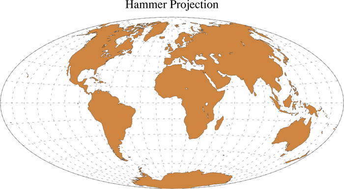
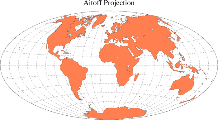
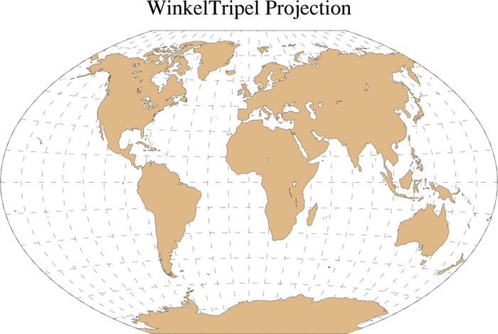
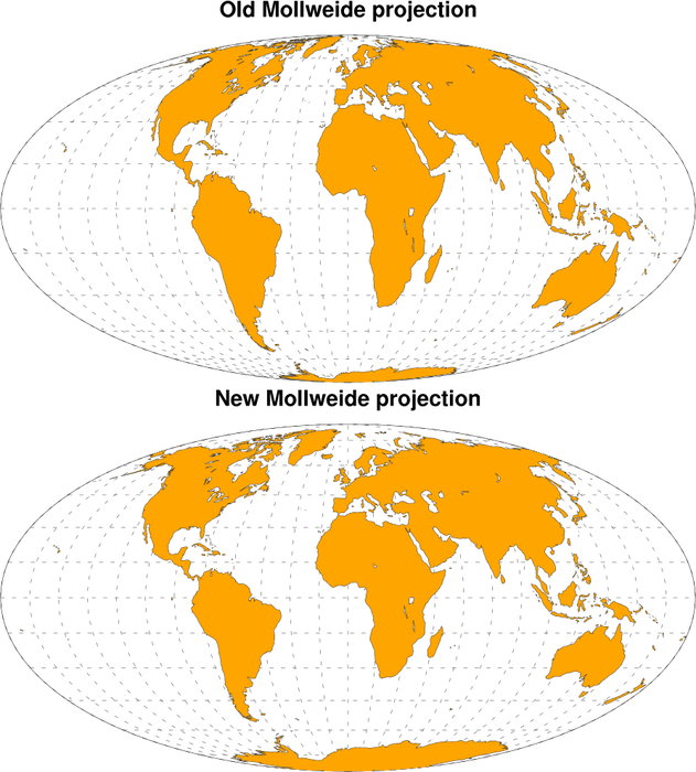
- Examples 17
and 18 were added to
the maps only
applications page. Example 17 shows three new map projections
added: Hammer, Aitoff,
and Winkel
tripel. Example
18 compares the old
Mollweide projection with a new one that uses more accurate
calculations.
Available in version 5.1.0 and later.
14 August 2008
- Example
16 was added to
the maps only
applications page showing how to use a new map database
for drawing province and state boundaries in China, India, and Brazil.
Available in version 5.1.0 and later.
29 July 2008
- A color maps applications page was added.
25 July 2008
- A T-S diagram applications page was added.
15 July 2008
- Example 13 was added to the text applications page showing how to change the justification of your text strings.
27 May 2008
- Example 9 was added to the legend applications page showing how to change the order of items in a legend.
22 May 2008
- Example 9 was added to the contour-on-contour applications page showing how to overlay domains of different resolution.
22 April 2008
- Example 13 was added to the histogram applications page demonstrating how to change the formatting of the bottom axis labels.
27 February 2008
- An applications page for dealing with GrADS CTL files was added. This page provides a ruby script for parsing such files. Thanks go to Saji N. Hameed of the APEC Climate Center for this contribution.
05 February 2008
- Examples 10 and 11 were added to the tickmarks applications page illustrating how to label both major and minor tickmarks. They both use a different method. Example 11 introduces a new function called gsn_blank_plot.
21 December 2007
- Example 8 was added to the weather symbols applications page showing how to draw vectors with an informational label box using wmvect and wmvlbl.
- Example 9 was added to the weather symbols applications page showing how to draw vectors over a map with an informational label box using wmvectmap and wmvlbl.
11 December 2007
- Example 22 was added to the panel applications page illustrating how to add individual common titles to two sets of plots paneled on the same page.
5 December 2007
- Example 21 was added to the panel applications page illustrating how to add common X/Y axis labels to a panel plot.
27 November 2007
- Examples 11 and 12 were added to the text applications page showing how to add a label on the right Y axis, and how to add subtitles to the top of a plot.
13 November 2007
- An Evans plots applications page was added to show how to generate the special Evans plot, which is a way to visualize spatially two variables of interest, one of which provides some measure of "importance".
30 October 2007
- Example 12 was added to the labelbar applications page illustrating how to control the end labels and boxes on a contour labelbar.
25 October 2007
- Example 6 was added to the three-dimensional graphics applications page illustrating how to draw curves with arrowheads.
24 October 2007
- Example 7 was added to the weather symbols applications page illustrating how to draw custom arrows.
24 September 2007
- Example 15 was added to the maps only applications page illustrating how to draw climate divisions.
17 September 2007
- Example 20 was added to the panel applications page illustrating how to panel plots of different sizes.
12 September 2007
- Example 6 was added to the weather symbols applications page illustrating plotting station model data over a map using wmstnm.
15 August 2007
- Example 18 was added to the Color Fill applications page to illustrate colors in the HSV color space.
30 July 2007
- A boxplot example was added that shows
how to calculate and plot the median, minimum value, maximum value, and the 25th and 75th percentiles of two
timeseries.
An example was added to the mask applications page that shows how to use landsea_mask to calculate a land sea mask for a particular grid, and how to apply the calculated land sea mask to a data array.
27 July 2007
- An applications page was added showing how to generate contours from an EASE grid.
9 July 2007
- Example 5 was added to the weather symbols applications page showing how to panel plots that use calls to wmbarb, wmbarbmap, and wmstnm.
1 July 2007
- A 3D plot applications page was added to show how some low-level routines can be called from NCL to generate 3D scatter, surface, and isosurface plots.
1 June 2007
- Example 22 on the XY page was added to show how to shift the left Y axis away from the rest of the plot.
31 May 2007
- A Example 9 on the tick mark page was added to show how to place and label the righthand side Y-axis tick marks differently than the lefthand side Y-axis tickmarks.
23 May 2007
- A TIGGE project applications page was added to show how NCL could be used to handle and display the TIGGE project data.
11 May 2007
- Example 21 on the XY page was added to show how to use reference lines and fill colors to achieve a special kind of filling of your XY plot.
27 March 2007
- Example 13 on the contour effects page was updated to show how to use the new gsn_contour_shade function.
16 February 2007
- Example 19 on the XY page was updated to show how to add a legend to a plot with three different Y axes.
28 December 2006
- Example 19 was added to the panel applications page to show how to use the new resources gsnPanelXF, gsnPanelYF, and gsnPanelDebug.
14 December 2006
- A new table applications page was added showing how to use the new gsn_table procedure.
28 November 2006
- The Taylor Diagram applications page was significantly overhauled to add some new examples, and to reflect some of the updates made to the code.
17 October 2006
- A new ASCII-reading page was added to show how to read columnar data that is separated by a common delimiter.
16 October 2006
- Example 9 was added to the unique applications page showing how to create a topographic map using raster contours.
14 October 2006
- Example 12 was added to the histogram applications page showing how to annotate each individual bar.
26 September 2006
- Example 11 was added
to the polygons, polymarkers, and
polylines applications page showing how to draw the political
divisions of Brazil.
1 September 2006
30 August 2006
- Two more unique application examples were added (examples 7 and 8). One is an animation that shows a simulation of an idealized vortex evolution on the sphere, and the other is a storm track of Hurricane Katrina.
23 August 2006
- A new page has been created to show how to contour the ARPEGE grid.
18 July 2006
- A legend example was added (example 8) to
show how to use the new gsn_create_legend function.
20 June 2006
- An example was updated to show how to use a new resource called
mpMaskOutlineSpecifiers to mask
outlines in a map that you don't want to see. This is useful if you
need to create "simplified" continental outlines (that is, outlines
without small islands and inland water areas included). See example 14 in
the map only section.
- A new example has been created to show how to use gsn_create_text and gsn_add_annotation to create text and attach and
position it on a plot. See example 9 in the text section.
31 May 2006
- A new example has been created to show how to draw simple
continental outlines that don't include inland water or island
outlines. See example 14 in the map only section.
19 April 2006
- Example 12 was added to demonstrate how to color fill/pattern fill/outline areas with missing values.
- Example 2 was added to the time applications page showing how to use ut_calendar / ut_inv_calendar to go from a mixed Julian/Gregorian date to a UT-referenced date, and then back again.
- Example 3 was added to highlight the functionality of yyyymm_to_yyyyfrac, which can be used to set up a monthly time array useful for plotting purposes.
14 April 2006
- Example 9 was added to
the polygons, polymarkers, and
polylines applications page showing how to draw the
meteorological subdivisions of India.
- Example 4 was added to the wind barb applications page showing how to produce a wind profile plot using gsn_csm_vector_scalar.
28 February 2006
- Example 20 was added to the XY applications page showing how to use gsn_csm_x2y2 to plot curves with multiple X and Y axes.
26 January 2006
- A new page on visualizing NARR (North American Regional
Reanalysis) data was added.
- Two new examples were added to the paneled plots page (examples 17 and 18). One shows how to panel
plots that have two separate labelbars, and the other shows how a
labelbar doesn't explicitly need colors in the middle.
- Example 6 was added
to the unique examples to
show a visualization with ten XY plots and a legend at the bottom.
- A new polymarker example
was added (example 8)
showing how to use markers of different colors and sizes at station
locations.
24 November 2005
- A new example was added to the tickmarks page (example 8) to show even
more ways of formatting tickmark labels.
20 October 2005
- New examples have been added to the legends (example 7) and station data (example 2)
applications pages. These examples are very similar: they show how to
plot station data by grouping the values by their ranges, and then
using a unique marker color and size for each range.
2 October 2005
- Two new applications page were created to show how to draw various
weather symbols and how
NCL can interact with the UNIX system command line.
30 September 2005
- A new applications page
has been created to show how to use the new
omega_ccm and omega_ccm_driver functions, both
available in NCL version 4.2.0.a033. (This version probably won't be
available until November 2005.)
8 September 2005
- A new applications page has been created to show how to read
in station data and
generate visualizations of it.
7 September 2005
- Three new examples have been added to the titles applications page. Of
note is example 7, which shows how to modify the position of the
gsnLeftString, gsnCenterString, and gsnRightString text strings. Also, example 8
shows how to switch the locations of the tiXAxisString and tiYAxisString.
- A new applications page has been created to show off some of the
unique visualizations created
by outside users who use NCL.
- A new example (#11) has been added to the histogram
applications page to show how to use the new gsnHistogramBarWidthPercent resource, which
allows you to set the width of the bars based on a percentage of the
bin width.
15 July 2005
- A new example has been created in the mask applications page to show how
to draw filled contours only over Africa, while filling the land and
oceans everywhere else.
30 June 2005
- A new page has been created to show how you can contour triangular meshes.
14 June 2005
- A new page has been created to show the various ways that you can control the appearance of tickmarks. Of special interest is example 4 which demonstrates how to change the formatting and precision of tickmark labels.
24 May 2005
- A new example has been created to show how to generate US
counties. See
example 10 in the map only section.
22 April 2005
- A new page has been created to show how to contour the ORCA grid, and
also, subsequently, how to do cell mode contour fill and outline the
individual cells.
19 April 2005
- 2D
vertical coords example 2 - shows how to do contour cell
fill and outline the underlying data grid.
- XY example
19 - shows how to use the new gsn_csm_xy3 function.
15 January 2005
- Contouring non-uniform grids example page.
- Example (color_17) demonstrates how to use gsn_draw_named_colors to draw a list of named colors (useful for debugging purposes).
9 December 2004
The long lag in adding new NCL examples had been due to our efforts in creating the new website.- Contour Levels example page.
- Contour Effects example page: Many of the examples on this page have been updated to reflect new resources that have replaced shea_util functions for contour effects.
- example (xy_7) has been updated to reflect the addition of gsn_csm_xy2.
- example (color_16) demonstrates how to retrieve the RBG values of an assigned colormap.
- example (conLab_6) demonstrates how easy it is to adjust contour labels.
- example (panel_16) demonstrates how to shrink a panel plot down to one column for ease in publication.
31 July 2004
- EOF example page.
- Meteogram example page.
- example (xy_9) demonstrates how to draw the Mexican states.
21 January 2004
- POP Slice example page.
- example (maponly_8) demonstrates how to draw only certain portions of the continental outline when there is no map fill.
- example(xy_11) has been modified to demonstrate how to change the precision of the tick mark labels on the YR axis.
- example (eosdis_5) demonstrates the use of dim_gbits.
- example (bar_6) and (bar_8) have been respectively modified to demonstrate the new resources gsnXYBarChartColors2 and gsnXYBarChartPatterns2.
- example (resize_7) demonstrates how to maximize a plot created with viewport specifications.
2 December 2003
- WRF example page.
- lambert conformal native grid example page.
- example (color_3) has been redone to demonstrate how to fill a contour with a transparent or no color.
- example (polyg_7) demonstrates how to add your own polymarker
- Meridional overturning example page
9 October 2003
- Titles example page.
- CRU data example page.
- example (histo_10) demonstrates overlaying multiple histograms on top of each other.
- example (xy_15) demonstrates how to draw inward facing tickmarks.
- example (xy_17) demonstrates how to manually add a legend and text to an xy plot.
- example (text_7) demonstrates how to put a degree symbol into a string.
- example (lb_10) demonstrates how to put end labels onto a label bar
14 August 2003
- Masked Lambert Conformal Projection example page.
- example (conLab_5) (popscal_1) demonstrates a new label density resource.
- example (conOncon_8) is a color significance plot.
- example (panel_15) demonstrates using gsn_panel twice to get two separate panels on a page each with their own label bar
- Isentropic Levels example page. ]
- Transect example page.
- Zonal Average example page. This was a consolidation of the 1D and 2D zonal average pages.
22 July 2003
- XY plot example page. This preplaces the older line example page.
- example (lat2pop_2) demonstrates how to remap lat/lon vectors to the POP grid.
- example (xy_3) demonstrates how to create your own xy dash pattern using the new function NhlNewDashPattern.
- example (xy_4) demonstrates how to create your own xy marker style using the new function NhlNewMarker.
- example (coneff_11) demonstrates how to change the size of the dots in a dot pattern using the new resource cnFillDotSizeF
- Wavelet example page.
19 June 2003
- example (h_time_5) demonstrates how to remove the height label from a pressure height plot.
- example (conLab_4) demonstrates how to create a white background box around a contour line label.
- example (native_3) demonstrates how to create a native stereographic projection from an ASCII file.
- example (lb_9) demonstrates how to add your own label bar using gsn_labelbar_ndc
13 May 2003
- Draw the POP Grid example page.
- Native Grid example page has been updated so that all scripts call gsn_csm templates. This removes the necessity of creating label bars and separate titles.
- Regional Climate Model example page has been updated so that all scripts call gsn_csm templates. This removes the necessity of creating label bars and separate titles.
- lat/lon 2 POP example page.
- example (conOncon_7) demonstrates how to draw a spaghetti plot with data that has 2D lat/lon coordinates.
- example (color_15) demonstrates symMinMaxPlt that automatically created a symmetric min/max/int for use with symmetric color tables.
- example (font_1) demonstrates the new font height resource gsnStringFontHeightF
- example (font_2) demonstrates the new font height resource gsnPolarLabelFontHeightF
25 April 2003
- eos dis example page has been updated to take advantage of the 2D coordinate plotting capability available since NCL version 4.2.0.a025. There was a bug in this capability that prevented it from working. This was fixed in NCL version 4.2.0.a028.
- Map Tickmarks example page.
- example (panel_1) demonstrates creating a panel plot with two manually placed plots.
19 Feb 2003
- seaWiFs example page.
- example (histo_9) demonstrates how to draw a histogram on top of a map.
- example (resize_6) demonstrates how to create a European size plot
- example (text_5) demonstrates how to add a carriage return to a string
- example (text_6) demonstrates how to included double quotes in a string