Example pages containing: tips | resources | functions/procedures
Zonal Average
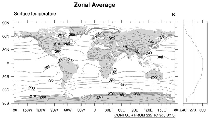
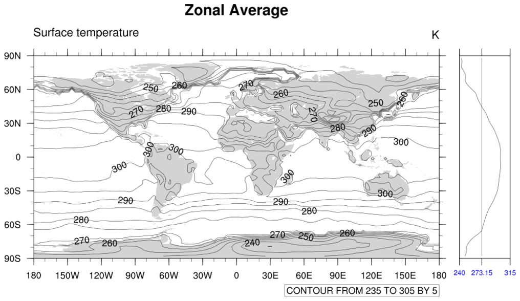
 zonal_1.ncl: The simplest.
Reads in data and then creates a default zonal means plot.
zonal_1.ncl: The simplest.
Reads in data and then creates a default zonal means plot.
dim_avg averages the right most dimension of a variable. So, for TS(time,lat,lon), the lon dimension is averaged which results in a zonal average.
This example used dim_avg_Wrap which preserves meta data.

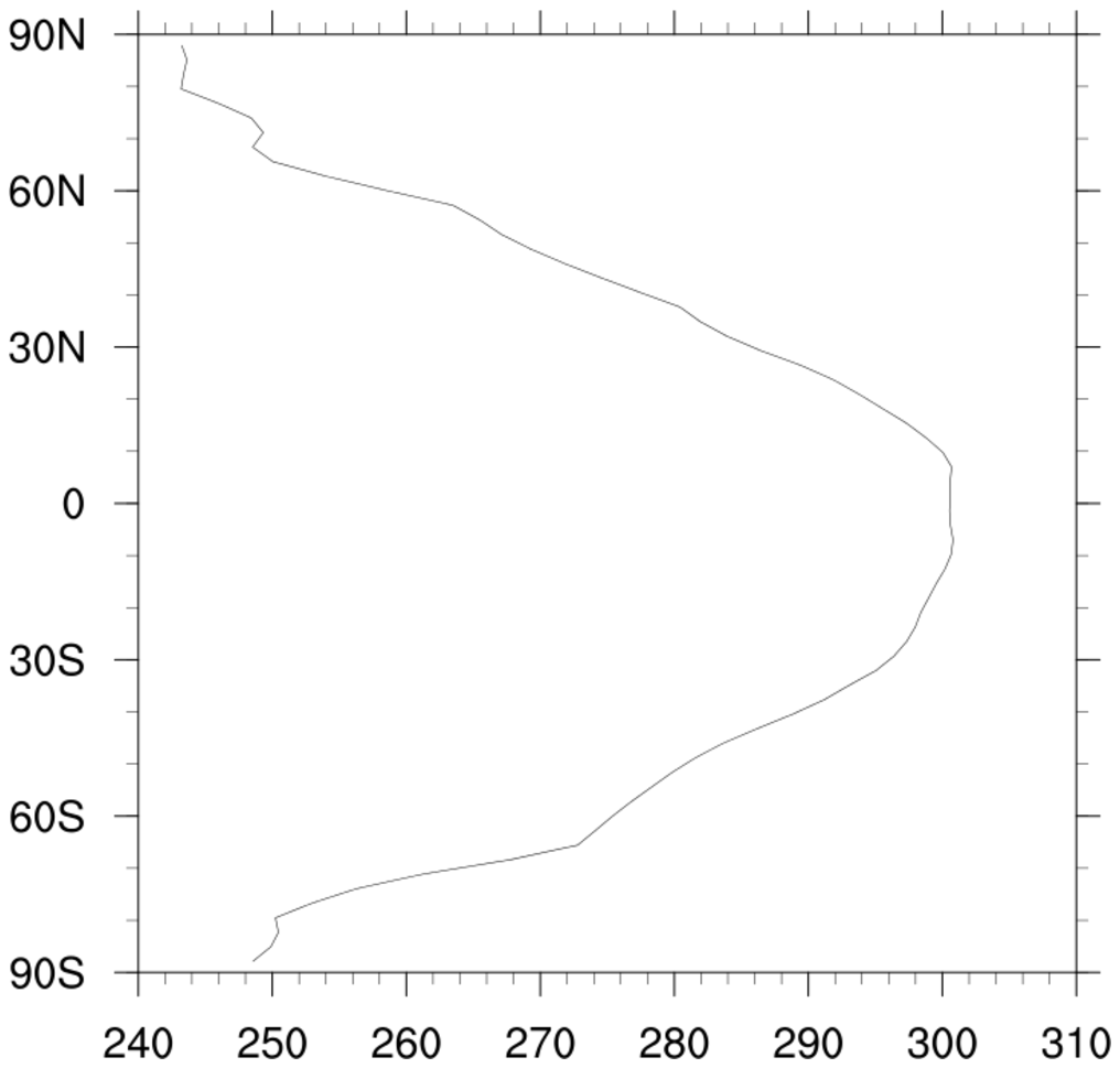
 zonal_3.ncl: Add zonal average to a
cylindrical equidistant plot. gsnZonalMean
turns on the zonal average.
zonal_3.ncl: Add zonal average to a
cylindrical equidistant plot. gsnZonalMean
turns on the zonal average.
The zonal average plot is modified by using gsnZonalMeanXMinF, gsnZonalMeanXMaxF, and gsnZonalMeanYRefLine to set the minimum X-axis value, the maximum X-axis value, and the X-axis value where the reference line will be drawn.
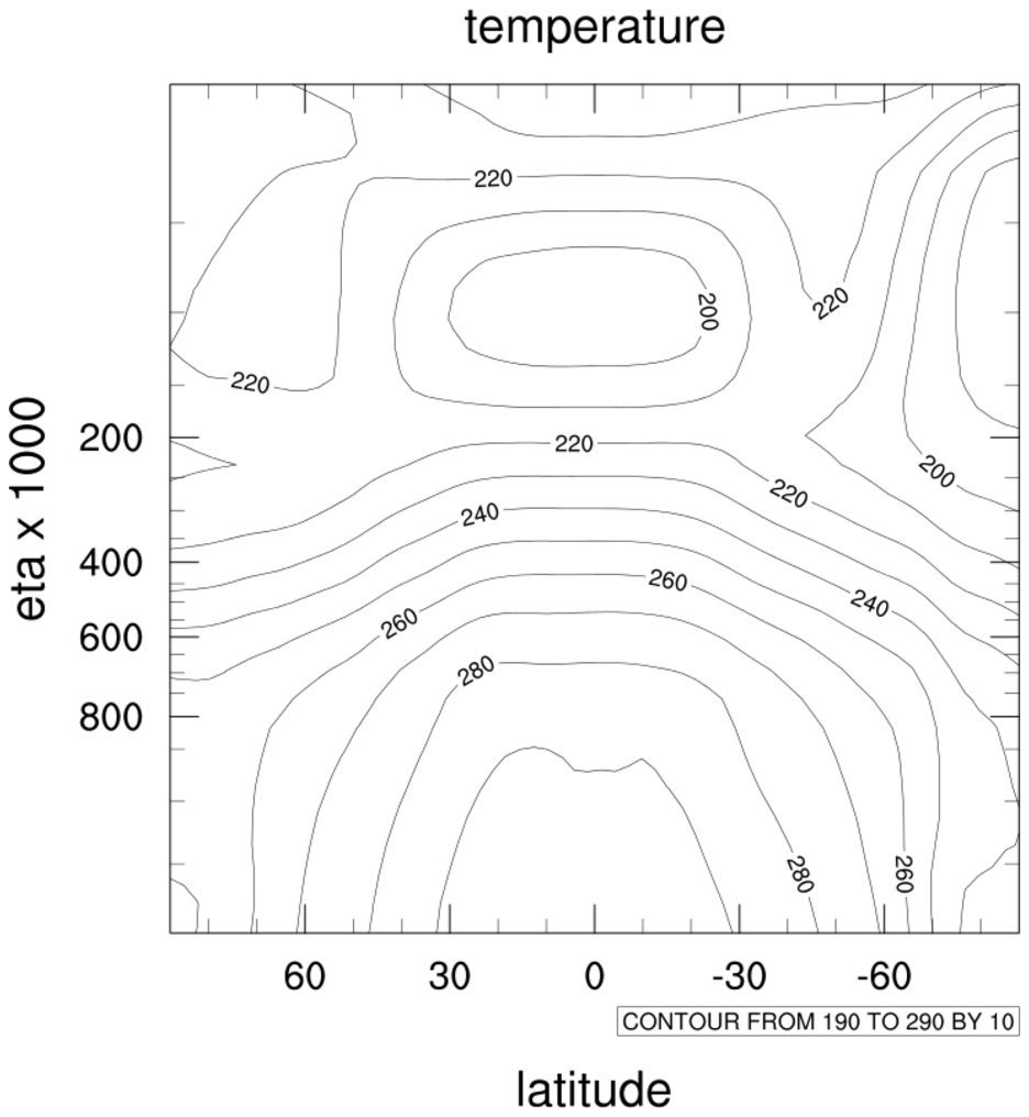 zonal_4.ncl: Transforms the
axis.
zonal_4.ncl: Transforms the
axis.
tiXAxisString = "latitude", adds an
axis string
tiYAxisString = "eta", adds another
axis string
sfXArray= lat, uses the latitude
array to label the x-axis
sfYArray=eta, uses eta to label
the y-axis
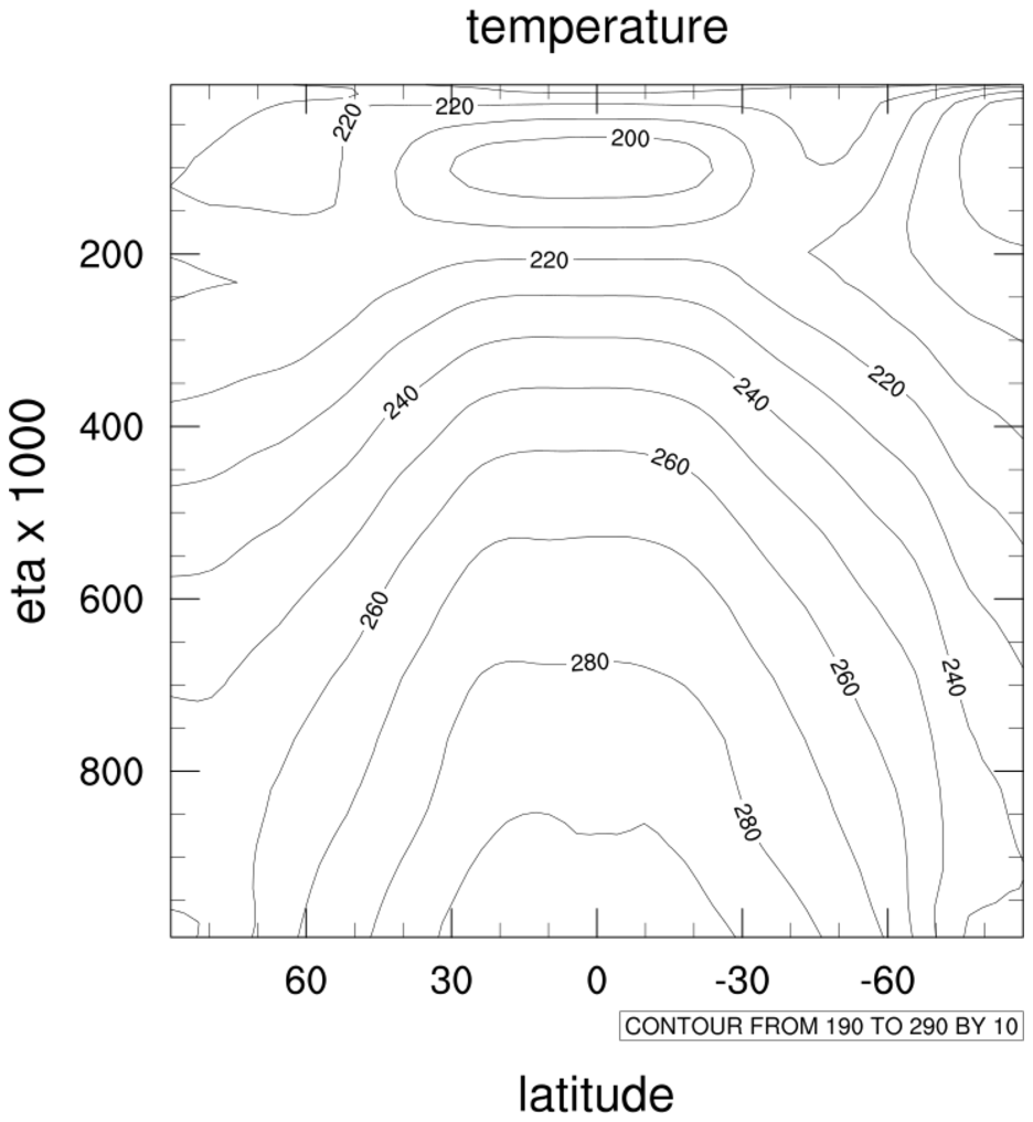 zonal_5.ncl: Transforms plot so
that the eta axis is evenly spaced.
zonal_5.ncl: Transforms plot so
that the eta axis is evenly spaced.
gsnYAxisIrregular2Linear = True, transforms the irregular eta axis to a regular axis.
 zonal_6.ncl: Changes Y-axis to log
scale.
zonal_6.ncl: Changes Y-axis to log
scale.
gsnYAxisIrregular2Log = True, Changes the y-axis to log scale when the original axis is irregular e.g. eta. If the y-axis is regular e.g. levels, then trYLog = True, should be used to set the y-axis to log scale.
cnInfoLabelOn = False, Turns off the contour information label.
 zonal_7.ncl: This
example is similar to example #3, except instead of setting a resource
to create a zonal means plot, gsn_csm_attach_zonal_means is used to create
and attach the plot separately. Using this gives you more control
over the look of the zonal means plot.
zonal_7.ncl: This
example is similar to example #3, except instead of setting a resource
to create a zonal means plot, gsn_csm_attach_zonal_means is used to create
and attach the plot separately. Using this gives you more control
over the look of the zonal means plot.
The tickmark resources tmXBMode, tmXBValues, and tmXBLabels are set to explicitly label the X axis of a zonal means plot, and other resources are set to change the size and color of the X axis labels.
 zonal_8.ncl: This
example is similar to example #3, with an additional dummy curve
added to the zonal means plot.
zonal_8.ncl: This
example is similar to example #3, with an additional dummy curve
added to the zonal means plot.
Adding a new curve to an existing XY plot involves three steps:
- The special create block is used to create a new data object containing the new curve to add.
- The NhlAddData function is used to add the dummy curve to the zonal means plot.
- The "setvalues" block is used to further customize the curve.
After the curve has been added, call the plot to draw everything.
Note: you can also add the additional line using gsn_add_polyline. This particular example was done this way to show another variation. Also, when you use NhlAddData, you can continue to use xy resources to customize the curve. Thirdly, any new curves added will be recognized by the automatical legend generator, if you set pmLegendDisplayMode to "Always".