LabelBar (lb) Resources
- lbAutoManage
-
The lbAutoManage switch determines how
LabelBar operates; when True,
LabelBar manages the sizing of the title and the
label text. The title is always sized to fit within the currently set
boundaries of the LabelBar given any text angle,
aspect ratio, etc. The labels also are sized to fit within the
current boundary. Additionally, the sizing of the labels is
managed so that under any rotation, the labels will not overlap. Also
the label justification is managed such that, given any rotation, the
end of the label string aligns with the correct
LabelBar box. When off, you may directly size the
labels and text as you please. However, under rotation, the
justification of the labels does not change, and, although the text is
moved out of the way of the LabelBar boxes, it will
not necessarily line up correctly. In practice, when working
interactively, a good method is to create a basic
LabelBar layout close to the desired size with the
lbAutoManage mode on, then switch it off to tune the text
size precisely to your taste.
Currently, when the text of the labels is rotated, the size of the LabelBar may increase slightly along the axis of orientation.
Default: True
- lbBottomMarginF
-
Defines an offset, specified as a fraction of whichever
LabelBar axis is smallest, between the bottommost
LabelBar element and the bottom edge of the
LabelBar perimeter. It is always subtracted from the
current LabelBar extent. Negative values are allowed.
Default: 0.05
- lbBoxCount
-
Number of boxes in the labelbar. All the LabelBar
array resources, when specified, are required to have a number of
elements related to the number of boxes. The arrays specified by
lbFillPatterns, lbFillColors, and
lbFillScales must have at least as many elements as the
box count. The minimum size of the lbLabelStrings array
may be the box count, one element less than box count, or one element
more than box count, depending on the setting of the
lbLabelAlignment resource. The
lbBoxFractions array, when set, always requires one
element more than box count.
This resource may be intercepted or disabled by:
Default: 16
- lbBoxEndCapStyle
-
Available in version 6.4.0 and later.
This resource controls the shape of the two outer boxes of the LabelBar, which may be either rectangular (like the interior boxes) or triangular/arrow shaped. Set it to one of these four values:
RectangleEndsTriangleLowEndTriangleHighEndTriangleBothEnds
Default:
RectangleEndsNOTE: this resource should be ignored if the contour resource cnLabelBarEndStyle is set to "ExcludeOuterBoxes".
- lbBoxFractions
-
An array that specifies sizing of each box in the
LabelBar when the box sizing mode is set to
ExplicitSizing. There must be one more element in this array than the number of items specified by the resource lbBoxCount. Each element of the array must eventually contain a number in the range 0.0 to 1.0, with succeeding elements increasing monotonically. The first element must be 0.0 and the last 1.0. If invalid values are discovered when the array is checked, it is not considered an error. Instead, the code simply supplies linearly interpolated values for all adjacent elements containing out- of-bounds elements. The interpolation is performed relative to the two closest bounding elements containing valid values, or 0.0 or 1.0 respectively if the first or last element contains invalid data. The values thus obtained represent the beginnings and endings of the LabelBar boxes.Default: NULL
- lbBoxLineColor
-
The hlu index of the color used to draw lines around the boxes in the
LabelBar
Default:
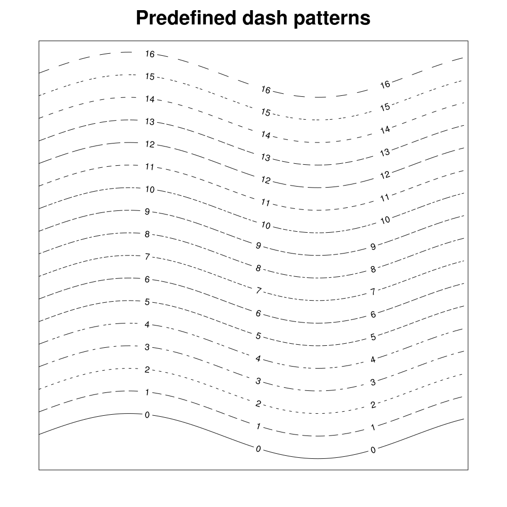
Foreground - lbBoxLineDashPattern
-
The hlu index of the
dash pattern used for the lines around the boxes of
the LabelBar.
Default: 0
- lbBoxLineDashSegLenF
-
The length in NDC units of the
dash pattern used for the lines around
the boxes of the LabelBar.
Default: 0.15
- lbBoxLineThicknessF
-
Determines the thickness of the lines used around the boxes.
Default: 1.0
- lbBoxLinesOn
-
A boolean flag determining whether lines should appear around the boxes
in the LabelBar.
Default: True
- lbBoxMajorExtentF
-
Determines the amount of the area allotted to each box of the
LabelBar in the direction of
lbOrientation is actually occupied by the box. When set
to 1.0, the boxes touch each other. If set to 0.0, the boxes disappear
entirely. Intermediate values create separated boxes.
Default: 1.0
- lbBoxMinorExtentF
-
When the lbAutoManage feature is turned on, this resource
determines the fraction of the distance (less the margins) across the
axis perpendicular to the orientation (the minor axis) occupied by the
boxes of the LabelBar. If set to 1.0, the boxes
entirely crowd out their associated labels. If
lbTitlePosition is set to a side parallel with the major
axis, the lbBoxMinorExtentF cannot exceed 1.0 minus the
amount of space used for the title, as set by the resource
lbTitleExtentF.
When lbAutoManage is False and lbTitlePosition is set to a side perpendicular to the major axis, the axis extent from which the box minor extent is calculated includes any extra extent added due to an increased value given to lbTitleFontHeightF. However, it does not include extra extent due to increased value given to the lbLabelFontHeightF resource.
Default: 0.33
- lbBoxSeparatorLinesOn
-
Available in version 6.2.0 and later.
If this resource is set to False, it will draw a labelbar with no interior box lines (box separator lines), and just a perimeter line around the "bar" of the labelbar.
Default: True
- lbBoxSizing
-
When set to
UniformSizing, all the boxes in the LabelBar have the same size. When set toExplicitSizing, the values in the array, lbBoxFractions, determine the relative size of each box along the major axis (the axis of orientation).Default:
UniformSizing - lbFillBackground
-
The color index used for the background of all the boxes in the
LabelBar. By default it is set to
Transparent(-1), specifying that the background of the boxes is transparent to whatever it overlays. Note that the box background is only observable when the fill pattern is not solid. This resource also applies to the background of the fill pattern set with the lbPerimFill resource.Default:
Transparent - lbFillColor
-
When lbMonoFillColor is set True, this resource of type
NhlTColorIndex
sets a uniform fill color for all the LabelBar boxes.
This resource may be intercepted or disabled by:
Default:
Foreground - lbFillColors
-
This array resource of type
NhlTColorIndexGenArray
individually sets the color of each box in the
LabelBar when lbMonoFillColor is set
False. The LabelBar ensures that this array contains
at least as many elements as the current value of lbBoxCount.
You may cause a box to appear empty by setting the appropriate array
element to the value
Transparent.This resource may be intercepted or disabled by:
Default: By default, each box is assigned to the next succeeding color in the hlu color table, up to the number of defined colors. Additional boxes are assigned the current value of wkForegroundColor.
- lbFillDotSizeF
-
This resource sets a uniform dot size, in
NDC units, for the
stipple dot fill pattern.
The default value of 0.0 causes the dots to be drawn as before, using
a workstation dependent minimum dot size. A caveat is that individual
dots are not clipped around the edges of fill areas; this becomes more
noticeable as the dot size increases.
Default: 0.0
- lbFillLineThicknessF
-
The line thickness used for the lines that comprise the fill pattern
within the label boxes.
Default: 1.0
- lbFillOpacityF
-
Available in version 6.4.0 and later.
This resource is intended for those who explicitly create labelbars, as opposed to the labelbars that are created automatically by a ContoutPlot. It is ignored in the case of automatically created LabelBars. Generally the opacity of automatic LabelBars mirrors the opacity of the colors used in the ContourPlot, although it is possible to override this via lbOverrideFillOpacity.
Valid values are real-numbers between 0.0 (completely transparent) and 1.0 (fully opaque).
Default:
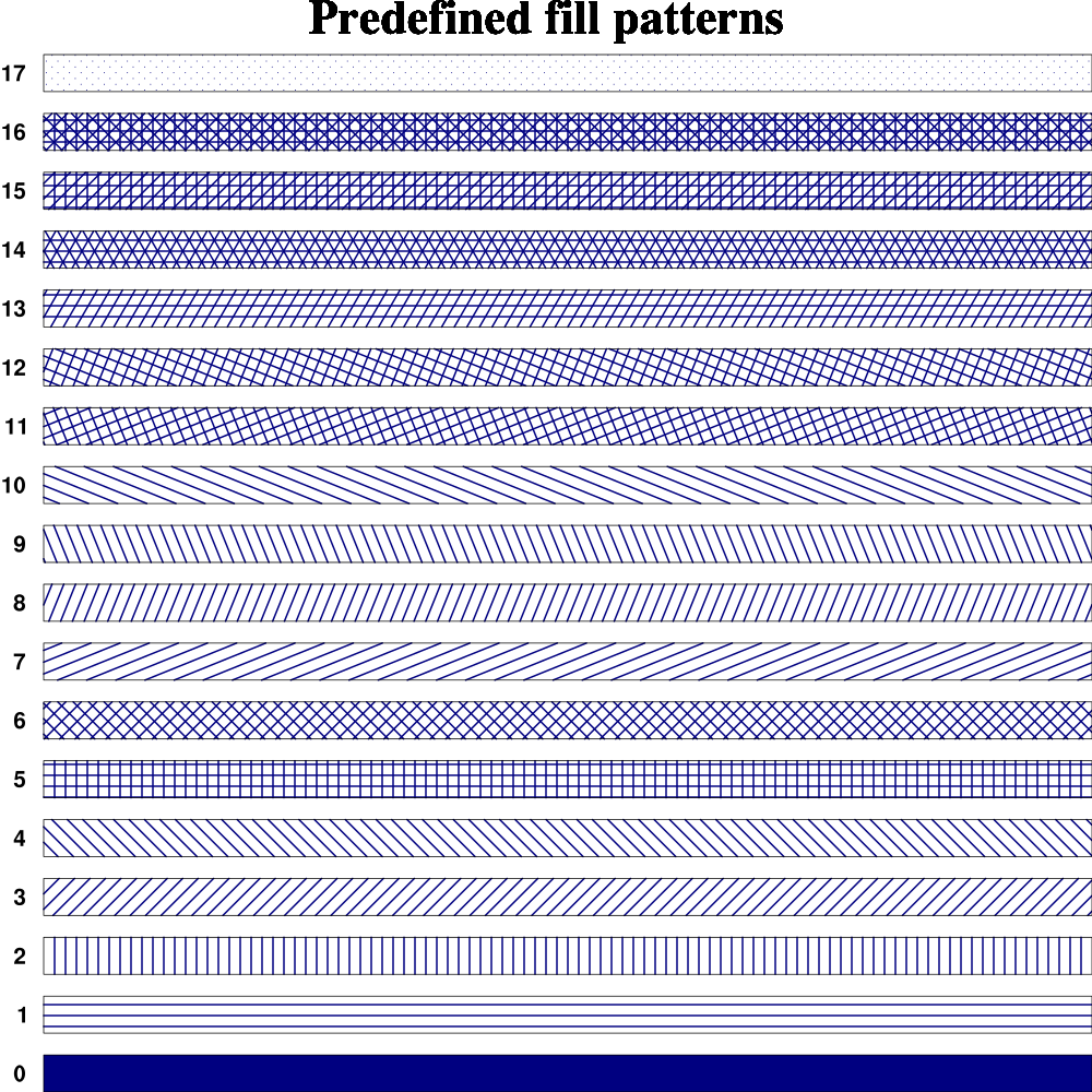
1.0 - lbFillPattern
-
When lbMonoFillPattern is set True, this resource of type
NhlTFillIndex
sets a uniform
fill pattern for
all the LabelBar boxes.
This resource may be intercepted or disabled by:
Default:
SolidFill - lbFillPatterns
-
This array resource of type
NhlTFillIndexGenArray
individually sets the
fill pattern of each box in the LabelBar when
lbMonoFillPattern is set False. The LabelBar
ensures that this array contains at least as many elements as the
current value of lbBoxCount. You can cause any box to appear
empty by setting the appropriate array element to the value
HollowFill(-1). Note that you can use the scalar resource lbFillBackground to set a uniform solid-fill background color the fill patterns.This resource may be intercepted or disabled by:
Default: All array elements above those specified by the user are assigned values according to the formula: element_index MOD wkFillTableLength + 1.
- lbFillScaleF
-
When lbMonoFillScale is set True, lbFillScaleF sets
a uniform fill scale that applies to all patterns in the
LabelBar boxes.
This resource may be intercepted or disabled by:
Default: 1.0
- lbFillScales
-
When lbMonoFillScale is False, each element of this array
resource contains an individual scale value that is applied to the
pattern assigned to the corresponding box in the
LabelBar. When the scale value is 1.0, all lines in
the currently defined patterns are nominally spaced at about 0.01 NDC
units. The scale value is applied as a factor to this spacing.
This resource may be intercepted or disabled by:
Default: 1.0 for all elements
- lbJustification
-
This resource of type NhlTJustification sets the justification point
of the LabelBar.
When the labelbar changes size, the justification determines a fixed point about which the size change occurs. Any of the corners, the center of any edge, or the current center of the labelbar may be set to the fixed justification point.
The first part of the string should be set to the desired vertical justifcation ("top", "center", "bottom"), and the second part to the desired horizontal justification ("left", "center", "right").
This resource may be intercepted or disabled by:
Default:
CenterCenter - lbLabelAlignment
-
How the labels align with respect to the labelbar boxes. If set to
BoxCenters, the labels align with the centers of each box, and the number of labels is equal to the number of boxes. If set toInteriorEdges, the labels align with the internal separators between the boxes, and there is one fewer label than the number of boxes. If set toExternalEdges, the labels align with the external edges as well as the interior separators between the boxes, and there is one more label than boxes.The default for this resource is
InteriorEdgeswhen used with a contour, vector, or streamline plot, because the labelbar colors represent colors between levels. If you set this resource toBoxCentersorExternalEdges, then NCL will use your contour, vector, or streamline levels to label the boxes, but they likely won't be correct. You must supply the correct labels and the extra labels required, by setting lbLabelStrings to the desired array of labels. If you don't, then the extra labels will be set to "Labels_xx".This resource may be intercepted or disabled by:
Default:
InteriorEdgeswhen used with a contour, vector, or streamline plot, andBoxCenterswhen creating a labelbar from scratch. - lbLabelAngleF
-
The angle of the text of the labels. When the auto-manage resource is
turned on, both the size and justification mode of the label text may change
in response to changes of the label angle.
Default: 0.0
- lbLabelAutoStride
-
When this boolean resource is set True, LabelBar
labels are checked for overlap before being drawn. If overlap would
otherwise occur, a stride is set through the labels such that overlap
will be avoided. The stride proceeds in both directions from a pivot
label, chosen based on how "round" it is relative to the other
labels. If the labels seem to be equally "round" or if the labels are
non-numeric, then the shortest label is chosen as the pivot.
If lbLabelAlignment is set to
ExternalEdges, the behavior is a bit different. In this case, the stride is set as described above, but the labels at each end are guaranteed to appear. This may cause labels that would otherwise be part of the stride sequence to be eliminated. This behavior is useful when the end labels are used to show the extreme values of a dataset.The stride calculated as a result of setting lbLabelAutoStride is independent of the stride specified by the lbLabelStride resource and is applied subsequently to it. Also note that lbAutoManage must be set False in order for lbLabelAutoStride to have an effect. When lbAutoManage is True, the label font height is reduced to avoid overlap and therefore a stride greater than unity is never required.
Default: False (will default to True in V6.1.0 and later)
- lbLabelBarOn
-
A boolean flag that determines whether the LabelBar
should appear. Primarily useful as a forwarded resource when the
LabelBar is a child of a higher level object.
This resource may be intercepted or disabled by:
Default: True
- lbLabelConstantSpacingF
-
Normally when lbLabelFontQuality is set to
High, theLabelBar writes line label text with proportional spacing. Setting the lbLabelConstantSpacingF to a value greater than 0.0 overrides this behavior and instead begins each character a distance of lbLabelConstantSpacingF times the nominal character size from the beginning of the previous character. This implies that values between 0.0 and 1.0 will cause the characters to overlap each other, while a value of 1.0 implies no space between two nominally sized characters. This parameter is ignored when lbLabelFontQuality is notLoworMedium. Values less than 0.0 result in an error and are replaced with the default value.Default: 0.0
- lbLabelDirection
-
This resource of type
NhlTTextDirection
specifies the direction of the label text.
Default:
Across - lbLabelFont
-
This resource of type
NhlTFont specifies
the font used to render the LabelBar labels.
Default: "pwritx"
- lbLabelFontAspectF
-
Determines the shape of the label font text. Values greater than 1.0 make
the text tall and skinny. Values less than one make the text short and wide.
Default: 1.0
- lbLabelFontColor
-
The hlu color index used for drawing the label text.
Default:
Foreground - lbLabelFontHeightF
-
The height in NDC coordinates of the text used to draw the
labels. When lbAutoManage is set True, the user cannot
directly set the label font height. Rather, it is set in response to
other factors, such as the current size and shape of the
LabelBar, the current setting of
lbBoxMinorExtentF, the current text angle of the labels, and
how much space there is between the labels. Set lbAutoManage
False if you wish to control the label font height directly.
Default: 0.02
- lbLabelFontQuality
-
Determines the text quality used to draw the label text.
Default:
High - lbLabelFontThicknessF
-
Sets the thickness of the line used to draw the Label text. The value
acts as a multiplier of a (device-dependent) unit thickness. This
resource is ignored when the lbLabelFont specifies a filled
font (font indexes 21-22, 25-26, 29-30, and 33-37).
Default: 1.0
- lbLabelFuncCode
-
Determines the function code character used when parsing the label string.
This resource may be intercepted or disabled by:
Note: the default function code was a colon (:) in NCL Versions 6.0.0 and earlier.
Default: ~
- lbLabelJust
-
This resource of type NhlTJustification sets the justification point
of the labelbar's label text.
When the auto-manage feature is on, the justification may be changed internally in response to changes in the label angle. Therefore in order to control the label justification explicitly, you must first turn off the auto-manage feature.
The first part of the string should be set to the desired vertical justifcation ("top", "center", "bottom"), and the second part to the desired horizontal justification ("left", "center", "right").
Default: <dynamic> (depends on labelbar orientation)
- lbLabelOffsetF
-
Defines an offset, specified as a fraction of the length of the minor
labelbar axis (perpendicular to the axis of orientation), between the
LabelBar boxes and the labels.
Default: 0.1
- lbLabelPosition
-
This resource of type
NhlTPosition
determines the position of the labels with respect to the
LabelBar boxes. If the orientation of the
LabelBar is
Horizontal, valid values areTop,Center, andBottom. If the orientation isVertical, valid values areLeft,Center, andRight. If a value inappropriate for the orientation is assigned, the value is silently converted as follows:BottombecomesLeft,TopbecomesRight, and vice versa. When set toCenterthe labels are centered on, and when the auto-manage feature is on, sized to fit within, each respective label box.Default:
Right - lbLabelStride
-
Determines which labels actually are rendered the
LabelBar is drawn. For example, if the stride is set
to 2, only every other label will be drawn, starting with the first
label.
Default: 1
- lbLabelStrings
-
An array containing the strings comprising each label in the
LabelBar.
This resource may be intercepted or disabled by:
- ContourPlot (see cnExplicitLabelBarLabelsOn)
- VectorPlot (see vcExplicitLabelBarLabelsOn)
- StreamlinePlot (see stExplicitLabelBarLabelsOn)
Default: Label_<label element number>
- lbLabelsOn
-
A boolean flag determining whether labels should appear in the
LabelBar.
Default: True
- lbLeftMarginF
-
Defines an offset, specified as a fraction of whichever
LabelBar axis is smallest, between the leftmost
LabelBar element and the left edge of the
LabelBar perimeter. It is always subtracted from the
current LabelBar extent. Negative values are allowed.
Default: 0.05
- lbMaxLabelLenF
-
This read-only resource returns the maximum length in NDC of the strings
used as LabelBar labels.
Default: <dynamic>
- lbMinLabelSpacingF
-
This read-only resource returns the minimum distance in NDC from the
start of one label string to the start of the next label string.
Default: <dynamic>
- lbMonoFillColor
-
When set True, all LabelBar boxes are set to a single
color, as specified by the value of the scalar resource lbFillColor.
When False, the elements of the array resource lbFillColors
control the color of each box individually.
This resource may be intercepted or disabled by:
Default: False
- lbMonoFillPattern
-
When set True, all the boxes in the labelbar are set to a
single pattern, as specified by
the value of the scalar resource lbFillPattern.
This resource may be intercepted or disabled by:
Default: False
- lbMonoFillScale
-
When set True, the patterns applied to each box in the
LabelBar are scaled by a single factor, as specified
by the value the scalar resource lbFillScaleF.
This resource may be intercepted or disabled by:
Default: True
- lbOrientation
-
This resource of type
NhlTOrientation
specifies whether the labelbar boxes are arranged horizontally in a
row or vertically in a column. The major axis of the
LabelBar instance is parallel to the orientation and the
minor axis is perpendicular to the orientation.
This resource may be intercepted or disabled by:
Default:
Vertical - lbOverrideFillOpacity
-
Available in version 6.4.0 and later.
In the case of LabelBars created automatically by a ContourPlot, by default the opacity of the LabelBar mirrors the opacity of the fill-colors of the ContourPlot. Setting this resource to
Truecauses the resultant LabelBar to be fully opaque, regardless of the ContourPlot fill-colors.Default:
False - lbPerimColor
-
The hlu index of the color used for the line around the perimeter of
LabelBar.
Default:
Foreground - lbPerimDashPattern
-
Specifies the hlu index of the
dash pattern used to draw the perimeter
of the LabelBar.
Default: 0, specifying a solid line
- lbPerimDashSegLenF
-
The length in NDC units of the
dash pattern used to draw the perimeter
of the LabelBar.
Default: 0.15
- lbPerimFill
-
The hlu index of the pattern used to fill the background of
the LabelBar area. Only has an effect when
the lbPerimFillColor has set to a value greater than
Transparent(-1).Default:
HollowFill - lbPerimFillColor
-
The hlu index of the color used to fill the background of the
Legend area. Only has an effect when the
lbPerimFill has a value greater than
HollowFill(-1).Default:
Background - lbPerimOn
-
A boolean flag determining whether a line is drawn around the perimeter of
the LabelBar.
Default: True
- lbPerimThicknessF
-
Specifies the thickness of the line used to draw the perimeter of
the LabelBar.
Default: 1.0
- lbRasterFillOn
-
If set
True, this resource causes the LabelBar to use raster mode fill rather than normal polygon fill to render the box colors. In this case, only solid fill is possible; the fill pattern resources are ignored. If any element of lbFillColors is set toTransparentor lbBoxSizing is set toExplicitSizing, raster mode fill is not possible: LabelBar issues a warning and defaults to normal polygon fill.Normally, assuming the boxes are solid-filled, the appearance of the LabelBar boxes will be identical whether or not this resource is set. It only makes a difference when the output must go to certain printers that render colors slightly differently when raster fill is in effect. ContourPlot forces lbRasterFillOn to
Truewhen it manages a LabelBar and raster fill is in effect.Default: False
- lbRightMarginF
-
Defines an offset, specified as a fraction of whichever
LabelBar axis is smallest, between the rightmost
LabelBar element and the right edge of the
LabelBar perimeter. It is always subtracted from the
current LabelBar extent. Negative values are allowed.
Default: 0.05
- lbTitleAngleF
-
The angle of the title text. When the auto-manage feature is on, the title
size changes as the text rotates.
Default: 0.0
- lbTitleConstantSpacingF
-
Determines a constant amount of extra space that is placed between
each character of the title text. Values less
than 0.0 result in an error and are replaced with the default value.
Default: 0.0
- lbTitleDirection
-
This resource of type
NhlTTextDirection
specifies the direction of the title text. When the title position, as
set by the resource lbTitlePosition, is
ToporBottomthe direction is set by default toAcross. When title position isLeftorRightthe text is set by default toDown.Default:
Across - lbTitleExtentF
-
The LabelBar title occupies a rectangular portion of the
LabelBar viewport bounded on three sides by edges of
the viewport and on the fourth by a line determined by the value of
this resource. lbTitleExtentF specifies a fraction of the
length (minus the margins) of the LabelBar axis
perpendicular to lbTitlePosition. At this point along the length
of the axis the fourth side of the title extent rectangle is constructed
parallel to the side specified by lbTitlePosition. The sum of the
values given to lbTitleExtentF and lbTitleOffsetF cannot
exceed 0.5 (half the length of the axis). If the sum does exceed 0.5,
a warning is issued and both values are reset to their default values.
If lbAutoManage is set False, and lbTitleFontHeightF is set such that the title extent rectangle cannot accommodate the full extent of the title text, the viewport of the LabelBar instance is expanded to fit the title text extent. However, the LabelBar treats this additional extent as 'extra'. The title extent rectangle does not change its size as long as the LabelBar view width or height is not explicitly modified. This means that as you set lbTitleFontHeightF to smaller values, the LabelBar viewport will shrink until its size matches the size it would have had if the text extent fit within the originally set title extent.
Default: 0.15
- lbTitleFont
-
This resource of type
NhlTFont specifies
the font used to render the LabelBar title.
Default: "pwritx"
- lbTitleFontAspectF
-
Determines the shape of the title font text. Values greater than 1.0 make
the text tall and skinny. Values less than one make the text short and wide.
Default: 1.0
- lbTitleFontColor
-
The hlu index of the color used for the title text.
Default:
Foreground - lbTitleFontHeightF
-
The font height in NDC units used for the title text. If
lbAutoManage is set True, the LabelBar sets
this resource automatically based on the space available and the value
of other title font attributes including lbTitleAngleF,
lbTitleConstantSpacingF and lbTitleFontAspectF. The
available space is determined from the size of the
LabelBar viewport and the setting of the resource
lbTitleExtentF. When lbAutoManage is True, attempts
by the user to set this resource are simply ignored.
If lbAutoManage is False, the LabelBar instance will honor the set value of lbTitleFontHeightF, even if it must increase the size of the viewport in order to encompass the full extent of the title text. However, space added in this manner is considered an addition to the 'fundamental' size of the LabelBar. If the lbTitleFontHeightF is reduced to a value less than or equal to the value that would be used if lbAutoManage were True, then the LabelBar will resize itself to its 'fundamental' size. If you resize the LabelBar by setting the width or height of its viewport, lbTitleFontHeightF and the 'fundamental' size both adjust themselves proportionally.
Default: 0.025
- lbTitleFontQuality
-
Determines the text quality used to draw the title text.
Default:
High - lbTitleFontThicknessF
-
Determines the thickness of the line used to draw the Label text. This
resource only affects the Hershey fonts.
Default: 1.0
- lbTitleFuncCode
-
Determines the function code character used when parsing the label string.
Note: the default function code was a colon (:) in NCL Versions 6.0.0 and earlier.
Default: ~
- lbTitleJust
-
This resource of type NhlTJustification sets the justification point
of the labelbar title.
The first part of the string represents the vertical justifcation (top, center, bottom), and the second part the horizontal justification (left, center, right).
Default:
CenterCenter - lbTitleOffsetF
-
This resource defines an offset specified as a fraction of the length
of the axis (minus the margins) perpendicular to the side specified by
lbTitlePosition. This offset separates the title extent, as
specified by lbTitleExtentF, from the other elements of the
LabelBar.
Default: 0.03
- lbTitleOn
-
A boolean flag determining whether the title should appear in the
LabelBar. If lbTitleString is set when the
LabelBar object created, lbTitleOn defaults to True. Otherwise
it defaults to False.
Default: True
- lbTitlePosition
-
This resource of type
NhlTPosition
determines the position of the title with respect to the other
elements of the LabelBar. Valid positions are
Top,Bottom,Left, andRight. When you set the title position, LabelBar automatically adjusts the title direction, unless you explicitly set lbTitleDirectionin the same call. When you set the position toToporBottom, the title direction is set toAcross; when the position is set toLeftorRight, the title direction is set toDown.Default:
Top - lbTitleString
-
A string containing the text used for the LabelBar
title. If lbTitleString is set when the LabelBar object
created, the boolean resource lbTitleOn defaults to True,
causing the title to appear. Otherwise it defaults to False. If you
explicitly set lbTitleOn True without setting
lbTitleString, LabelBar
supplies a title consisting of the name of the current instantiation of
the object.
Default: <dynamic>
- lbTopMarginF
-
Defines an offset, specified as a fraction of whichever
LabelBar axis is smallest, between the topmost
LabelBar element and the top edge of the
LabelBar perimeter. It is always subtracted from the
current LabelBar extent. Negative values are allowed.
Default: 0.05