NCL Home>
Application examples>
Plot techniques ||
Data files for some examples
Example pages containing:
tips |
resources |
functions/procedures
NCL Graphics: Polygons, Polymarkers, Polylines, Text
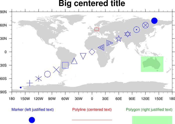
This page describes how to use
various
primitive drawing
routines to add markers, lines, filled areas (polygons), and text on
an existing plot or anywhere outside a plot (known as
"
NDC space" or the "frame").
Drawing primivites on a plot
To draw primitives on top of a plot, you must use the plot's data
space. On a map plot, for example, you would use lat/lon
values to position the primitives. The routines for drawing
primitives on a plot are:
The difference between the "add" versions of these routines (which are
functions) and the other routines (which are procedures) is that the
"add" functions actually attach the primitive to the existing plot,
and you won't see the primitive until you actually draw the plot. If
the plot is resized, the primitive will be resized accordingly. This
can be useful if you plan to
use gsn_panel to panel the plot
later and want the primitives to be resized.
Important note: since these are functions, you need to make
sure that every return value is unique. If you reuse the same
variable to add primitives to a plot, then only the last primitive
that you add will be visible. See example "polyg_4.ncl" below.
The procedural versions of these routines simply draw the
primitive when you call procedure, and do not attach the primitive to
the plot. These routines are a little easier to use because you don't
have to worry about the return value. They can also be faster if you
are drawing tons of primitives, because less memory is used.
Drawing primivites on the NDC square
To draw primitives on the NDC square or frame, you must use values
from 0.0 to 1.0 for the location of the primitive(s). Location (0,0)
represents the lower left corner of the square, and (1,1) represents
the upper right corner of the square. The procedures for drawing in
NDC space are:
Note that there are no "add" versions of these routines, because there
is nothing for which to attach the primitives.
Useful tip: the drawNDCGrid
procedure draws a grid and labels the NDC locations. This is very
useful to help you position primitives in the NDC square. See example
"polyg_18.ncl".
Potential backwards-incompatible change
There is a potential incompatible change
with gsn_polyline,
gsn_add_polyline,
gsn_polygon,
and gsn_add_polygon in NCL
version 6.2.0 and later, when
attaching lines or polygons to a map.
Previously, drawing a polyline around the equator, for example, could
be specified using 2-element arrays. For example:
lnid = gsn_add_polyline(wks,map,(/0,360/),(/0,0/),lnres)
Now, however, in order to eliminate a number of ambiguous situations and to make user code simpler in most cases, a new behavior has been introduced: the line between two points on the globe always follows the shortest path. In the example above, the behavior in NCL V6.2.0 leads to a 0-length line. The recommended approach now for drawing a line around the equator is to use four points, such that the distance from one to the next is always less than 180 degrees. For example:
lnid = gsn_add_polyline(wks,map,(/0,120,240,360/),(/0,0,0,0/),lnres)
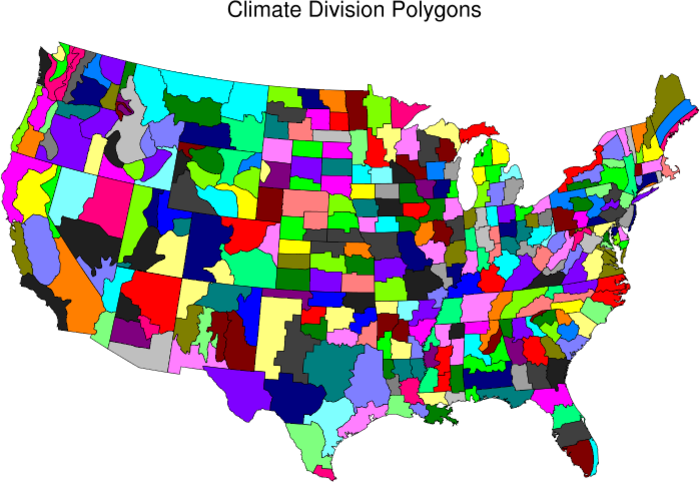
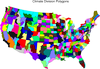 polyg_1.ncl
:
This code comes from Mark Stevens of CGD NCAR. To teach himself
NCL, he decided to try and plot the climate divisions that are used
by the NCDC. Outstanding job Mark! By the way this is the most
exciting plot to watch as it draws. Each state is done separately.
Can you name each state as it draws?
gsn_polygon_ndc will add polygons in ndc(page) coordinates while
gsn_polygon will add them in plot coordinates.
The "climdiv_polygons.nc" netCDF file used in this script is available
here (767440 bytes).
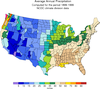 polyg_2.ncl
:
This is the same code as example one, except that Mark is now
coloring each polygon with a precipitation value.
mpGridAndLimbOn = False, turns off the lat/lon grid.
mpAreaMaskingOn = True, enables area masking. This then allows the
map to be divided into different areas by setting the resource
mpFillAreaSpecifiers, e.g. (/"Water","Land"/). These designated areas
can then be filled by setting the resource
mpSpecifiedFillColors to various colors. In this case, they were
set to zero to mask them entirely.
A Python version of this projection is available here.
 polyg_3.ncl
:
A plot with poly markers added. You would be able to panel this
plot. There are numerous
marker styles to choose from.
gsn_add_polymarker is the plot interface that will add polymarkers
to a plot so that they can be paneled. There is also
gsn_polymarker and
gsn_polymarker_ndc
which adds the polymarkers in page coordinates.
IMPORTANT: note the syntax on the use of this function:
dum1 = gsn_add_polymarker(wks,plot,glon(inds),glat(inds),polyres)
. With this function, you need to set it equal to some sort of
dummy variable. Do not set it equal to plot like we do in all other
cases. Also, if you do panel this type of plot, do not delete that
dummy variable or over write it.
 polyg_5.ncl
:
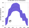
Demonstrates the use of a polygon to shade an xy curve.
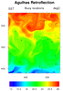
 polyg_6.ncl
:
Demonstrates adding polylines.
The trick with this plot is to create an array of dummy graphic
variables. When you use
gsn_add_polyline,
the result must be a graphic variable. In a loop,
you must not over write the dummy variable, which is why we need an
array.
 polyg_7.ncl
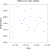
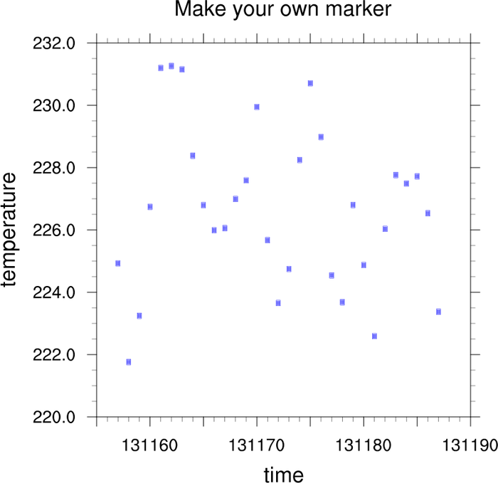
:
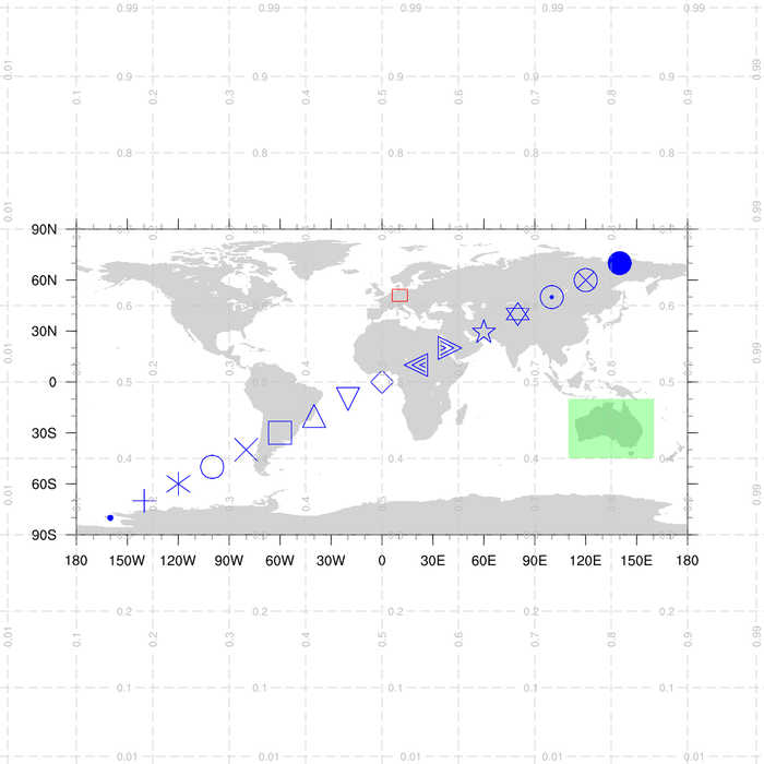
Demonstrates how to create your own polymarker.
As of NCL version 4.2.0.a030, you can make your own marker using
NhlNewMarker. You give the function the character and font table you
want the marker taken from, and provide sizing and placement values. The
function returns a marker index that can be used with
xyMarkerColor.
 polyg_8.ncl
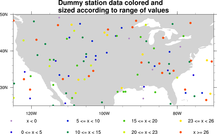
:
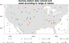
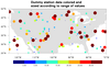
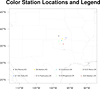
This example shows how to plot values at station locations using
different colors and marker sizes for each station point. The station
values are grouped depending on which range of values they fall in,
and then every marker in this group gets the same color and size.
A legend is added at the bottom, using calls to gsn_polymarker and gsn_text_ndc.
A Python version of this projection is available here.
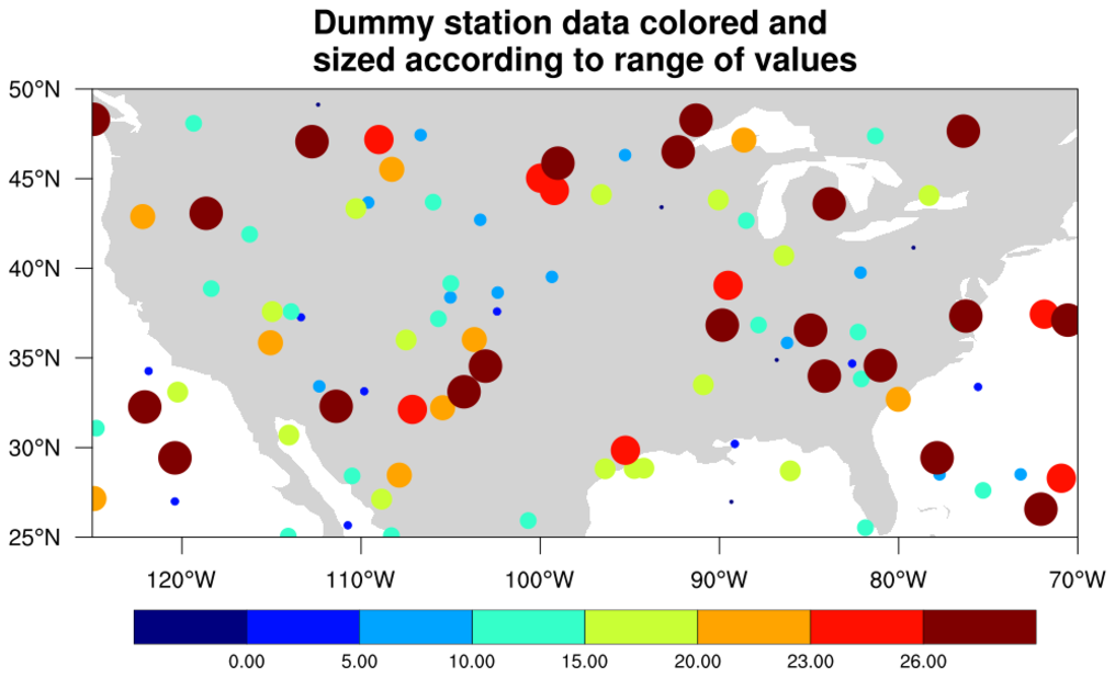
 polyg_8_lbar.ncl
: This example is
very similar to the previous one, except a labelbar is drawn instead of
a legend.
The gsn_create_labelbar and
gsn_add_annotation functions are used
to create the labelbar and then attach it as an annotation. This allows you
to use it in a call to gsn_panel if desired.
A Python version of this projection is available here.
 polyg_9.ncl
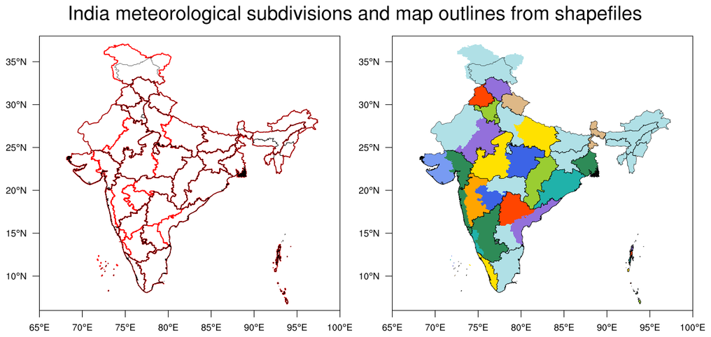
 /
polyg_shp_9.ncl
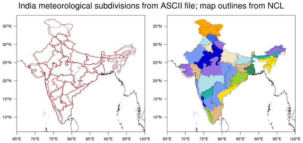
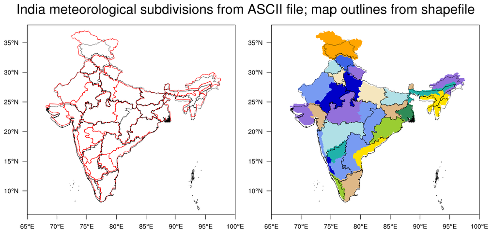
This example shows how to draw the Meteorological Subdivisions of
India. The first script draws the subdivisions given the boundary
coordinates for each subdivision in an ASCII file. The second
script draws the subdivisions from a shapefile.
In the first script, the left plot
uses gsn_add_polyline to attach
the subdivision outlines to the base map. The right panel
uses gsn_add_polygon add filled
subdivisions.
The first script produces two images: the first image uses NCL's
map outlines to draw the states of India
(USE_SHAPEFILE_OUTLINES=False). The second image uses outlines
from a shapefile (USE_SHAPEFILE_OUTLINES=True).
In the second script, the left panel
uses gsn_add_shapefile_polylines
to add the subdivision outlines and the right panel
uses gsn_add_shapefile_polygons
to add filled subdivisions. It draws India outlines from the same
shapefile as the second frame of the first script.
The third image with the India outlines and subdivisions coming
from shapefiles seems to be the best "match" between the two sets
of outlines.
 polyg_10.ncl
:
This example shows how to draw various polylines and polygons on a
several generic tickmark backgrounds to create a series of bar
charts. The
gsn_add_polyline and
gsn_add_polygon functions are
used to create the polylines and polygons and
gsn_panel is used to panel all the plots
on one frame.
 polyg_11.ncl
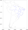
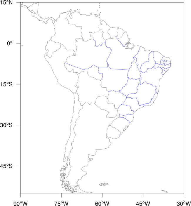
: This example
shows how to draw the political divisions of Brazil. It was
contributed to us by Mateus da Silva Teixeira from IPMet, who
gave us permission to include it and the data files. It is based
on
example 9 that draws the Indian
subdivisions.
The data files can be downloaded via the estados_brasil.tar tar file.
You need to type "tar -xvf estados_brasil.tar" to extract the files.
In version 5.1.0, you
will be able to generate the states of Brazil using a new NCL map
database. See example
16 on the "maps only" page.
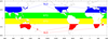 polyg_12.ncl
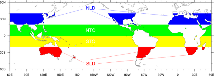
: An example of "layering"
different plot objects to get a particular effect.
As the extratropical polygons (red/blue) require the ocean to overlay the polygons,
and the tropical polygons (green/yellow) require the land to overlay the polygons,
the only way to get the desired effect is to draw two plots, and to set
tfPolyDrawOrder equal to Draw.
A third blank plot is drawn over the previous two to draw the border
correctly.
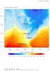
This is a reproduction of figure 1b from Kutzbach et al. 2008, Climate Dynamics, 30:567-579.
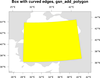
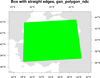
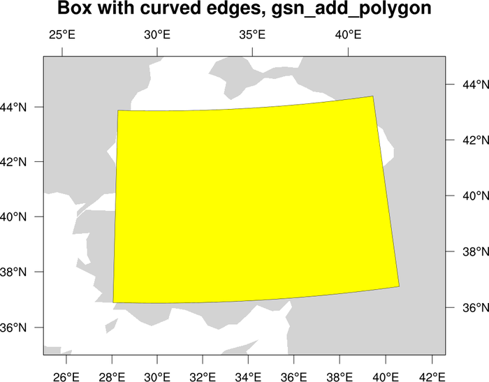
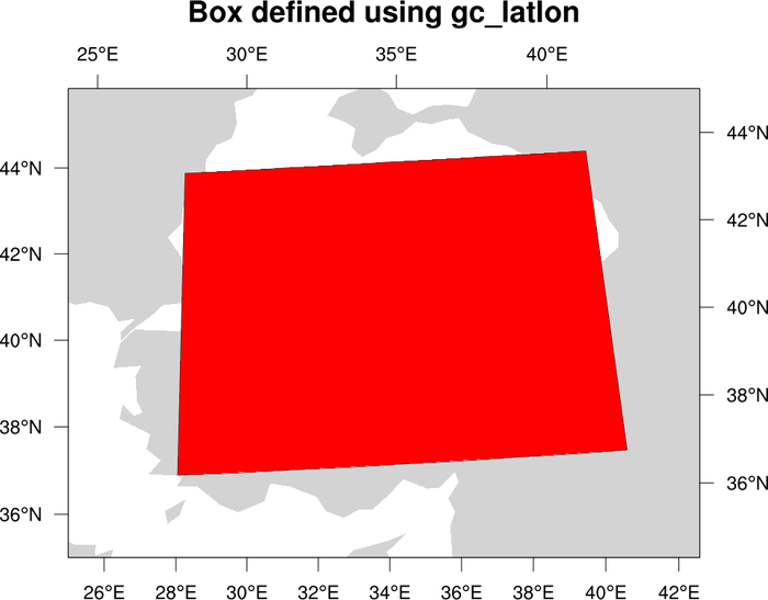
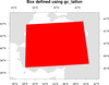 polyg_13.ncl
: An example showing
how to overlay filled boxes on a map using different methods:
The third method is the preferred one if you want straight edges for
your polygon and you want to be able to attach the box to your map
(for paneling or resizing later).
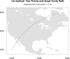
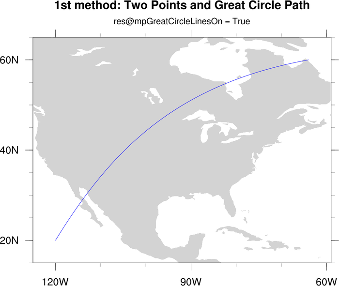
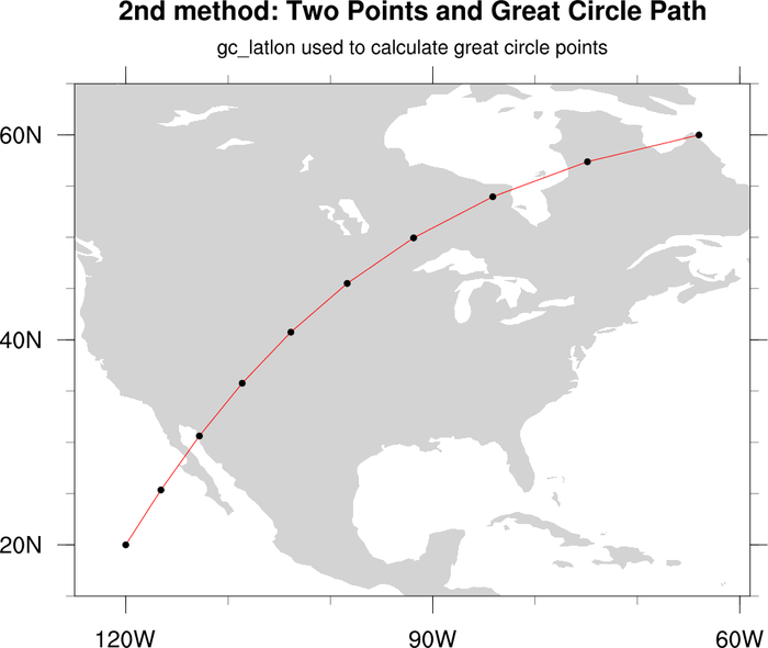
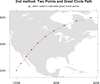 polyg_14.ncl
: Draws a line on an
existing map between two points on the globe using two different
methods: (a)
Setting
mpGreatCircleLinesOn=True,
(b) using
gc_latlon to create a great circle path between two
locations. Uses
gsn_add_polyline to
add the polyline. Any map projection can be used.
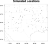 polyg_15.ncl
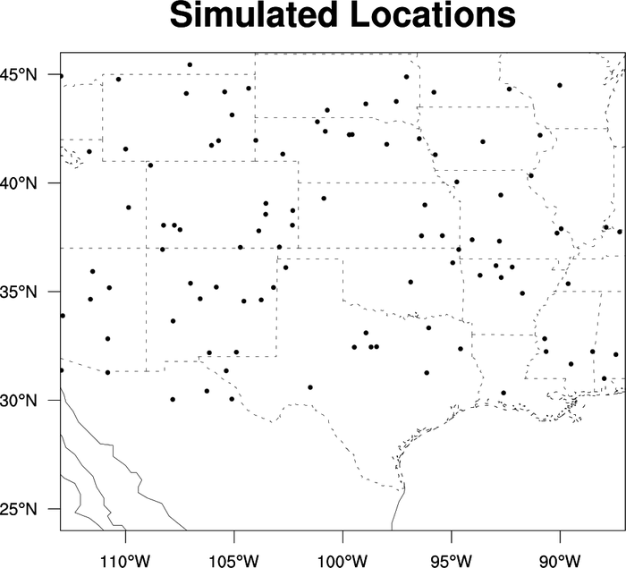
: This is a
minimal script to plot the location of stations on a map background.
 polyg_16.ncl
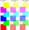
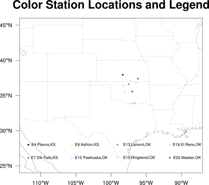
: This is a
simple script to color plot the location of stations on a map background
and manually add a legend. (Donated by Lisi Pei.)
 newcolor_12.ncl
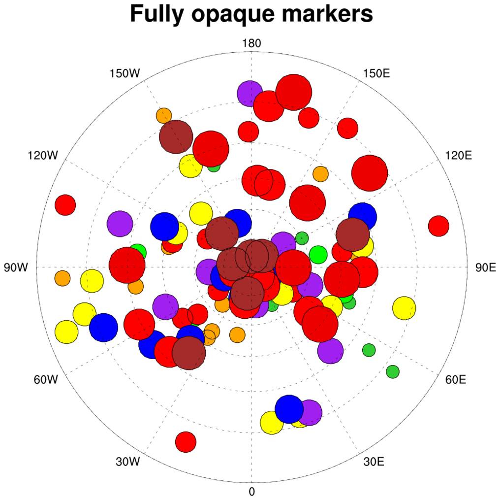
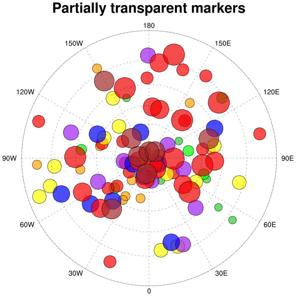
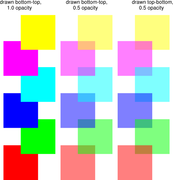
:
This example shows how to draw partially transparent filled polygons
using the
gsFillOpacityF resource
introduced in NCL
6.1.0.
The point of this example is to show how various boxes look when they
overlaid in a different order. The middle column was drawn starting
with the red box starting first. The right column was drawn with the
yellow box starting first.
 polyg_17.ncl
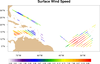
: This script
was written mainly to show how to read an ASCII file with groupings
of headers and data.
It then creates a map of color-coded surface wind speed values
based on an array of levels. A new function
called span_color_indexes is used to select a
nice span of colors through the given color map. This function
was added in NCL
version 6.2.0.
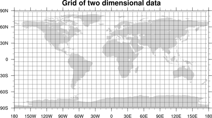
 scatter_10.ncl
: Demonstrates how to
overlay a scatter plot (of filled squares) on a map plot, when the
scatter plot is not in lat/lon space. The key is to use
gsn_csm_blank_plot to create a
canvas for drawing the filled polygons, making sure that the four
corners of the blank plot correspond with the four corners of the
cylindrical equidistant map plot that is created.
You then set tfDoNDCOverlay to
True to make sure that when the blank plot is overlaid on the map
plot using the overlay procedure, it simply
lines up the corners of the two plots and does the draw.
In this example, the blank plot goes from 0,ny+1 in the Y direction,
and 0,nx+1 in the x direction. This corresponds to the following
lat/lon locations:
     x = 0    --> lon = -180
     x = nx+1 --> lon =  180
     y = 0    --> lon =  -90
     y = ny+1 --> lon =   90
 polyg_18.ncl
: This script
is an overall demonstration of the various primitive drawing
routines, both for adding or drawing primitives on a plot, and
for drawing primitives in NDC space.
The first frame shows primitives drawn using the map plot's data space
(lat/lon values).
Note the use of unique_string to
generate a unique attribute name, which is then attached to the
existing map variable as a way of creating a unique name for each
marker primitive.
An NDC grid is drawn using
drawNDCGrid. This was used to
determine the NDC locations for the primitives in the second frame of
this script.
A Python version of this projection is available here.
 polyg_19.ncl
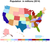
: This script
shows how to draw a map of mainland United States with Alaska, Hawaii,
and Puerto Rico added as annotations at the bottom. Each state is
colored based on population in 2014, using shapefiles downloaded
from
gadm.org. The "states.shp" set
of files is available on our
data page.
A Python version of this projection is available here.
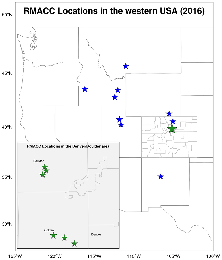
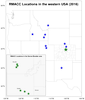 polyg_20.ncl
: This script
shows how to draw a larger map with a smaller map as an annotation.
Each map is customized by drawing various outlines, turning
tickmarks on/off, and adding text strings and markers.
The USA_adm2.shp shapefile downloaded from
gadm.org is used to specifically
draw the counties of Colorado only, while the USA_adm1.shp shapefile
is used to draw the remaining state outlines.
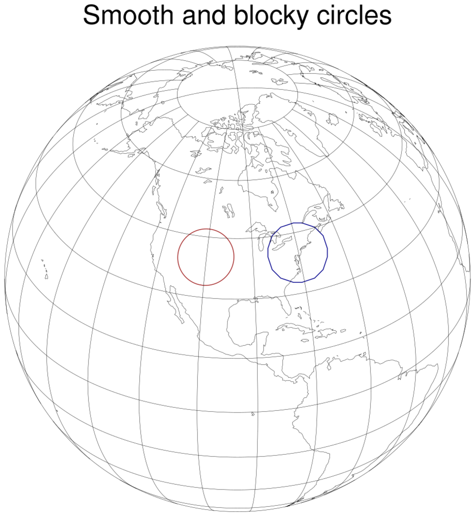
 polyg_21.ncl
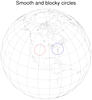
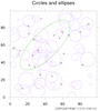
: This script shows how
to draw large, smooth, hollow circles on a plot.
If you try to draw large circles using
gsn_add_polymarker
and a
marker index of 4, they will
look blocky.
The first plot draws a single circle on a map
using nggcog to create the circle and
gsn_add_polyline to add the circle
to the map. A hollow circle using marker index 4
and gsn_add_polymarker and is also
drawn for comparison.
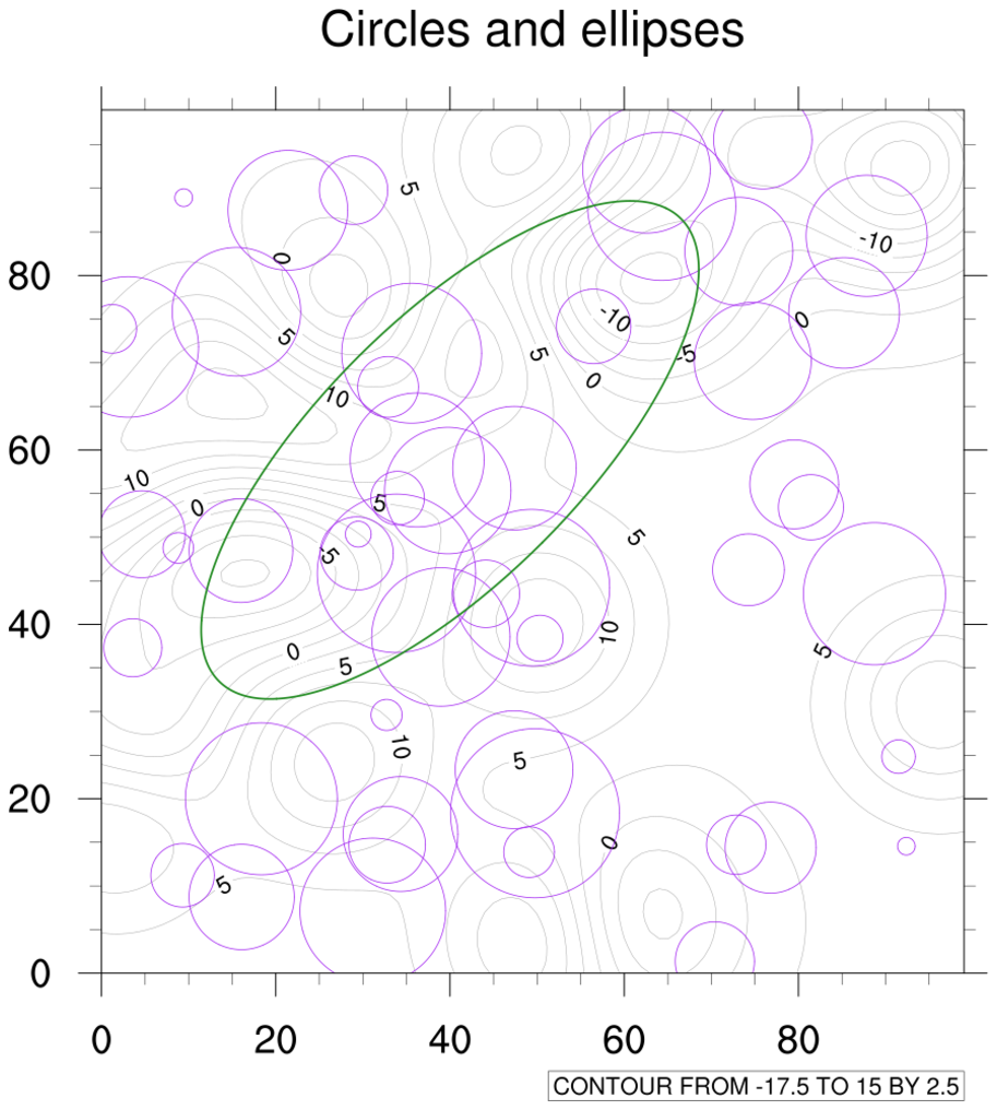
The second plot draws circles and ellipses using an unadvertised
function called "circle_ll" contributed by Arindam Chakraborty. The
circles are added to the plot using
gsn_add_polyline.
See example poly_22.ncl for another way to draw smoother hollow circles,
using NCL's font tables.
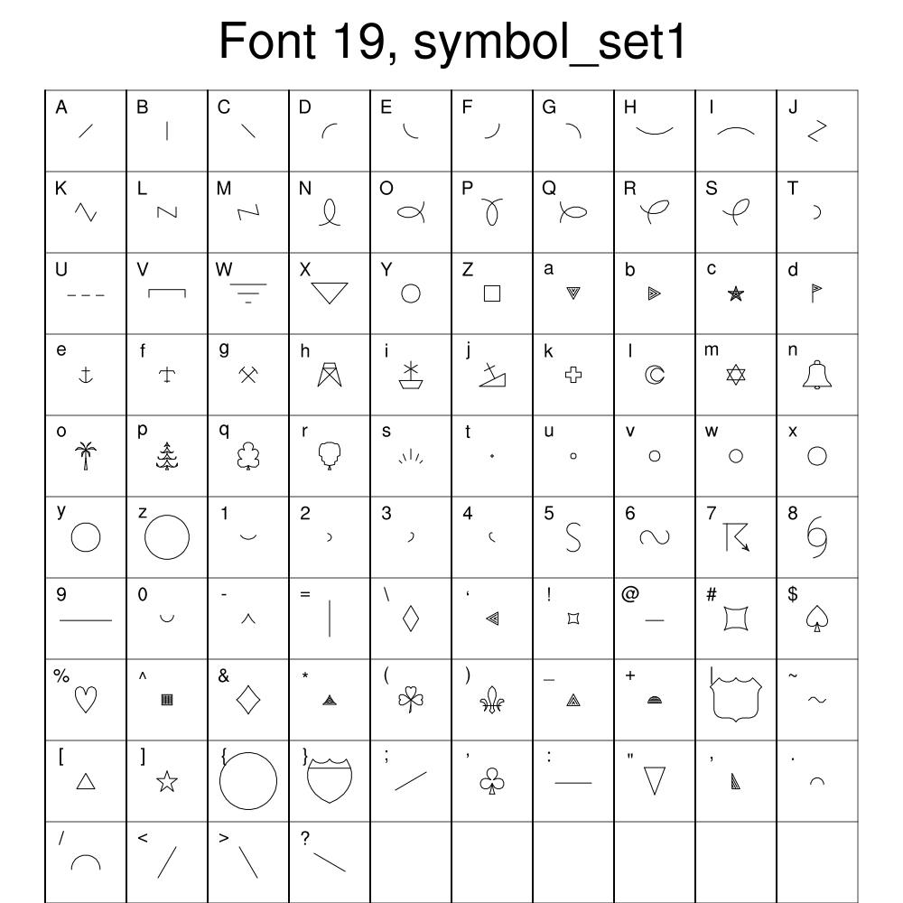
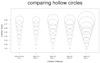 polyg_22.ncl
: This script shows
another way to draw large, smooth, hollow circles on a plot, using
hollow circle markers defined
in
NCL's font
tables #19
and
#37.
See example poly_21.ncl for an example of how to create your own hollow circles.
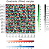
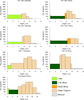
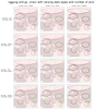
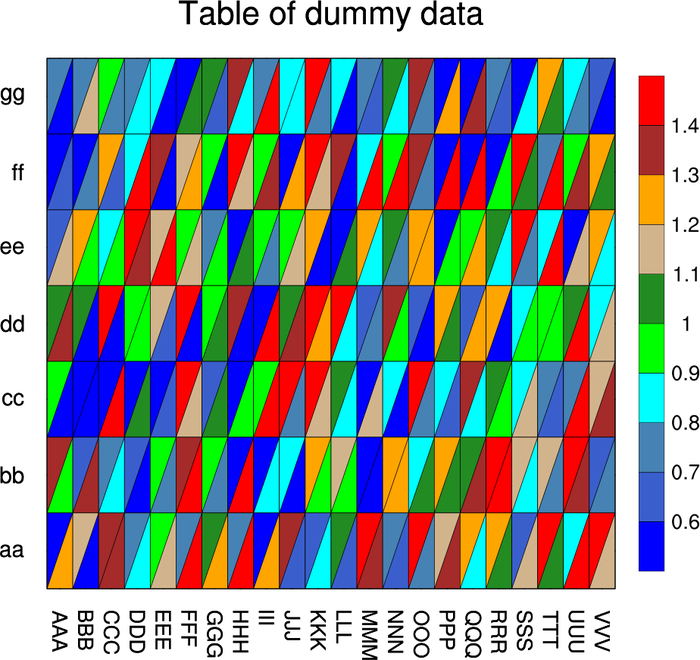
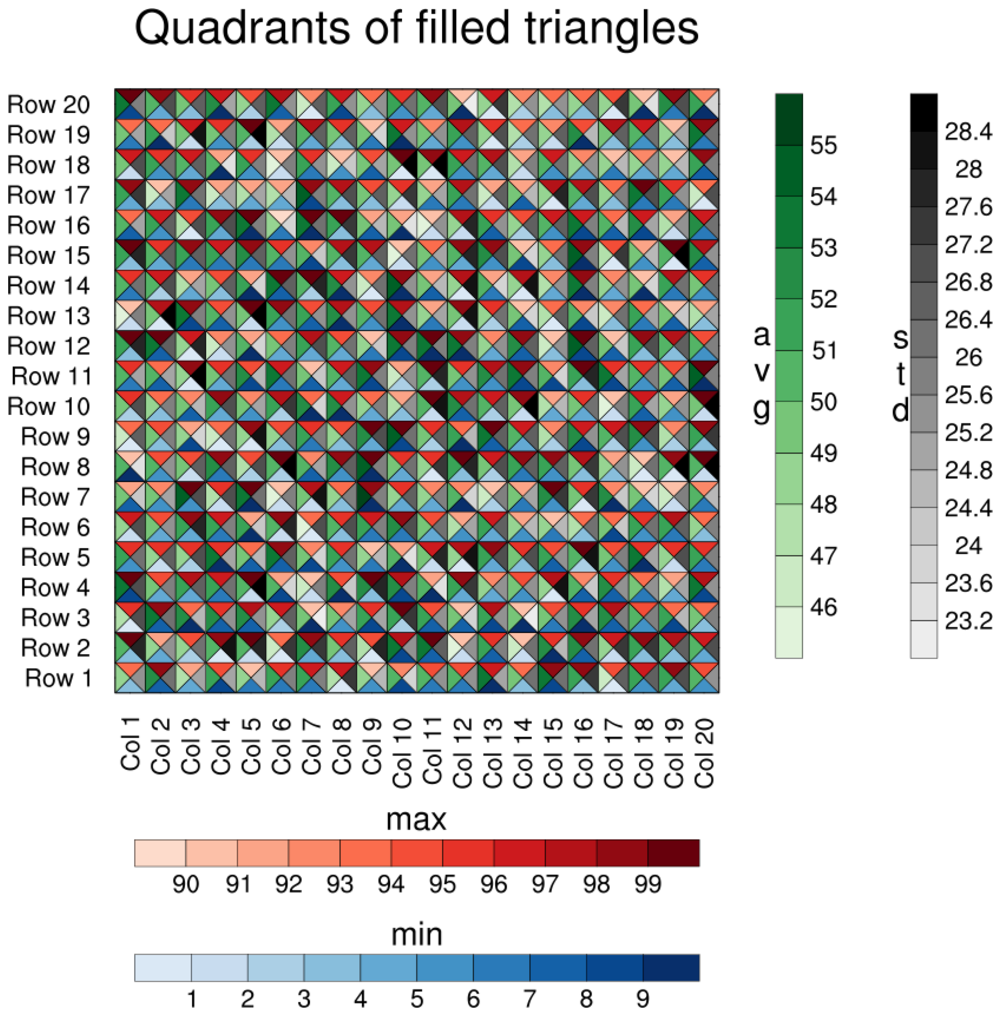
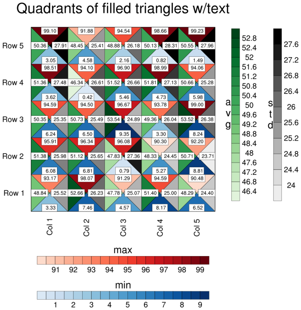
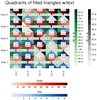 table_8.ncl
:
This example is similar to table_6.ncl, except it draws four triangles
per each quadrant. The bottom triangles represent the minimum of the
values, the top triangles represent the maximum of the values, the
left triangles represent the average, and the right triangles the
standard deviation. Each set of triangles has their own color map,
illustrated by the four labelbars.
The second image is from running the script with nvars=5, nmodels=5, and ADD_TEXT=True.
This is just for debugging purposes, so you can see what each triangle value is equal
to.
Dummy data is used, which is generated by the script.
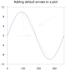
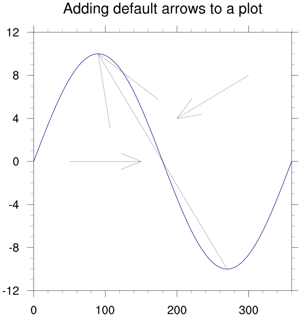
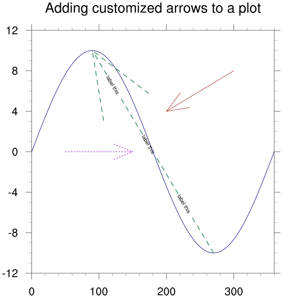
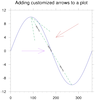 polyg_23.ncl
: This script shows how to
add arrows to a plot, using an "arrow" function contributed by Arindam Chakraborty.
This function uses
gsn_add_polyline under the hood,
which means you can
use gsLineXXXX
resources to customize the arrows.
 polyg_24.ncl
:
Use
geolocation_circle
to generate concentric latitude/longitude locations about a central location.
Draw multiple 'circles' around a central location.
Ths script uses radii specified in kilometers.
Each radius is colored differently and has different line thicknesses.
A
+ polymarker is used to show the location.
This function uses gsn_add_polyline.
Each circle 'object' must be given a unique attribute identifier.
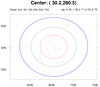
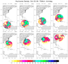
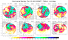
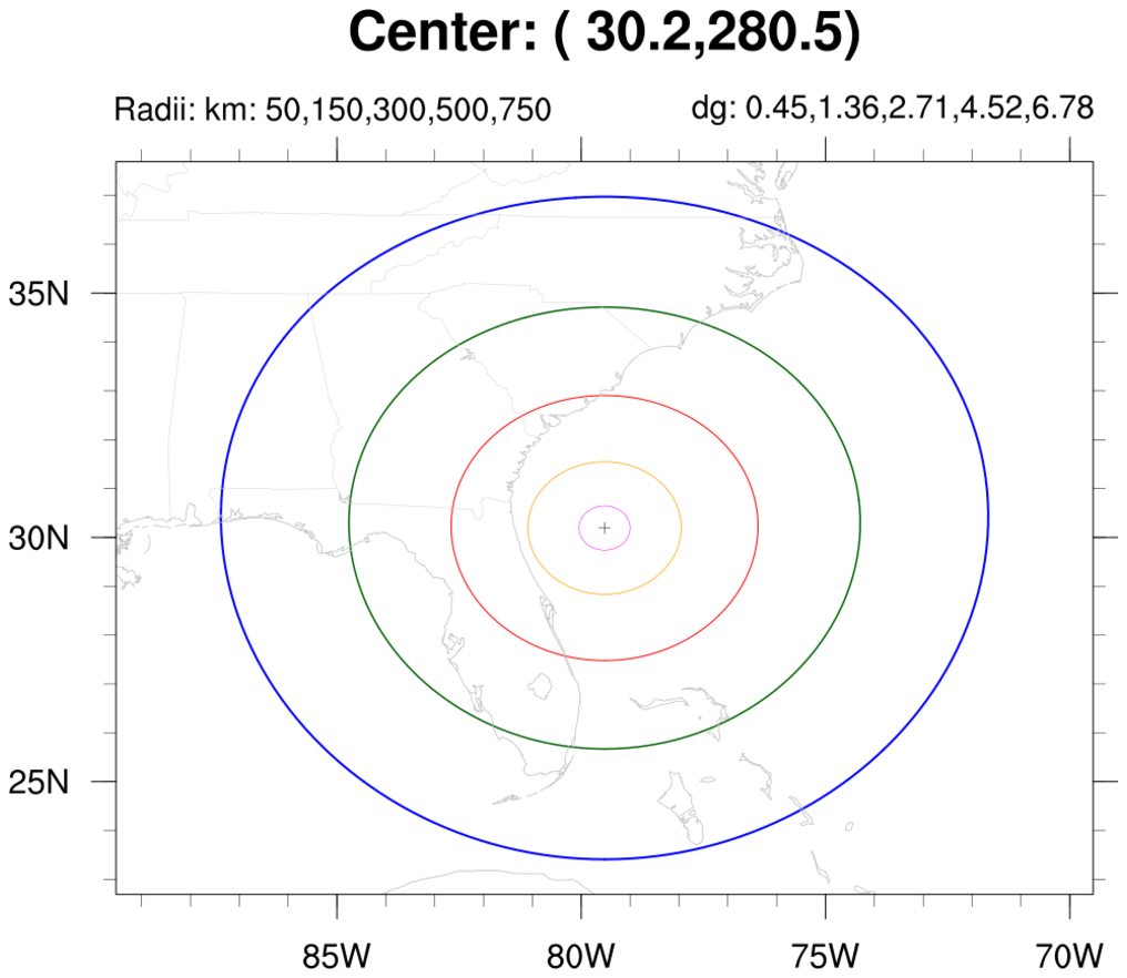
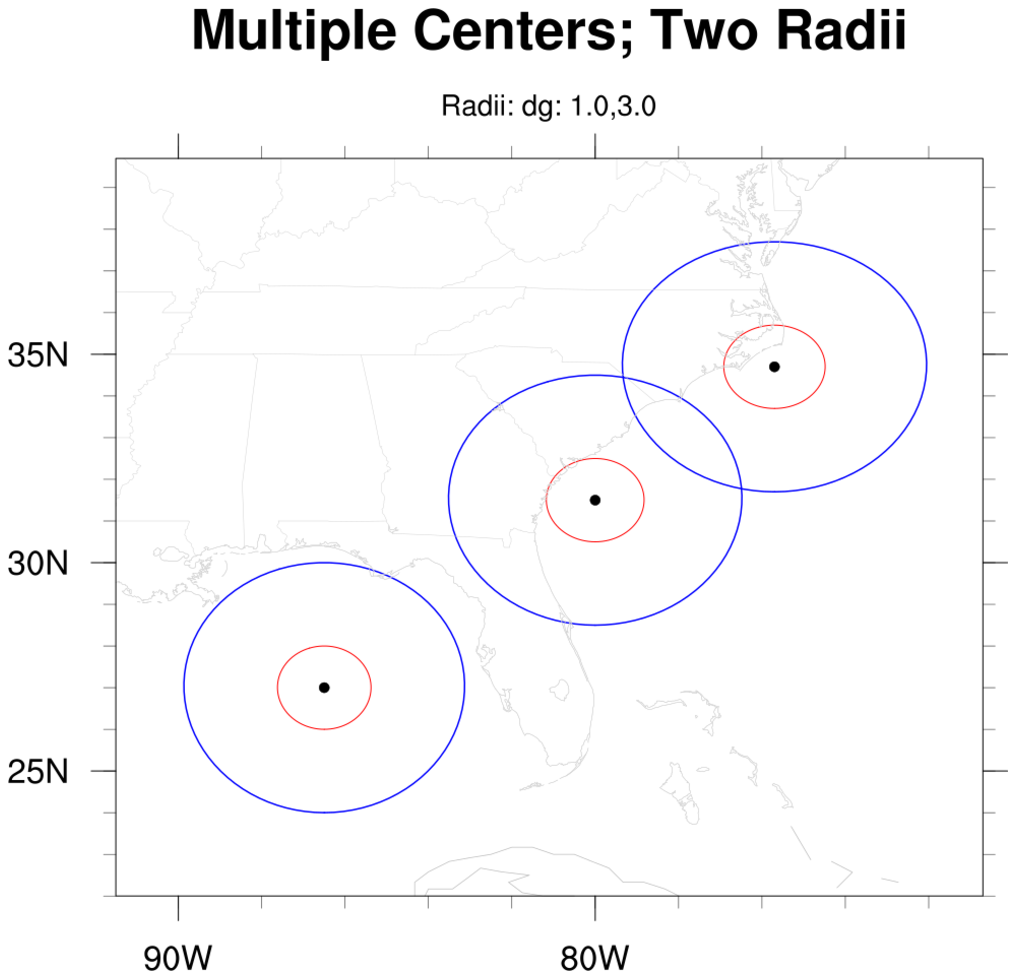
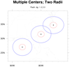 polyg_25.ncl
:
Use
geolocation_circle
to generate concentric latitude/longitude locations about a central location.
Draw multiple 'circles' around multiple central locations.
Ths script uses radii specified in degrees ('great circle distances').
Each radius is colored differently and has different line thicknesses.
A 'filled-circle' polymarker is used to show the locations.
This function uses gsn_add_polyline.
Each circle 'object' must be given a unique attribute identifier.
Please see examples polyg_29, polyg_30 and polyg_31 for examples that use data masking.
 wrf_nogsn_poly_5.ncl
:
This example shows how to add text and markers to an existing WRF-ARW
plot that was created using
wrf_contour
and
wrf_map_overlays.
The key is to set "pltres@PanelPlot = True", telling this function
that you plan to do something with the plot later. This
causes wrf_map_overlays to not
draw the plot and to not remove all the overlain features, allowing
you to put more annotations on the plot before drawing it yourself.
gsn_add_polymarker and
gsn_add_text are used to add the
dots and text strings to the WRF plot.
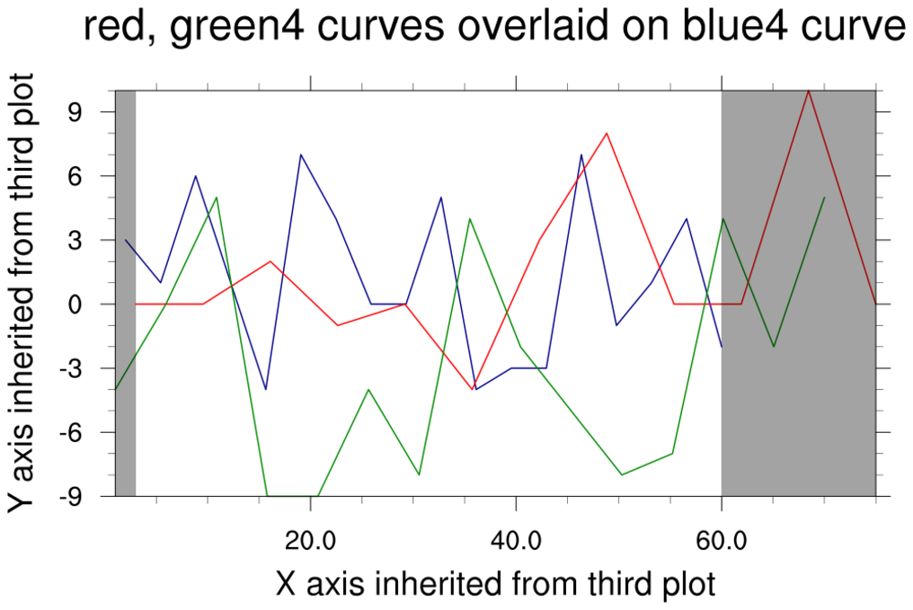
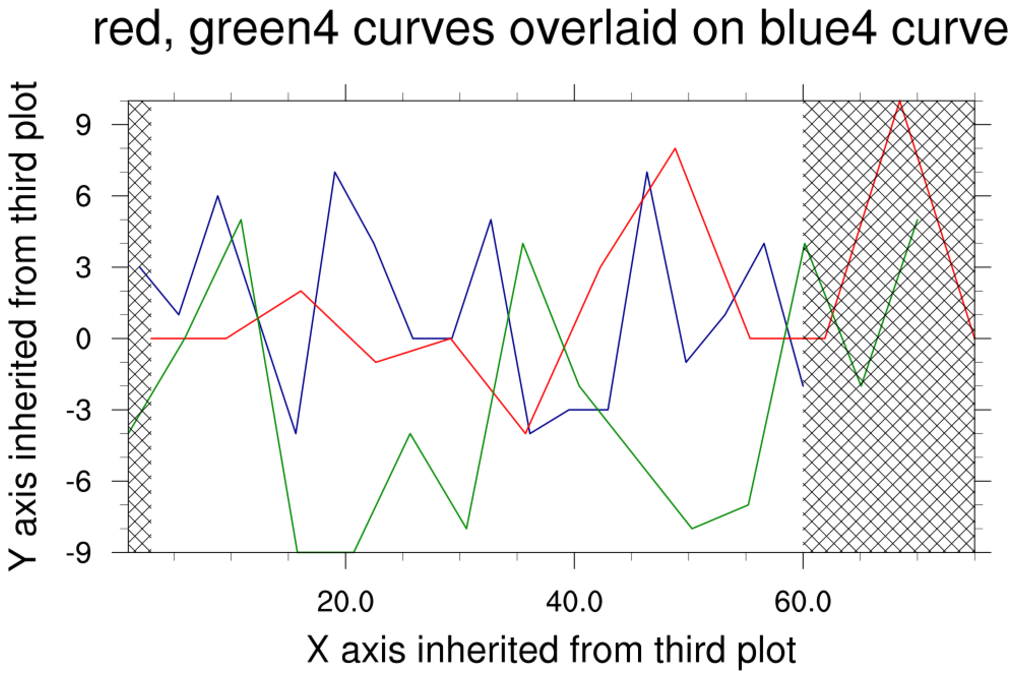
 polyg_26.ncl
:
This example illustrates how to mask portions of an XY plot, using
solid-fill polygons, hatch patterns, or both.
The gsFillColor resource is used to set the color of the
polygons or the hatch patterns. However, in order to have both solid fill and hatching
in the same polygon, you must call gsn_add_polygon twice: once
to get the solid fill and again to get the hatch pattern on top. The
gsFillIndex resource is used to specify which type of fill is desired.
You can choose the desired hatch (or stipple) pattern from the
fill pattern table and the desired color
from the list of named colors.
To further customize the hatch patterns, you can change the thickness of the lines
using gsFillLineThicknessF and the density
using gsFillScaleF.
 polyg_27.ncl
:
The purpose of this script is to demonstrate that using floating
point and double precision values with
nggcog
and
gc_onarc, while also varying the number of
great circle arcs to approximate a circle can yield differing results.
For illustrative purposes, a quadruply nested do loop is used in
this example. Generally, it is recommended to minimize the number
of nested do loops in order to maximize performance.
Note that more points are considered to be "on arc" when double
precision types are used.
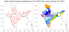
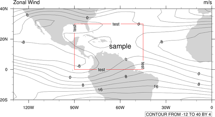
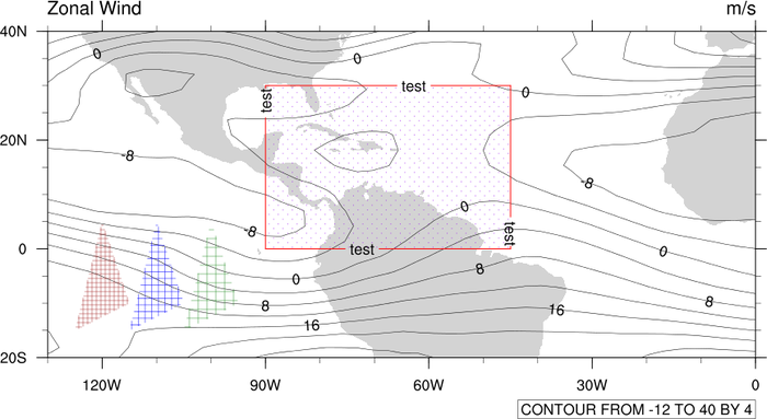
 polyg_29.ncl
:
Use
geolocation_circle to generate concentric latitude/longitude locations about three central locations.
Use
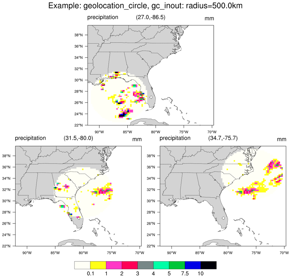
gc_inout to mask grid points outside the circles. A consistent map backround is used.
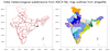
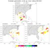
 polyg_30.ncl
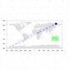
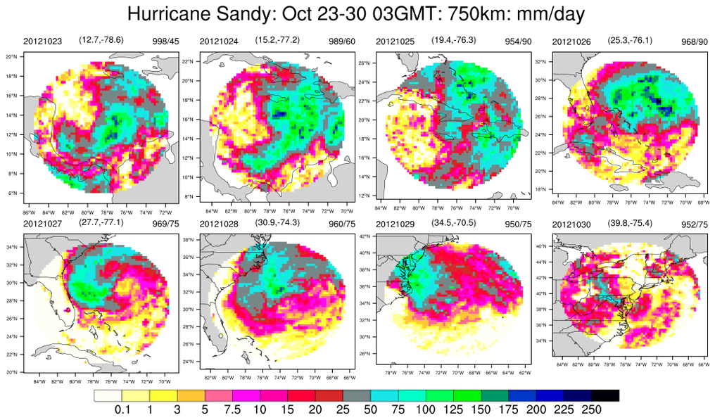
:
Hurricane Sandy locations at 0300GMT on 8 days (23-30 October 2012):
use
geolocation_circle to create areas spanning 750km
on each day and plot the total daily precipitation for each day. The title indicate the date, the central
location and the central pressure and maximum wind speed (mph).
A consistent map backround is used.
 polyg_31.ncl
:
Similar to
polyg_30 except the background map is allowed to change with each storm location.


