For an introduction to MPAS modeling, see the slides presented at the Joint WRF-MPAS Users' Conference, "MPAS for WRF Users - A Gentle Introduction to Atmospheric Modeling with MPAS".
Example pages containing: tips | resources | functions/procedures
For an introduction to MPAS modeling, see the slides presented at the Joint WRF-MPAS Users' Conference, "MPAS for WRF Users - A Gentle Introduction to Atmospheric Modeling with MPAS".
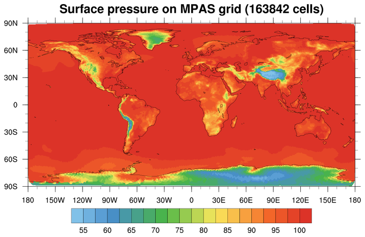 mpas_1.ncl: This
example shows how to create a color-filled contour plot
of surface pressure on an MPAS grid.
mpas_1.ncl: This
example shows how to create a color-filled contour plot
of surface pressure on an MPAS grid.The lat/lon values on the file are in radians, so they need to be converted to degrees. Since they contain missing values, it is necessary to set trGridType to "TriangularMesh" to plot correctly.
cnFillMode is set to "RasterFill" to make the plotting go faster.
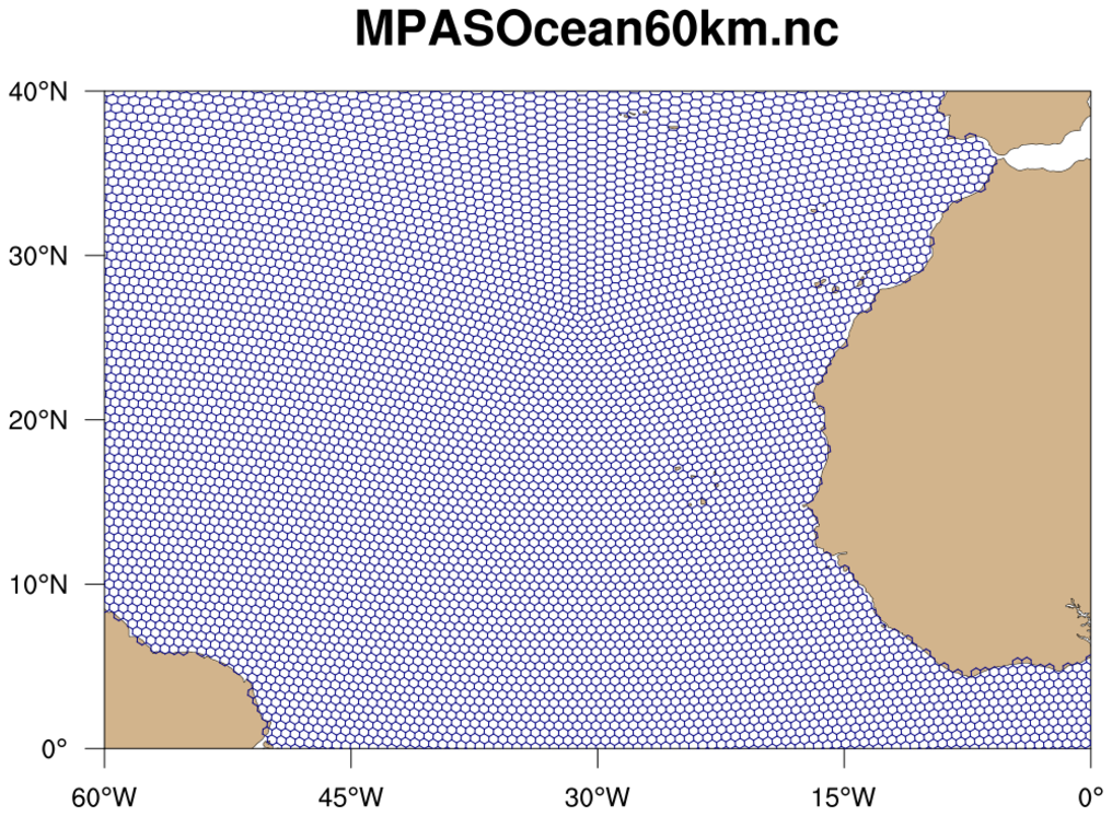
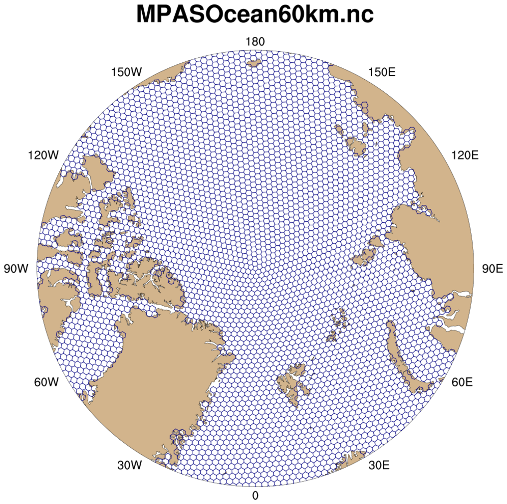 mpas_2.ncl /
mpas_faster_2.ncl: This
example shows how to draw the MPAS-O (ocean) grid edges on a
cylindrical equidistant or polar stereographic map.
mpas_2.ncl /
mpas_faster_2.ncl: This
example shows how to draw the MPAS-O (ocean) grid edges on a
cylindrical equidistant or polar stereographic map.
This map would be too busy if you drew the whole globe (there are 349,339 edges), so this example zooms in on arbitrarily selected areas.
With NCL Version 6.2.0, there's a much faster way of drawing the MPAS edges, using the new resource gsSegments. The "mpas_faster_2.ncl" script demonstrates the use of this resource.
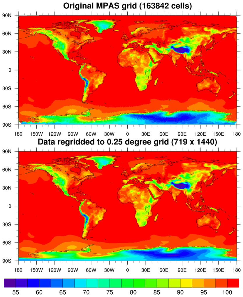 ESMF_regrid_10.ncl
This example shows how to regrid unstructured MPAS data (163842 cells) to a 0.25 degree grid (719 x 440), using the default "bilinear" method with ESMF_regrid.
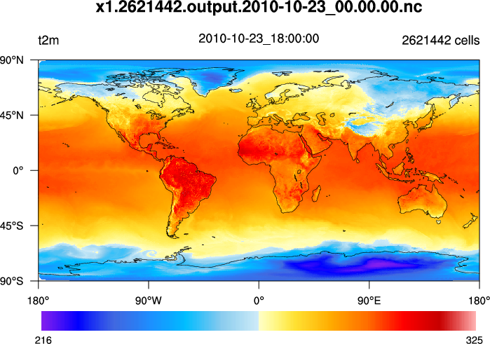
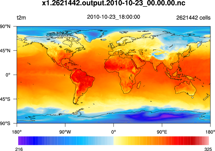
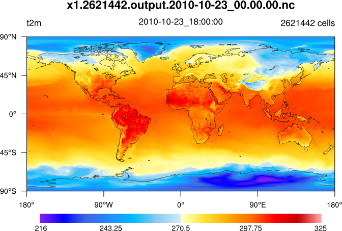 mpas_3.ncl /
mpas_cell_3.ncl /
mpas_polygon_3.ncl: This
example shows how to draw contours of temperature on a 15 km MPAS grid
(2,621,442 cells) using three different methods:
mpas_3.ncl /
mpas_cell_3.ncl /
mpas_polygon_3.ncl: This
example shows how to draw contours of temperature on a 15 km MPAS grid
(2,621,442 cells) using three different methods:
The second two methods will only work in NCL V6.2.0 and later. The first method (raster fill), works in previous versions, but has been significantly sped up in NCL V6.2.0.
The cell fill and polygon methods produce slightly nicer looking plots (the 2nd and 3rd images above); you won't see the white corners in the upper and lower left corners of the plot.
Here are some timing results on a Mac for the various scripts:
mpas_3.ncl (V6.1.2):       83.5 CPU seconds
mpas_3.ncl (V6.2.0):       14.5 CPU seconds
mpas_cell.ncl (V6.2.0):    95.6 CPU seconds
mpas_polygon.ncl (V6.2.0): 71.9 CPU seconds
The mpas_polygon_3.ncl example is the most complicated one to use, because you have to generate the labelbar yourself and call gsn_add_polygon to add the polygons after the map plot is created. It was written mainly to show how to use the gsSegments and gsColors resources. This example will give you the most control over the individual cells, should you need it.
 mpas_4.ncl /
mpas_cell_4.ncl: This example
shows how to draw raster-filled contours of "ssh" on an MPAS-O (ocean)
grid, using a cylindrical or polar steregraphic map.
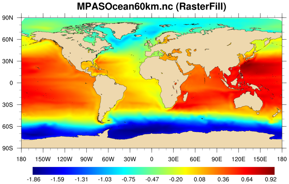
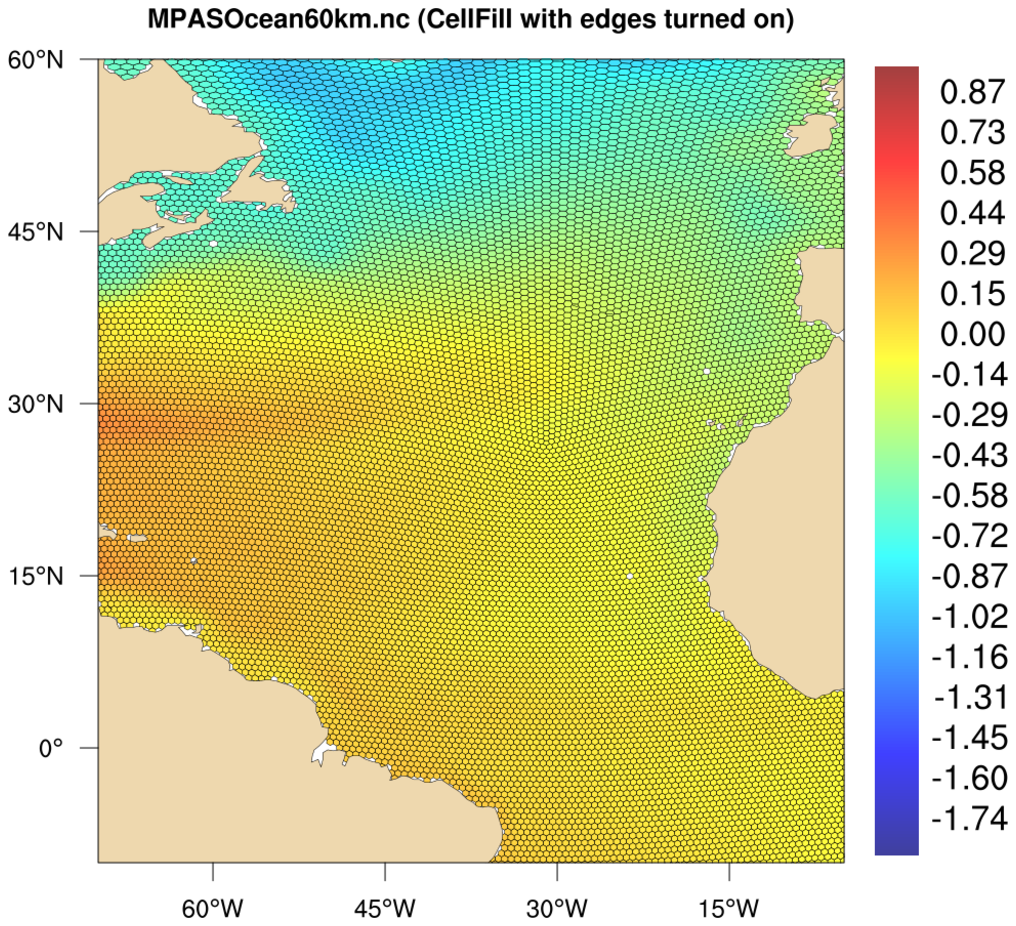
mpas_4.ncl /
mpas_cell_4.ncl: This example
shows how to draw raster-filled contours of "ssh" on an MPAS-O (ocean)
grid, using a cylindrical or polar steregraphic map.
The first image uses raster contours (res@cnFillMode = "RasterFill") over a global area, and the second image uses cell-filled contours (res@cnFillMode = "CellFill") over a zoomed area. Using "CellFill" allows you to turn on the cell edges with cnCellFillEdgeColor.
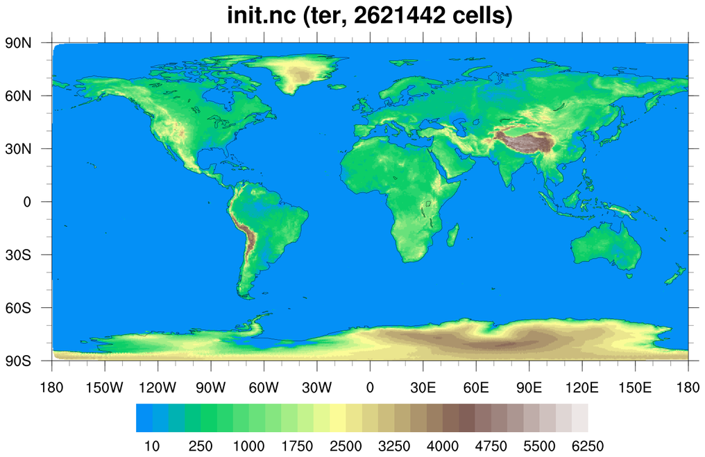 mpas_5.ncl - This script shows how to
create a filled raster contour plot of the "ter" variable on an MPAS
initialization file (init.nc). This particular MPAS file is a
quasi-uniform 15 km global forecast file that has 2.6 million cells,
which takes about 7 seconds to plot on a Mac.
mpas_5.ncl - This script shows how to
create a filled raster contour plot of the "ter" variable on an MPAS
initialization file (init.nc). This particular MPAS file is a
quasi-uniform 15 km global forecast file that has 2.6 million cells,
which takes about 7 seconds to plot on a Mac.
The contour levels are explicitly chosen and the MPL_terrain color map is subsetted to remove some of the dark blue colors.
The next example plots the same data, except on a higher-resolution MPAS mesh.
 mpas_6.ncl - This script is similar
to mpas_5.ncl, except the MPAS file is a mixed-resolution mesh of 15
km and 3 km cells, where the 3 km region is over the United
States. There are 6.4 million cells in this file, which takes about 18
seconds to plot on a Mac.
mpas_6.ncl - This script is similar
to mpas_5.ncl, except the MPAS file is a mixed-resolution mesh of 15
km and 3 km cells, where the 3 km region is over the United
States. There are 6.4 million cells in this file, which takes about 18
seconds to plot on a Mac.
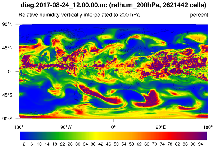
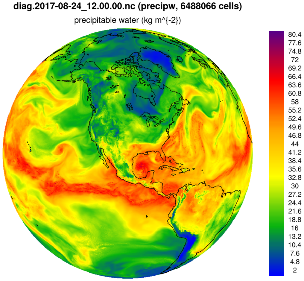
 mpas_7.ncl - This script creates a
filled raster contour plot of any 2D variable (dimensioned Time x
nCells) on an MPAS file. The MPAS mesh is the same one used in example
mpas_5.ncl, except the data being plotted are on a separate file
called "diag.2017-08-24_12.00.00.nc".
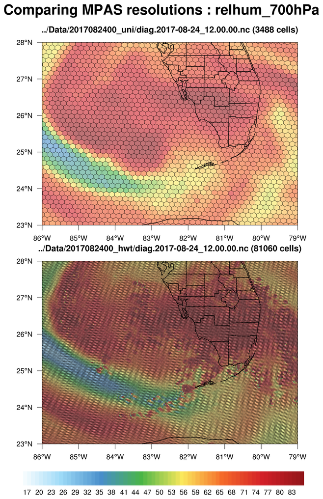
mpas_7.ncl - This script creates a
filled raster contour plot of any 2D variable (dimensioned Time x
nCells) on an MPAS file. The MPAS mesh is the same one used in example
mpas_5.ncl, except the data being plotted are on a separate file
called "diag.2017-08-24_12.00.00.nc".
You can change the variable being plotted when you run the script:
ncl 'vname="relhum_700hPa"' mpas_7.ncl
The cnMaxLevelCount resource is set to 256 to force NCL to use more contour levels. The default is 16.
The next example plots the same data, except on a higher-resolution MPAS mesh.
 mpas_8.ncl - This script creates a
filled raster contour plot of any 2D variable (dimensioned Time x
nCells) on an MPAS file. The MPAS mesh is the same mixed-resolution
one used in example mpas_6.ncl.
mpas_8.ncl - This script creates a
filled raster contour plot of any 2D variable (dimensioned Time x
nCells) on an MPAS file. The MPAS mesh is the same mixed-resolution
one used in example mpas_6.ncl.
Just for something different, the data are plotted over an orthographic projection instead of a cylindrical equidistant map projection.
The cnMaxLevelCount resource is set to 256 to force NCL to use more contour levels. See the next example which compares the two different resolutions using a panel plot.
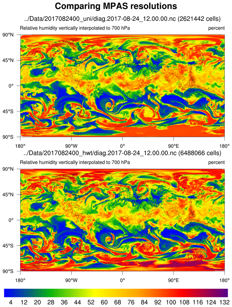 mpas_9.ncl - This script plots the
same variable on two different resolutions of MPAS meshes. See
examples mpas_5.ncl and mpas_6.ncl
for descriptions of the MPAS files.
mpas_9.ncl - This script plots the
same variable on two different resolutions of MPAS meshes. See
examples mpas_5.ncl and mpas_6.ncl
for descriptions of the MPAS files.
For a similar example that zooms in on a map area of interest and outlines the edges of the mesh, see mpas_11.ncl.
 mpas_10.ncl - This script plots data
from the same 15-km MPAS file described in example
mpas_7.ncl, except it uses CellFill instead
of RasterFill to generate the contours. This script takes longer, but
creates a slightly nicer looking plot that doesn't have gaps in the
upper and lower left corner of the rectangle.
mpas_10.ncl - This script plots data
from the same 15-km MPAS file described in example
mpas_7.ncl, except it uses CellFill instead
of RasterFill to generate the contours. This script takes longer, but
creates a slightly nicer looking plot that doesn't have gaps in the
upper and lower left corner of the rectangle.
Using CellFill requires that you provide the cell borders for each lat/lon center point. This part of the script takes almost 35 seconds, while the plotting takes another 25 seconds.
If you plan to plot other variables on the same MPAS mesh, then you can write the cell border information to a file and read it in later for faster processing. When you run this script for the first time, the lat/lon cell borders will be constructed and written to a file. When you run the script again, it will detect this file and use it to read in the cell borders, hence running in half the time.
The other advantage of using cell fill is that you can draw the mesh outlines by setting cnCellFillEdgeColor. See the next script for an example.
Note: change the workstation type (in the call to gsn_open_wks) from "png" to "x11" to watch the MPAS mesh get drawn in real-time. This can be a useful debugging tool.
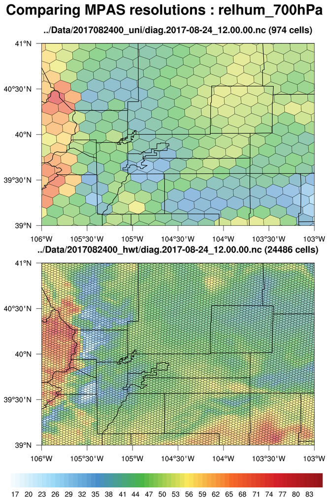
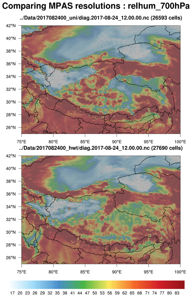
 mpas_11.ncl - This script uses cell
fill to plot the same variable on two different resolutions of MPAS
meshes, but over a small map region of interest. This can significantly
speed up the script.
mpas_11.ncl - This script uses cell
fill to plot the same variable on two different resolutions of MPAS
meshes, but over a small map region of interest. This can significantly
speed up the script.
The cell edges are outlined by setting cnCellFillEdgeColor to "black".
The three frames are the result of setting the "region_of_interest" variable in the script three different values: "Colorado", "Tibet", and "Florida". The script currently only recognizes these three regions, but you can certainly modify it to add other regions.
Note that with the Colorado and Florida regions, you can clearly see the different mesh resolutions, with the top mesh being 15 km and the bottom mesh being 3 km. However, with the Tibet region, the two regions look close to the same resolution. This is because the top mesh is mostly uniform over the whole globe (15 km), and the bottom mesh is a mixed-resolution, with 3 km over the United States and 15 km elsewhere.
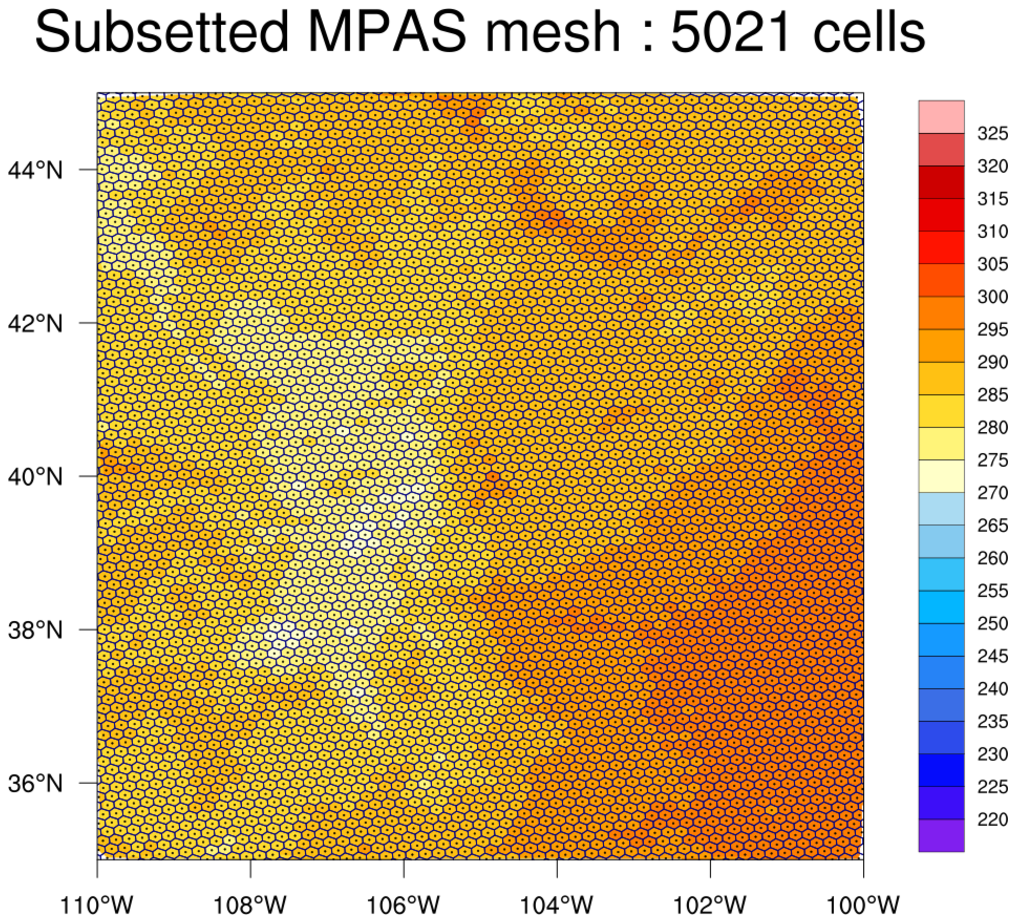 datagrid_9.ncl: This example
shows how to use gsn_coordinates to
draw the edges and centers of an unstructured mesh. These feature were
added in NCL Version 6.6.0.
datagrid_9.ncl: This example
shows how to use gsn_coordinates to
draw the edges and centers of an unstructured mesh. These feature were
added in NCL Version 6.6.0.
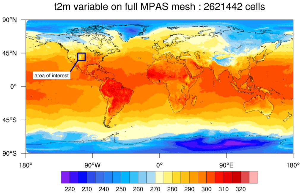
The first image is the "t2m" variable plotted over the full grid. An area of interest is highlighted on this plot, which is what the second image represents.
The MPAS edges and cell centers were only added to the second plot, because this particular MPAS mesh has over two million cells which would create a very dense plot if you drew all the edges. An area of interest was selected using the special gsnCoordsMinLat, gsnCoordsMaxLat, gsnCoordsMinLon, and gsnCoordsMaxLon resources, making the drawing of the mesh less dense and significantly faster.