NCL Home>
Application examples>
Special plots ||
Data files for some examples
Example pages containing:
tips |
resources |
functions/procedures
NCL Graphics: Histograms
Histograms are bar plots, where each bar is a count of how many values
of your data either fall in a range of values, or are exactly equal to a set
of values. We refer to this as "binning" the data.
If you simply want to draw bars of your data and don't need to bin
the data first, then see the bar charts
example page. You may also want to check out the
binning satellite and observational data
examples page, which talks about summing and averaging binned data.
gsn_histogram is the function for
creating histograms. The following options are specific to this
function:
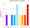
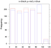
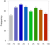
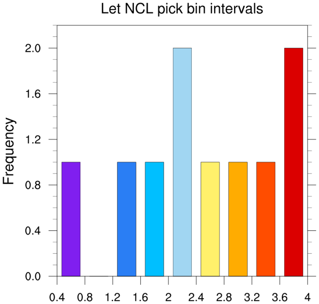
 histo_1.ncl
:
The first plot shows how to draw a default histogram, where we let NCL
pick the bin intervals to use.
The dummy Y values are equal to:
y = (/3.1, 0.5, 3.8, 3.4, 2.1, 1.5, 2.6, 2.3, 3.6, 1.7/)
and the intervals NCL chose were:
= (/0.4, 0.8, 1.2, 1.6, 2.0, 2.4, 2.8, 3.2, 3.6, 4.0/)
Given these intervals and the ten y values, the bins represent:
  1 y value(s)  >= 0.4 and <  0.8   (0.5)
  0 y value(s)  >= 0.8 and <  1.2   ()
  1 y value(s)  >= 1.2 and <  1.6   (1.5)
  1 y value(s)  >= 1.6 and <  2.0   (1.7)
  2 y value(s)  >= 2.0 and <  2.4   (2.1,2.3)
  1 y value(s)  >= 2.4 and <  2.8   (2.6)
  1 y value(s)  >= 2.8 and <  3.2   (3.1)
  1 y value(s)  >= 3.2 and <  3.6   (3.4)
  2 y value(s)  >= 3.6 and <= 4.0   (3.6,3.8)
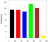
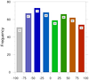
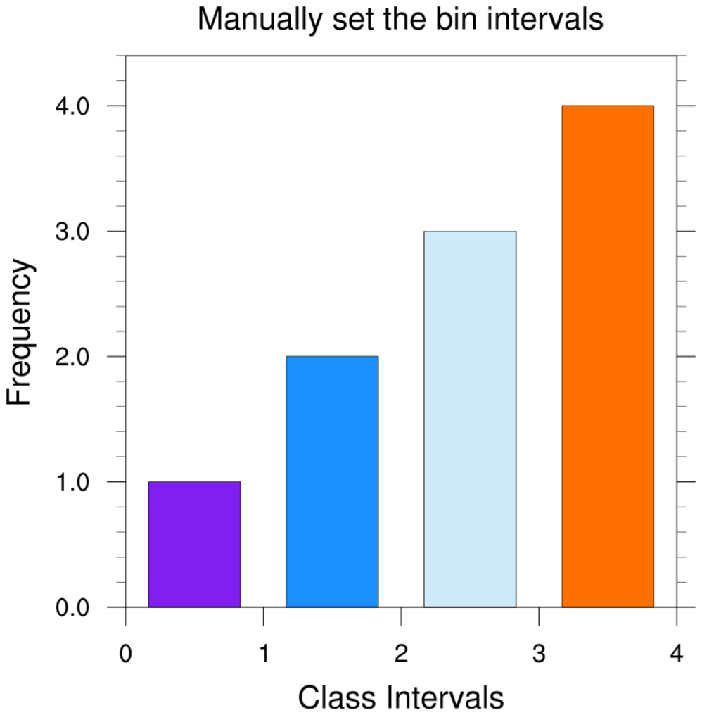
For the second plot, the bin intervals are manually set to (/0,1,2,3,4/)
The plot represents:
  1 y value(s)  >= 0.0 and <  1.0   (0.5)
  2 y value(s)  >= 1.0 and <  2.0   (1.5,1.7)
  3 y value(s)  >= 2.0 and <  3.0   (2.1,2.3,2.6)
  4 y value(s)  >= 3.0 and <= 4.0   (3.1,3.4,3.6,3.8)
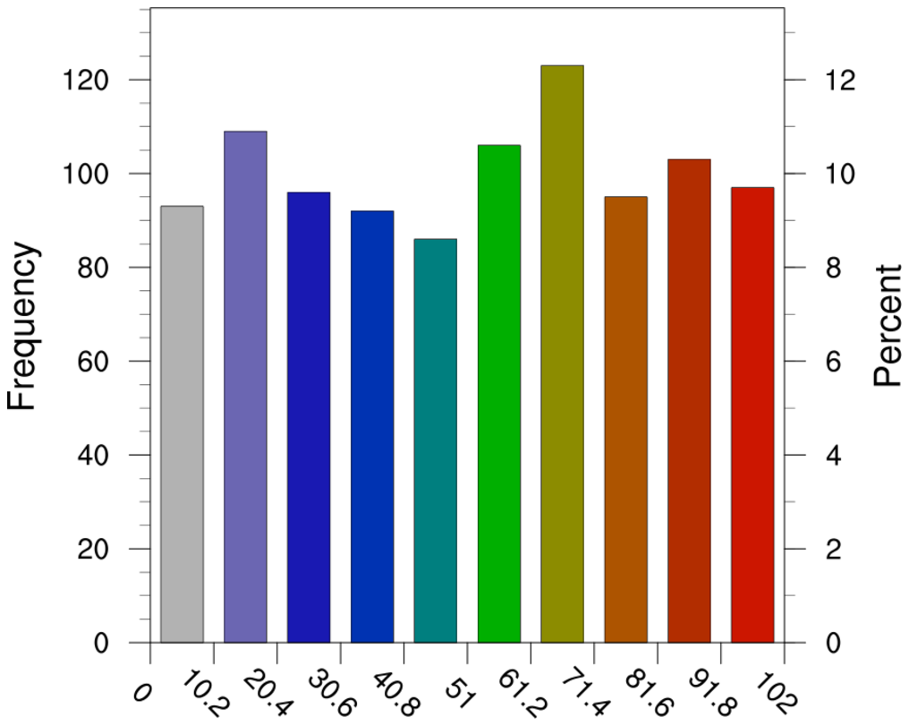
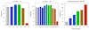 histo_2.ncl
: Histograms can be
panelled.
The leftmost two images
use gsnHistogramNumberOfBins to select
the approximate number of bins. Note that you are getting less than
the requested number of bins because NCL is trying to give you "nice"
bin intervals. See example histo_4.ncl below for
how to override this.
The rightmost image shows how to explicitly set the intervals using
gsnHistogramBinIntervals.
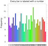
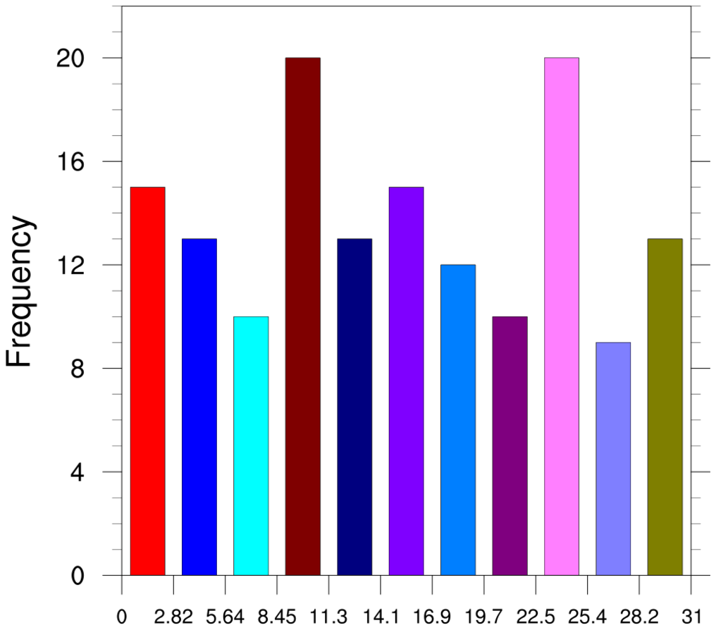
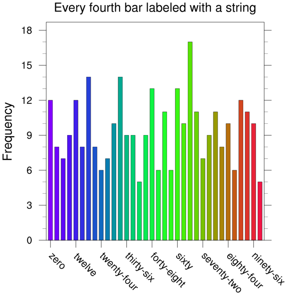
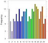 histo_3.ncl
:
An example of using integer values for the discrete bin values.
By default, gsn_histogram will bin
your data into intervals. If you set gsnHistogramDiscreteBinValues, then your data is
assumed to already be "binned", and it just counts the number of
values exactly equal to the mid points. The resource gsnHistogramDiscreteClassValues behaves the same
way.
In this example we used ispan to create an integer
array of bin values.
If you want to change the labels on the X axis, then you need to
set tmXBLabels to the desired
labels. Note that in this example, only every other bar is labeled,
so if you want to label every bar, you additionally need to set
tmXBLabelStride to 1 (it is set internally to 2 in this case).
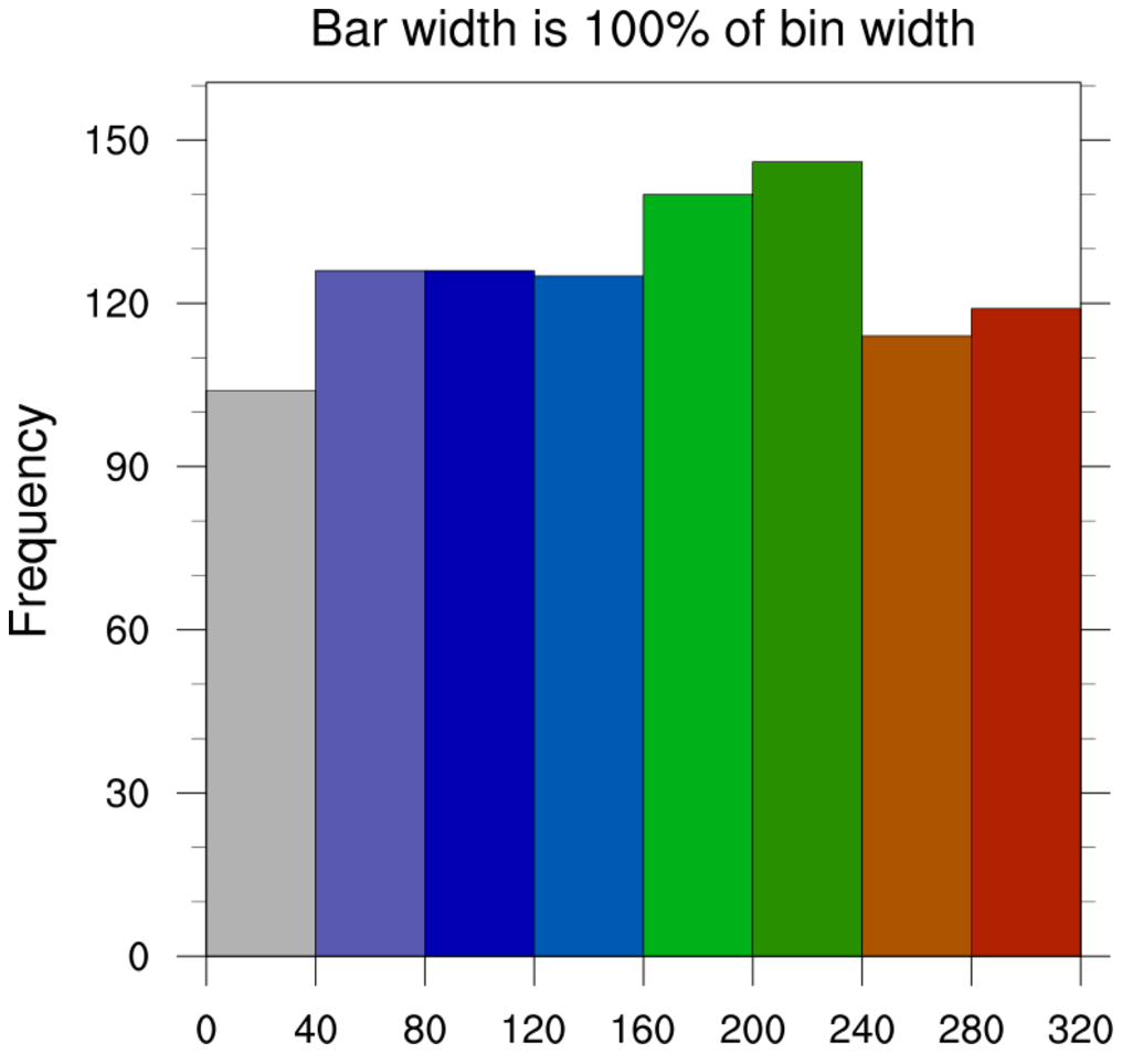
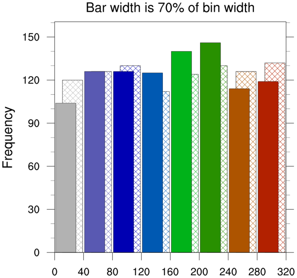
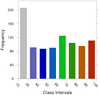 histo_5.ncl
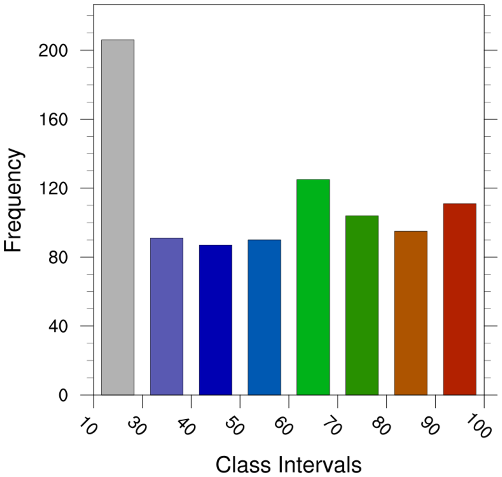
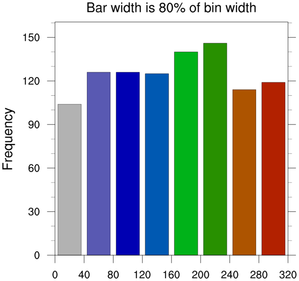
: Explicitly select the
bin intervals.
gsnHistogramClassIntervals allows the
user to specify bin intervals. Note that with these different sized
bins, the size of the histogram column remains the same by default.
If there is data outside the range of the bins you have chosen, they
will not be counted. You can set gsnHistogramMinMaxBinsOn to get a bins that
include all values that are greater than and less than the max and min
bins you have selected. This resource only works when gsnHistogramClassIntervals or gsnHistogramBinIntervals is also selected.
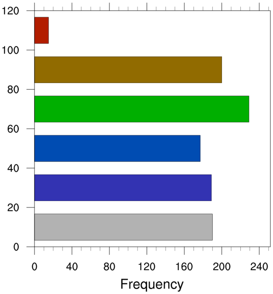
 histo_6.ncl
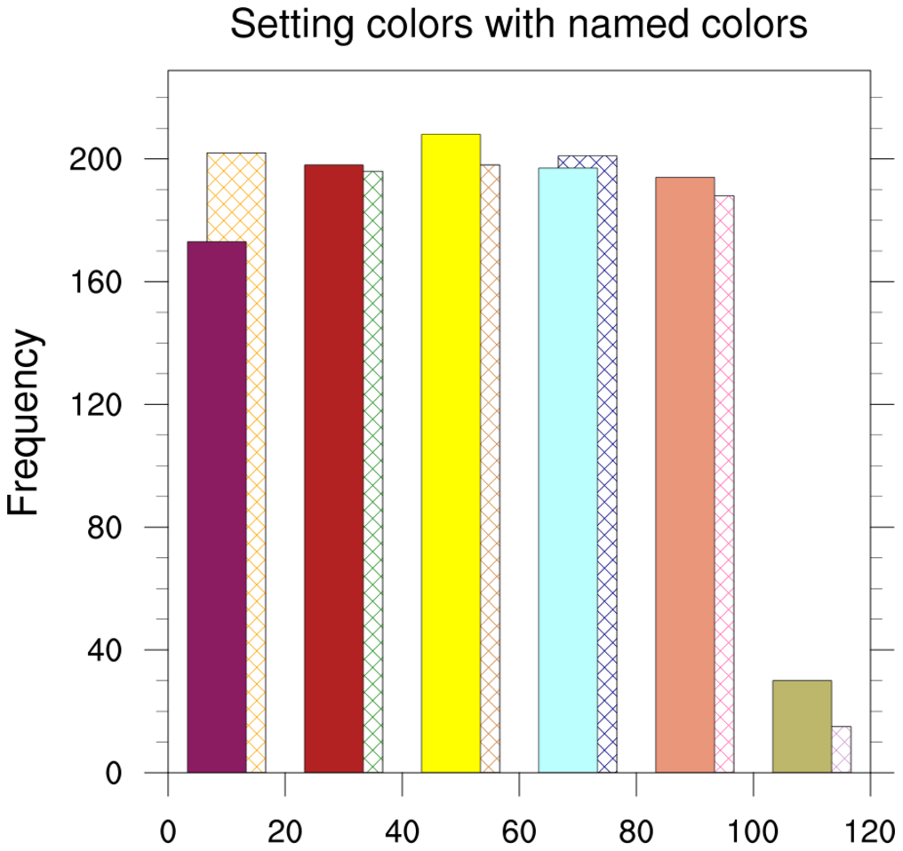
: Compares two arrays.
Both arrays are combined into a single array with the first dimension
equal to 2.
gsnHistogramCompare, will create two
histograms, one set of bars drawn behind the other.
In the second frame, the colors for each bar are explicitly set with
gsnHistogramBarColors, a new
resource only available in NCL V6.4.0 or later.
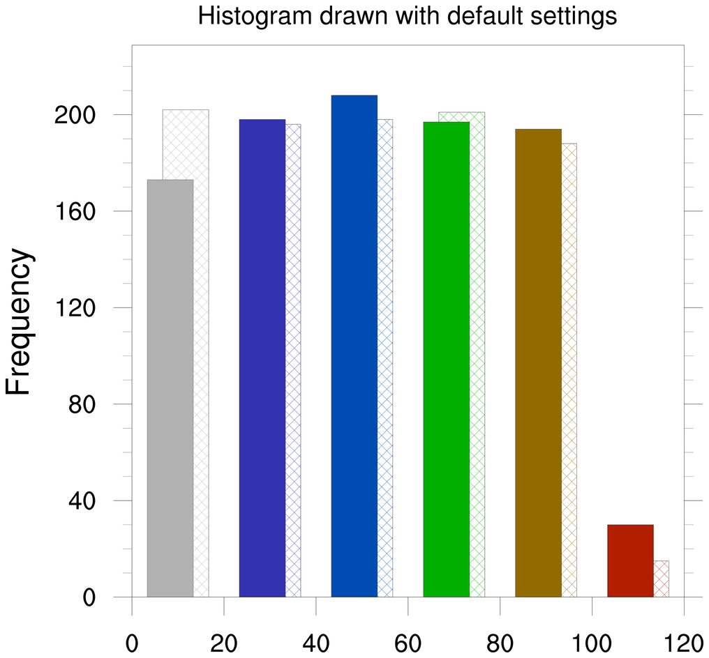
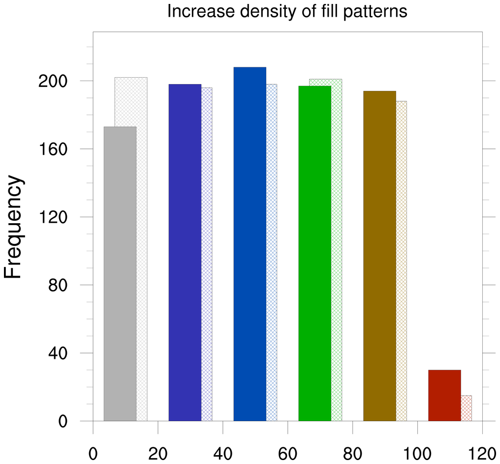
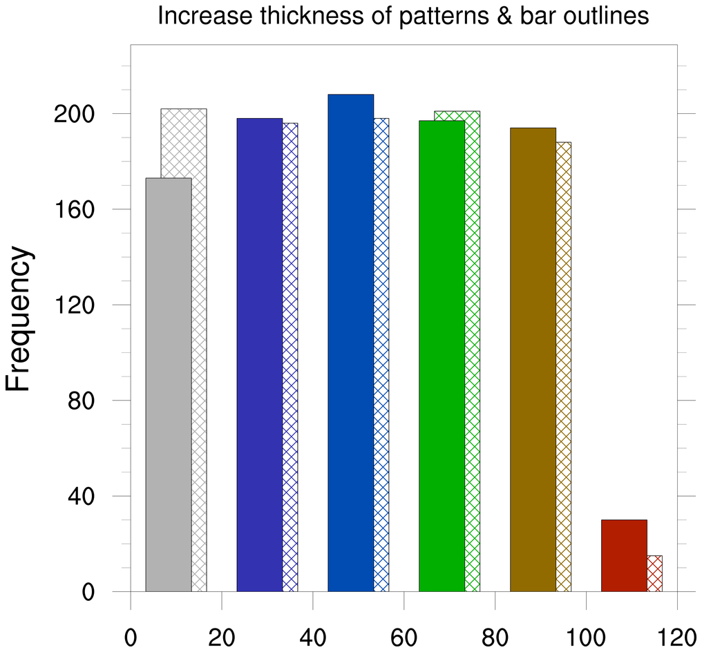
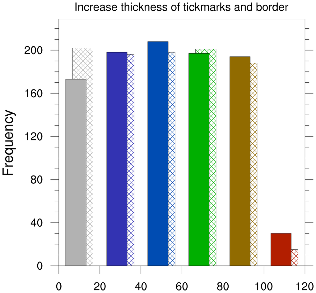
 histo_7.ncl
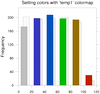
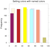
: Demonstrates changing the
color of the bins.
gsFillColor controls the color
of the bins. If you set it equal to one color the entire histogram
will be that color. If you set it to an array of colors it will cycle
through that array and repeat if necessary.
gsFillIndex will change the fill
pattern. Default is 0 or solid fill. There are many fill patterns to
choose from. gsFillIndex will
change the fill pattern. Default is 0 or solid fill. There are many
fill
patterns to choose from.
 histo_9.ncl
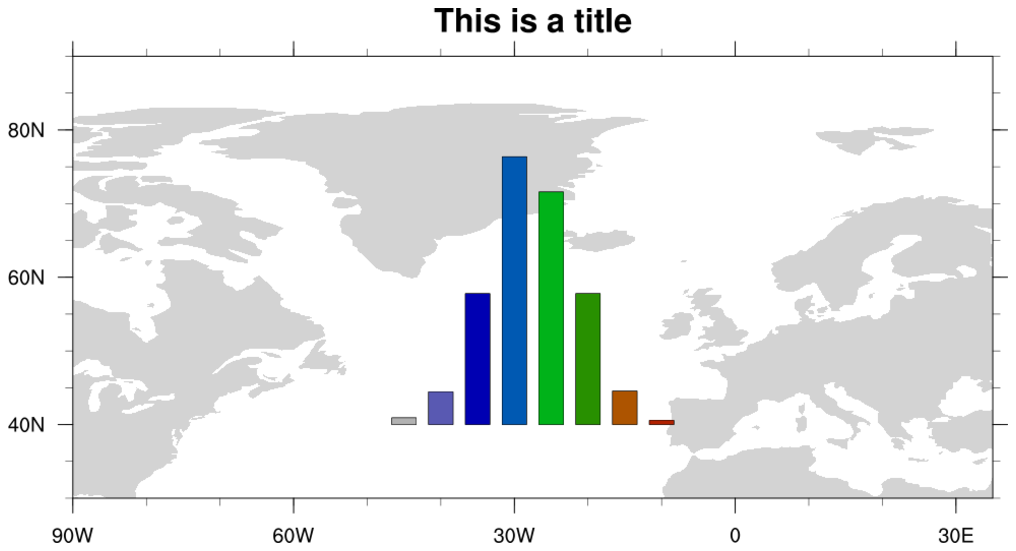
: A highly specialized
plot that draws a histogram on top of a map.
 histo_10.ncl
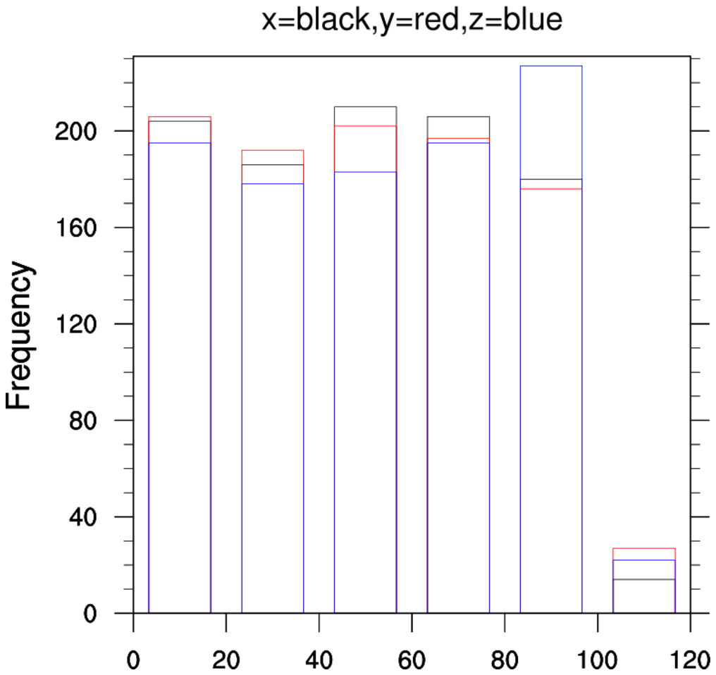
: Demonstrates how to
overlay multiple histograms on top of each other so that more than two
histograms can be compared. If you only have two, see example 6.
First we set the color of the histograms to transparent using gsFillColor, and then color the bin
edges using gsEdgeColor. With
the various colors, you can distinguish the height of the various
bins. The color of the last overlay will be the one on top .
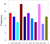
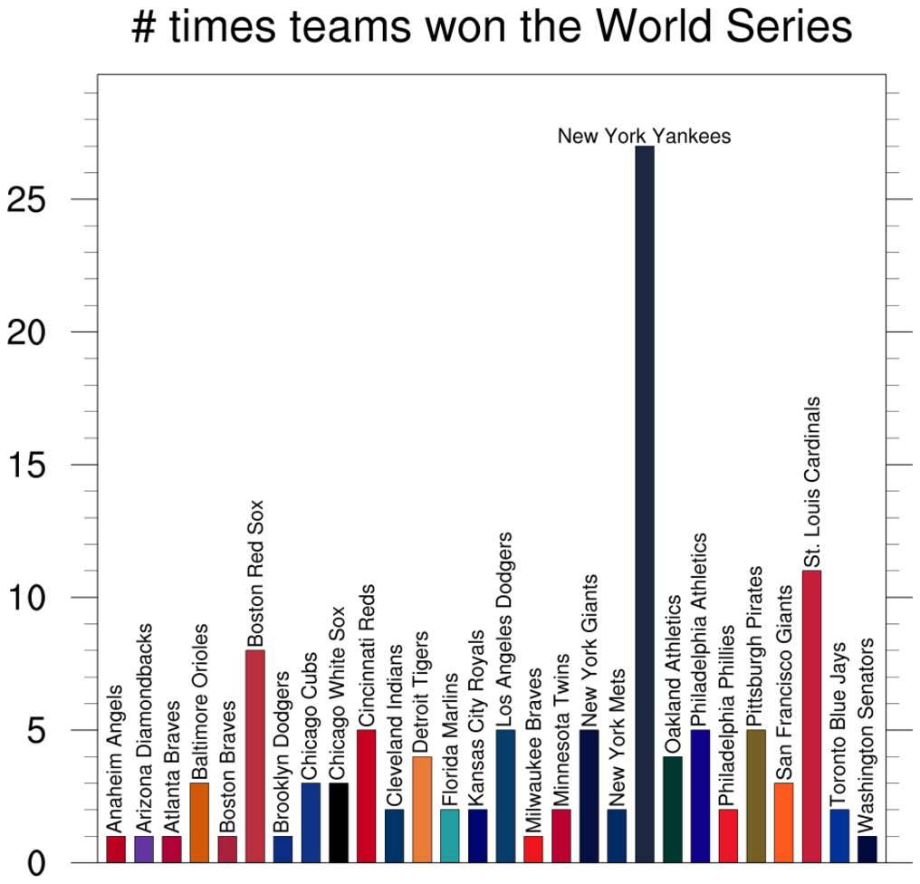
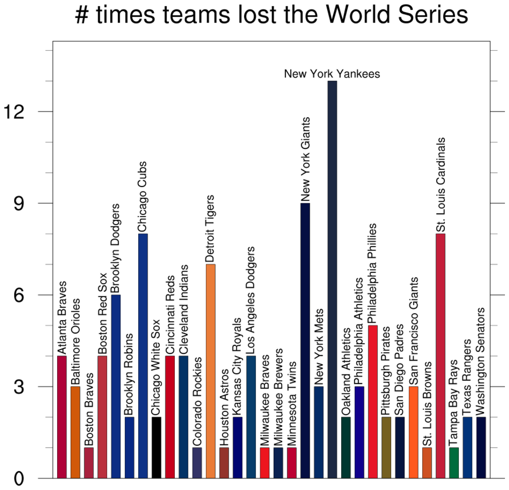
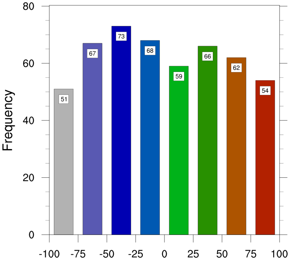
 histo_12.ncl
: Demonstrates how to
add text at the top of each bar, using information returned from
gsn_histogram.
The third frame was added later, showing how to do a histogram
comparison and lots of customization of tickmarks.
 histo_13.ncl
: The tickmarks on the
bottom axis of a histogram are labelled by setting
tmXBMode to "Explicit", and setting
tmXBValues and
tmXBLabels to internally calculated values. The
normal resources for trying to control precision and/or formatting
will not work as expected.
This example demonstrates a kludgy method for reformatting the
tickmark labels on the bottom axis, by using the "BinLocs" attribute
returned by gsn_histogram.
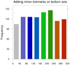 histo_14.ncl
: As explained
in the previous example, you don't have much control over the
tickmarks on the bottom axis. This example shows how to
work around this to add minor tickmarks.
The special resource "MidBarLocs" is used to get the X axis locations
of the middle of each bar, so we can add a minor tickmark. We have to
draw the plot twice, so we can get both major and minor
tickmarks. Because the size of the plot will actually change the
second time, we need to retrieve the
vpXF, vpYF,
vpWidthF, and
vpHeightF resources, and set these
for the second plot.
 histo_15.ncl
: Demonstrates how to
control the labeling of the X axis. You first have to create
the histogram, and then the return plot it will have
several attributes attached that provide information about the
histogram:
- NumInBins - An array containing the number of elements in
each bin or range.
- BinLocs - An array containing the location value of each bin.
- BeginBarLocs - An array that gives the X NDC position of
the beginning of each bar.
- MidBarLocs - An array that gives the X NDC position of
the midpoint of each bar.
- EndBarLocs - An array that gives the X NDC position of
the end of each bar.
For this example, the MidBarLocs array was used to select which
tickmarks to label, and the labels were created manually.
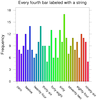
 histo_16.ncl
: Demonstrates how
to use return information from a histogram plot to further
annotate it with text strings indicating the values of each bar.
The return information used is the NumInBins attribute for
the number of values in each bar, and the MidBarLocs
attribute for the X location for the midpoint of each bar.
The gsn_add_text function is used to
attach labels to the top of each bar (first plot), and then inside
each bar (second plot).
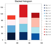 histo_17.ncl
: Demonstrates how
to stack histograms.
This script does it the "lazy" way, by drawing one histogram on top of
another. The key is to draw the histograms with the largest number of
values in each bin first. Each histogram is created first, so we can
calculate the largest bin value. We use this value to "fix" the Y axis
for each plot.
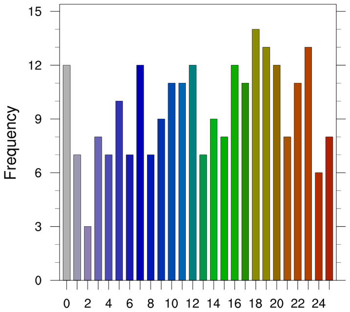
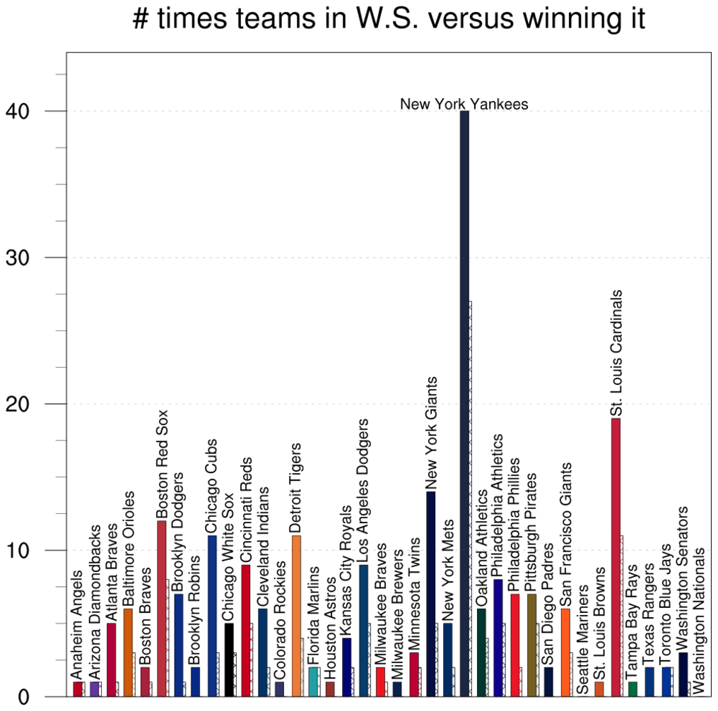
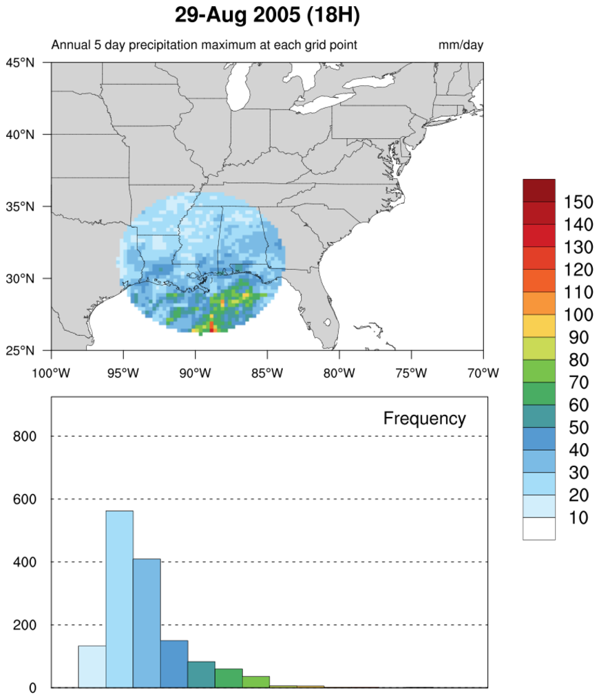
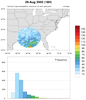 Katrina_circle_hist.ncl
:
This script plots the 5-day running average of precipitation for
an entire year (2005). Included is a histogram
showing the distribution of values for each contour level.
See the Unique examples page
for more details.
This code was contributed by Jake Huff, a Masters student in the
Climate Extremes Modeling Group at Stony Brook University.

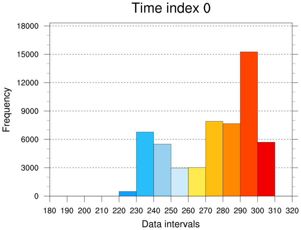
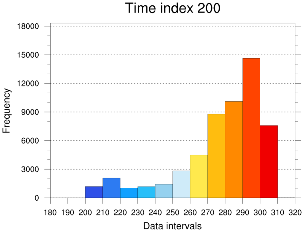
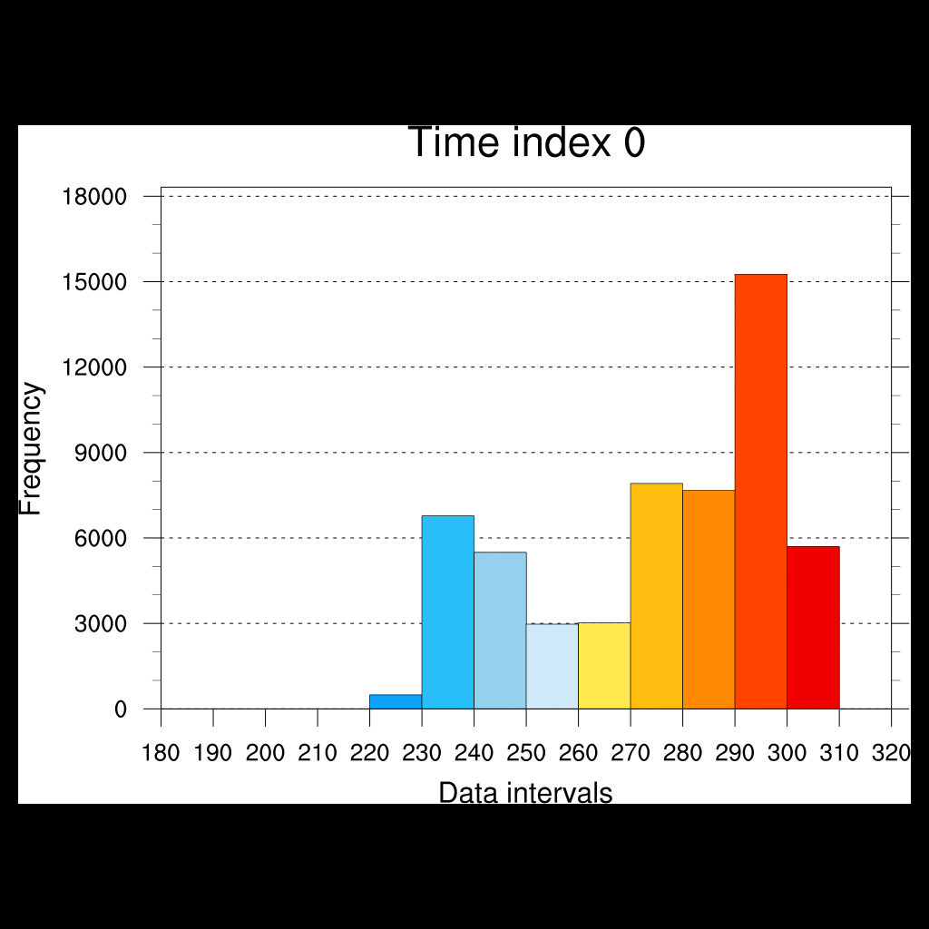
 histo_18.ncl
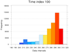
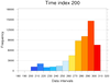
: Creates an animated
histogram showing the distribution of temperature values across a
series of timesteps. This particular variable has 1872 timesteps;
only every 100th timestep is animated.
See the function "print_binned_info" in this script, which calculates
the binned values given a data array and an array of values for
binning. The "draw_histogram" procedure draws each histogram.
The "convert" tool from ImageMagick
is used to convert a series of PNG images to an animated gif.
Only three of the frames are shown here. Click here for the animation.


