NCL Home>
Application examples>
Plot techniques ||
Data files for some examples
Example pages containing:
tips |
resources |
functions/procedures
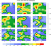
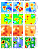
NCL Graphics: Panel Plots
gsn_panel is a powerful procedure
that allows you to "panel" multiple plots on the same page. There are
many
special
gsnPanel
resources that are specific to this procedure.
Note:
gsn_panel calls
draw and
frame automatically for
the user. You do not need to call these after you call
gsn_panel.
A debug tip: setting the panel resource gsnPanelDebug to True causes a bunch of output to
be echoed to the screen, telling you what values are used for the plot
positions and sizes in gsn_panel. You can then use this information
to adjust resources as necessary.
When using gsn_panel it is generally recommended
that you not set gsnMaximize to True in the resource lists
that control the look of the individual plots. When paneling,
gsnMaximize should only be set in the panel resource list, as in
Example 13 or Example 25.
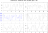
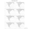
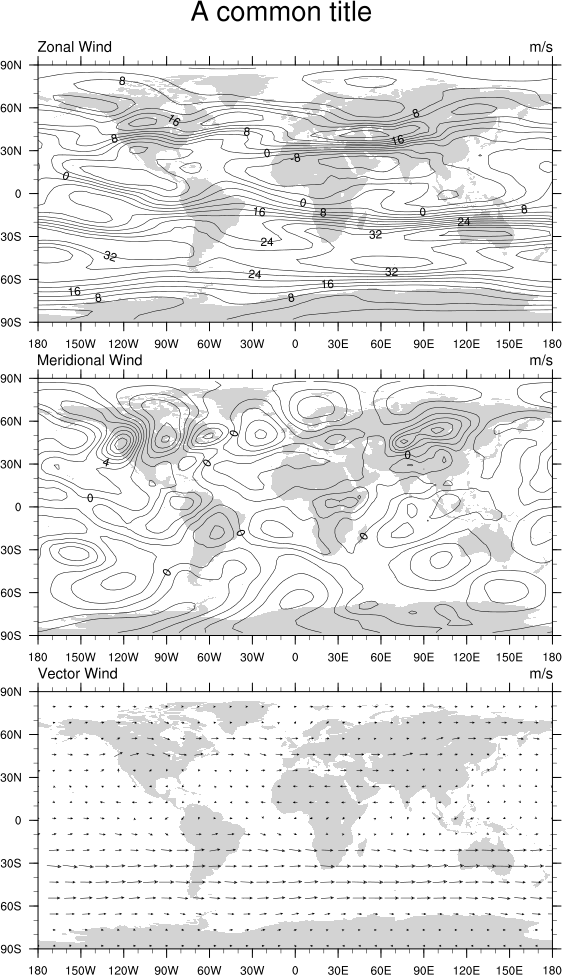
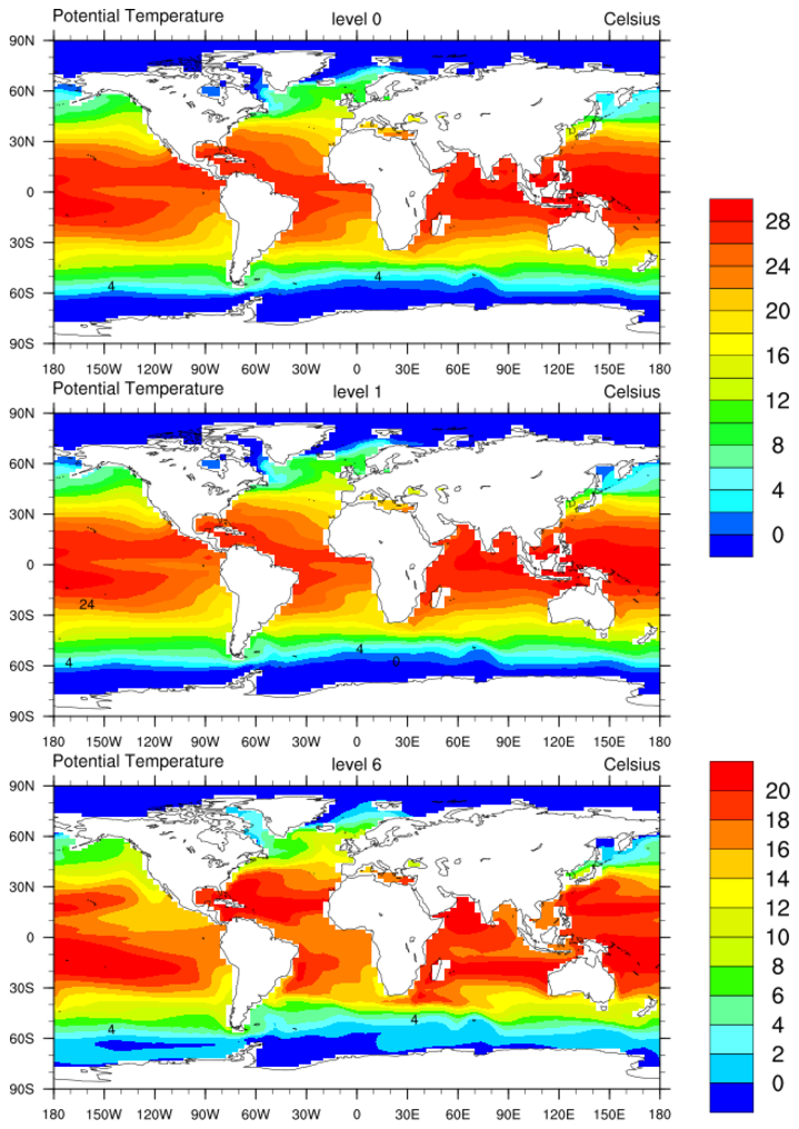
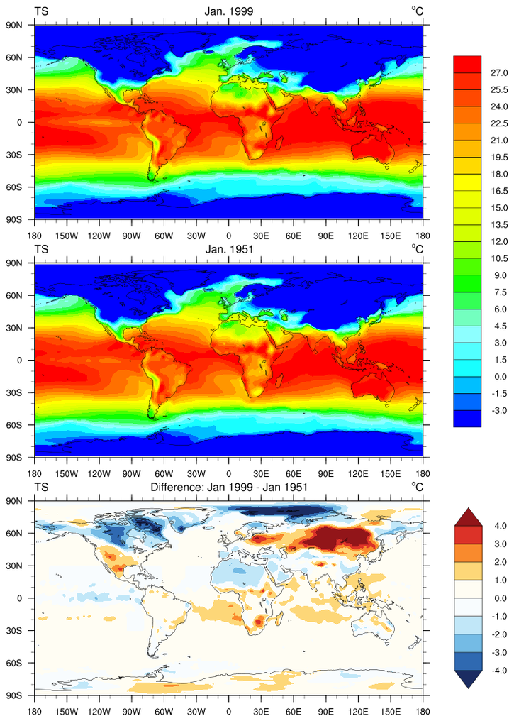
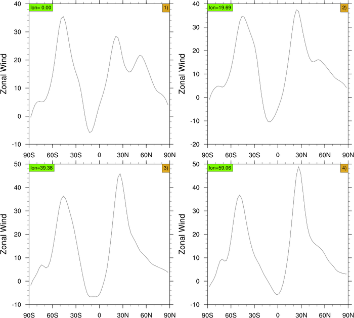
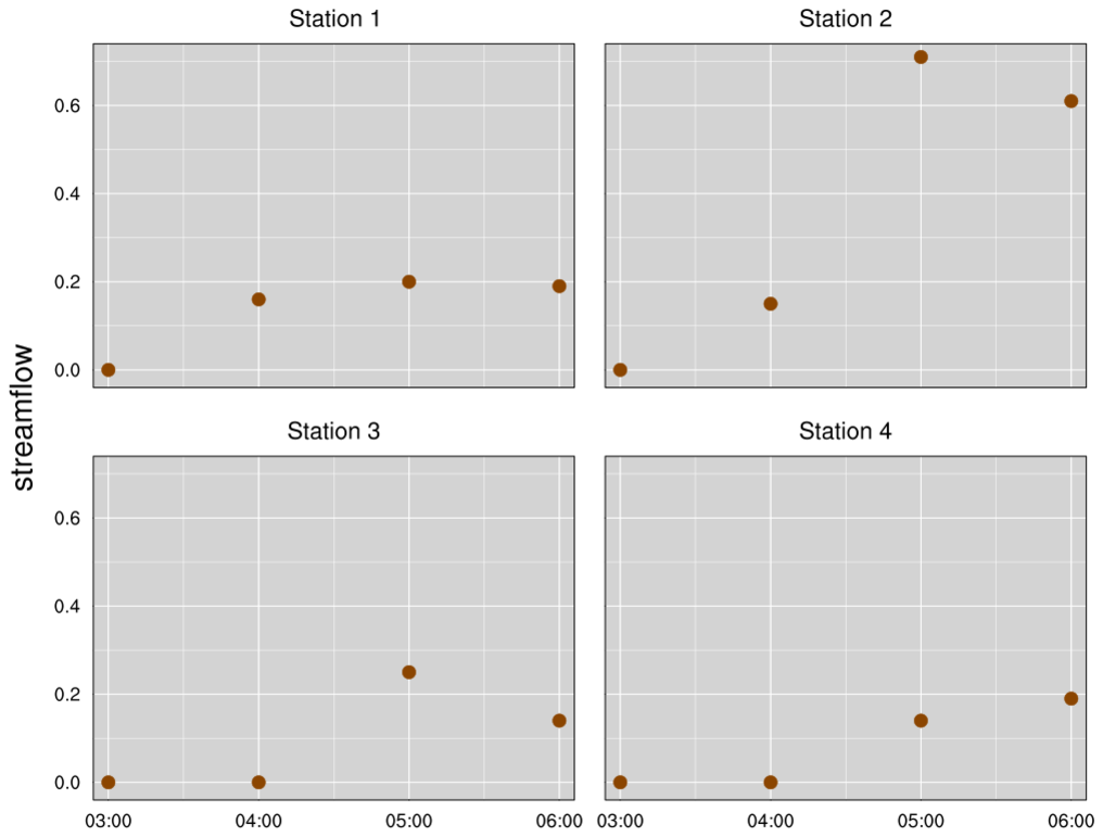
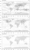 panel_1.ncl
: This is the simplest
panel plot. Three plots are draw and then placed on the page. In most
instances, the user will also want to add a common title or label
bar. Subsequent examples demonstrate these features.
gsn_panel is the plot interface that
creates panel plots.
gsnDraw and gsnFrame should be set to false when drawing the
individual plots so that they can be saved for the panel plot.
You do not, however, need to call these afterwards. gsn_panel calls them for you.
A Python version of this projection is available here.
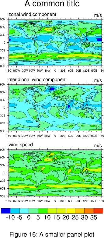
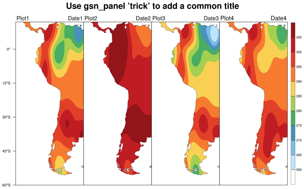
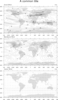 panel_2.ncl
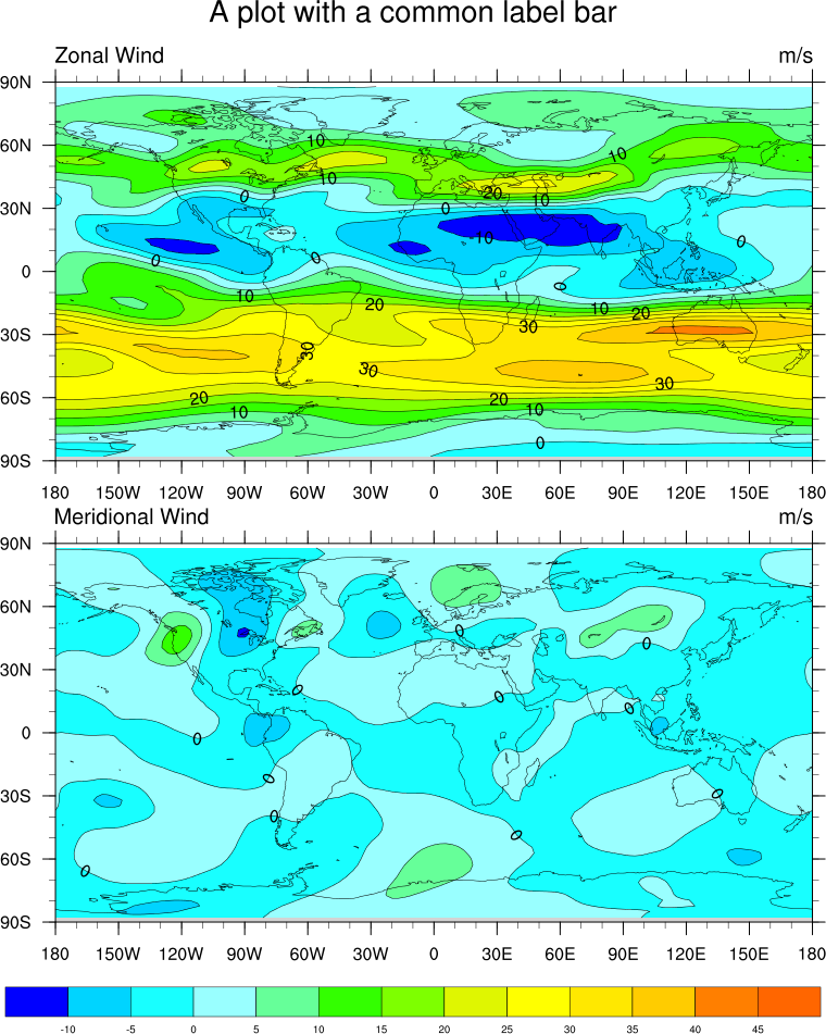
: Adds a common title to
the plot.
To add a title, it is necessary to create a set of resources that are
passed to only the panel template. It is best to give them a different
name than the resources used for the individual plots. (e.g.
resP = True)
In NCL versions 6.4.0 and
later, gsnPanelMainString is the resource
that sets a main title for the paneled plots. In NCL versions 6.3.0
and earlier, txString is the
resource for setting a main string.
A Python version of this projection is available here.
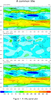
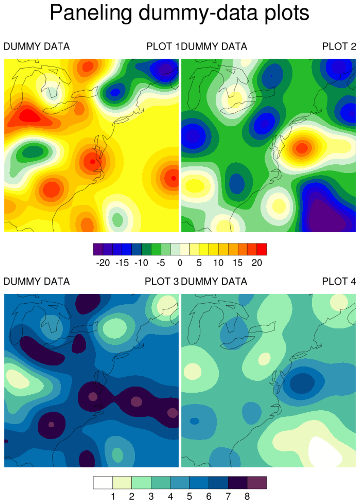
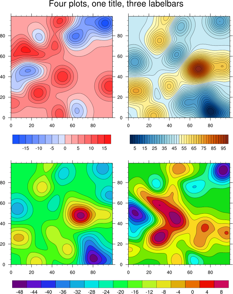
 panel_3.ncl
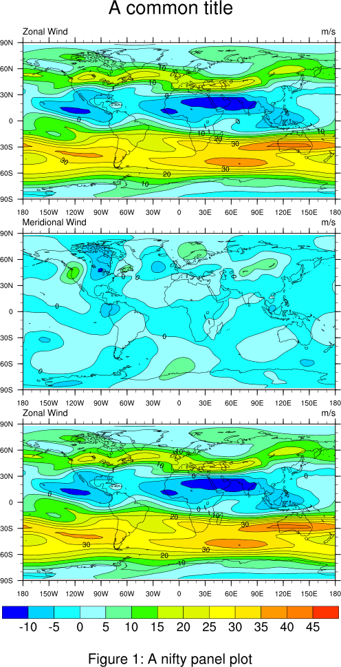
: Adds a common label bar
to the plot.
lbLabelBarOn = False, Turns off the
individual label bars, while gsnPanelLabelBar = True, adds a common label bar
at the bottom of the plot. lbLabelFontHeightF is used to decrease the
labels sizes of the common labelbar.
Remember to manually set the contour levels so that each plot has the
same interval. The common label bar is draw from the first plot, and
assumes all are the same.
A Python version of this projection is available here.
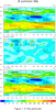
 panel_4.ncl
: Adds some space at the
bottom of the plot for more text.
gsnPanelBottom = 0.05, Is the panel plot
resource that adds space at the bottom of the plot.
 panel_5.ncl
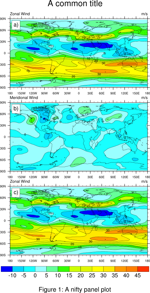
: Automatically adds text
strings to the panel plot. These strings can be anything you want, but
the text used here is most common.
gsnPanelFigureStrings = (/"a)","b)"/), is
the resource that will add a string to a corner in a panel plot.
The default position is the bottom right-hand corner. In this
example, we use amJust "TopLeft",
to move them to the upper left-hand corner.
Additionally, amOrthogonalPosF
and amParallelPosF will how close
the boxes are to the axis. Zero is the center of the line, and 0.5 is
flush with the right and -0.5 is flush with the left.
You can
use gsnPanelFigureStringsFontHeightF to
adjust the font heights of the figure strings. Values range between 0
and 1, with the default being 0.01
You can use gsnPanelFigureStringsPerimOn
to turn off the box around the FigureString, and
gsnPanelFigureStringsBackgroundFillColor to change the
background color.
A Python version of this projection is available here.
 panel_6.ncl
: Demonstrates the
addition of white space to a panel plot. The first figure contains no
white space. You can see it is somewhat cramped. The second figure as
5% white space added in both x and y. It looks much nicer.
gsnPanelYWhiteSpacePercent = 5
gsnPanelXWhiteSpacePercent = 5, Adds the
white space to the panel plot.
A Python version of this projection is available here.
 panel_7.ncl
: An example of a
compressed panel plot. In this case we remove the longitude labels and
tickmarks from the first two plots and keep only the one on the
bottom. Since the plot template judges the spacing of the panel plot
from the first plot, we need to add just a bit of space at the bottom
like we did in example 4 in order to see the long labels on the bottom
plot.
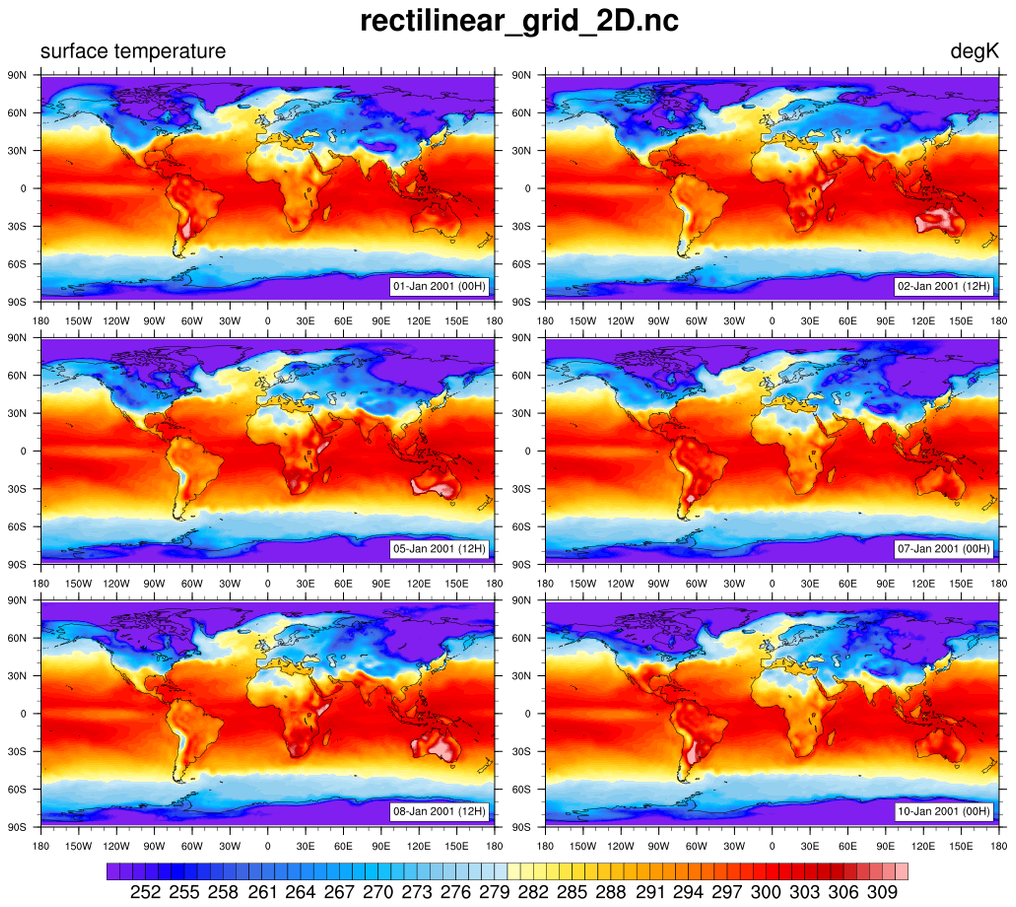
 panel_8.ncl
: Similar to example 7,
except that we really start turning the tickmarks and their associated
labels on and off.
 panel_9.ncl
: Create a panel plot
using viewport specifications. This is required if the plots are of
different shapes.
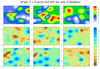
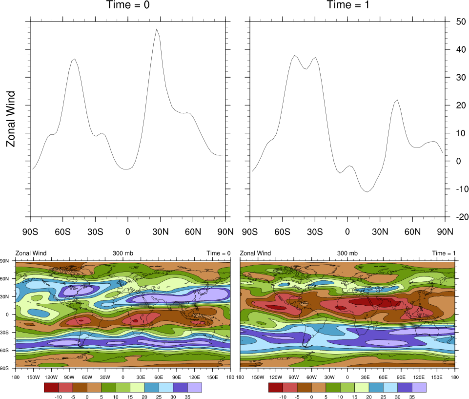
 panel_10.ncl
 /
panel_attach_10.ncl: There may be time
when it is necessary to panel plots next to each other that have
different sizes. If these plots can be attached, then the resulting
new plot can be paneled.
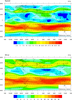
In this example, we attach a zonal average plot to a Hovmueller
diagram. The result is one plot that could then be paneled (see
panel_attach_10.ncl). This
second script uses the nice
"time_axis_labels" procedure to
generate nice time labels on the Y axis.
gsn_attach_plots is the plot
interface that will attach the a group plots along the y-axis
(default).
     _________________________________
     |       |       |       |       |
     | plot1 | plot2 | plot3 | plot4 |
     |       |       |       |       |
     _________________________________
If you set
gsnAttachBorderOn to False,
then it will remove the interior borders and look like this:
     _________________________________
     |                               |
     | plot1   plot2   plot3   plot4 |
     |                               |
     _________________________________
If you set
gsnAttachPlotsXAxis to True,
then the plot will be attached along the x-axis.
 gsnAttachBorderOn      gsnAttachBorderOn
  = True (default)           = False
     _________              _________
     |       |              |       |
     | plot1 |              | plot1 |
     |       |              |       |
     |-------|              |       |
     |       |              |       |
     | plot2 |              | plot2 |
     |       |              |       |
     |-------|              |       |
     |       |              |       |
     | plot3 |              | plot3 |
     |       |              |       |
     |-------|              |       |
     |       |              |       |
     | plot4 |              | plot4 |
     |       |              |       |
     ---------              ---------
Draw each plot separately, but then fine tune once you see them
attached, and "scrunched". In our example, we removed the minor
tickmarks and only plotted every other x-axis label.
HOW TO PANEL ATTACHED PLOTS:
- Ensure that each plot is given a unique variable name that is
never overwritten:
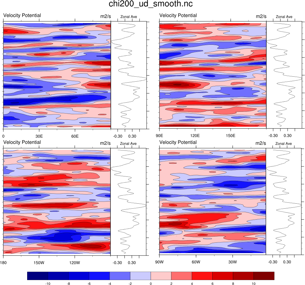
  plot1  = gsn_csm_hov (wks, chi(:,{0:100}), hres)
  xyplt1 = gsn_csm_xy(wks, x,y,xyres)
  plot2  = gsn_csm_hov(wks, chi(:,{220:320}), hres)
  xyplt2 = gsn_csm_xy(wks, x,y,xyres)
- The function gsn_attach_plots
returns a special id number (an integer), and not a plot (a graphical
object).
  attachres1 = True

  attachres1@gsnAttachPlotsXAxis = True ; attaches along x-axis

  attachres2 = True

  attachid1  =
  gsn_attach_plots(plot1,xyplt1,attachres1,attachres2)

  attachid2  =
  gsn_attach_plots(plot2,xyplt2,attachres1,attachres2)
- The attached plot is now the first plot in the function call.
herefore, feed this into the panel procedure:
gsn_panel(wks,(/plot1,plot2/),(/2,1/),False)
- If you were so inclined the special id number could be used to
"unattach" an already attached plot by:
NhlRemoveAnnotation(plot1,attachid1)
plot1 would now only contain the original Hovmueller diagram.
A Python version of panel_10 is available here.
 panel_11.ncl
: As of NCL version
4.2.0.a012,
gsn_panel has the option
of specifying how many plots should be placed on each row. To do this,
set
gsnPanelRowSpec = True.
The default layout is for the plots to be centered. You can change
this by setting gsnPanelCenter = False.
 panel_12.ncl
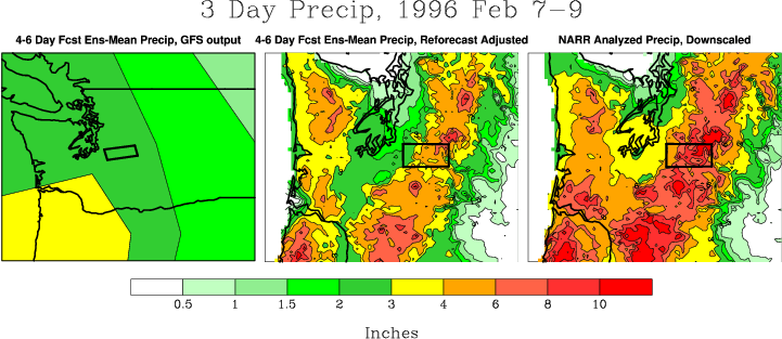
: Demonstrates putting two separate panel plots on one page, so that each can have its own unique label bar.
The important thing to remember here, is to create two separate plot
arrays to hold the individual plots for both panels. This is required
b/c the label bar is taken from the last plot drawn.
gsnPanelRight = 0.5, tells the plot to
only draw on the left 50% of the page, while gsnPanelLeft = 0.5, tells the plot to only draw
on the right 50% of the page.
 panel_13.ncl
: Demonstrates paneling
plots created with
overlay.
A Python version of this projection is available here.
 panel_14.ncl
: Demonstrates
combining a two-panel panel plot with two manually placed line
plots. This is required b/c
gsn_panel assumes all the plots are the same
size, and these plots are different enough to prevent their lining up
axis to axis. Thanks to Keith Lindsay for this example.
The trick here is to divide the page into two sections. The lower
section will just be for the contoured panel plot and its common label
bar. We can tell gsn_panel to only
draw its result in the lower half of the page by setting gsnPanelTop to 0.5.
Next, we make sure the width of the xy plots is the same as the
contour plots by setting vpWidthF to its
appropriate value. Finally, we exactly position each of the two xy
plots in ndc space so that their axis line up with the contour
plots. This is done by setting vpXF to
its appropriate value.
pmLabelBarWidthF is used to increase
the width of the labelbar.
 panel_15.ncl
: Demonstrates paneling
two sets of contour plots on the same page, each with its own labelbar.
You must download
panel_two_sets.ncl
for this script to run.
The panel_two_sets procedure is similar to gsn_panel, except you
give it two sets of plots to panel, each with their own dimensions for
paneling and their own panel resources. There's a third resource list
that is solely for setting the gsnPanelTop /
gsnPanelBottom /
gsnPanelLeft /
gsnPanelRight resources if needed.
The two sets of plots can be paneled side-by-side in a "horizontal"
configuration, with the labelbars appearing at the bottom, or in a
top-and-bottom "vertical" configuration, with the labelbars appearing
at the right. This function will figure out the orientation to use
based on two dimension arguments.
For example, if you have 6 plots that you want to panel in a 3 x 4
configuration and 3 plots that you want to panel in a 2 x 4
configuration, then all the plots will be drawn in a single 5 x 4
configuration with the 3 x 4 plots appearing on top, the the 2 x 4
plots on the bottom. They will each have a horizontal labelbar
appearing at the bottom.
If you have a set of 2 x 3 plots and a set of 2 x 2 plots, then the plots
will be drawn in a 2 x 5 configuration, with the 2 x 3 plots on the left,
and the 2 x 2 plots on the right, and vertical labelbars appearing at the right.
For a horizontal configuration, the two sets of plots must each be
paneled using the same number of rows.
For a vertical configuration, the two plots must have must be
paneled using the same number of columns.
A Python version of this projection is available here.
 panel_15_old.ncl
: Demonstrates using
gsn_panel twice in order to get
groups of plots with different label bars.
Note: see panel_15.ncl above for a function that makes it easier to
panel two sets of contour plots, each with their own labelbar. This
example is an older version that is being kept for historical
purposes.
The trick here is the setting of gsnPanelBottom and gsnPanelTop for the two respective panel
plots. For the first panel, we move the bottom up to 0.4, which leaves
0.6 for the two panel plot. This means that each plot will be 0.3 in
size. For the third, single panel plot, we draw only up to where the
upper plot ended at 0.4. One more step is required, and that is to
move the bottom of the bottom panel up to 0.1 so that the total draw
area for this plot equals 0.3, just like we have for the upper
plots. If you do not set gsnPanelBottom
in this case, then the bottom plot has 0.4 space and will not be the
same size as the upper two plots.
 panel_16.ncl
: Demonstrates using
gsnPanelBottom and
gsnPanelTop to "squeeze" the panel plots to
approximately a column width for use in a publication. By setting
gsnPanelTop = .9 and
gsnPanelBottom = .2, the panel plots are drawn
on .7 of the page instead of the entire page. This is a very easy way
to shrink panel plots to a desired size.
 panel_17.ncl
: Demonstrates how to
panel four plots that have two separate labelbars and a main title.
The
gsnPanelTop and
gsnPanelBottom resources are used to make sure
the two sets of plots are drawn in an area of the same size so that
the plots are the same size, and then a small area is reserved for
drawing the main title using
gsn_text_ndc. The
generate_2d_array function is used to generate
dummy data for this example.
 panel_trilbar_17.ncl
:
This example is similar
to
panel_17.ncl, except it shows
how to get triangle ends on the labelbar by setting
the
lbBoxEndCapStyle resource to one
of three values: "TriangleLowEnd", "TriangleHighEnd",
"TriangleBothEnds". The default for this resource is "RectangleEnds".
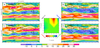
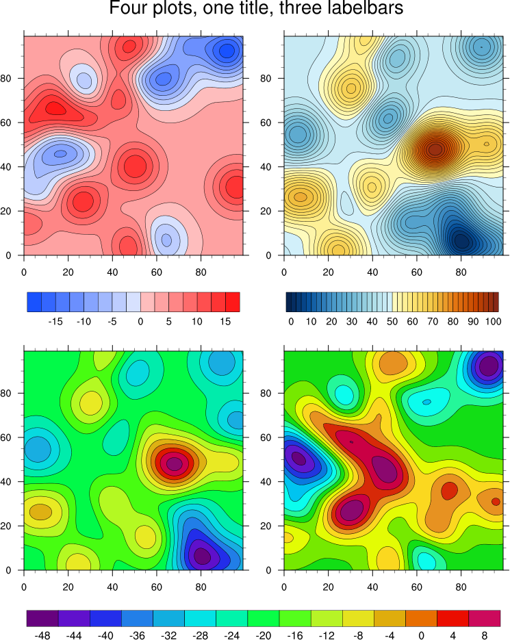
 panel_18.ncl
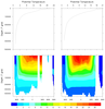
: Similar to
example 15, this
example demonstrates that the label bar need not explicitly have color in the middle.
This is shown in the bottom panel, as
cnFillColors
is manually being set, and the background color (0, = white for BlAqGrYeOrRe colormap)
is used to fill in all areas between -1 and 1.
You must download panel_two_sets.ncl
for this script to run.
See example panel_33.ncl for
another version of this plot, but with more plots, and using newer NCL
features to define the color map for each set of contours.
 panel_19.ncl
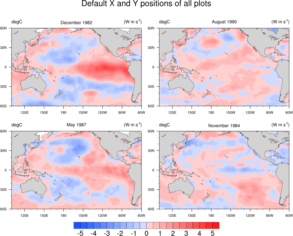
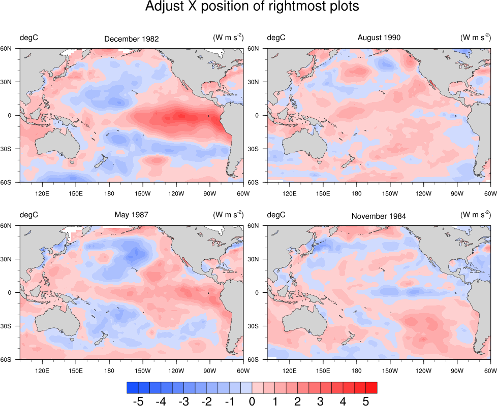
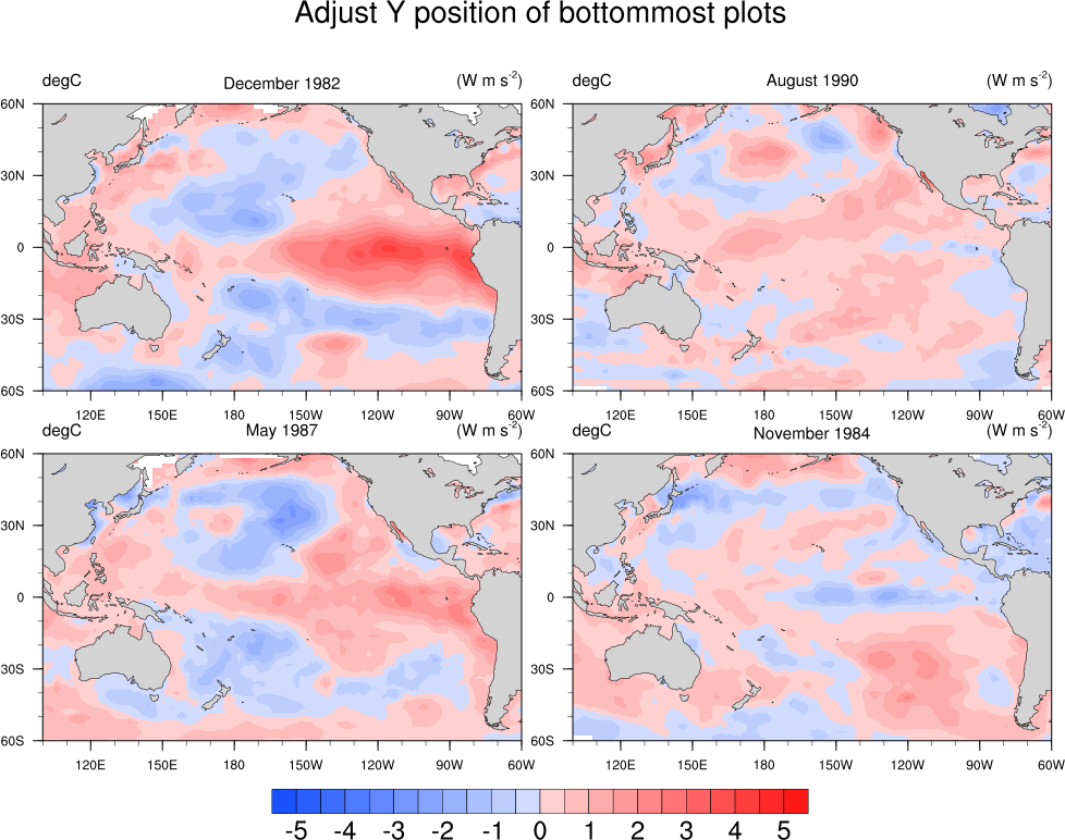
: This example shows
how to use the
gsnPanelXF and
gsnPanelYF resources to adjust the X and/or Y
NDC positions of the upper left
corners of plots in a panel. The first frame shows the paneled plots
without adjustments, and the remaining two have both X and Y
adjustments.
These resources must be arrays of the same size as the number of plots
you have. Any individual plots that you don't want to adjust,
you can set a negative value and the default value will be used.
You can optionally set gsnPanelDebug
to True to have some debug information about the default X and Y
positions being used, so you know approximately how much to tweak
the values.
These resources will be added in version 4.3.0.
 panel_20.ncl
: This example shows
how to use viewport resources
vpXF,
vpYF,
vpWidthF, and
vpHeightF, to panel different-sized plots.
If you try to use
gsn_panel, you
will get unexpected results.
In order to maximize these four plots in the frame, the procedure
maximize_output is used.
A Python version of this projection is available here.
 panel_21.ncl
: This example shows
how to add a common title, and common x-axis and y-axis labels to a
panel plot using
gsn_text_ndc and
the
gsnPanelLeft,
gsnPanelRight resources.
It also shows how to move the labelbar closer to the panelled plots
using the special pmLabelBarOrthogonalPosF resource.
(Similarly, pmLabelBarParallelPosF can be used to
move the labelbar parallel to the panelled plots.)
This script was written by Jonathan Vigh, a PhD candidate student in
the Atmospheric Sciences department at Colorado State University.
 panel_22.ncl
: This example shows
how to add individual common titles to a panel plot that actually
contains two panelled plots (each 2 rows x 1 column).
In NCL versions 6.4.0 and
later, use gsnPanelMainString to
set a main title for the paneled plots, and
gsnPanelMainPosXF to position it. You
need to use a value between 0 and 1, because otherwise both titles
will be exactly centered on the page (=0.5). In NCL versions 6.3.0,
use txString
and txPosXF resource control the
main string.

 panel_23.ncl
: This example shows
how to draw a panel of 4 plots with the plots attached along
the X and Y axes. A common title and labelbar is added.
gsn_panel is NOT being used here.
Instead, the resources vpXF, vpYF, vpWidthF,
and vpHeightF are set to control the
size and location of each plot, and tickmark resources are set to turn
off labels and tickmarks on the various axes.
The second frame is generated by calling maximize_output, which maximizes all objects
in a frame.
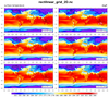
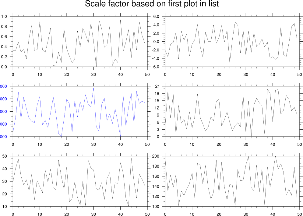
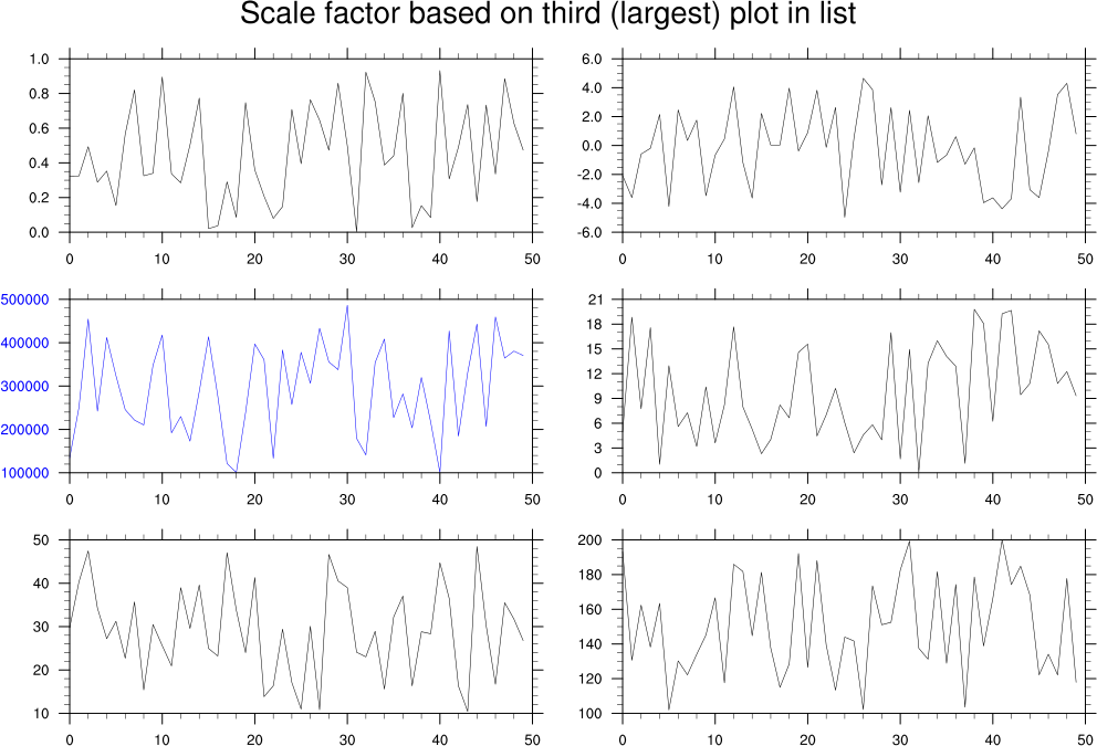
 panel_24.ncl
: This example shows
how to draw a panel of 3 x 2 plots where each plot is a slightly
different size due to Y axis labels that are different lengths.
The first frame shows what the paneled plots looks like, without any
special options set. Note the plot with the blue Y axis labels, and
how they run off the screen.
By setting gsnPanelScalePlotIndex to 2
(the third plot with the labels, counting starts at 0), you can tell
gsn_panel which plot to base the
scale factor on when resizing all the plots (the default is the first
valid plot).
 panel_25.ncl
: This example, which
was contributed by Gary Bates of NOAA, shows how to draw a three plots
in a row, where each plot is the same height, but a different width. A
common labelbar and title is added. If you draw the default panel
plot, the plots run into each other.
To fix this, Gary set the resources gsnPanelXWhiteSpacePercent
and gsnPanelYWhiteSpacePercent to 2.0 to add some
white space between each plot.
With plots like this, you may find it easier to position the plots
yourself using the vpXF, vpYF, vpWidthF,
and vpHeightF resources. However,
you will then need to create the title and common labelbar yourself.
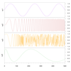
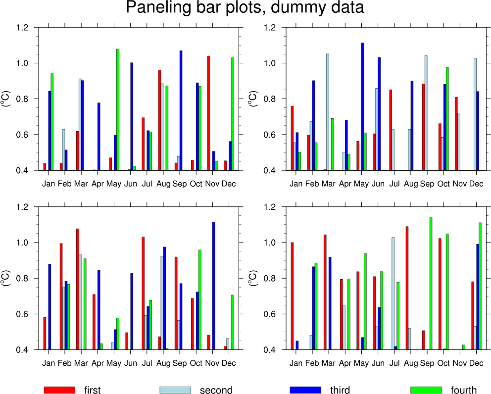
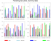 bar_11.ncl
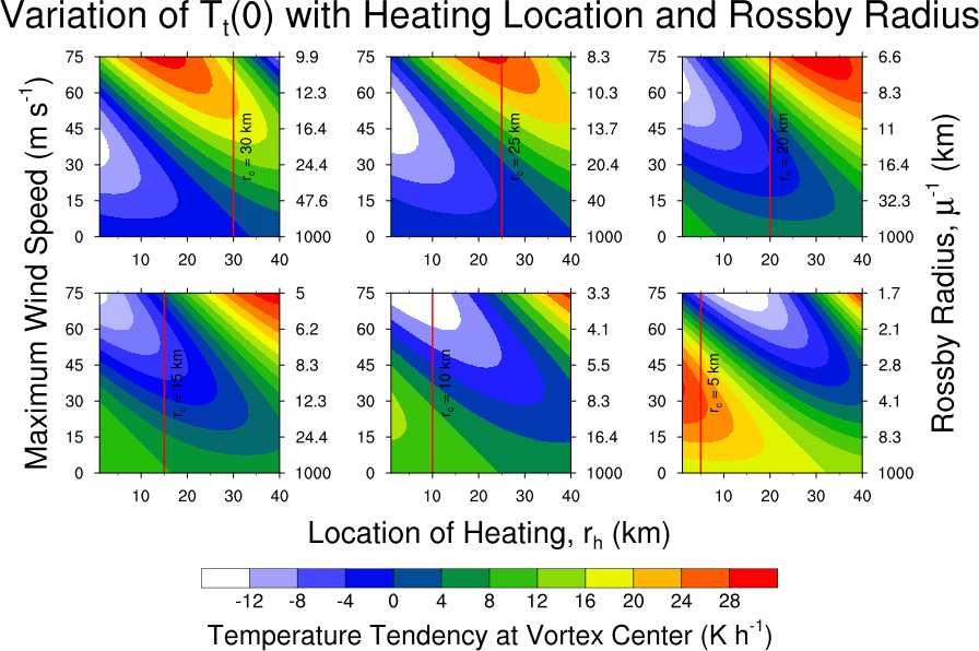
: This script shows how to
panel multiple bar charts and add a custom legend (using labelbars).
This example uses the overlay procedure to overlay
the individual bar plots. Finally, it uses gsn_panel to panel the four sets of plots.
See the bar chart page for more examples of
bar plots.
 panel_26.ncl
: This example shows
how to draw multiple sets of paneled plots on one page, each with
their own colormap.
An unadvertised function is used, "gsn_panel_return", which returns
the objects created
by gsn_panel. This allows us to get
the size of the paneled plots so we can draw the remaining ones right
next to the previous ones.
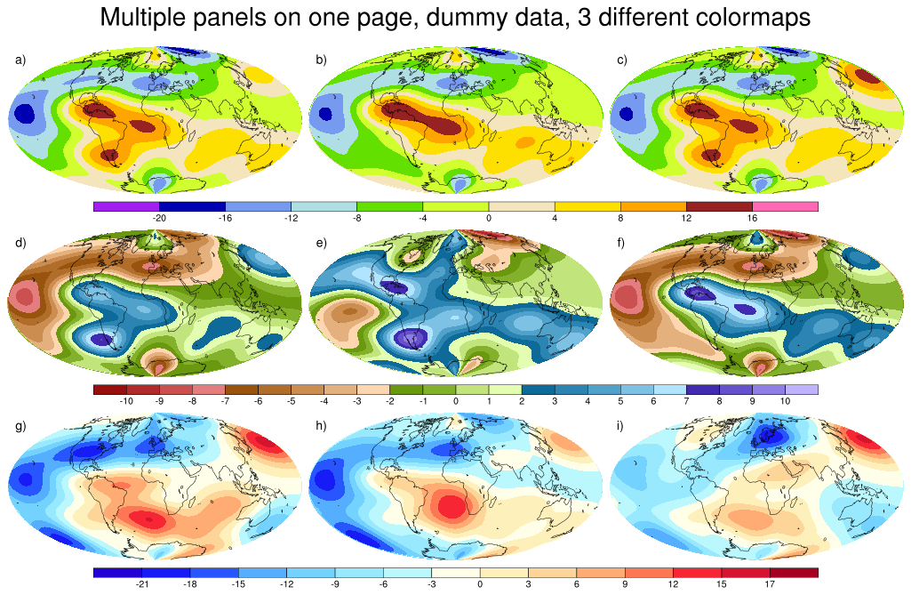
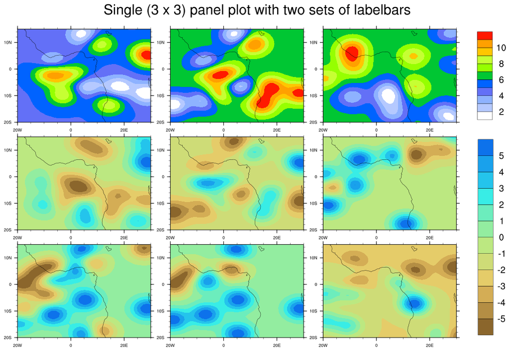
 panel_27.ncl
: This example shows
how to draw a vertical shaded labelbar and a horizontal color
labelbar on a 3 x 3 panel plot. The plots were created using
dummy data, and have shaded contours overlaid on filled contours
overlaid on a map.
The horizontal labelbar is added via the usual
gsnPanelLabelBar resource,
and the vertical labelbar is added using
gsn_create_labelbar.
This is not the cleanest solution, because creating a labelbar
yourself can require setting quite a few resources. See the "labelbar"
function in this script.
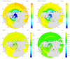
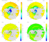
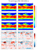
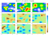
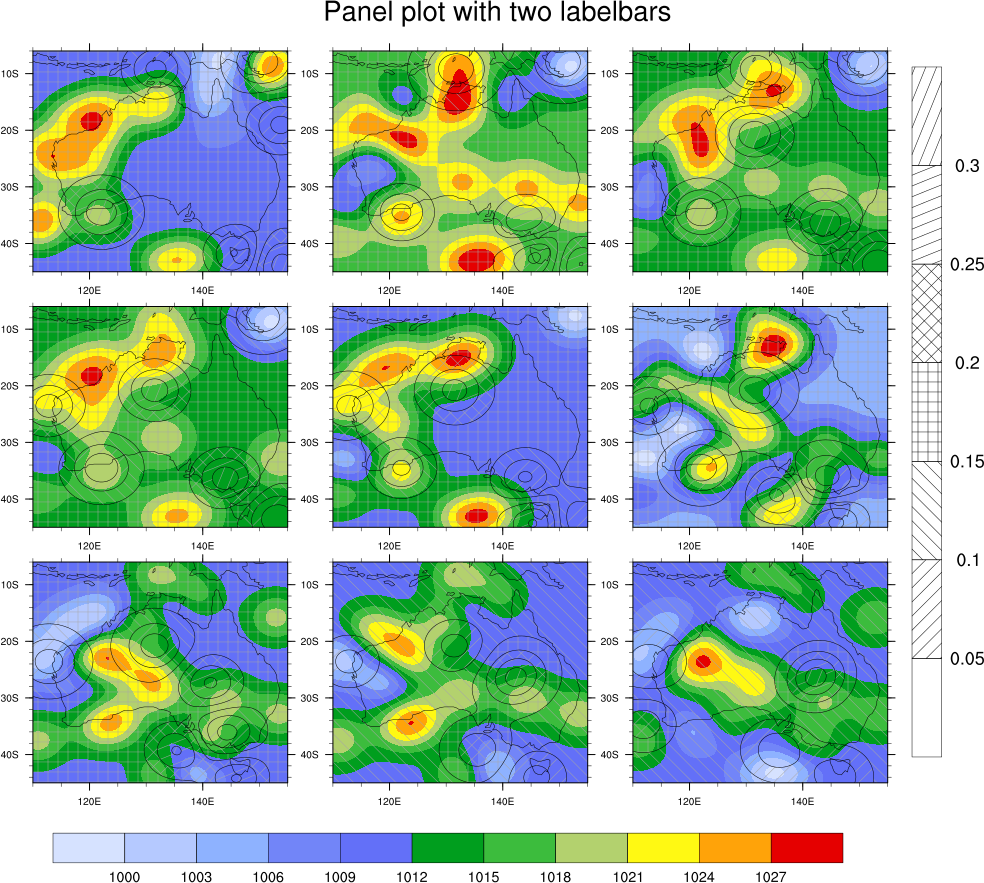
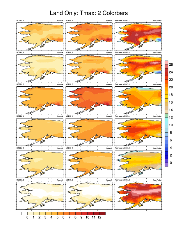
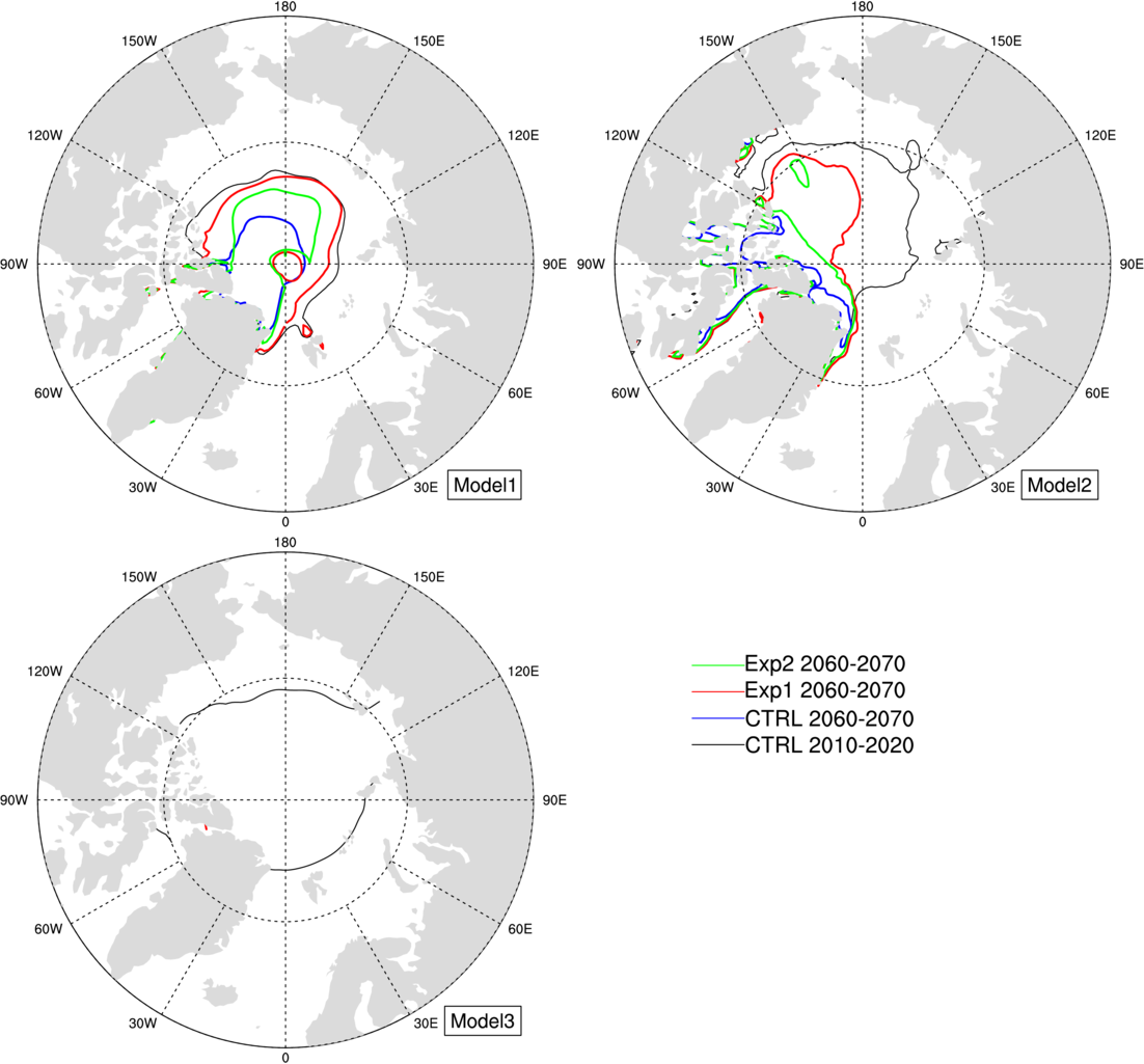
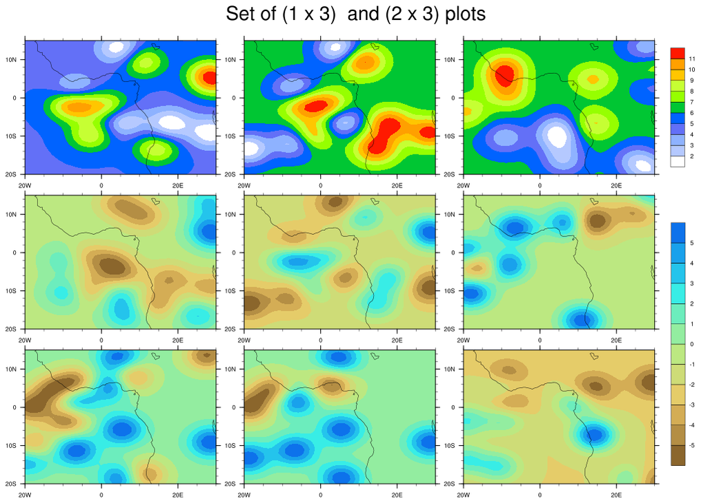
 panel_29.ncl
:
This shows how to draw two separate labelbars for variables
with different spans.
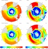
The leftmost two columns are future scenarios. The right column contains
different model reference periods. NCL's masking is used to plot only
the land area.
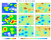
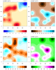
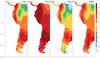
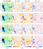
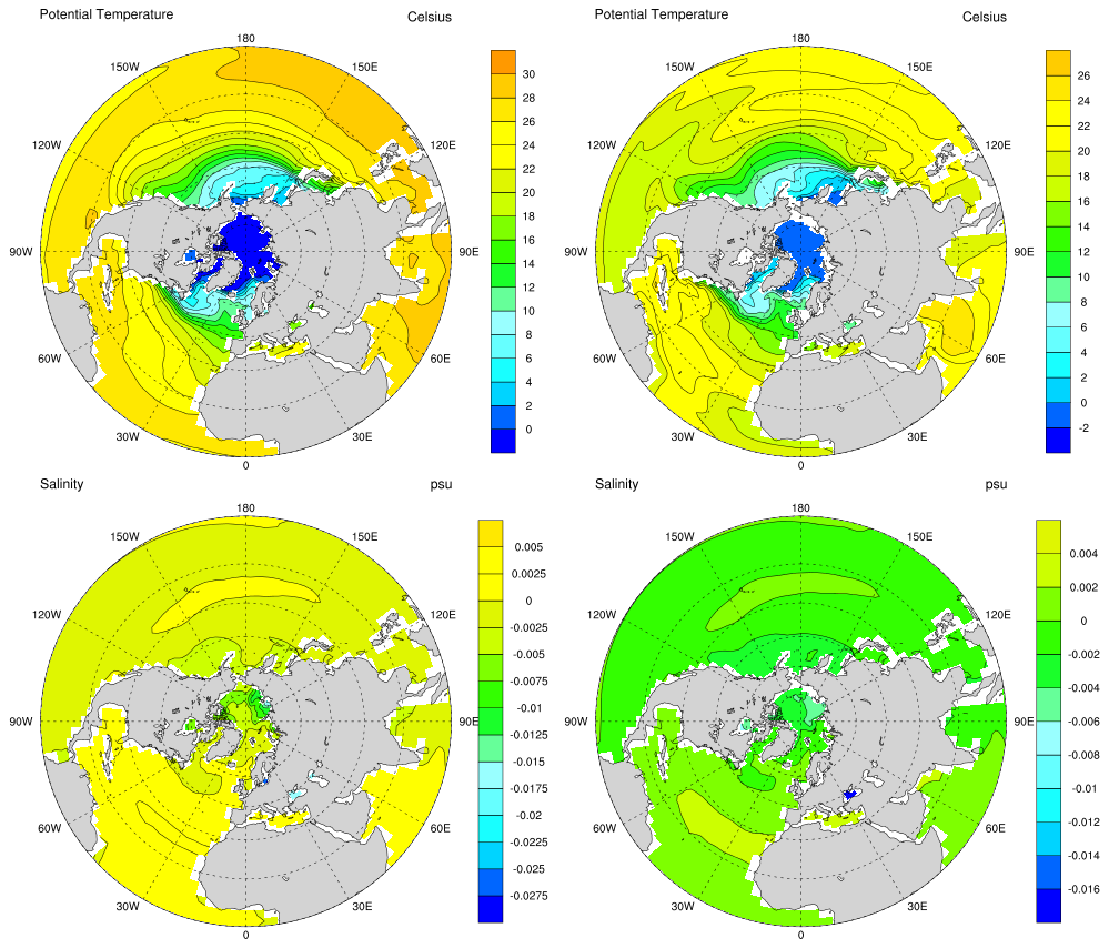
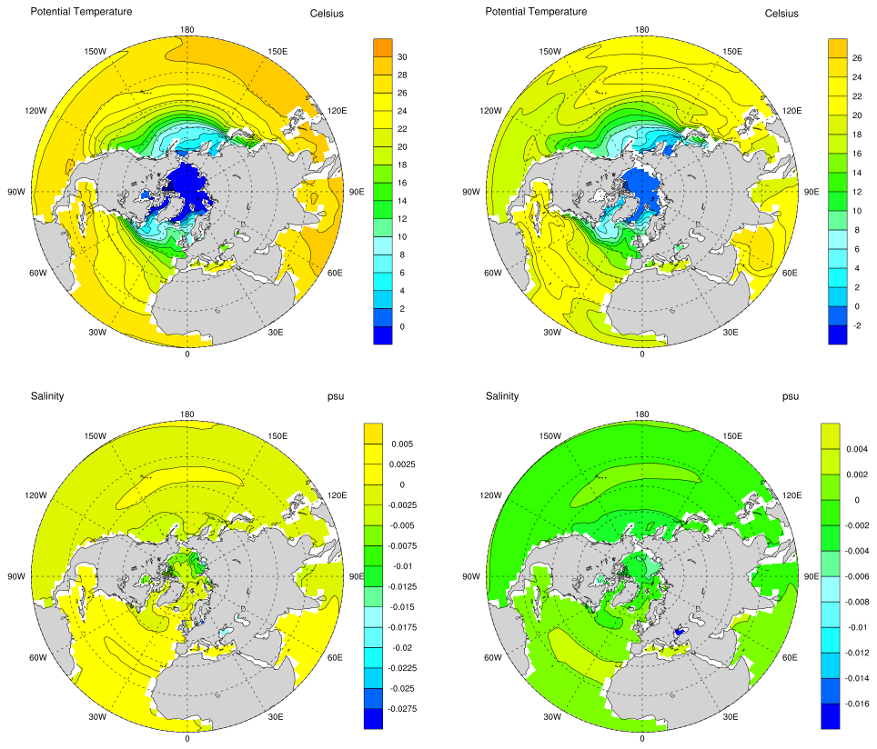
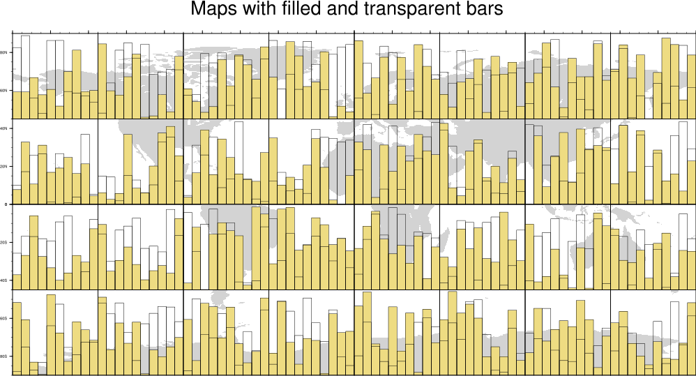
 panel_30.ncl
:
This example shows how to divide a global map into a 4 x 8
array of individual maps with overlaid bar charts.
Panel and tickmark resources are set so that the paneled plots have
no white space between them.
The bar charts are overlaid on the maps by setting the
tfDoNDCOverlay resource to False
and calling overlay to do the overlays.
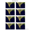
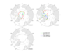
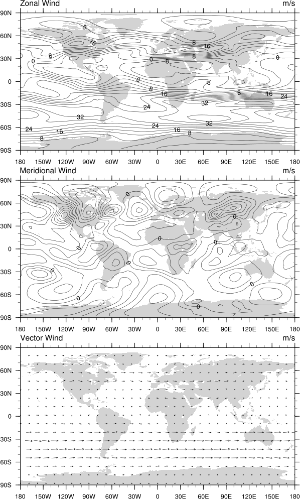
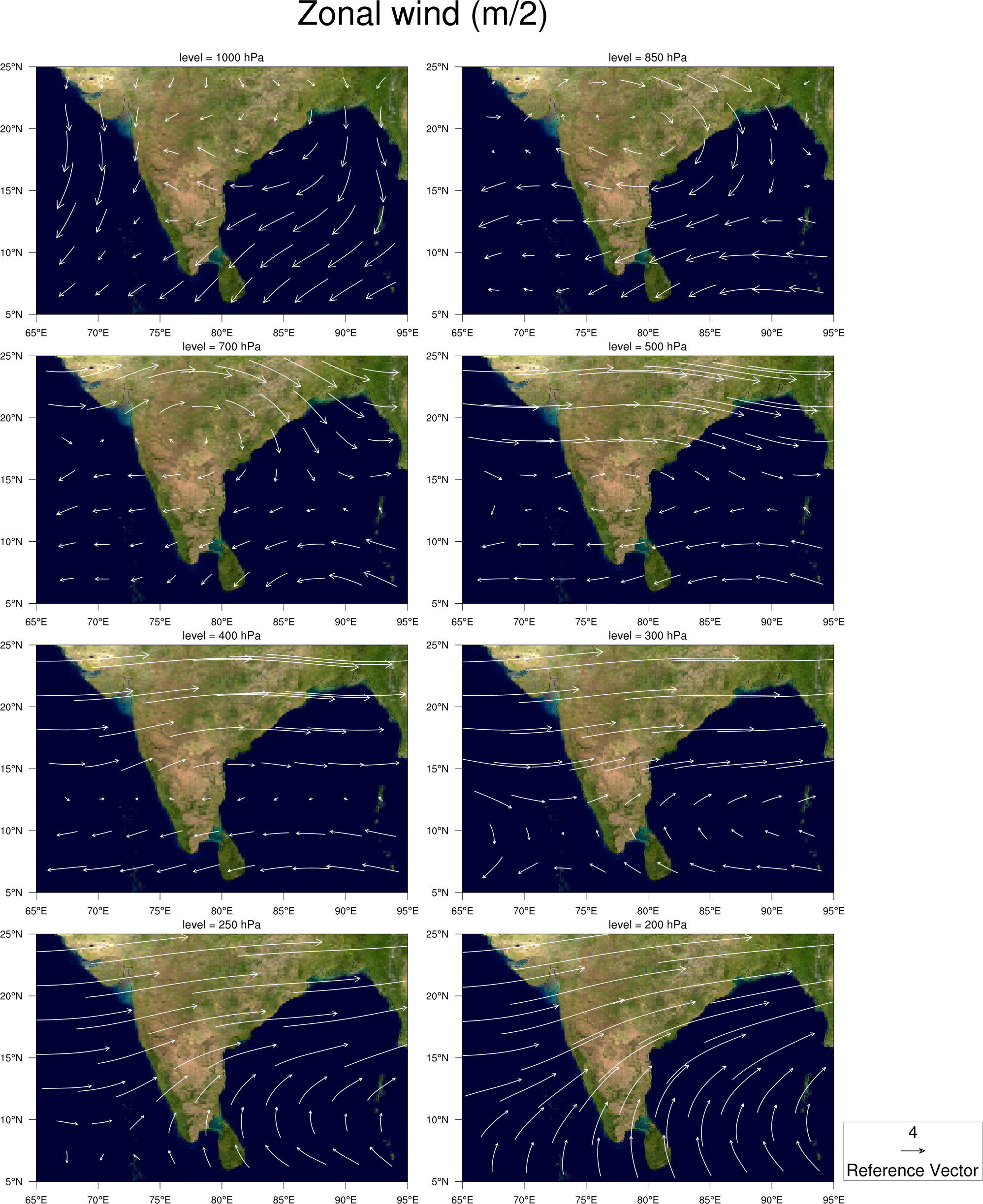
 panel_31.ncl
: This example shows
how to panel vector plots with only one vector reference annotation box.
If TOPO_MAP is set to True in the script, then it will
overlay the vectors on a topographic map read from a JPEG image.
The vector reference annotation box is turned off for all plots except
the lower rightmost one by setting
res@vcRefAnnoOn = False for all but
that one plot. The box is moved to the outside right of that plot by
setting res@vcRefAnnoParallelPosF.
The topographic map is created by reading in a JPEG image. See example
newcolor_11.ncl on the RGBA page.
This image can be slow to create, so set TOPO_MAP to False in the
script if you just want to generate a generic NCL map object (this
is the second thumbnail image above).
The open source tool gdal_translate was
used to convert the jpeg file to a NetCDF file:
gdal_translate -ot Int16 -of netCDF EarthMap_2500x1250.jpg EarthMap_2500x1250.nc
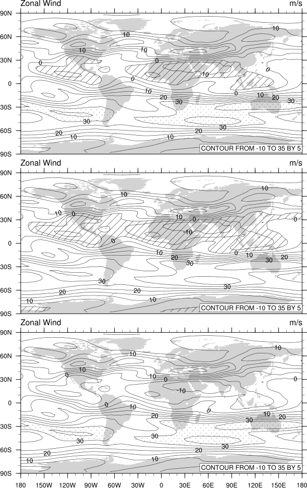
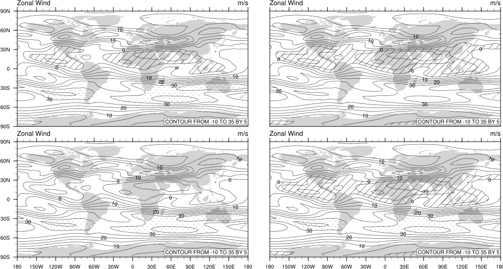
 panel_32.ncl
: This example shows
how to panel three spaghetti contour plots that are overlaid
on the northern hemisphere.
The plots are left-justfied and the extra space is used for a custom
legend, which is drawn with a call
to gsn_legend_ndc.
This example was contributed by Mira Berdahl of the Dept. of
Environmental Studies, Rutgers University.
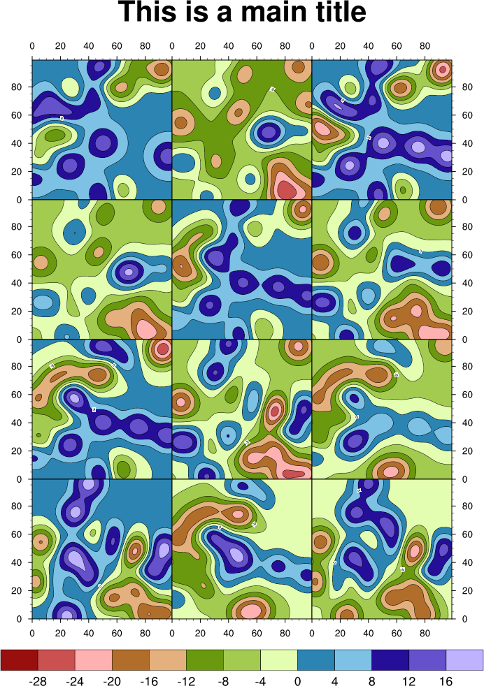
 panel_33.ncl
: This example is similar to
example 18,
except it creates two sets of difference plots. It also demonstrates
how you can use
cnFillPalette to
assign a color palette to a group of contour plots.
You must download panel_two_sets.ncl
for this script to run.
 panel_5x2_33.ncl
: This example
is similar to panel_33.ncl above, except there are three rows of
regular plots and two rows of difference plots. This script uses the
"panel_two_sets" function
in
panel_two_sets.ncl to make it
easier to panel two sets of plots in various configurations.
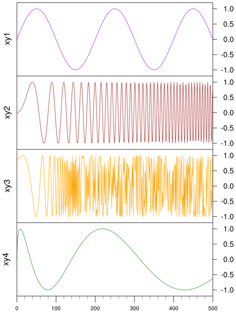
 xy_23.ncl
: Shows how to
use
gsn_attach_plots and the
resource
gsnAttachPlotsXAxis to attach
multiple XY plots along the bottom X axes, and how resizing the base
plot will automatically cause all plots to be resized.
Several "tmYR"
tickmark resources are set to control the ticks and the labels on
the right Y axis. The default is to put tickmarks and labels only on
the left axis. To put them on the right only, you need to set (for
one) tmYUseLeft to False. The
resource tmYRLabelDeltaF is set to
2.0 to move the labels further away from the right tickmarks,
and tmYRLabelJust is set to
"CenterRight" to right-justify the labels.
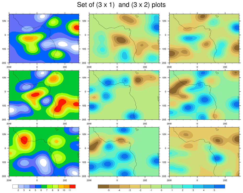
 panel_34.ncl
: This example shows
how to draw two sets of paneled contour plots, using two
different configurations: one with the paneled plots side-by-side
with vertical labelbars, and one with the paneled plots top-to-bottom
with horizontal labelbars.
You must download panel_two_sets.ncl
for this script to run.
 panel_old_34.ncl
: This example shows
how to draw two vertical labelbars on the right size of a set of
paneled plots.
This is an older version of this script. See panel_34.ncl above for a
function that makes it easier to panel two sets of contour plots, each
with their own labelbar.
For this example, a
getvalues
block is used to retrieve plot information, like position, size, and
colors, so the labelbar can be constructed from scratch.
The plots were created using dummy data, and have shaded contours
overlaid on filled contours overlaid on a map.
 panel_35.ncl
: This example shows
how to draw three filled contour plots, attached along their Y axes,
with a common labelbar and title
The gsn_attach_plots function is
used to attach the plots, and
then gsn_create_text and
gsn_create_labelbar are
used to create a main title and labelbar. The
NhlGetBB function gets the bounding box of the
given plot, which allows us to determine the locations for
the title and labelbar.
A Python version of this projection is available here.
 panel_36.ncl
 /
panel_vp_36.ncl: This example shows
two ways drawing four filled contour plots, with two plots having
their own labelbar and the other two sharing a labelbar.
The "panel_36.ncl" script
uses gsn_panel to panel the four
plots with the labelbars drawn for all of them, but it draws the last
two labelbars in white and transparent, effectively hiding them. We
then create a custom labelbar using
to gsn_labelbar_ndc, and place it
where the hidden labelbars are. This example is a bit kludgy, but you
don't have to worry about sizing or positioning the individual plots.
The "panel_vp_36.ncl" script uses viewport resources to position and
resize each individual plot, and then creates a title and labelbar
from scratch, using gsn_labelbar_ndc
and gsn_text_ndc. This example
requires a bit more work, but it is also more customizable, as you can
use to place the plots, title, and labelbar wherever you want them.
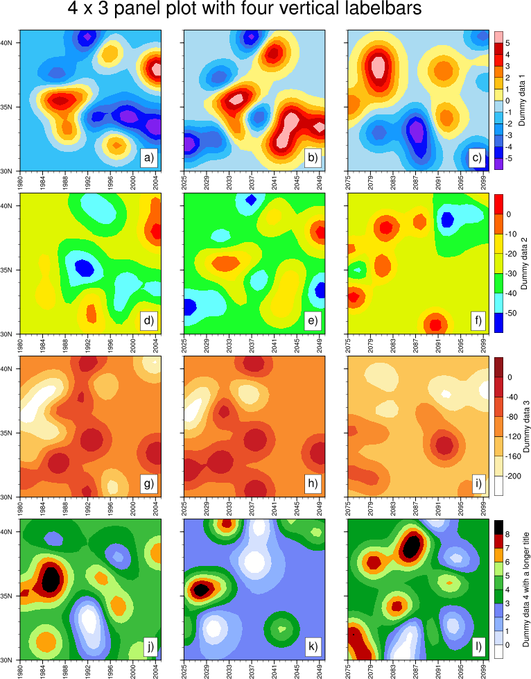
 panel_37.ncl
: This example shows
how to draw a 4 x 3 set of paneled plots, each row being represented
by a single labelbar.
Basically, the leftmost two columns of plots have the labelbars turned
off, and the rightmost column has the labelbars turned on.
 panel_38.ncl
: This example shows
how to draw three sets of paneled plots with various labelbars
and titles, while keeping the plots the same size.
In order to keep all the plots the same size, it's important that each
row of plots is drawn to the exact same size of canvas. This is
controlled with the gsnPanelTop and
gsnPanelBottom resources.
The gsnPanelYF resource is used to
slightly adjust the Y position of the top of each row of plots, order
to make room for various titles and labelbars.
The txPosYF resource is used to
position the title relative to the top of each row of plots.
 panel_39.ncl
: This example shows
how you can panel plots yourself using
viewport resources
vpXF,
vpYF,
vpWidthF, and
vpHeightF.
The left image was created
using gsn_panel, and the right image
was created using vp resources. They should be identical.
One way to help determine good values to use for the vp resources is
to first panel the plots
using gsn_panel
with gsnPanelDebug set to True. This
echoes a bunch of output to the screen, including the "new" values
being used for the X and Y position and the width and
height of each plot.
With this information, you can then recreate the paneled plots by
setting the appropriate vp resources for each plot. In this example
all the plots are the same size, so you only need to set
vpWidthF and
vpHeightF once, then adjust the
vpXF and vpYF
resources as needed for each plot.
 panel_40.ncl
: This example shows
how to attach four plots along a Y axis, with a labelbar on
the right side.
gsn_attach_plots is used to
attach the four plots, with the
resource gsnAttachPlotsYAxis set to True.
Each plot is customized to turn various tickmark labels and the
labelbar on or off.
The second image simply shows a "trick" for using
gsn_panel to add a main title
to a set of plots that have already been attached.
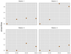 scatter_13.ncl
: This example
shows how to draw a panel plot with the plot area filled in gray,
and with a title draw on the left of the panel
using
gsn_text_ndc and
gsn_add_polygon.
There's quite a bit of customization going on with the tickmark
labels, in order to turn them on and off for various plots.
 panel_41.ncl
: This example shows
how to add left, right, and center subtitles to a series of paneled
plots, in the same style that is done for individual plots that
use
gsnLeftString,
gsnCenterString,
and
gsnRightString. See the
"draw_panel_titles" procedure in this script.
The unadvertised gsnPanelSave resource is set to True, which
tells gsn_panel to keep the plots in
their resized state. This allows us to query for the NDC locations of
the topmost paneled plots, and then use this information to draw the
titles just above the plots
using gsn_text_ndc.
 panel_42.ncl
:
This example shows how
gsnPanelXWhiteSpacePercent
can be used to create space between panel columns. A common label bar is used for the panel figures.
Between the panel columns, a different contour plot which uses a different color palette and
adds grid lines is placed. Finally, creation of angled and colored text is added
using
gsn_text_ndc .
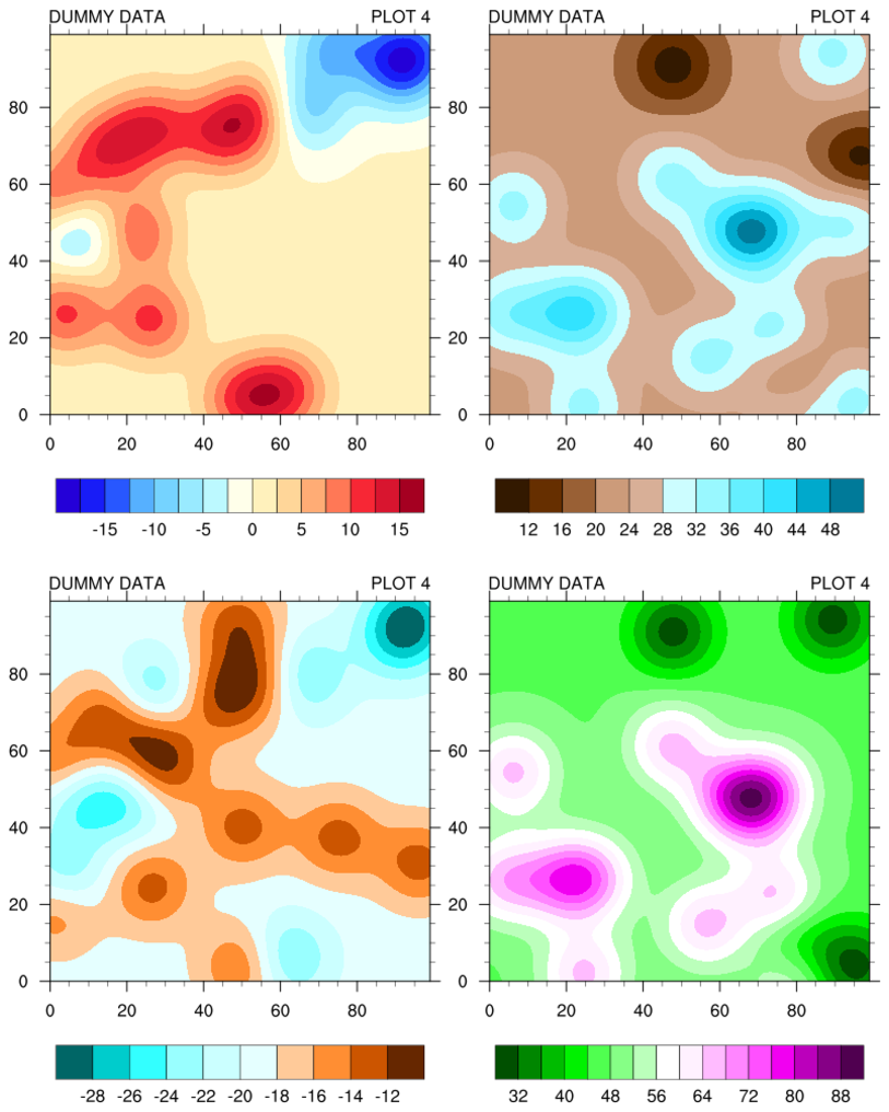
 panel_43.ncl
:
Almost identical to
panel_42, except that for demonstration purposes,
the data used for the panel plots are scaled, via a local function
('scale_values'), to the same range as that used for the center
regular contour plot. Hence, a single color bar.
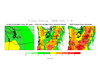
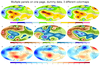
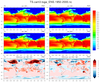
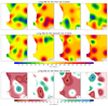
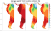
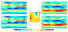
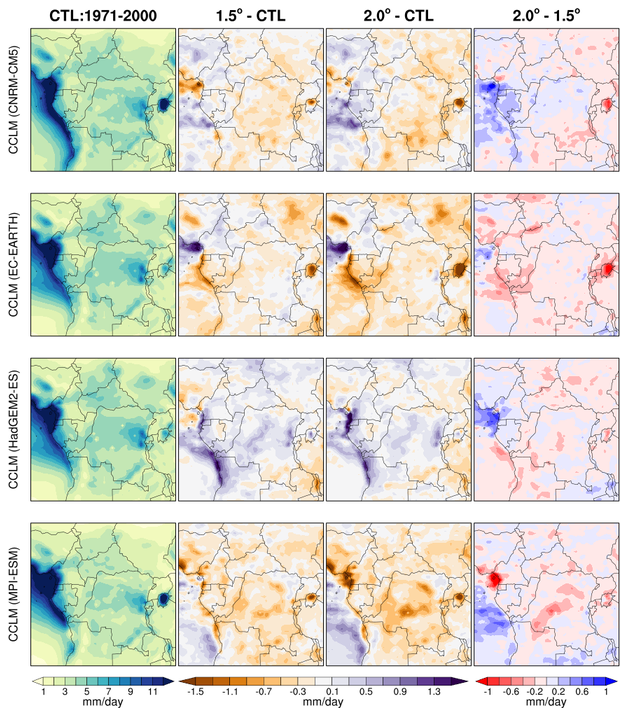
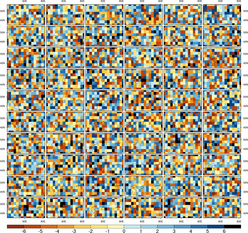
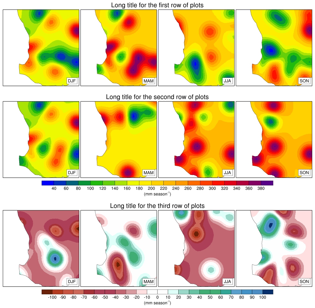
 panel_GWLs_Rain.ncl
: This
example shows how to create a 4 x 4 panel of plots, where different
columns of plots have their own labelbars. This is accomplished by
turning off the individual labelbars for all but the bottom row plots.
To further give the paneled plots a clean look, the tickmarks and
their labels are turned off.
The unadvertised gsnPanelSave resource is set to True, which
tells gsn_panel to keep the plots in
their resized state. This allows us to query for the NDC locations of
the leftmost paneled plots, and then use this information to draw
rotated titles on the left side
using gsn_text_ndc.
This script was written by Appolinaire Derbetini of the Laboratory
for Environmental Modelling and Atmospheric Physics, University of
Yaounde 1, Yaounde, Cameroon.
The idea was inspired by the paper of Pokam et al.,
2018, Consequences
of 1.5 C and 2 C global warming levels for temperature and
precipitation changes over Central Africa, Environ. Res. Lett. 13
(2018)
055011, https://doi.org/10.1088/1748-9326/aab048.


