NCL Home>
Application examples>
Maps and map projections ||
Data files for some examples
Example pages containing:
tips |
resources |
functions/procedures
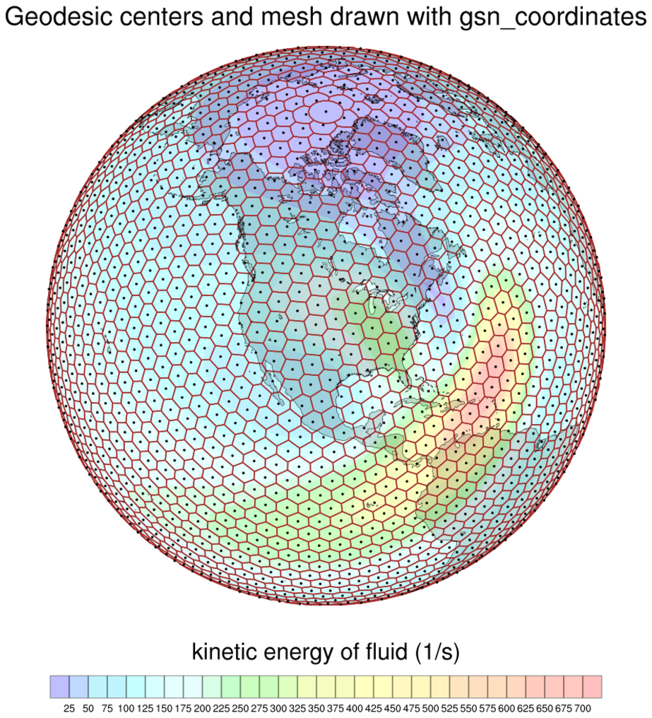
NCL: Drawing locations of data values via markers or lines
The
gsn_coordinates procedure
takes an existing plot and a data variable, and draws the plot again
but with markers or grid lines drawn at the grid locations of your
data.
It will query your data variable and/or the resource list in order to
get the grid location information, by looking for one of the
following:
- Coordinate arrays attached to the data variable
- Special "lat2d" / "lon2d" attributes attached to the data variable
- Special "lat1d" / "lon1d" attributes attached to the data variable
- gsnCoordsLat / gsnCoordsLon attached to
the res resource list
- gsnCoordsX / gsnCoordsY attached to
the res resource list
This procedure recognizes several additional special attributes:
- gsnCoordsAttachAsLines - by default, the grid locations
will be drawn as filled dots, unless this resource is set to True,
in which case lines will be drawn.
- gsnCoordsAttach - by default, when this procedure is called, the
plot is drawn immediately, the markers or lines are drawn on top, and
the frame is advanced. If this resource is set to True, then the
markers or lines are only attached to the plot, and nothing gets drawn.
You will need to call draw and frame
yourself. This is useful if you need to panel plots with coordinate
locations added. See datagrid_6.ncl below.
- gsnCoordsMissingColor / gsnCoordsNonMissingColor -
By default, if you are drawing the locations as markers, they will all
get drawn in black. These resources allow you to set colors for marker
locations where your data is or isn't missing.
In NCL version
6.6.0, gsn_coordinates was
updated to allow the drawing of unstructured meshes, like triangular
or hexagonal meshes. There are several examples below.
For other examples of using gsn_coordinates, see
the Plotting data on a map examples page.
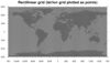
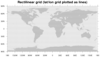
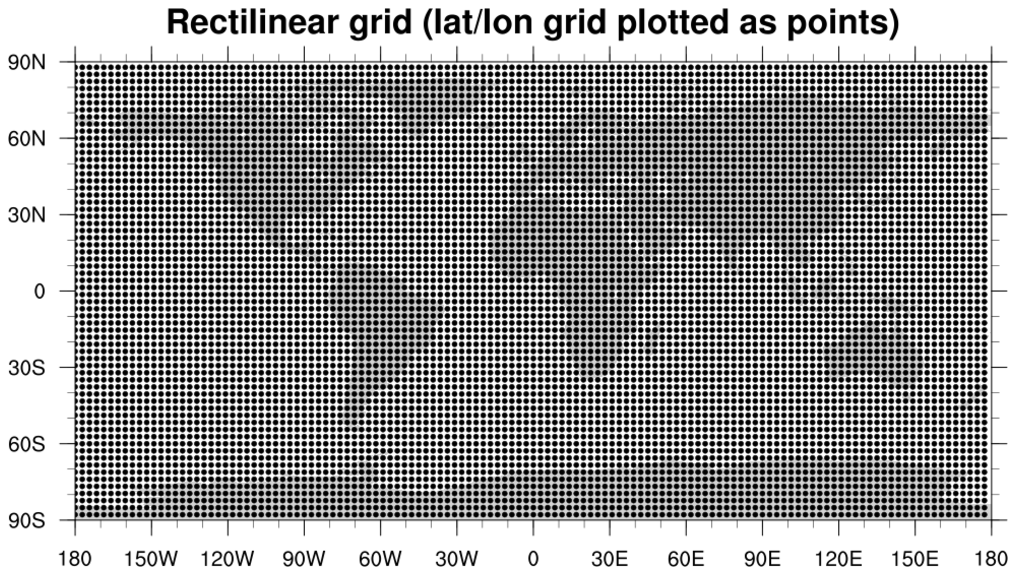
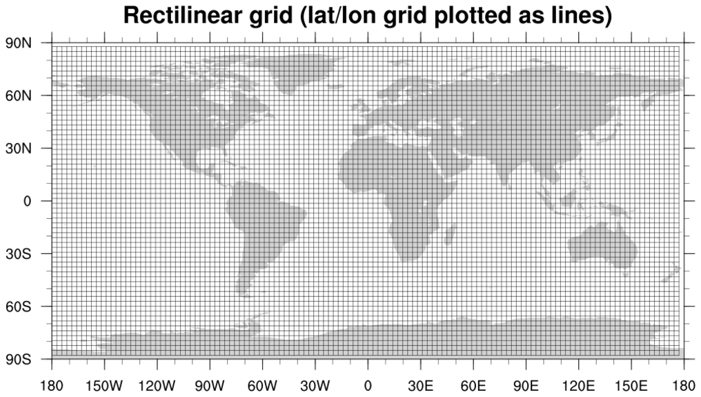
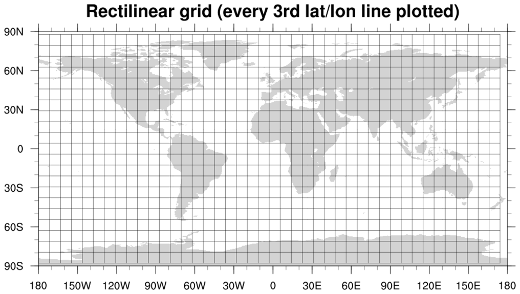
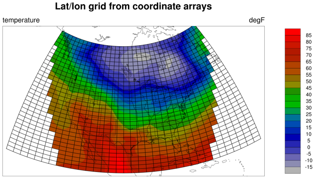
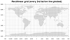 datagrid_1.ncl
: This
script draws the lat/lon locations of a global
rectilinear grid in three
ways: 1) as points, 2) as lines, and 3) as every 3rd line.
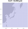
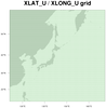
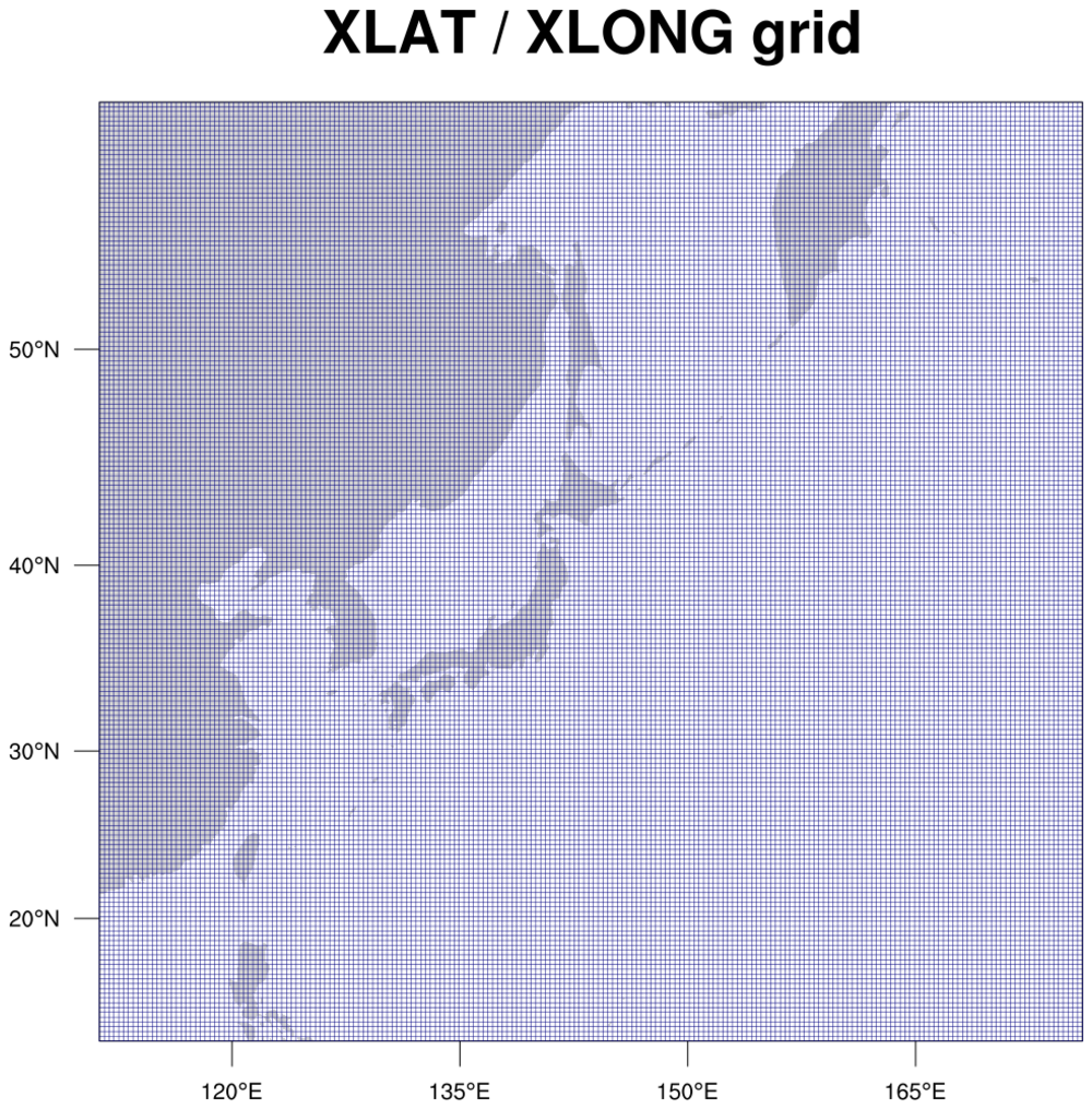
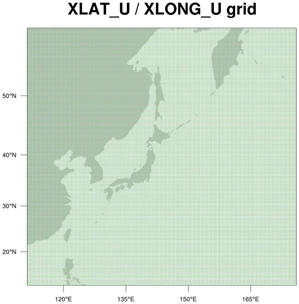
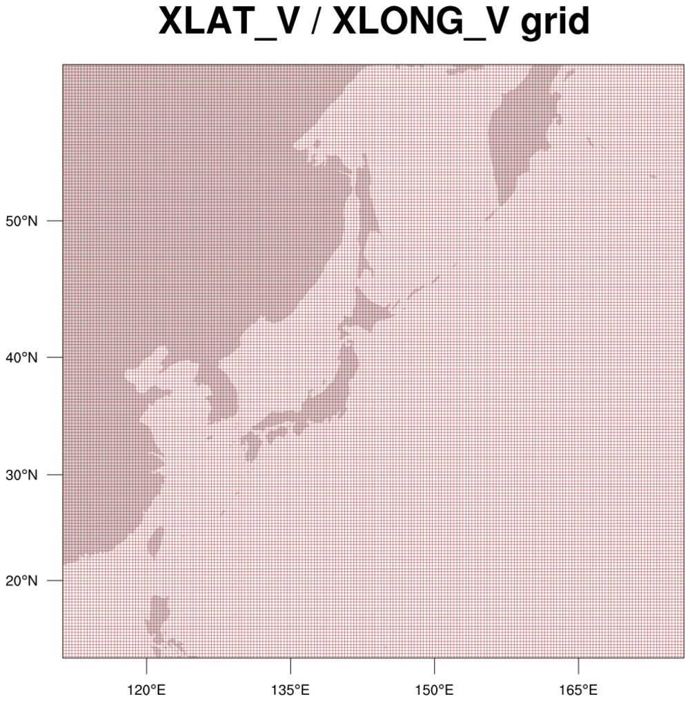
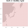 datagrid_2.ncl
: This script shows
how to add lines at locations of three WRF-ARW
variables which are on different lat/lon grids:
  hgt [south_north | 197] x [west_east | 206]
  u   [south_north | 197] x [west_east_stag | 207]
  v   [south_north_stag | 198] x [west_east | 206]
Since WRF data is on a
curvilinear grid
you must read the lat/lon values off the file
and attach them as special lat2d / lon2d attributes
before calling
gsn_coordinates.
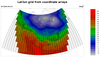
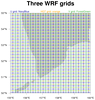 datagrid_3.ncl
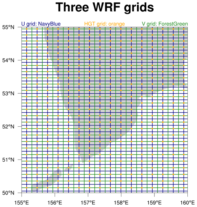
: This
example plots the same three WRF grids as the previous example,
except it plots them on one map plot that has been zoomed in
so you can see the grid better. The HGT lat/lon locations are drawn
in dots instead of lines.
 datagrid_4.ncl
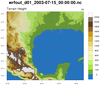
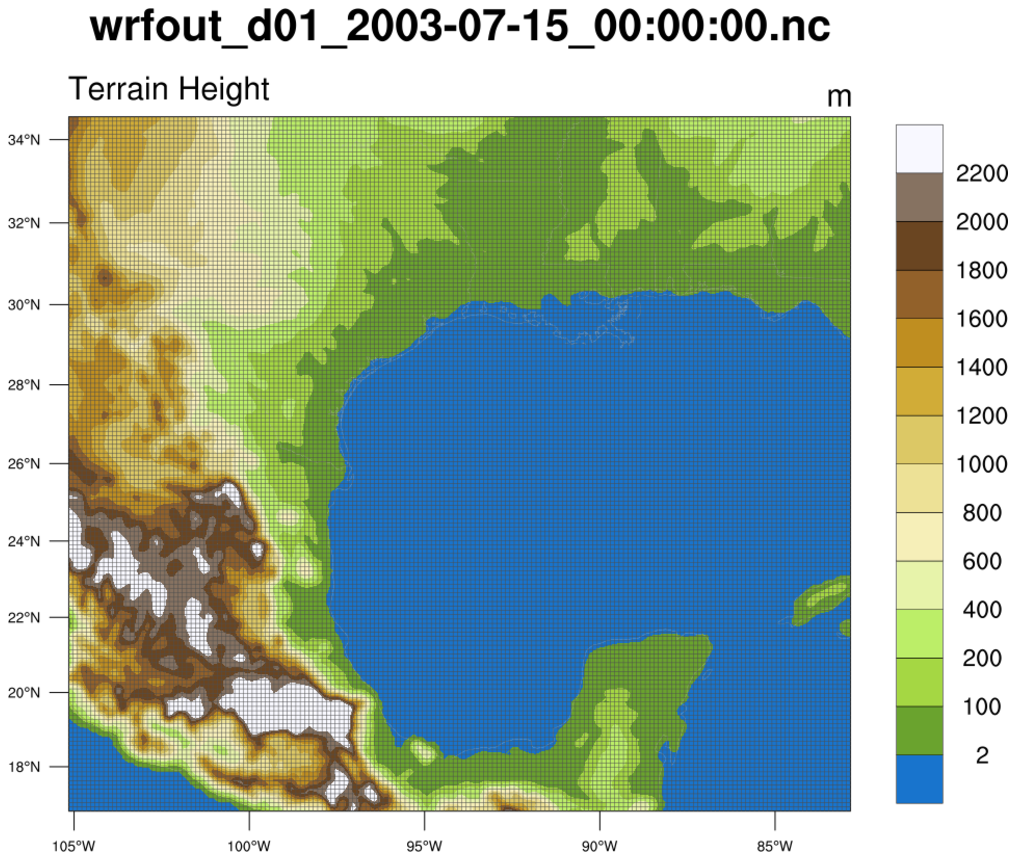
: This
script draws a WRF lat/lon grid on top of a filled contour
plot of the HGT variable, using the native map projection
defined on the WRF output file.
 datagrid_5.ncl
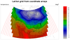
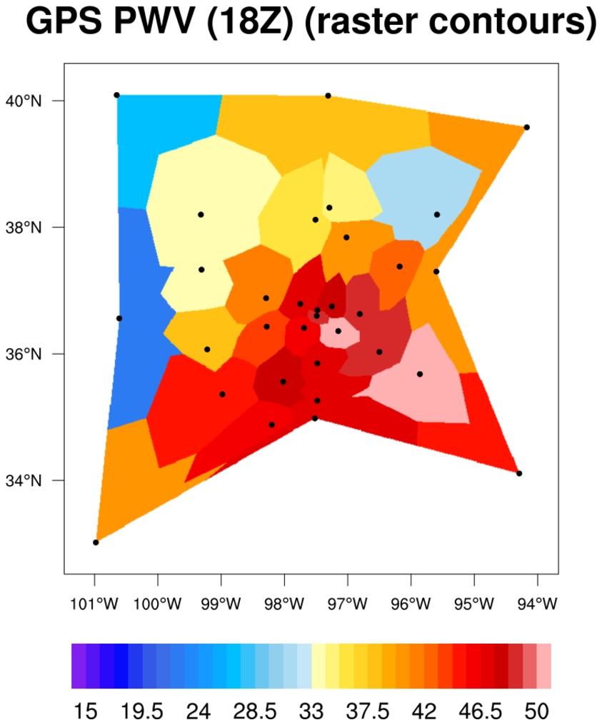
: This script draws
the lat/lon grid of a temperature variable on a regional rectilinear
grid using two methods: 1) black lines and 2) red markers where the
data is missing, and black markers where it isn't.
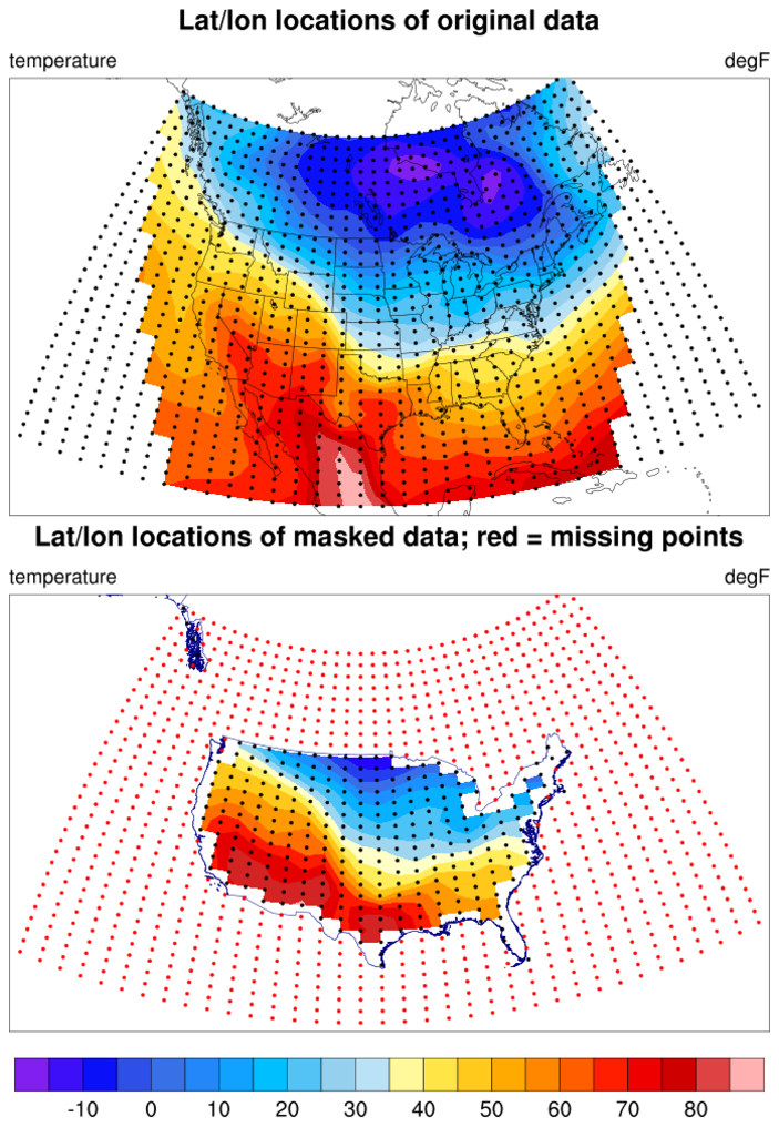
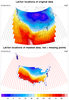 datagrid_6.ncl
: This script uses
the USA_adm0.shp shapefile (downloaded
from
gadm.org/country) to
mask data on a rectilinear grid over the United States. Both the
original data and the masked data have the lat/lon locations drawn as
markers, with the red points indicating missing data locations.
The special gsnCoordsAttach resoure is set to True, so the markers
are actually attached to both plots. This is so we can panel the plots
later and have the markers still be visible.
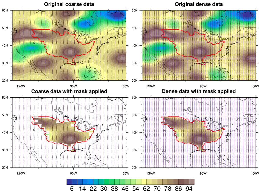
 shapefiles_16.ncl
: This
is another example of drawing data locations after you've
masked the data against a shapefile.
In this case, dummy data is used to create a coarse (32 x 64) grid and
fine (64 x 128) grid. Both grids are masked against
a Mississippi River Basin shapefile. Finally,
gsn_coordinates is used to draw the
lat/lon grid as a set of markers on all four plots.
See examples shapefiles_21.ncl and
See examples shapefiles_22.ncl for
more examples of masked shapefiles with data locations drawn.
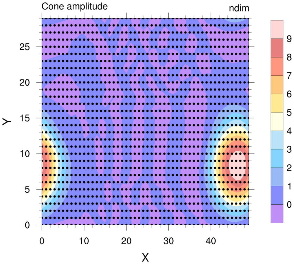
 datagrid_7.ncl
: This
script draws markers for a contour plot that's
not over a map. Since the data is rectilinear,
the coordinate arrays are already attached to "u".
Note that the
cnFillOpacityF
resource is set to 0.5 to draw the filled contours partially transparent.

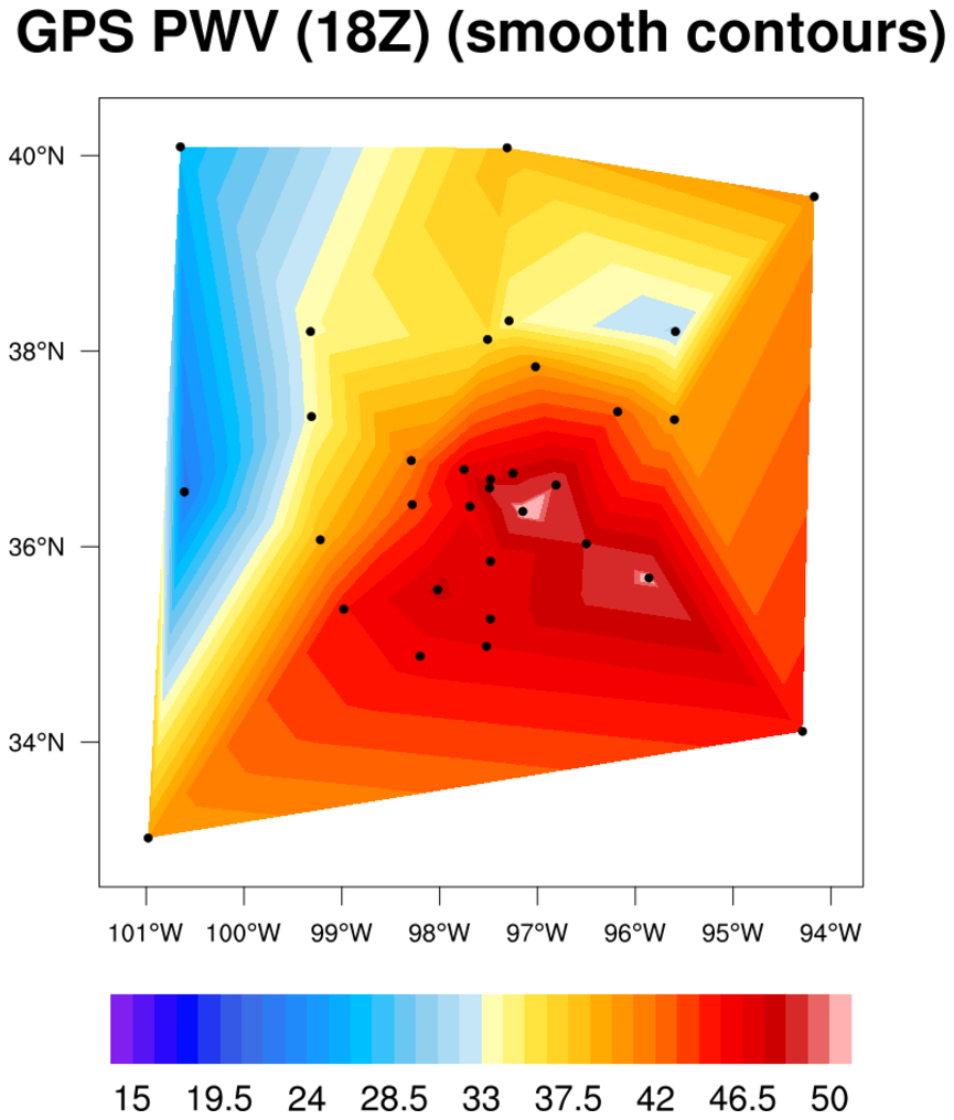
 contour1d_1.ncl
:
The data in this example is a one-dimensional (1D) array with
corresponding 1D lat/lon arrays.
Since the "pw" data already has lat1d / lon1d attributes attached for
creating the contour plot, it's easy to plot the data locations using
gsn_coordinates.
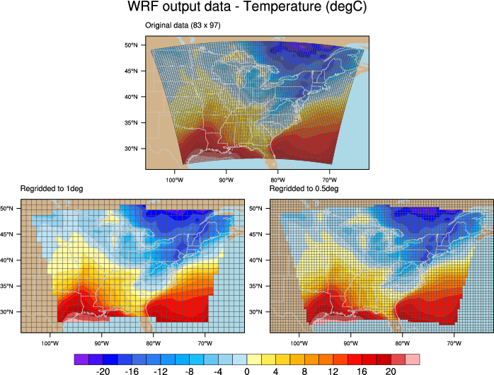
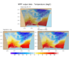 ESMF_regrid_32.ncl
: Drawing
lat/lon locations on plots of regridded data can be useful for
debugging purposes. This particular example regrids WRF output
temperature data to both a 1.0 and 0.5 degree grid, and compares them
in a panel plot.

 datagrid_8.ncl
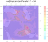
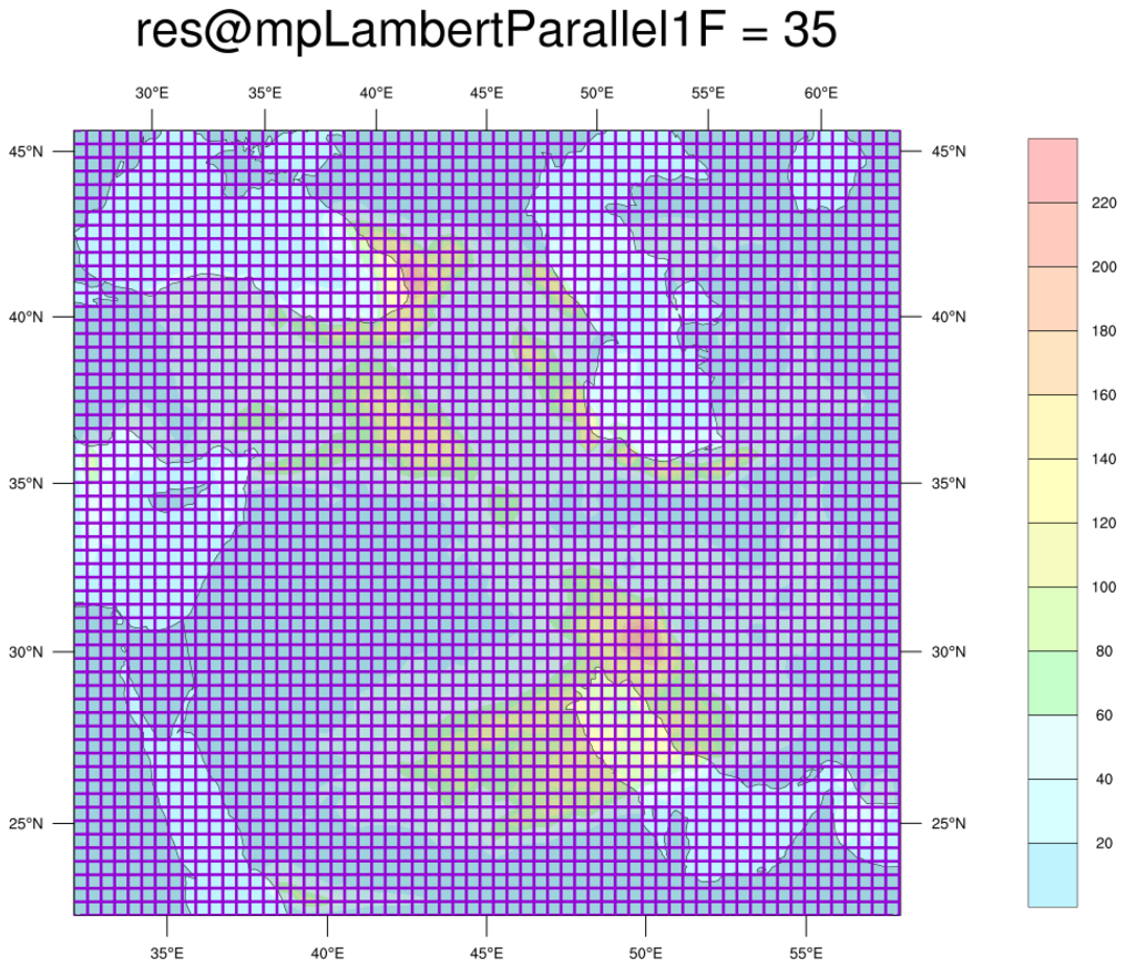
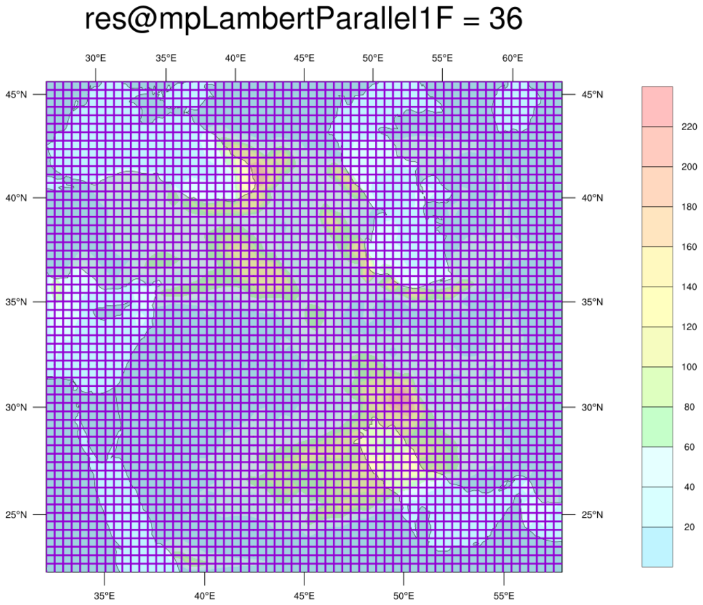
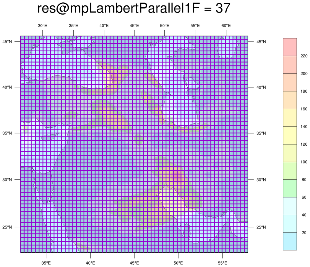
: This
script shows how
gsn_coordinates
can be used to help guess at the correct map projection parameters
needed to plot data in a native lambert conformal map projection.
When plotting native data over an LC projection, you need to
provide a meridian and two parallels:
mpLambertParallel1F
mpLambertParallel2F
mpLambertMeridianF
These values are usually available on the same file that the data is
on. If not, then you may need to guess at these values.
To help with the guessing process, you can draw the lat/lon grid
of your data using the given map projection parameters. If the
lat/lon grid lines are parallel and perpendicular to the
rectangle that the plot is drawn in, then you likely have the
correct parameters.
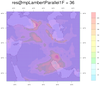
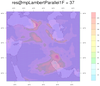
In this example, the meridian and one of the parallel values was
provided, but the other parallel value didn't look right. We used a do
loop to loop through four possible values, and drew the lat/lon lines
as thick purple lines for each plot.
If you click on the leftmost plot (res@mpLambertParallel1F=34), you'll
see the farmost right vertical grid line sticking out in the lower
right corner, so this is likely not the correct value. The
second-from-the-left plot (res@mpLambertParallel1F=35) is a little
better, but the vertical line still sticks out a little in the lower
right. In the rightmost plot (res@mpLambertParallel1F=37), the
vertical lines stick out at the upper left corner.
The second-from-the-right plot (res@mpLambertParallel1F=36) seems to
be the best fit. Of course, you could fine tune this example by
trying other values close to 36, like 35.8, 35.9, 36, 36.1, etc.
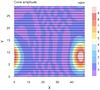
 geo_1.ncl
: This particular geodesic
grid has 2562 cells, each with 5 edges. The lat/lon cell centers are
defined as 1D arrays called
grid_center_lat
and
grid_center_lon on the file, while the cell edges are
defined as 2D arrays dimensioned 2562 x 6 (ncells x nvertices), called
grid_corner_lat and
grid_corner_lon.
To plot this data over a map,
sfXArray and
sfYArray are set to the mesh
centers (grid_center_lat and grid_center_lon), while
sfXCellBounds and
sfYCellBounds are set to the cell
corners (grid_corner_lat and grid_corner_lon). Both sets of lat/lon
arrays are in radians, so they have to first be converted to degrees.
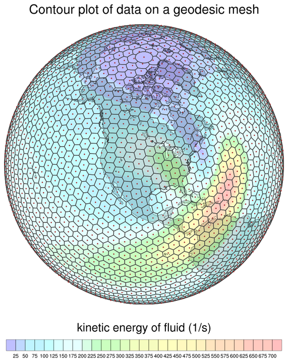
The second image draws the cell centers as filled dots, and the
geodesic mesh as polylines. Note that the cell edges have to first be
closed before drawing them.
See the next example which uses an updated version
of gsn_coordinates to draw the mesh
edges and centers.
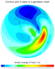
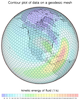
 datagrid_9.ncl
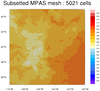
: This is another
example of drawing the edges of an unstructured mesh, except
this one is of the MPAS mesh, in which cells can have different numbers
of edges.
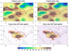
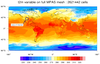
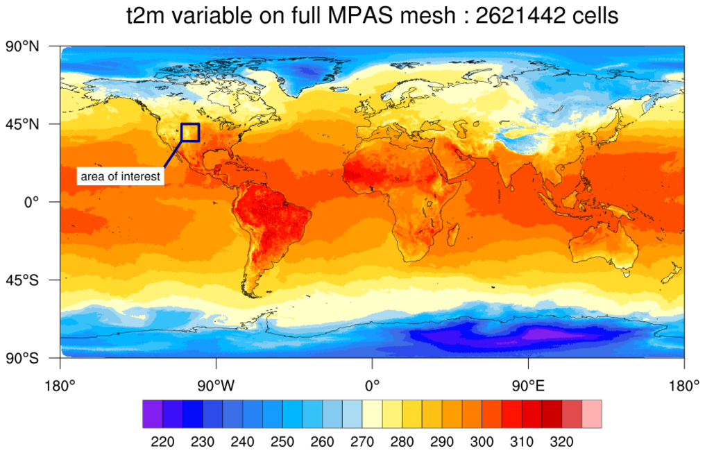
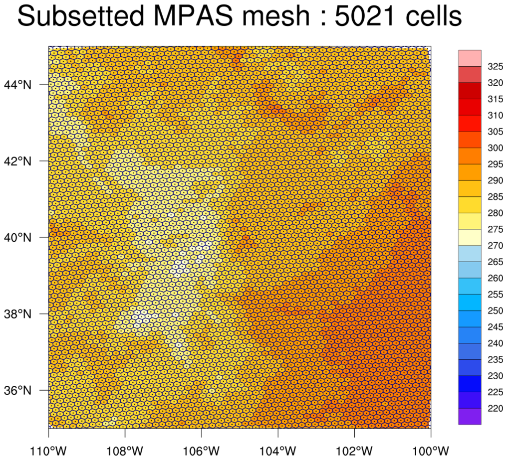
The first image is the "t2m" variable plotted over the full grid.
An area of interest is highlighted on this plot, which is what the
second image represents.
The MPAS edges and cell centers were only added to the second plot,
because this particular MPAS mesh has over two million cells which
would create a very dense plot if you drew all the edges. An area of
interest was selected using the special gsnCoordsMinLat,
gsnCoordsMaxLat, gsnCoordsMinLon, and gsnCoordsMaxLon resources,
making the drawing of the mesh less dense and significantly faster.
This functionality was added in NCL version 6.6.0.
 datagrid_10.ncl
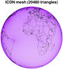
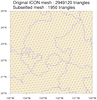
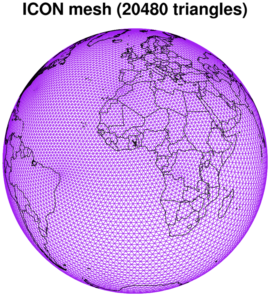
: This is an
example of drawing the edges and centers of an ICON triangular mesh
using
gsn_coordinates.
This ICON data only has 20,480 triangular cells, so the whole mesh
is drawn in this case. See datagrid_11.ncl below for an example
of drawing an ICON mesh with close to three million cells.
This functionality was added in NCL version 6.6.0.
 datagrid_11.ncl
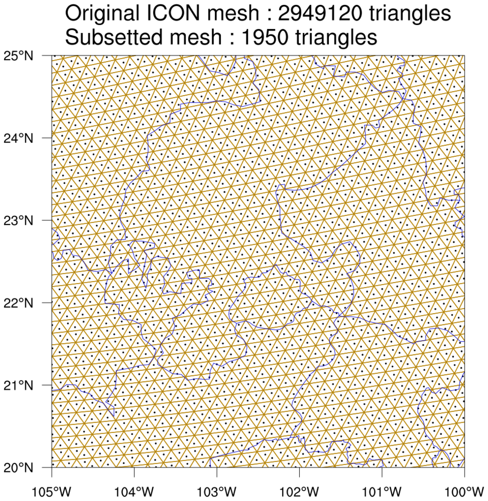
: This is an
example of drawing the edges and centers of an ICON triangular mesh
using
gsn_coordinates.
This data has almost three million triangles which would create a very
dense plot if you drew all the edges. As with the previous MPAS
example, an area of interest was selected using the special
gsnCoordsMinLat, gsnCoordsMaxLat, gsnCoordsMinLon, and gsnCoordsMaxLon
resources, making the drawing of the mesh less dense and significantly
faster.
This functionality was added in NCL version 6.6.0.

