NCL Visualization examples for EGU2013
These NCL examples are for the
"
Visualization
Tools - A light hands-on" meeting at
the
EGU General Assembly 2013.
There are three sets of examples:
- UV300 - rectilinear (data and scripts: uv300_ncl_demo.tar)
- NEMO - curvilinear (data and scripts:
nemo_ncl_demo.tar.gz)
- CAMSE - unstructured (data and scripts:
camse_ncl_demo.tar.gz)
Each set of examples starts with a minimal script (for example,
"uv300_wind_1.ncl"), and then subsequent scripts ("uv300_wind_2.ncl",
"uv300_wind_3.ncl", etc.) build on the previous ones to create a more
complex plot.
Rectilinear grid (one-dimensional coordinate arrays)
The following examples show how to use NCL to draw contours of data on
a rectilinear grid. When you use
NCL to read rectilinear data, generally the data will contain
one-dimensional lat/lon coordinate arrays. This means you don't need
to read these arrays in separately for plotting.
All of the "uv300_n.ncl" and "uv300_wind_n.ncl" scripts, and the
"uv300.nc" NetCDF file are in this
uv300_ncl_demo.tar file.
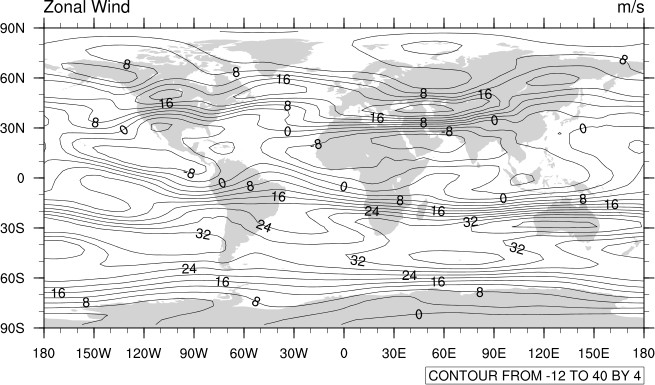
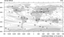 uv300_1.ncl
: This example shows how to
create a contour plot of zonal winds on a rectilinear grid.
No plot options are set here, which gives you all the default settings
(black line contour plot, land filled in gray, "informational" contour
level label at the bottom).
 uv300_2.ncl
: This example is identical
to the previous one, except options are set to turn on color fill and
increase the size of the plot.
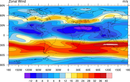
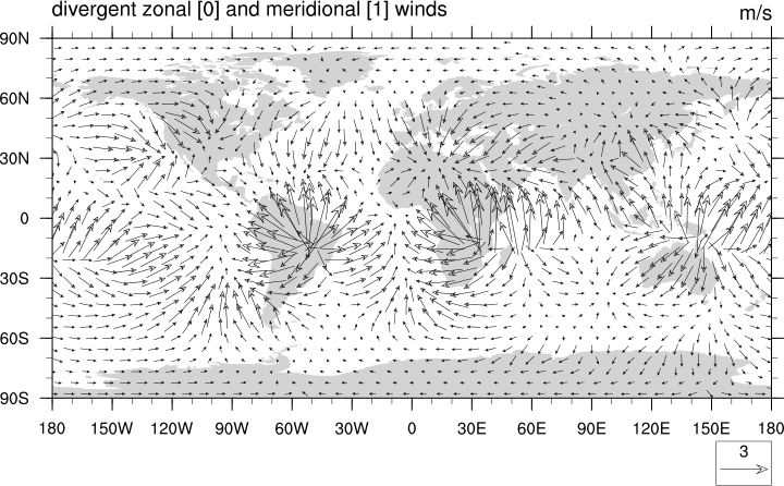
 uv300_wind_1.ncl
: This example
shows how to create a vector plot of divergent winds. Minimal options
are set to control the length of the vectors, since the default values
are not ideal.
 uv300_wind_2.ncl
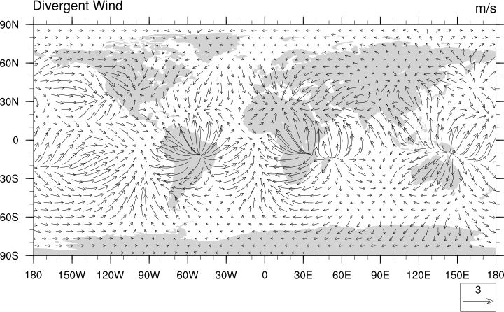
: This example is
identical to the previous one, except options are set to turn on curly
vectors and to change the left subtitle at the top of the plot.
 uv300_wind_3.ncl
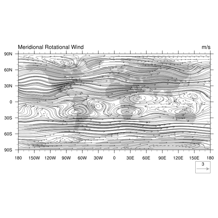
: This example
is similar to the previous one, except it draws rotational winds.
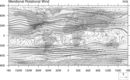
 uv300_wind_4.ncl
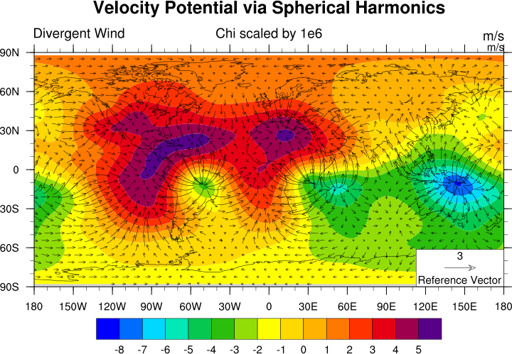
: This example
shows how to overlay vectors on a contour/map plot.
The key to overlaying plots that involve maps is to make the map plot
the first argument to the overlay procedure (this
is called the "base" plot ). The second argument
of overlay should be a non-map plot, but must still
be in the same lat/lon space as the base plot.
Curvilinear grid (two-dimensional lat/lon arrays)
The following NEMO (Nucleus for
European Modelling of the Ocean) examples show how to use NCL to draw
contours of data on a curvilinear
grid.
The NEMO file was provided with permission by Clotilde Dubois of
Météo-France.
All of the "nemo_n.ncl" scripts and the NEMO NetCDF file are
in this
nemo_ncl_demo.tar.gz
gzipped tar file.
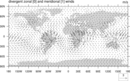
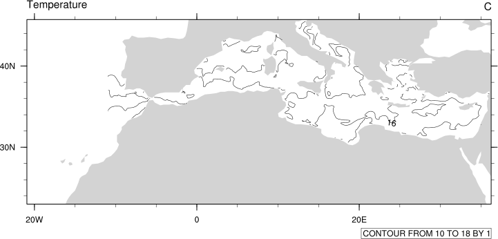
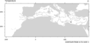 nemo_1.ncl
: This example shows how to
create a line contour plot of temperature data on a NEMO grid.
Options are set to zoom in on the area of interest, and to
indicate the lat/lon locations of the data.
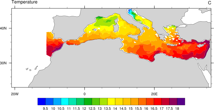
 nemo_2.ncl
: This example is identical to
the previous one, except options are set to turn on color fill and to
double the number of contour levels.
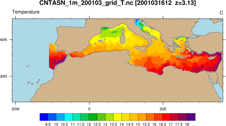
 nemo_3.ncl
: This example is identical to
the previous one, except options are set to use higher-resolution map outlines,
change the color of the land and ocean, and add a main title.
Unstructured grid (point data)
The
following CAM-SE
examples show how to use NCL to draw contours of data on
an unstructured grid.
All of the "camse_n.ncl" scripts and the subsetted CAM-SE NetCDF file
are in this
camse_ncl_demo.tar.gz
gzipped tar file.
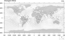
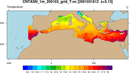
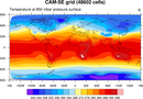
 camse_1.ncl
: This example shows how to
create a line contour plot of temperature data on a CAM-SE grid. The
only options set are to indicate the lat/lon positions of the data,
and to maximize the size of the plot in the PNG file.
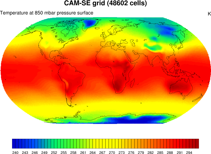
 camse_2.ncl
: This example is identical
to the previous one, except options are set to turn on color fill.
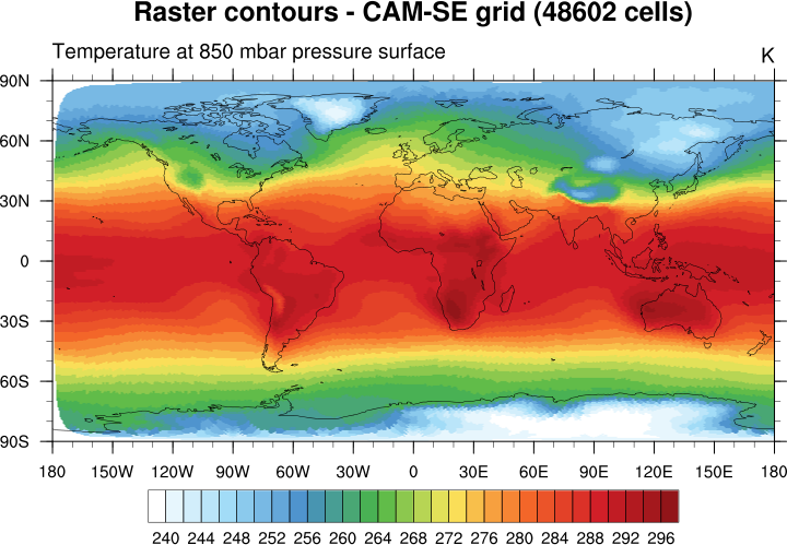
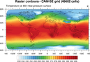 camse_3.ncl
: This example is similar
to the previous one, except options are set to use raster contours,
which can be rendered faster than the default smoothed contours.
Raster contours can look blocky if you have a low-resolution grid, but
you can smooth them by
setting cnRasterSmoothingOn to True.
The color map is also changed in this example, using the
"WhiteBlueGreenYellowRed"
color table from NCL's collection of
predefined color tables.
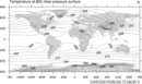
 camse_4.ncl
: This example is similar
to the previous one, except the contours are drawn over a Robinson
map projection, and a function was added to create a different color map.

