NCL Graphics: Wind Barbs
NCL Home> Application examples> Special plots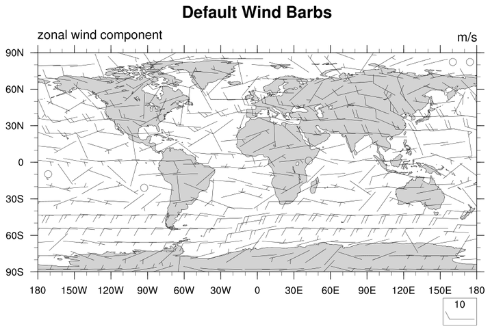
Wind barbs are a vector style, so the normal vector resources
work to control the look and feel of wind barbs.
barb_1.ncl:
Demonstrates a default wind barb plot.vcGlyphStyle = "WindBarb" turns on wind barbs.
In this example, vcMinDistanceF is used to control the density of the wind barbs. The default density blacks out the entire plot. The length of the barbs is controlled by vcRefMagnitudeF and vcRefLengthF
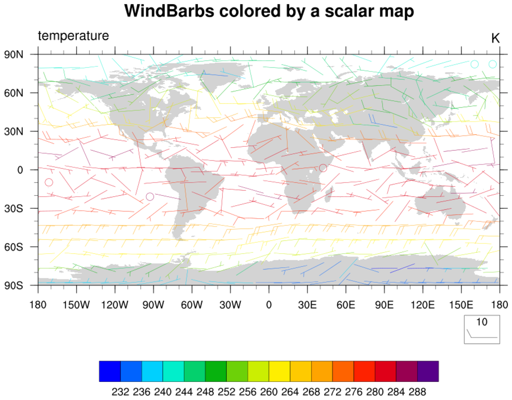 barb_2.ncl:
Wind barbs colored by a scalar field.
barb_2.ncl:
Wind barbs colored by a scalar field.vcMonoWindBarbColor will color the wind barbs by the scalar field rather than plot them on top of the scalar field.
gsn_csm_vector_scalar_map is the plot interface that draws either vector quantities on a scalar field, or colors those quantities by the scalar field.
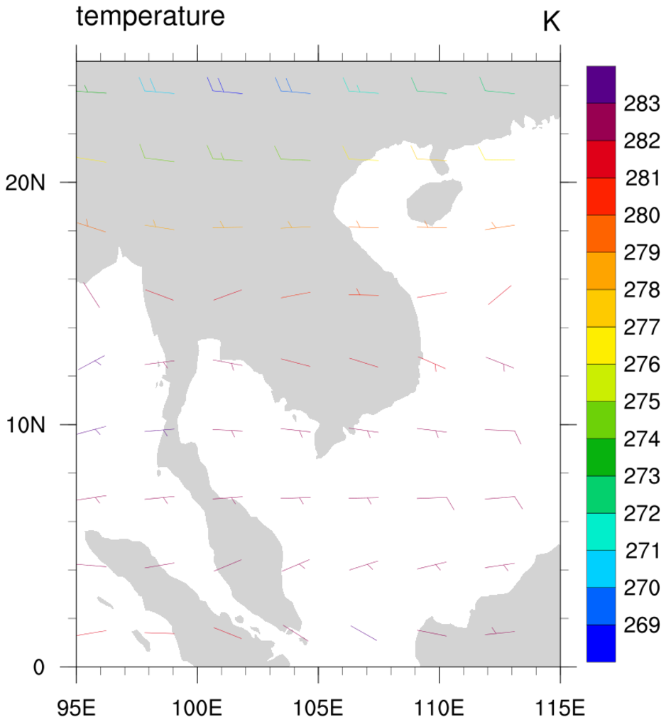 barb_3.ncl:
A regional plot that demonstrates more wind barb controls.
barb_3.ncl:
A regional plot that demonstrates more wind barb controls.vcRefAnnoOn turns off the reference wind barb since by nature it is not needed.
vcWindBarbTickLengthF controls the length of the wind barb ticks. Default is 0.3.
vcWindBarbTickSpacingF controls the distance between the wind barb ticks. Default is 0.125.
Because this is a non-global plot, we must set gsnAddCyclic to False
mpDataBaseVersion allows the user to select the coastline data base. See the coastline example page for more details.
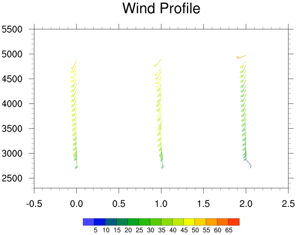
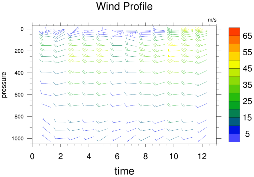 barb_4.ncl:
Demonstrates how to produce a wind profile plot.
gsn_csm_vector_scalar
is used to draw the wind profile, and then the plot is overlaid
on a logLin plot. The overlay is done for two reasons. First, the
logLin plot allows the expansion of the range of the X and Y axis
beyond that of the X/Y data coordinates. This allows the entire
wind barb field to be seen. Second, the logLin plot allows the
Y-axis to be changed from irregular to linear. (Optionally, this
also allows the Y-axis to be set to logarithmic by
setting trYLog = True,
although the Y-axis labels will likely need to be manually set
and the Y-axis cannot go < 0.)
barb_4.ncl:
Demonstrates how to produce a wind profile plot.
gsn_csm_vector_scalar
is used to draw the wind profile, and then the plot is overlaid
on a logLin plot. The overlay is done for two reasons. First, the
logLin plot allows the expansion of the range of the X and Y axis
beyond that of the X/Y data coordinates. This allows the entire
wind barb field to be seen. Second, the logLin plot allows the
Y-axis to be changed from irregular to linear. (Optionally, this
also allows the Y-axis to be set to logarithmic by
setting trYLog = True,
although the Y-axis labels will likely need to be manually set
and the Y-axis cannot go < 0.)
Note that any plot object can be overlaid on a logLin plot to make the Y-axis linear or logarithmic. (You would not want to do this when working with certain plot types, a map plot for instance.)
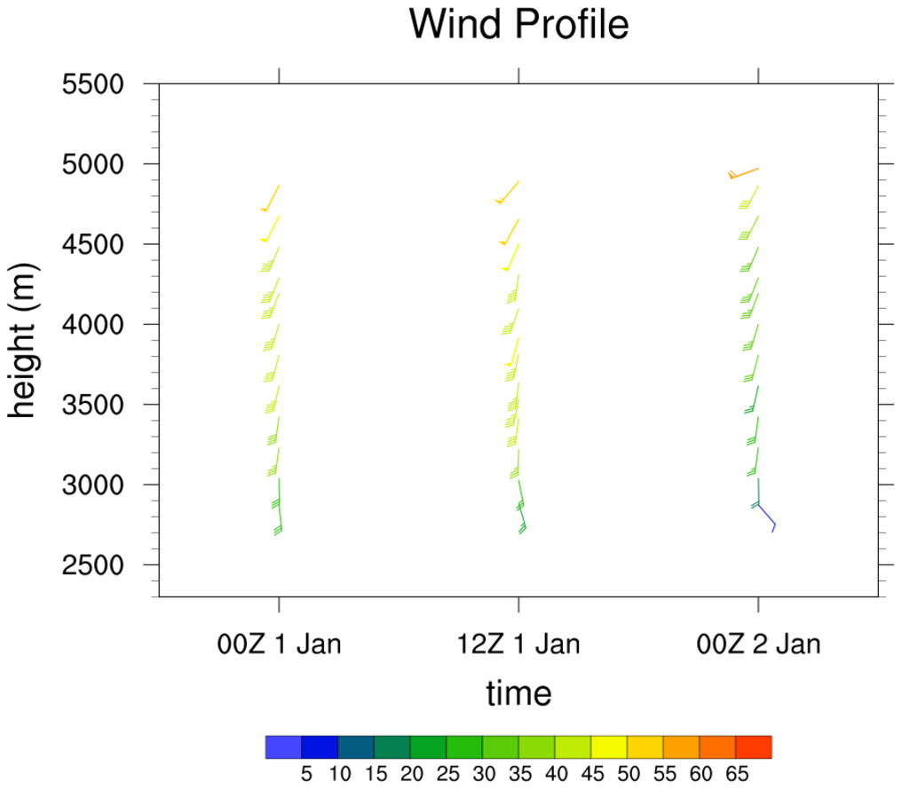
 barb_5.ncl:
Demonstrates how to produce a wind profile plot by using wmbarb.
barb_5.ncl:
Demonstrates how to produce a wind profile plot by using wmbarb. In example 4, gsn_csm_vector_scalar was used to draw a wind profile plot. One reason not to use gsn_csm_vector_scalar is if your data at each timestep has values at different levels. This can be the case with wind profiler data. In this example profiler data is read in from three ascii files and plotted on a blank plot created by gsn_csm_xy. Each wind barb is drawn separately by using wmbarb and colored according to its wind speed. Finally, a labelbar is drawn by calling gsn_labelbar_ndc.
 barb_6.ncl:
This example is identical to example 5 above, except here the wind barbs are thinned based on a user-defined criteria,
titles are added, and the bottom X-axis labels are modified. An automatic way to thin the wind barbs does not exist,
so a manual method is used here that is based on a user-defined minimum distance between barbs. This method employs
a number of if statements to determine whether a particular barb should be drawn or not.
barb_6.ncl:
This example is identical to example 5 above, except here the wind barbs are thinned based on a user-defined criteria,
titles are added, and the bottom X-axis labels are modified. An automatic way to thin the wind barbs does not exist,
so a manual method is used here that is based on a user-defined minimum distance between barbs. This method employs
a number of if statements to determine whether a particular barb should be drawn or not.