NCL Home>
Application examples>
Plot techniques ||
Data files for some examples
Example pages containing:
tips |
resources |
functions/procedures
NCL Graphics: Contours overlaid on contours
To overlay contours on top of other contours (and possibly those on
top of maps), you can either use the
overlay
procedure (which can also be used to overlay other things like vectors
and streamlines), or the special plotting function
gsn_csm_contour_map_overlay.
This page also shows how you can create different types of contours
for more meaningful plots, like dashed line contours, shaded contours,
and stippled contours.
If you plan to overlay multiple types of plots on a map
plot, the prefered method is to use the overlay
procedure.
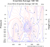 conOncon_1.ncl
: A typical contour
on contour plot.
Note that this data is already on pressure
levels. If this were model data, it would be necessary to interpolate
from hybrid coordinates to pressure levels.
Use gsn_csm_pres_hgt and gsn_csm_contour. Then
overlay(plotu,plotv) will overlay the two plots.
At this point NCL only sees one plot, plotu since it was listed first,
so now if we draw plotu, we will get both plots.
gsnContourZeroLineThicknessF doubles the
thickness of the zero contour, and gsnContourNegLineDashPattern dashes the negative
contours.
A Python version of this projection is available here.
 conOncon_2.ncl
: This example
shows how to overlay several contour objects over a map background.
gsn_csm_contour_map_overlay is the
plot interface that overlays contour objects onto a map
background. Note that this function sets the zero line thickness to
2.0 and sets all other contours line thickness to 1.0. This will
override whatever thicknesses you have set.
gsnContourZeroLineThicknessF doubles the
thickness of the zero contour, and gsnContourNegLineDashPattern dashes the negative
contours.
A Python version of this projection is available here.
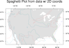
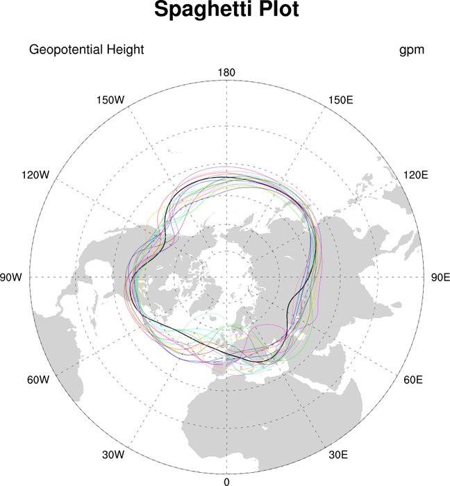
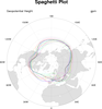 conOncon_5.ncl
: Spaghetti plot
(data with 1D coordinates):
A Python version of this projection is available here.
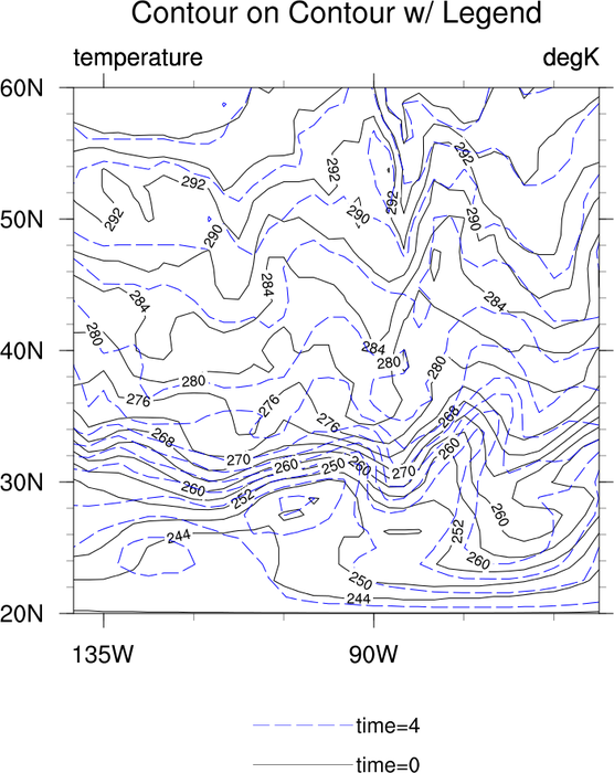
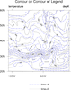 conOncon_6.ncl
: Demonstrates the
addition of a legend for a contour-On-contour plot.
gsn_legend_ndc is the function that
will add a legend to a contour plot.
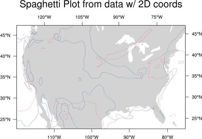
 conOncon_7.ncl
: Spaghetti plot
(data with 2D coordinates). Data with 2D coordinates require extra
steps to create an overlay spaghetti plot.
You must use gsn_contour for the
contour portion of this plot. See the sample script for all the
details.
This data just happens to be on a native
grid projection. This is just one type of data that usually has 2D
coordinates. The techniques in the loop will not change for data that
is not on a native grid.
 conOncon_8.ncl
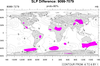
: A color
significance plot. The difference between this example and example 2
is the order. The color fill must be drawn first and then the contour
lines added. This goes whether the significance is colored magenta or
gray. The issue is a solid fill versus a pattern fill (stippling).
For a "B&W" plot, replace magenta with gray and turn off the continent
fill by setting mpFillOn = False.
 conOncon_9.ncl
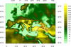
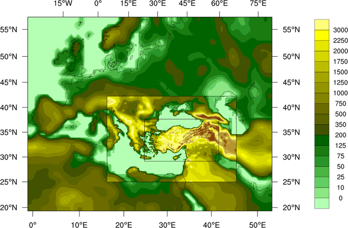
: This image
describes land use in different resolutions for each domain. This
script was originally written in
PyNGL by Ufuk Utku Turuncoglu of
the Istanbul Technical University in relation to a Turkey Climate
Change Scenarios project.
The overlay function is used to do the multiple
contour overlays, and the special lat2d/lon2d attributes are used to
indicate there are 2-dimensional latitude/longitude coordinate arrays.
Polylines are drawn on top of the map to show the three domains.
 conOncon_10.ncl
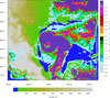
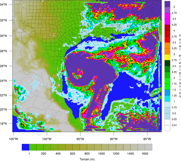
: This example shows
how to overlay precipitation contours on a terrain map, each with its
own color map. For the two lowest precipitation contours, the colors
are set to transparent. Since two color maps are used here, one of
the labelbars is drawn horizontally, and the other vertically.
This example is similar to the WRF_pcp_1.ncl
example, except it uses "gsn" functions to create the plots, rather than
"wrf" functions. The special wrf_map_resources
function is used to set the correct map projection.
The overlay function is used to do the overlay of
precipitation. The special lat2d/lon2d attributes are used to indicate
the latitude, longitude positions of the data.
Thanks to Dr. Craig Mattocks at the Center for Environmental Modeling
for Policy Development, UNC-Chapel Hill, for providing the inspiration
for this example and helping fine-tune it.