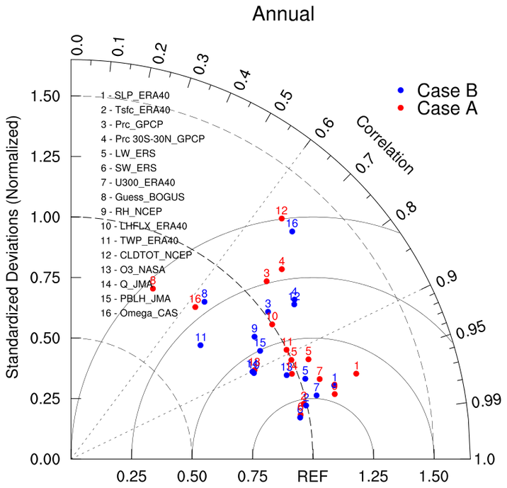
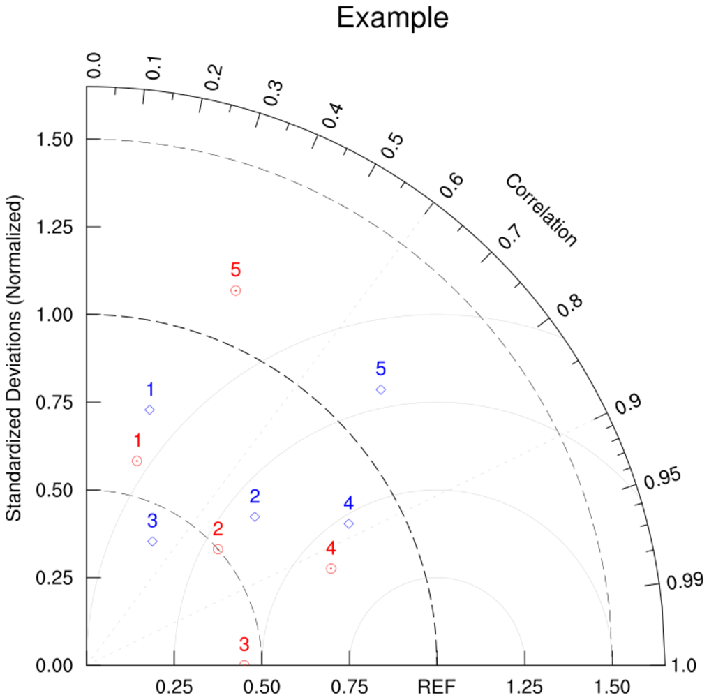
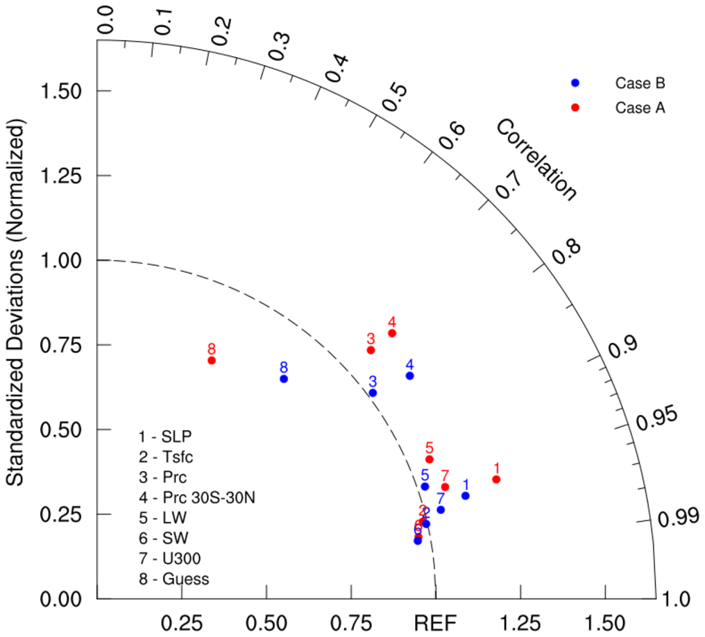
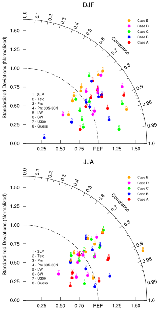
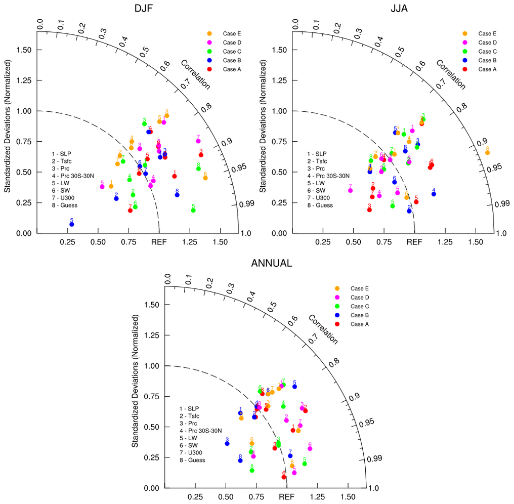
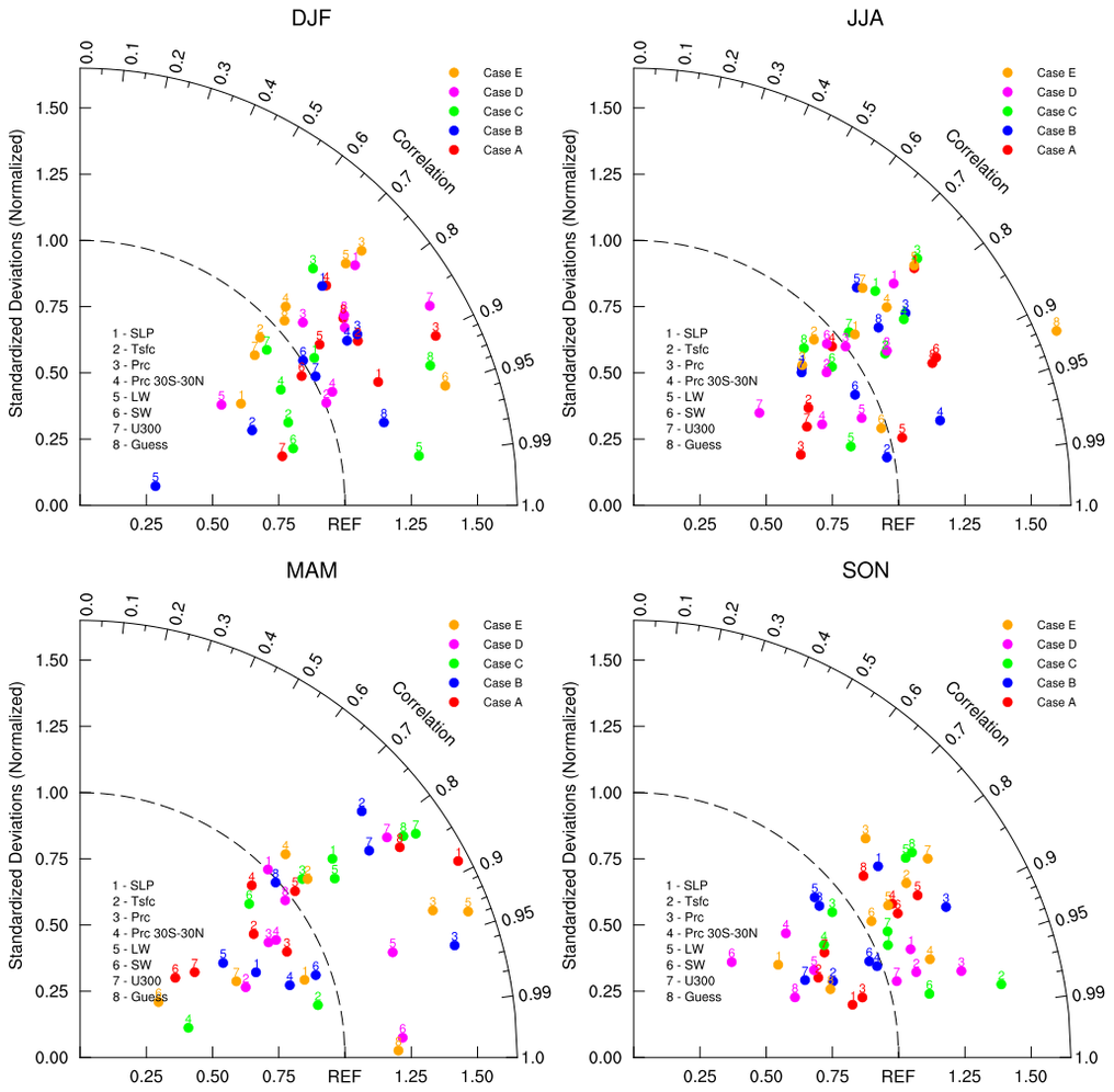
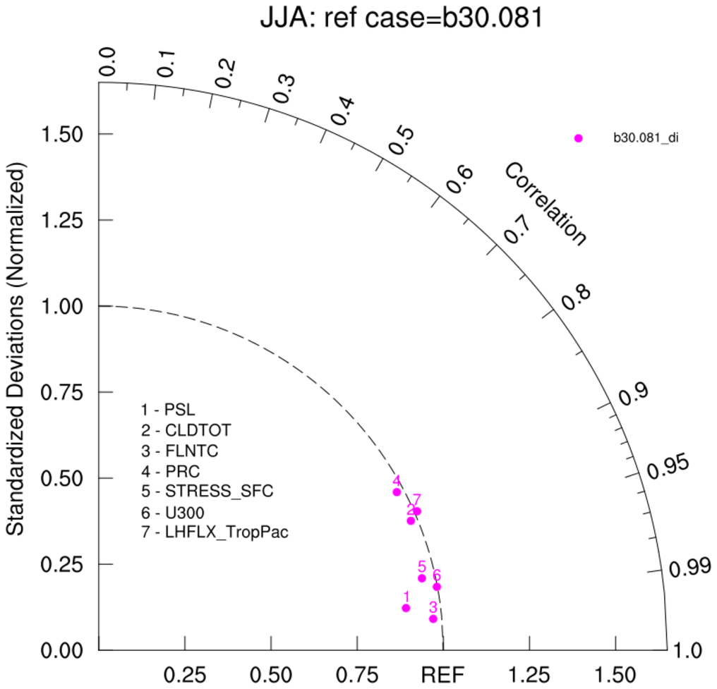
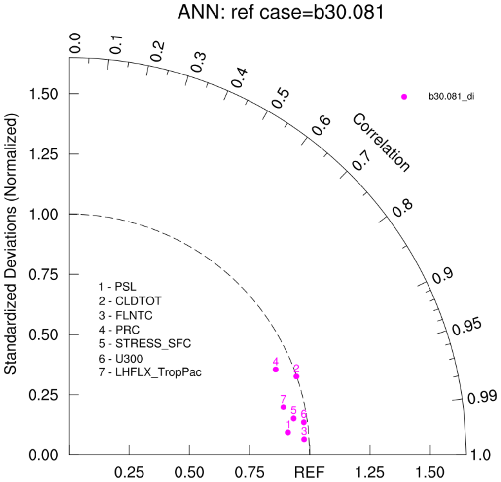
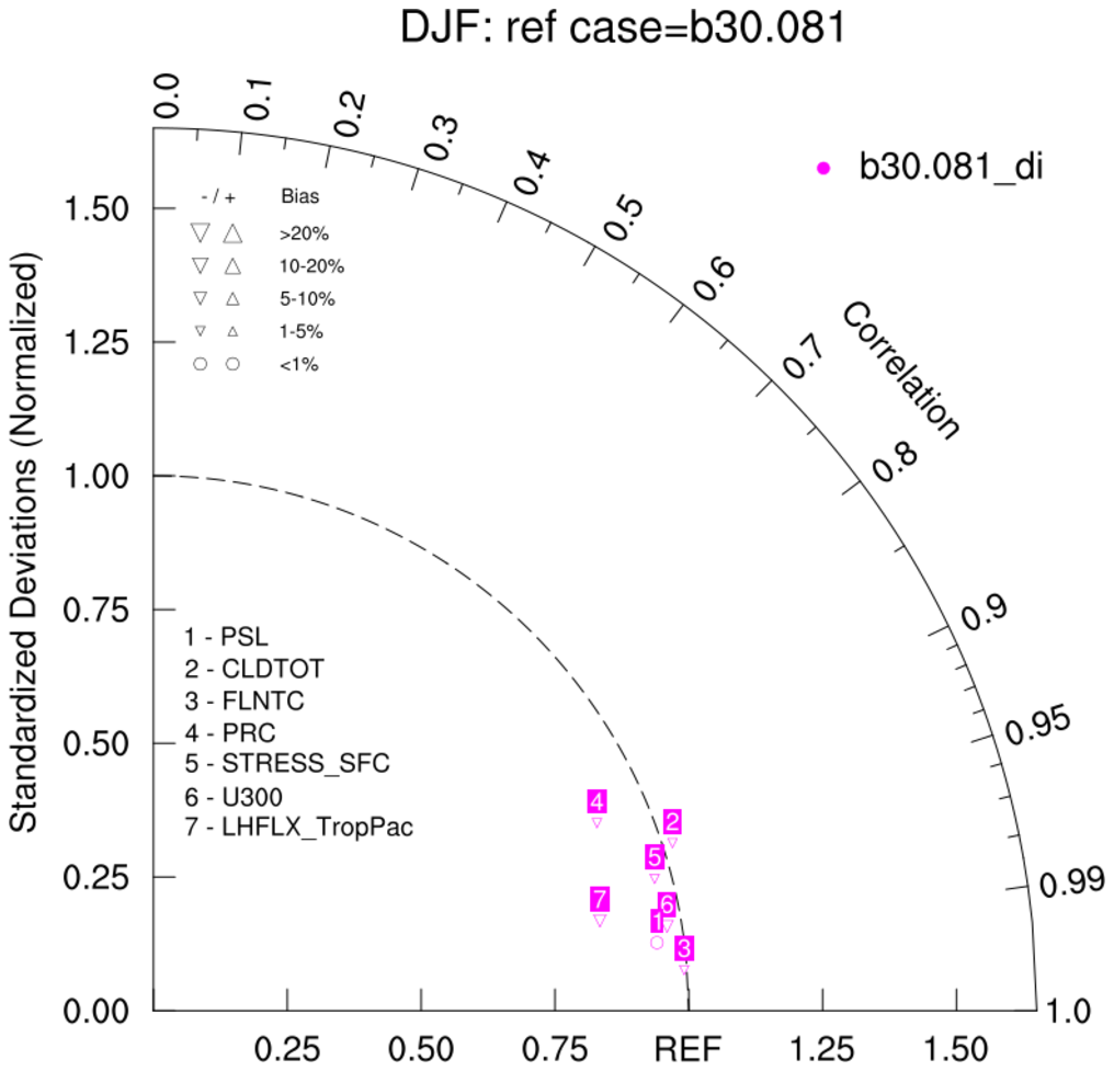
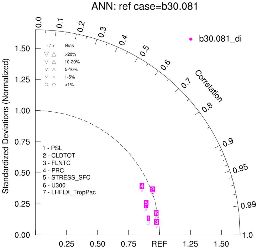
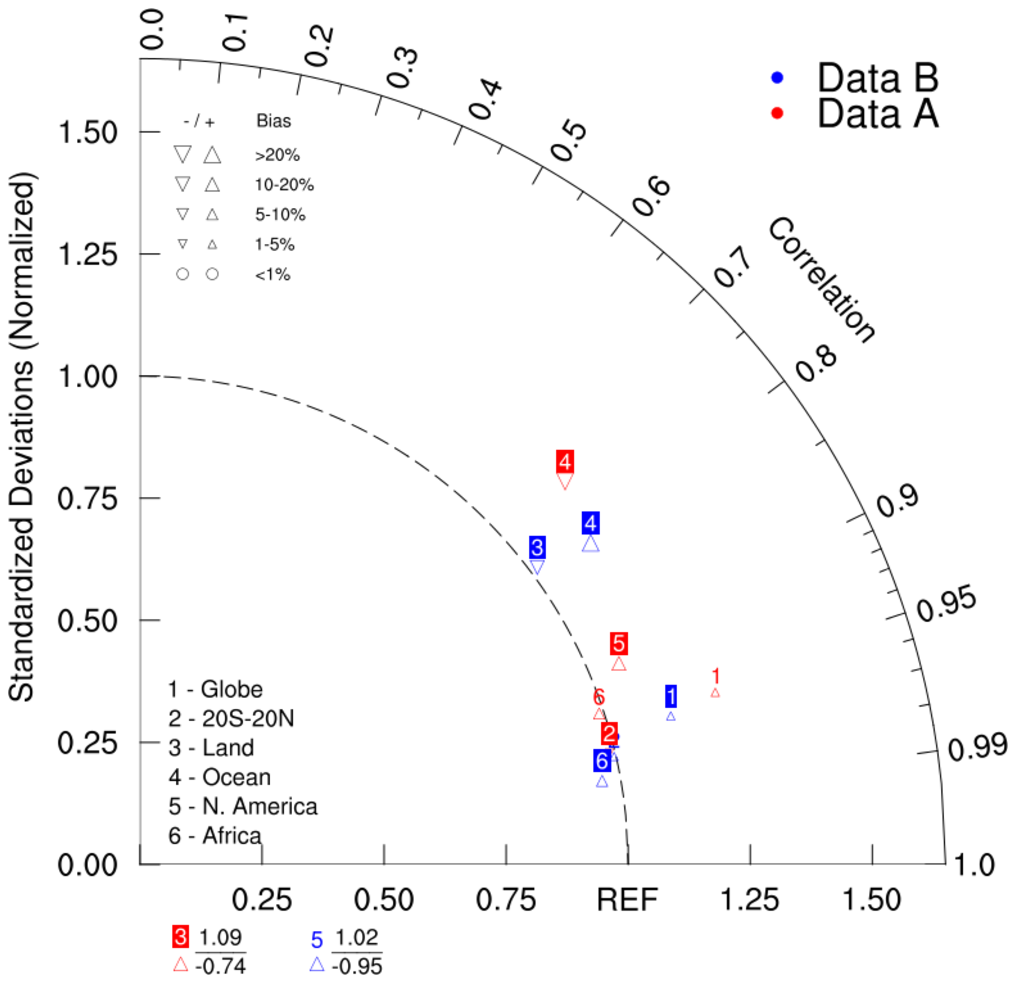
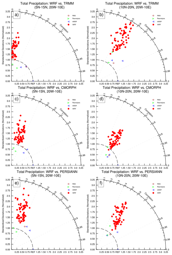
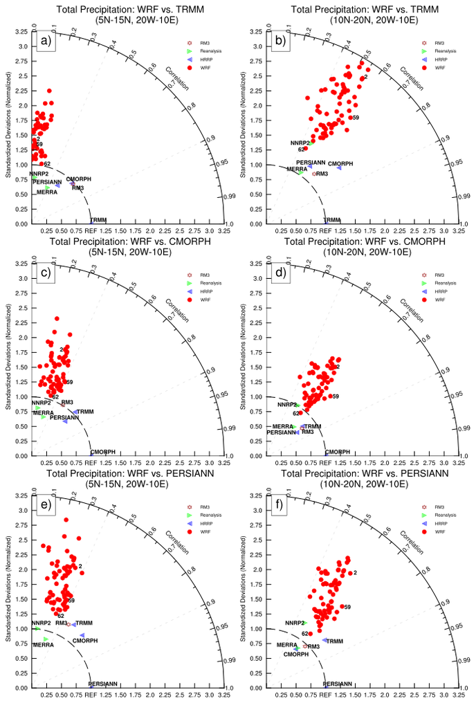
Taylor diagrams provide a visual framework for comparing a suite of variables from one or more test data sets to one or more reference data sets. Commonly, the test data sets are model experiments while the reference data set is a control experiment or some reference observations (eg, ECMWF Reanalyses). Generally, the plotted values are derived from climatological monthly, seasonal or annual means. Because the different variables (eg: precipitation, temperature) may have widely varying numerical values, the results are normalized by the reference variables. The ratio of the normalized variances indicates the relative amplitude of the model and observed variations.
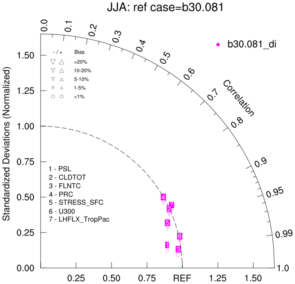
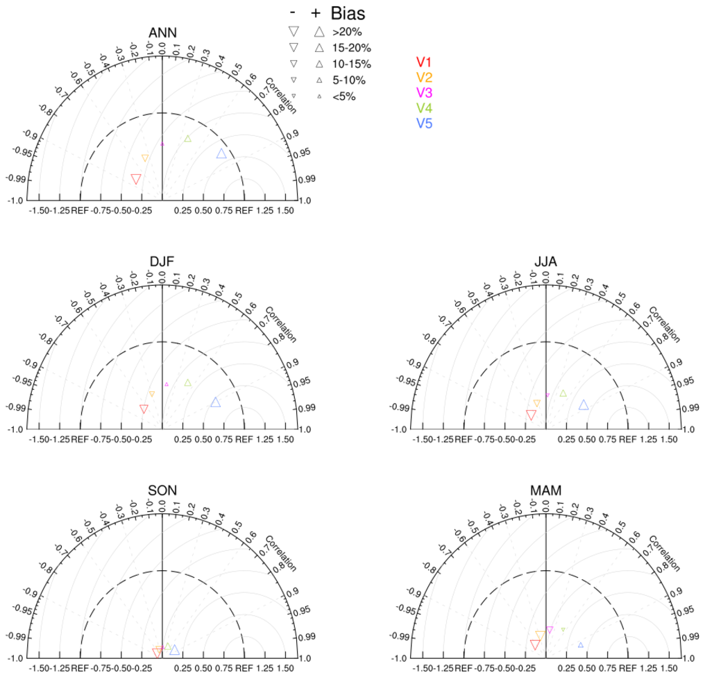
For the classic Taylor Diagram (Karl, 2005), the pertinent statistics are the weighted centered pattern correlation(s) (pattern_cor) and the ratio(s) of the normalized root-mean-square (RMS) differences between 'test' dataset(s) and 'reference' dataset(s). An additional bias statistic, developed by R. Neale (NCAR), may added to the classic Taylor Diagram. See taylor_7b below.
NCL V6.5.0 contains a function, taylor_stats, which creates the statistics needed for the taylor diagram: pattern_correlation, ratio and bias. Optionally, additional statistics can be returned. Prior to the release of NCL 6.5.0, the taylor_stats function may be downloaded from here.
Reference:
Taylor, K.E. (2005):  Taylor Diagram Primer:
A brief 4-page overview which summarizes the important aspects of these useful plots.
---

Taylor, K.E. (2001):
Summarizing multiple aspects of model performance in a single diagram
JGR, vol 106, no. D7, 7183-7192, April 16, 2001.

Gleckler, P. J., K. E. Taylor, and C. Doutriaux (2008):
Performance metrics for climate models
J. Geophys. Res., 113, D06104

Baker, N.C., Taylor, P.C (2016):
A Framework for Evaluating Climate Model Performance Metrics
Journal of Climate, 2016, 29, 5, 1773.
The following examples use taylor_diagram.ncl or taylor_diagram_cam.ncl to generate the background upon which the normalized statistics are plotted. The advantage of using the normalized version of the Taylor diagram is that variables with widely varying variances can be viewed on one figure.
The classic taylor_diagram function is prototyped as follows:
    function taylor_diagram ( wks:graphic\    ; pre-created workstation
                   , RATIO[*][*]:numeric \    ; ratios
                   , CC[*][*]:numeric    \    ; pattern correlations: range 0-1
                   , rOpts:logical)           ; scalar to which attributes are assigned
The version that includes the bias is prototyped as:
    function taylor_diagram_cam ( wks:graphic\; pre-created workstation
                   , RATIO[*][*]:numeric \    ; ratios
                   , CC[*][*]:numeric    \    ; pattern correlations: range 0-1
                   , BIAS[*][*]:numeric  \    ; rlative bias (%)
                   , rOpts:logical)           ; scalar to which attributes are assigned
The arguments are:
- RATIO[*][*]: ratio of the standardized variances
- CC[*][*]: pattern correlations: range 0-to-1
- BIAS[*][*]: relative bias (%): See taylor_8
- rOpts: options
The RATIO, CC and BIAS arguments are two dimensional. The left dimension refers to the number of test data sets used (eg: model experiments and/or observational). The right dimension holds the actual values to be plotted. If only one comparison dataset is used, the ratio, cc and bias are scalars. to plot, the user must create a two dimensional array prior to calling the function. EG:
    CC    = conform_dims( (/1,1/), cc)
    RATIO = conform_dims( (/1,1/), ratio)
    BIAS  = conform_dims( (/1,1/), bias)
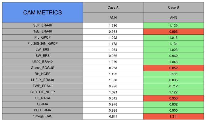
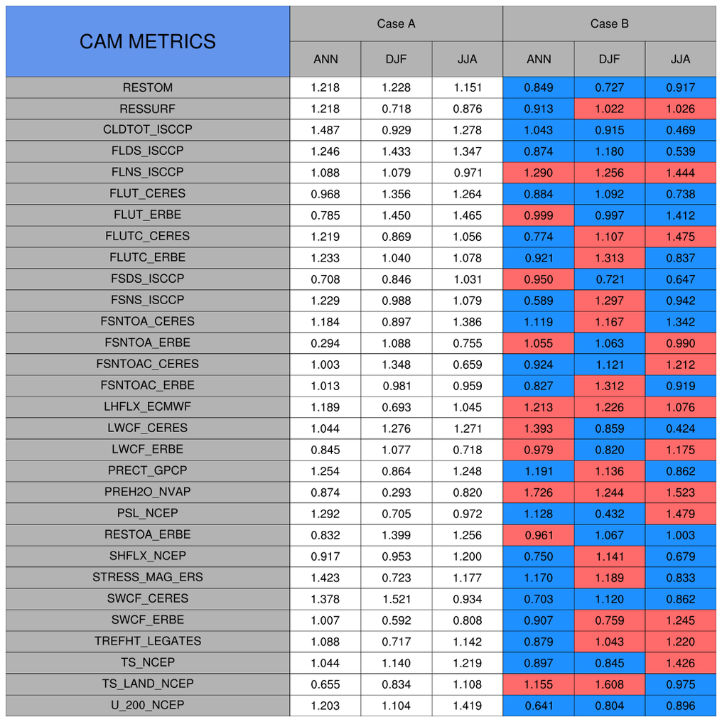
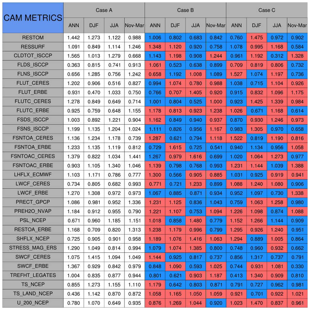
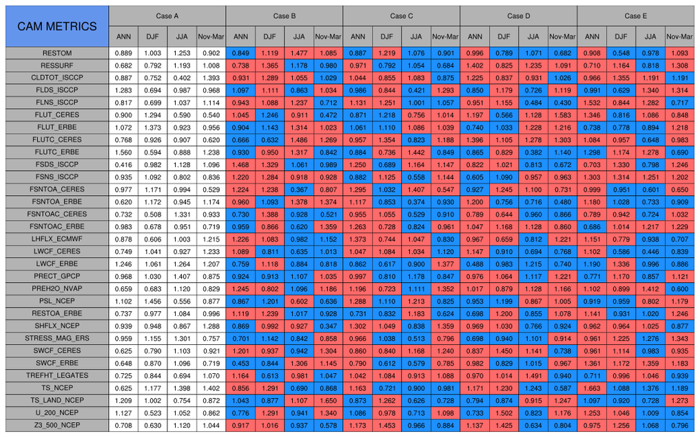
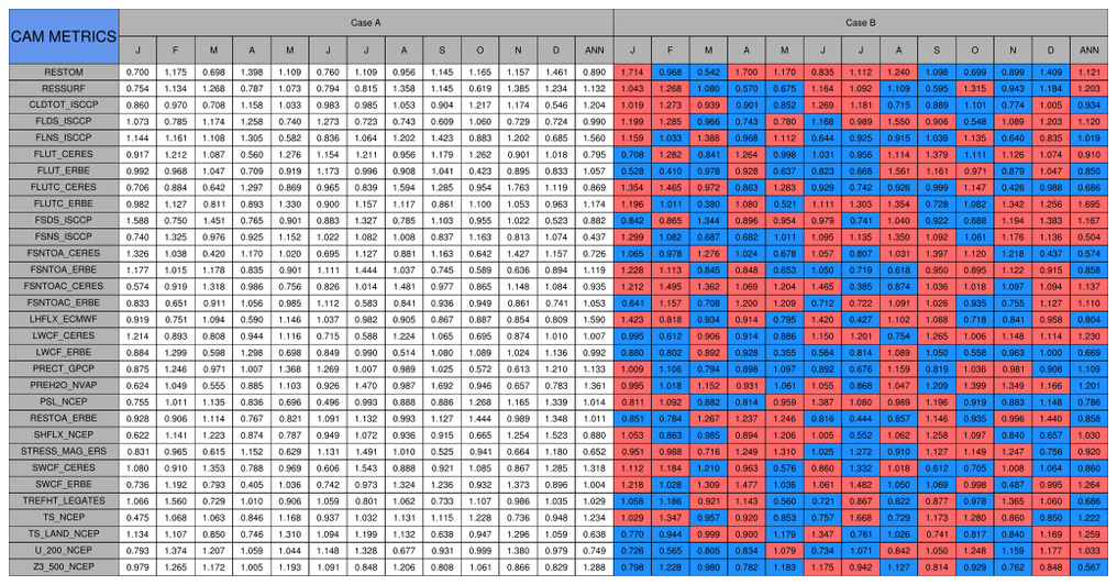
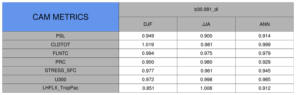
The procedure taylor_metrics_table.ncl can be used to create a table containing a specified statistic. See taylor_{7,8}.
    procedure taylor_metrics_table (mfname[1]:string \ ; plot name
                   ,varNames[*]:string      \   ; variable names
                   ,cases[*]:string         \   ; case (model) names
                   ,seasons[*]:string       \   ; season names
                   ,values[*][*][*]:numeric \   ; 3d array w values
                   ,topt:logical            )   ; table options
By default, the taylor diagram functions can handle up to 10 variable comparisons. Different colors and markers are used to differentiate between different models/cases. The 10 default colors and markers are:
      Markers = (/ 4, 6, 8,  0, 9, 12, 7, 2, 11, 16/) ; Marker Indices
      Colors  = (/ "red"      , "blue" , "green" , "cyan"  , "orange" \
                 , "turquoise", "brown", "yellow", "purple", "black" /)
The markers and colors can readily be changed by the user.
The taylor_diagram plot options are activated by setting the option argument, (say) "opt", to True and setting various attributes. The user specified attribute options include:
      opt   = True                      ; taylor diagram with options
      opt@tiMainString  = "......"      ; title
      opt@Markers       = (/  ...  /)   ; markers
      opt@Colors        = (/  ...  /)   ; colors
      opt@caseLabels    = (/  ...  /)   ; case Labels
      opt@varLabels     = (/  ...  /)   ; variable Labels

      opt@caseLabelsFontHeightF =       ; caseLabels size [default=0.12  ]
      opt@varLabelsFontHeightF  =       ; varLabels  size [default=0.013 ]
      opt@varLabelsYloc =               ; Move location of variable labels
                                        ; [default=0.45]
      opt@gsMarkerSizeF =               ; marker size     [default=0.0085]

                                        ; BACKGROUND options
      opt@stnRad        = (/  ...  /)   ; additional standard radii
      opt@ccRays        = (/  ...  /)   ; correlation rays
      opt@centerDiffRMS = True          ; RMS 'circles'
      opt@ccRays_color  = "LightGray"          ; default is black
      opt@centerDiffRMS_color  = "LightGray"   ; default is black

                                        ; OTHER recognized options
      opt@taylorFrame   = False         ; do not advance frame [default is True]
The following examples illustrate the most commonly used options.
The taylor_metrics_table options are activated by setting the option argument, (say) opt=True and setting various attributes. The user specified attribute options include:
      opt   = True                      ; taylor metric table with options
      opt@tiMainString  = "......"      ; title [default="CAM METRICS"]
                                        ; make roughly the same length
