NCL Home>
Application examples>
Plot techniques ||
Data files for some examples
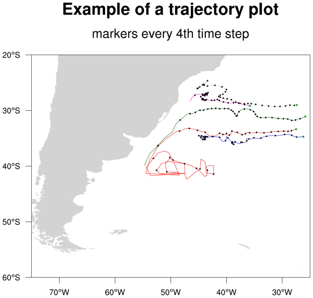
 traj_1.ncl: A simple trajectory
plot. Each trajectory is a different color for clarity, and every
fourth time step is marked with a circle. The start of each trajectory
is marked with a green circle.
traj_1.ncl: A simple trajectory
plot. Each trajectory is a different color for clarity, and every
fourth time step is marked with a circle. The start of each trajectory
is marked with a green circle.
 traj_2.ncl: Each portion of the
trajectory is now colored by a separate scalar field.
traj_2.ncl: Each portion of the
trajectory is now colored by a separate scalar field.
 traj_3.ncl:This is a unique example
of using multiple xy plots overlaid on each other to simulate a 3D
environment. The angle of the eye view is calculated using the fortran
program particle.f. To change the
angle at which the plot is viewed, change the values of angle_x,
angle_y, and angle_z in particle.f. The "particle.so" file was compiled using WRAPIT:
traj_3.ncl:This is a unique example
of using multiple xy plots overlaid on each other to simulate a 3D
environment. The angle of the eye view is calculated using the fortran
program particle.f. To change the
angle at which the plot is viewed, change the values of angle_x,
angle_y, and angle_z in particle.f. The "particle.so" file was compiled using WRAPIT:
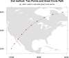 polyg_14.ncl: Draws a line on an
existing map between two points on the globe using two different methods: (a)
Setting mpGreatCircleLinesOn=True,
(b) using
gc_latlon to create a great circle path between two
locations. Uses gsn_add_polyline to
add the polyline. Any map projection can be used.
polyg_14.ncl: Draws a line on an
existing map between two points on the globe using two different methods: (a)
Setting mpGreatCircleLinesOn=True,
(b) using
gc_latlon to create a great circle path between two
locations. Uses gsn_add_polyline to
add the polyline. Any map projection can be used.
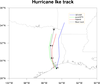 annotate_4.ncl: This example
shows how to create a hurricane track and annotate it
with a custom legend.
annotate_4.ncl: This example
shows how to create a hurricane track and annotate it
with a custom legend.
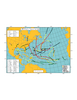 unique_1.ncl:
A real world plot showing the best tracks for a given season storms,
including all data (subtropical storms, depressions, extratropical
lows, etc).
unique_1.ncl:
A real world plot showing the best tracks for a given season storms,
including all data (subtropical storms, depressions, extratropical
lows, etc).
Example pages containing: tips | resources | functions/procedures
NCL Graphics: Trajectories
 traj_1.ncl: A simple trajectory
plot. Each trajectory is a different color for clarity, and every
fourth time step is marked with a circle. The start of each trajectory
is marked with a green circle.
traj_1.ncl: A simple trajectory
plot. Each trajectory is a different color for clarity, and every
fourth time step is marked with a circle. The start of each trajectory
is marked with a green circle.
A Python version of this projection is available here.
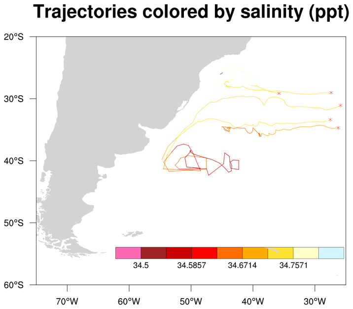
traj_2.ncl: Each portion of the
trajectory is now colored by a separate scalar field.
RGBtoCmap will take an external RGB file and create a colormap out of it.
GetFillColor will assign a color based upon an input scalar variable.
 traj_3.ncl:This is a unique example
of using multiple xy plots overlaid on each other to simulate a 3D
environment. The angle of the eye view is calculated using the fortran
program particle.f. To change the
angle at which the plot is viewed, change the values of angle_x,
angle_y, and angle_z in particle.f. The "particle.so" file was compiled using WRAPIT:
traj_3.ncl:This is a unique example
of using multiple xy plots overlaid on each other to simulate a 3D
environment. The angle of the eye view is calculated using the fortran
program particle.f. To change the
angle at which the plot is viewed, change the values of angle_x,
angle_y, and angle_z in particle.f. The "particle.so" file was compiled using WRAPIT:
WRAPIT particle.f
This technique was developed by Chin-hoh Moeng of MMM.
 polyg_14.ncl: Draws a line on an
existing map between two points on the globe using two different methods: (a)
Setting mpGreatCircleLinesOn=True,
(b) using
gc_latlon to create a great circle path between two
locations. Uses gsn_add_polyline to
add the polyline. Any map projection can be used.
polyg_14.ncl: Draws a line on an
existing map between two points on the globe using two different methods: (a)
Setting mpGreatCircleLinesOn=True,
(b) using
gc_latlon to create a great circle path between two
locations. Uses gsn_add_polyline to
add the polyline. Any map projection can be used.
A Python version of this projection is available here.
 annotate_4.ncl: This example
shows how to create a hurricane track and annotate it
with a custom legend.
annotate_4.ncl: This example
shows how to create a hurricane track and annotate it
with a custom legend.
The gsn_create_legend function is used to create the legend, and gsn_add_annotation attaches it to the map.
gsn_add_text, gsn_add_polyline, gsn_add_polymarker are used to draw the hurricane tracks.
This script was contributed by Yongzuo Li from the University of Oklahoma.
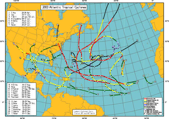 unique_1.ncl:
A real world plot showing the best tracks for a given season storms,
including all data (subtropical storms, depressions, extratropical
lows, etc).
unique_1.ncl:
A real world plot showing the best tracks for a given season storms,
including all data (subtropical storms, depressions, extratropical
lows, etc).
This script was written by Dr. Jonathan Vigh.