NCL Home>
Application examples>
gsn_csm graphical interfaces ||
Data files for some examples
Example pages containing:
tips |
resources |
functions/procedures
NCL Graphics: Plotting data on cylindrical equidistant (CE) projections
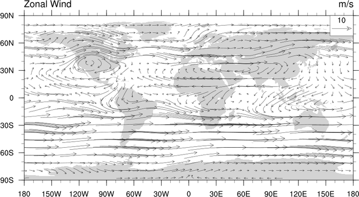
These functions all produce plots on a cylindrical equidistant map
projection:
The functions below will also give you a cylindrical equidistant map
plot by default, unless you
set mpProjection to something
other than "CylindricalEquidstant":
See the description at the top of the Map
outlines examples page for information about a change to the
behavior of the mpDataBaseVersion
resource in NCL V6.4.0.
 ce_3.ncl
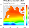
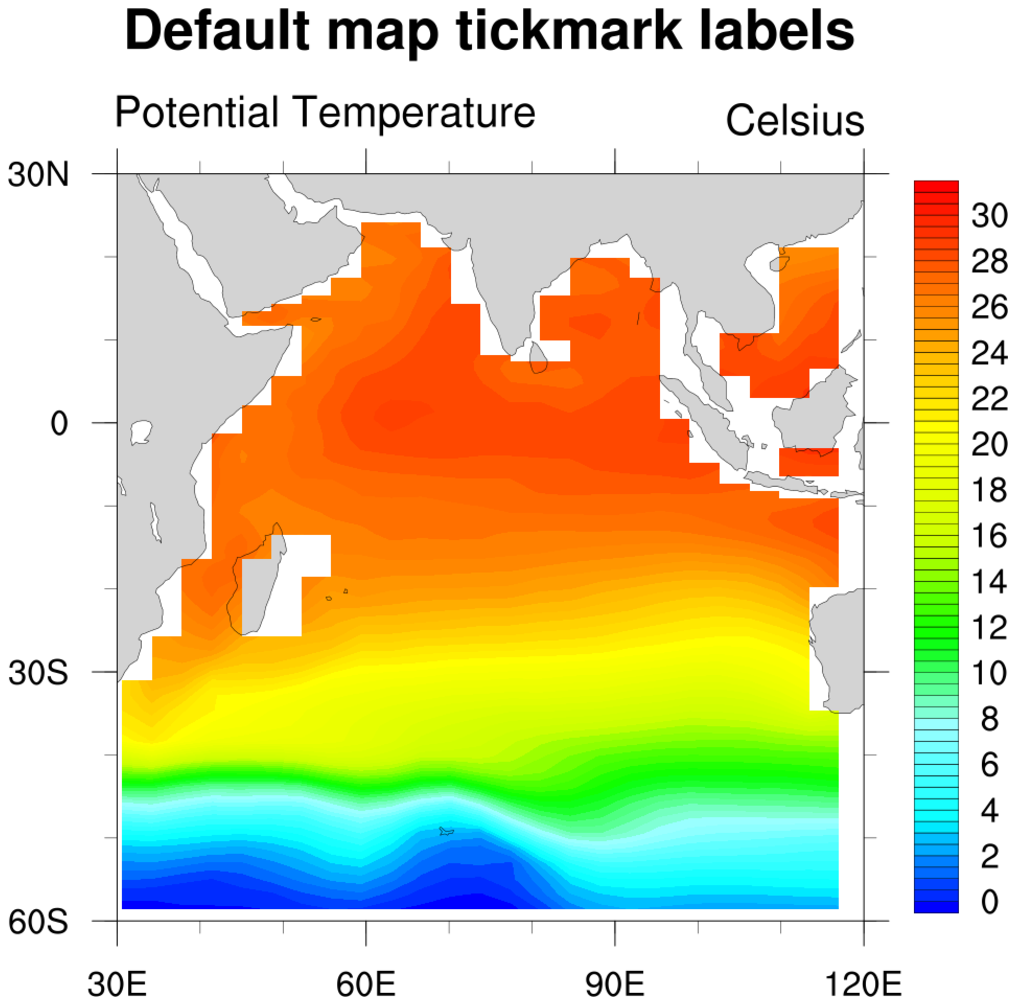
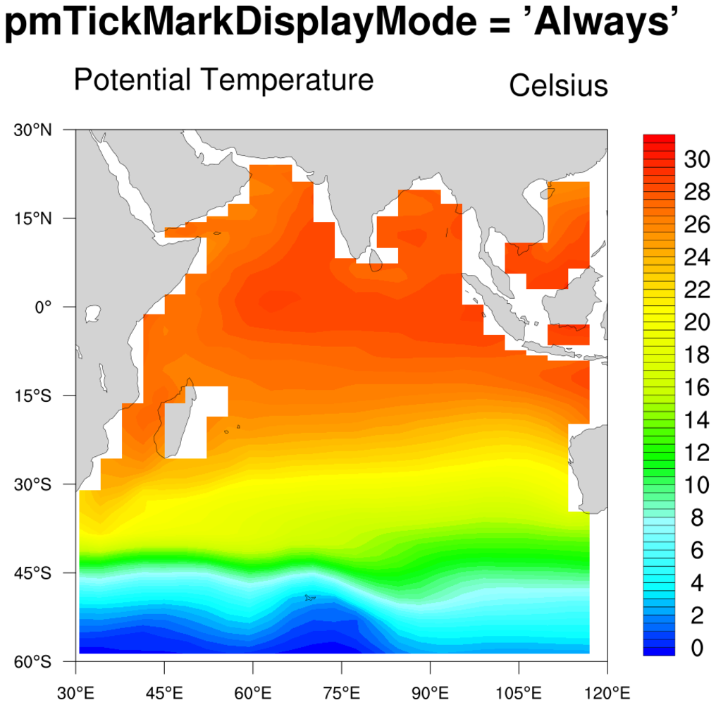
: This script shows how to plot
a subregion of a map, and compares two kinds of map tickmark
labels.
In order to plot a subregion, the map must be limited or "zoomed". For
a cylindrical equidistant projection, one method to zoom in on a map
area is by setting min/max lat/lon values:
res@mpMinLonF
res@mpMaxLonF
res@mpMinLatF
res@mpMaxLatF
To see what other methods exist and what projections they apply to,
review the
mpLimitMode documentation.
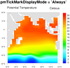
The first frame shows the default map tickmark labels. If you want
the lat/lon labels to have have degree symbols and minutes,
then set
pmTickMarkDisplayMode =
"Always". Generally, regional plots look better if you set this resource.
Note that if your data is only on a regional grid, you likely want
set to gsnAddCyclic to False to avoid
a longitude cyclic point from being added.
A Python version of this projection with major and minor ticks is available here.
A Python version of this projection with major ticks and no minor ticks is available here.
 ce_5.ncl
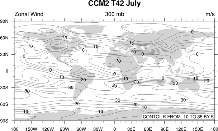
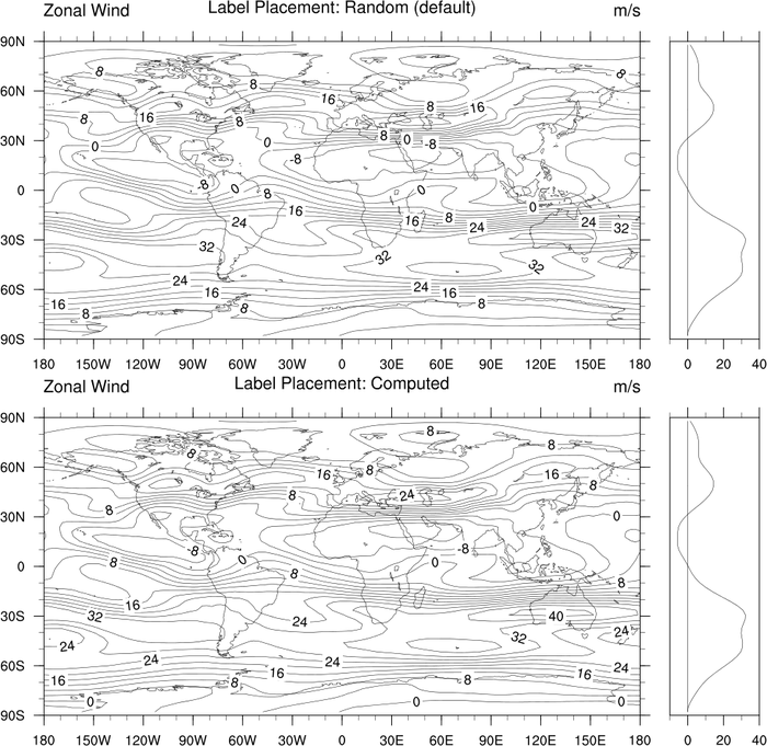
: Turns off the map fill and
adds a side zonal average.
gsnZonalMean turns on the side zonal mean
plot. This only works for contour plots. gsnZonalMeanXMaxF and gsnZonalMeanXMinF allow the user to change the
X-axis of the zonal average plot. gsnZonalMeanYRefLine sets the value that the
reference line will be drawn at on the zonal average plot, the default
value = 0.
cnInfoLabelOn turns off the
contour info label.
The placement of the line labels is controlled by the cnLineLabelPlacementMode resource. The
default is random. Also demonstrated is the "computed" value.
mpFillOn = False, turns off the
gray continents.
gsn_panel is the graphical interface
that creates a panel plot. More panel
examples are available.