In NCL Version 6.2.0, new resources were introduced that significantly speed up the drawing of ICON data done with filled polygons. See examples #2, #3, and #5 below for more information and sample scripts.
NCL Home>
Application examples>
Models ||
Data files for some examples
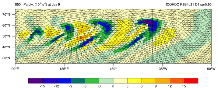
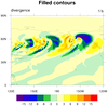
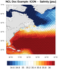
 icon_1.ncl: This script, which was
contributed by Hui Wan of MPI-M, creates a filled contour plot of the
"divergence" variable from an ICON model data file.
icon_1.ncl: This script, which was
contributed by Hui Wan of MPI-M, creates a filled contour plot of the
"divergence" variable from an ICON model data file.
 icon_2.ncl /
icon_faster_2.ncl:
This example is identical to the previous one, except additionally,
each triangle is drawn, filled, and outlined using the triangle vertex
information on the file ("clon_vertices" and "clat_vertices").
The gsn_add_polygon procedure is used to
add the triangles to the plot. Various draw order resources are set in
order to control the order of the various plot elements:
icon_2.ncl /
icon_faster_2.ncl:
This example is identical to the previous one, except additionally,
each triangle is drawn, filled, and outlined using the triangle vertex
information on the file ("clon_vertices" and "clat_vertices").
The gsn_add_polygon procedure is used to
add the triangles to the plot. Various draw order resources are set in
order to control the order of the various plot elements:
 icon_3.ncl /
icon_faster_3.ncl:
This example is identical to
the previous one, except this time just a map plot is created for
drawing the filled triangles on top.
icon_3.ncl /
icon_faster_3.ncl:
This example is identical to
the previous one, except this time just a map plot is created for
drawing the filled triangles on top.
 icon_4.ncl: The first frame is
a simple filled contour plot over a map of divergence, again
using 1D lat/lon arrays for the overlay.
icon_4.ncl: The first frame is
a simple filled contour plot over a map of divergence, again
using 1D lat/lon arrays for the overlay.


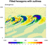 icon_5.ncl /
icon_faster_5.ncl:
This dataset is similar to that from the first three examples, except
this time instead of triangles, you have hexagons. The code is very
similar to that in example 3, except the vlon/vlat and
vlon_vertices/vlat_vertices variables on the file are used to
determine the centers and edges of the data.
icon_5.ncl /
icon_faster_5.ncl:
This dataset is similar to that from the first three examples, except
this time instead of triangles, you have hexagons. The code is very
similar to that in example 3, except the vlon/vlat and
vlon_vertices/vlat_vertices variables on the file are used to
determine the centers and edges of the data.
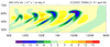
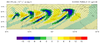
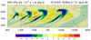
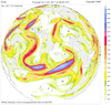
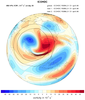 icon_6.ncl: This example shows how to
overlay contours from two high-resolution fields onto a coarse global
field. These are contours of 750 hPa vorticity for the
mountain-induced Rossby wave train test.
icon_6.ncl: This example shows how to
overlay contours from two high-resolution fields onto a coarse global
field. These are contours of 750 hPa vorticity for the
mountain-induced Rossby wave train test.
 ESMF_regrid_14.ncl /
ESMF_wgts_14.ncl /
ESMF_all_14.ncl:
ESMF_regrid_14.ncl /
ESMF_wgts_14.ncl /
ESMF_all_14.ncl:
 NUG_triangular_grid_ICON.ncl:
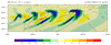
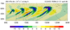
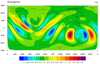
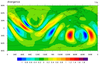
 plot_jetstream_icon.ncl:
Example pages containing: tips | resources | functions/procedures
NCL Graphics: ICON model data
This page describes various ways to visualize ICON model data.
The variables "clon" and "clat" on the file are used to indicate the center lat/lon locations of the triangles, so we can overlay this data on a map.
Because these arrays are all one-dimensional, internally NCL is using a triangular mesh algorithm to create the contours.
cnFillDrawOrder = "PreDraw"
tfPolyDrawOrder = "Draw"
mpOutlineDrawOrder = "PostDraw"
With NCL Version 6.2.0, there's a faster way of drawing these triangles, using new resources gsSegments and gsColors. The second image and "icon_faster_2.ncl" show how to use these resources.
Note that this example is a bit of an overkill, because the contout plot is being drawn and then completely covered by the filled triangles. It is necessary to create and draw the contour plot so we get tickmarks and a labelbar. We also use the contour plot to retrieve what levels and colors to use for the filled triangles.
The next example shows how to create and draw the filled triangles using just a map plot.
Doing things this way requires us to set our own levels and colors that we want for the filled triangles. We also have to create our own labelbar using gsn_create_labelbar and gsn_add_annotation.
Similar to the "icon_faster_2.ncl" script above, you can create a faster version of this script using new resources gsSegments and gsColors, which are available in NCL Version 6.2.0. See the "icon_faster_3.ncl" script. The "icon_3.ncl" script took about 1.64 CPU seconds on a Mac, and "icon_faster_3.ncl" took about 0.33 CPU seconds.
The second frame draws filled triangles over a map, this time using gsn_add_polygon to attach the filled triangles. Note that it takes a long time to draw this second frame, because there are thousands of individual triangles being filled. Also, some triangles "wrap" around the globe, so these have to be fixed.
Similar to the "icon_faster_2.ncl" script above, you can create a faster version of this script using new resources gsSegments and gsColors, which are available in NCL Version 6.2.0. See the "icon_faster_5.ncl" script. The "icon_5.ncl" script took about 38 CPU seconds on a Mac, and "icon_faster_5.ncl" took about 0.55 CPU seconds.
The overlay procedure is used to overlay the two high-resolution fields onto the global field. cnFillDrawOrder and cnLineDrawOrder are set to "PostDraw" for the overlaid plots to make sure they get drawn on top of all the elements from the global field.
This example was contributed by Daniel Reinert of Deutscher Wetterdienst (the German Meteorological Service).
 ESMF_regrid_14.ncl /
ESMF_wgts_14.ncl /
ESMF_all_14.ncl:
ESMF_regrid_14.ncl /
ESMF_wgts_14.ncl /
ESMF_all_14.ncl:
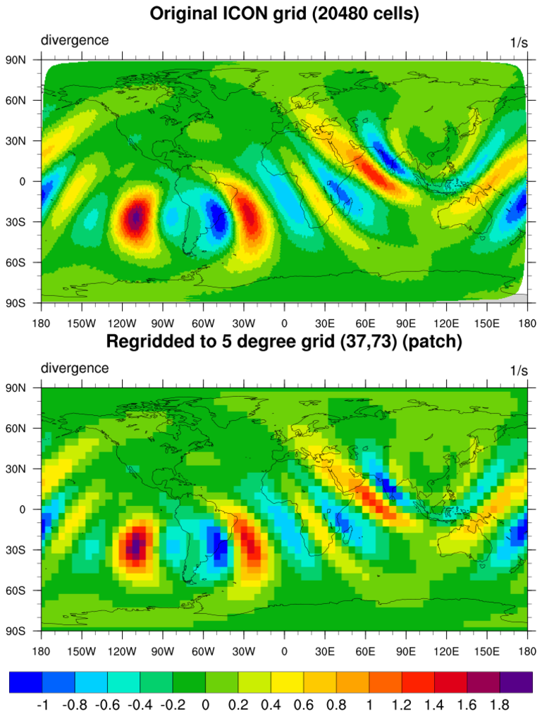
This example regrids triangular mesh (unstructured) data from the ICON model (20480 cells) to a 5 degree grid (37 x 73).
This example shows how to use gsn_add_polygon to color fill the triangles of an ICON grid based on which level the 'wet_c' value falls in.
As with the previous ICON examples, the gsSegments and gsColors resources are used to set the array of segments and the colors to use for each segment. This makes the polygon draw go much faster than using a loop to draw each triangle.
A unique feature of this example is that it first creates a contour/map plot of the ICON grid, but doesn't draw it. This is done in order to retrieve the contour levels and colors that NCL chose for this grid, and then this information is used to draw the filled polygons.
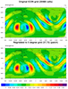
This is a nice example of drawing geopotential line contours over filled contours of wind intensity, using the overlay procedure to overlay the line contour plot on the contour/map plot. The filled contours are drawn using raster fill, with the first contour level set to transparency.
There's a quirk with raster contours and transparency in NCL. It's not enough to simply set the alpha value to 0.0. You must also set the color to black as well:
  cmap_r      = read_colormap_file("wind_17lev")
  cmap_r(0,:) = 0.0  ; Sets desired color to black and transparent at same time
This example was contributed by Guido Cioni, who has created a number of nice graphics using NCL and other packages which you can see at http://guidocioni.altervista.org/nuovosito/modelli/icon-globe-forecasts/.