Example pages containing: tips | resources | functions/procedures
NCL Graphics: Plotting r,theta (radar) data
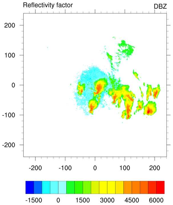
 radar_1.ncl: A simple example of
creating contours from (r, theta) coordinates. Note the calculations
that are done to create 2D coordinates in X and Y.
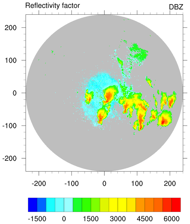
radar_1.ncl: A simple example of
creating contours from (r, theta) coordinates. Note the calculations
that are done to create 2D coordinates in X and Y.
The first frame is done using raster fill (cnFillMode = "RasterFill"). The second frame is done using cell fill (cnFillMode = "CellFill"), which allows you to additionally set cnMissingValFillColor to fill the missing value areas in some color.
A Python version of this projection is available here.
 radar_3.ncl: This example
shows how to create a radial background plot and then
attach different colored markers to it (using dummy data).
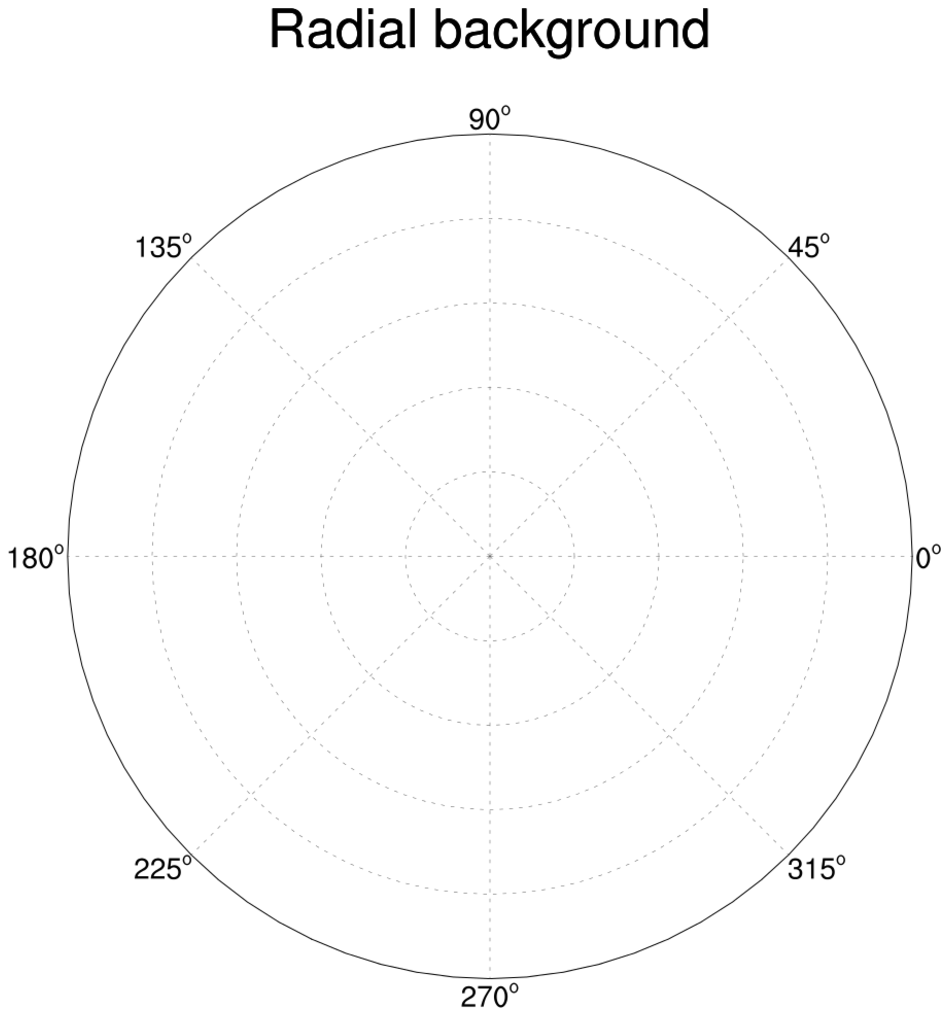
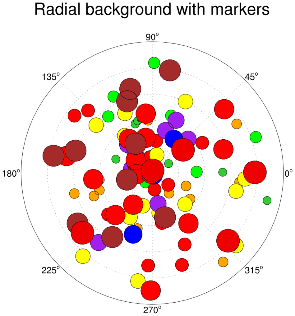
radar_3.ncl: This example
shows how to create a radial background plot and then
attach different colored markers to it (using dummy data).
The main funtion for creating the radial plot is "radial_plot". This function calls three different procedures for creating the radial lines (add_radial_lines), the circles (add_radial_circles), and the labels around the outer circle (add_radial_labels).
Note: this example may change if we get some better examples of plotting radar data.
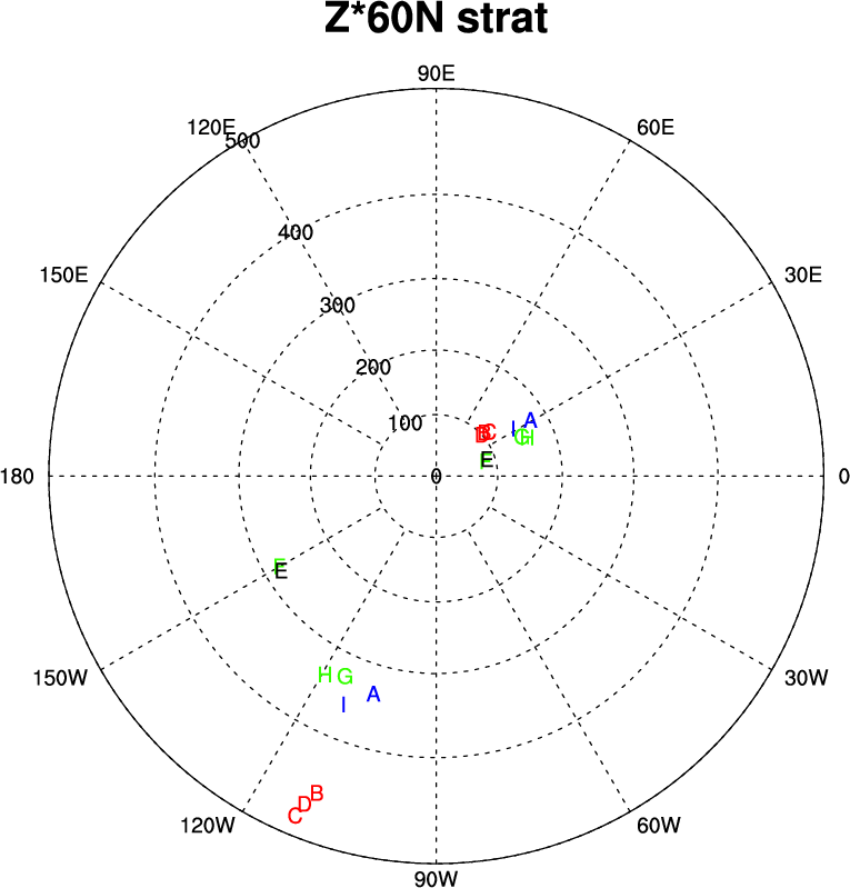 radar_4.ncl: This example uses a
modified version of map tickmarks to create a nice set of labels for a
radar plot.
radar_4.ncl: This example uses a
modified version of map tickmarks to create a nice set of labels for a
radar plot.
It was contributed by Chris Fletcher from the University of Waterloo.
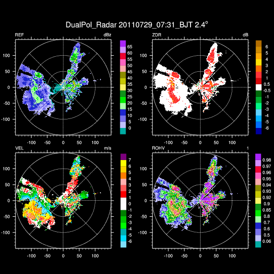
radar_5.ncl: This example shows
how to create a radar plot by plotting the random points using
raster-filled contours. It uses a color table
called radar_qinrui.rgb.
This example creates a panel plot where each plot uses a different part of the colormap, via the use of read_colormap_file to read the file as an RGBA array, and then subsetting it accordingly with the cnFillPalette resource.
This example was contributed by Qin Rui of the Beijing Weather Modification Office.