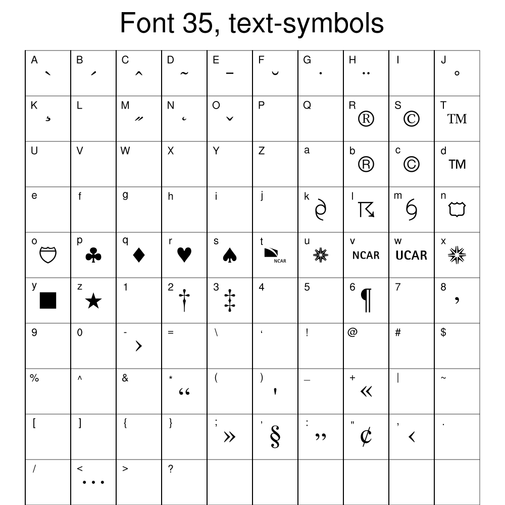
You can use the NCL table of predefined markers, or you can define your own using the NhlNewMarker function.
NCL Home>
Application examples>
gsn_csm graphical interfaces ||
Data files for some examples

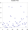 scatter_1.ncl: Basic scatter plot
using gsn_y to create an XY plot,
and setting the resource xyMarkLineMode to "Markers" to get markers
instead of lines.
scatter_1.ncl: Basic scatter plot
using gsn_y to create an XY plot,
and setting the resource xyMarkLineMode to "Markers" to get markers
instead of lines.
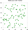
 scatter_2.ncl: This is similar to the
previous example, except NhlNewMarker is used to
create a new marker (clover, character 'p' in font
table #35). You can create your own marker using any character
from any of NCL's font
tables.
scatter_2.ncl: This is similar to the
previous example, except NhlNewMarker is used to
create a new marker (clover, character 'p' in font
table #35). You can create your own marker using any character
from any of NCL's font
tables.
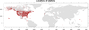
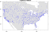 scatter_3.ncl: This example
shows how to create a scatter plot over a map. The
gsn_csm_map function
is used to create and draw the map, and then
gsn_polymarker is used to
draw markers on top of the map.
scatter_3.ncl: This example
shows how to create a scatter plot over a map. The
gsn_csm_map function
is used to create and draw the map, and then
gsn_polymarker is used to
draw markers on top of the map.
 scatter_4.ncl: Demonstrates a
scatter plot with a regression line.
scatter_4.ncl: Demonstrates a
scatter plot with a regression line.
 scatter_5.ncl: Demonstrates
how to take a 1D array of data, and group the values so you can
mark each group with a different marker and color using gsn_csm_y.
scatter_5.ncl: Demonstrates
how to take a 1D array of data, and group the values so you can
mark each group with a different marker and color using gsn_csm_y.
 scatter_6.ncl: Demonstrates
how to draw outlined, filled markers over a polar map plot.
scatter_6.ncl: Demonstrates
how to draw outlined, filled markers over a polar map plot.
 newcolor_4.ncl:
This example is identical to the previous scatter_6.ncl example,
except it uses the
new gsMarkerOpacityF
resource introduced in
NCL 6.1.0 to make
the filled markers partially transparent.
newcolor_4.ncl:
This example is identical to the previous scatter_6.ncl example,
except it uses the
new gsMarkerOpacityF
resource introduced in
NCL 6.1.0 to make
the filled markers partially transparent.
 scatter_7.ncl: Demonstrates how to
draw hollow markers of different sizes and colors, and then use
labelbars, markers, and text to create a legend.
scatter_7.ncl: Demonstrates how to
draw hollow markers of different sizes and colors, and then use
labelbars, markers, and text to create a legend.
 scatter_8.ncl: Demonstrates how to
draw filled square markers of different colors, and then
attach a labelbar to the outside of the plot.
scatter_8.ncl: Demonstrates how to
draw filled square markers of different colors, and then
attach a labelbar to the outside of the plot.
 scatter_9.ncl: Demonstrates
how to use lspoly to calculate a least-squares
polynomial fit through a random set of points.
scatter_9.ncl: Demonstrates
how to use lspoly to calculate a least-squares
polynomial fit through a random set of points.
 scatter_10.ncl: Demonstrates how to
overlay a scatter plot (of filled squares) on a map plot, when the
scatter plot is not in lat/lon space. The key is to use
gsn_csm_blank_plot to create a
canvas for drawing the filled polygons, making sure that the four
corners of the blank plot correspond with the four corners of the
cylindrical equidistant map plot that is created.
scatter_10.ncl: Demonstrates how to
overlay a scatter plot (of filled squares) on a map plot, when the
scatter plot is not in lat/lon space. The key is to use
gsn_csm_blank_plot to create a
canvas for drawing the filled polygons, making sure that the four
corners of the blank plot correspond with the four corners of the
cylindrical equidistant map plot that is created.
 scatter_11.ncl
: Adapted from scatter_5.ncl, illustrates the use of new XYPlot
opacities resources for controlling the transparency of markers on a
scatter plot (new with NCL 6.4.0). See
xyMarkerOpacityF and
xyMarkerOpacities
scatter_11.ncl
: Adapted from scatter_5.ncl, illustrates the use of new XYPlot
opacities resources for controlling the transparency of markers on a
scatter plot (new with NCL 6.4.0). See
xyMarkerOpacityF and
xyMarkerOpacities
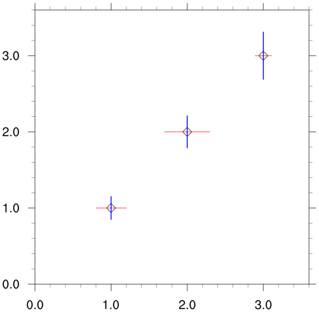
 scatter_12.ncl: Draw separate error
bars in the x and y directions.
scatter_12.ncl: Draw separate error
bars in the x and y directions.
 scatter_13.ncl: This script shows
how to draw a more custom scatter plot with the plot area filled in
gray and white grid lines added. This plot uses the same data and is similar
to bar_22.ncl on the bar plot page.
scatter_13.ncl: This script shows
how to draw a more custom scatter plot with the plot area filled in
gray and white grid lines added. This plot uses the same data and is similar
to bar_22.ncl on the bar plot page.
Example pages containing:
tips |
resources |
functions/procedures
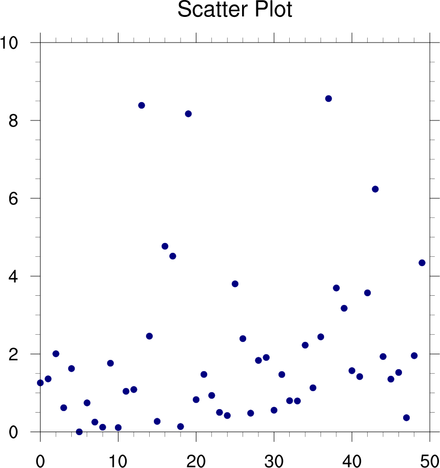
NCL Graphics: Scatter Plots
This suite of examples shows how to create scatter plots. Some of
these are basic XY plots in "marker" mode. Others are drawn using
polymarkers.
 scatter_1.ncl: Basic scatter plot
using gsn_y to create an XY plot,
and setting the resource xyMarkLineMode to "Markers" to get markers
instead of lines.
scatter_1.ncl: Basic scatter plot
using gsn_y to create an XY plot,
and setting the resource xyMarkLineMode to "Markers" to get markers
instead of lines.
The appearance of the markers are changed using xyMarker to get a filled dot, xyMarkerColor to change the color, and xyMarkerSizeF to change the size.
A Python version of this projection is available here.
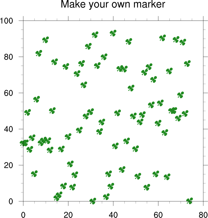
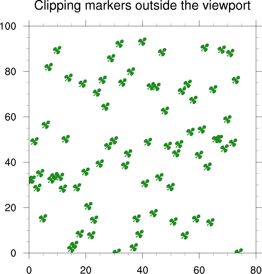 scatter_2.ncl: This is similar to the
previous example, except NhlNewMarker is used to
create a new marker (clover, character 'p' in font
table #35). You can create your own marker using any character
from any of NCL's font
tables.
scatter_2.ncl: This is similar to the
previous example, except NhlNewMarker is used to
create a new marker (clover, character 'p' in font
table #35). You can create your own marker using any character
from any of NCL's font
tables.
The second frame of this example shows how you can clip the markers by setting vpClipOn to True.
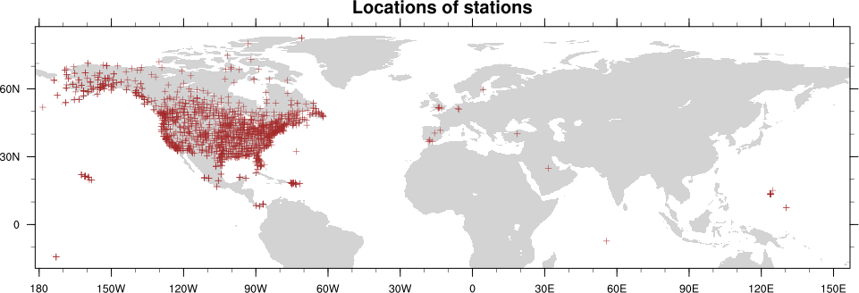
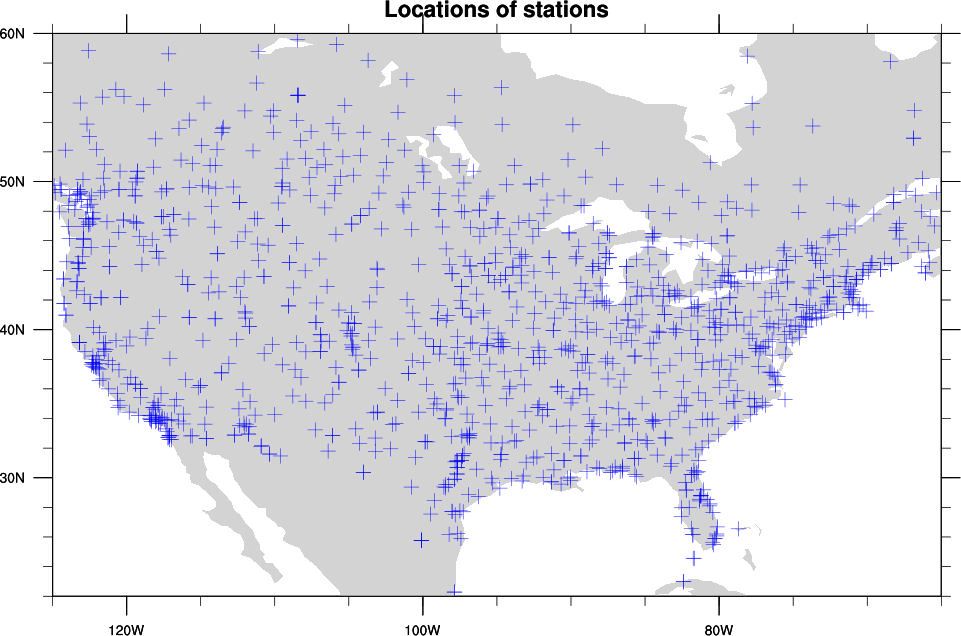 scatter_3.ncl: This example
shows how to create a scatter plot over a map. The
gsn_csm_map function
is used to create and draw the map, and then
gsn_polymarker is used to
draw markers on top of the map.
scatter_3.ncl: This example
shows how to create a scatter plot over a map. The
gsn_csm_map function
is used to create and draw the map, and then
gsn_polymarker is used to
draw markers on top of the map.
In the second frame, the map is zoomed further in, and the markers are "attached" to the map using gsn_add_polymarker. This means you won't see the markers until you draw the map. This is the preferred method, especially if you plan to resize or panel this plot later.
A Python version of this projection is available here.
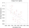
scatter_4.ncl: Demonstrates a
scatter plot with a regression line.
The function regline calculates the least squared regression for a one dimensional array.
A Python version of this projection is available here.
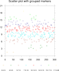
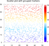
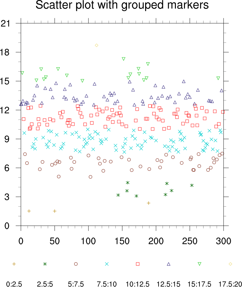 scatter_5.ncl: Demonstrates
how to take a 1D array of data, and group the values so you can
mark each group with a different marker and color using gsn_csm_y.
scatter_5.ncl: Demonstrates
how to take a 1D array of data, and group the values so you can
mark each group with a different marker and color using gsn_csm_y.
The function nice_mnmxintvl is used to create a nice set of equally-spaced levels through the data. You can then create a 2D array, where the leftmost dimension represents each level and the rightmost dimension the number of values grouped in that level.
xyMarkers and xyMarkerColors are used to to define different colors and markers for each group.
A Python version of this projection is available here.
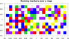
 scatter_6.ncl: Demonstrates
how to draw outlined, filled markers over a polar map plot.
scatter_6.ncl: Demonstrates
how to draw outlined, filled markers over a polar map plot.
The gsn_add_polymarker function is called twice for each range of values: once to draw a filled dot (gsMarkerIndex=16) and one to draw an outlined dot (gsMarkerIndex=4). This gives the appearance of outlined markers. The marker sizes (gsMarkerSizeF) range in value from 0.025 to 0.075.
The random_uniform function is used to generate random data.
A Python version of this projection is available here.
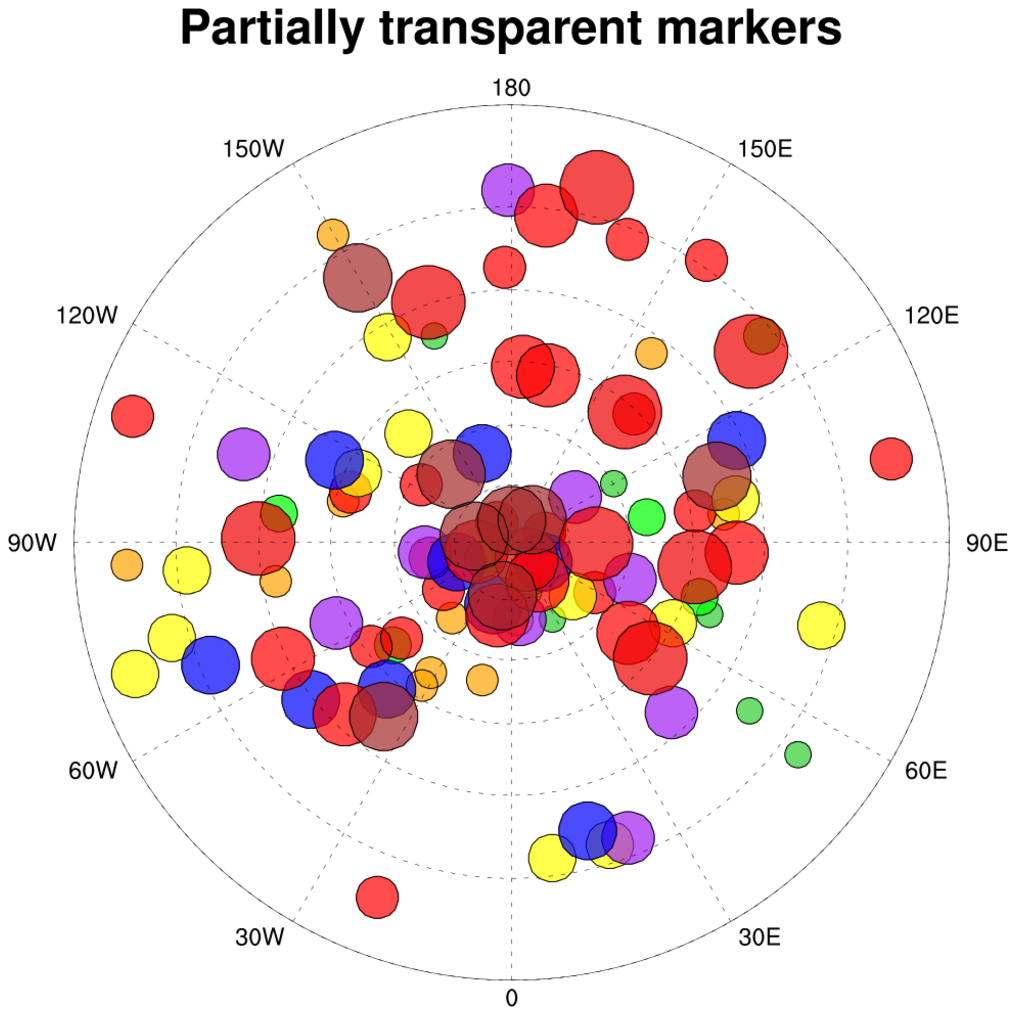 newcolor_4.ncl:
This example is identical to the previous scatter_6.ncl example,
except it uses the
new gsMarkerOpacityF
resource introduced in
NCL 6.1.0 to make
the filled markers partially transparent.
newcolor_4.ncl:
This example is identical to the previous scatter_6.ncl example,
except it uses the
new gsMarkerOpacityF
resource introduced in
NCL 6.1.0 to make
the filled markers partially transparent.Only the second frame is shown here. Notice how markers that are obscured in the first version are visible in the second plot.
 scatter_7.ncl: Demonstrates how to
draw hollow markers of different sizes and colors, and then use
labelbars, markers, and text to create a legend.
scatter_7.ncl: Demonstrates how to
draw hollow markers of different sizes and colors, and then use
labelbars, markers, and text to create a legend.The original version of example was contributed by Larry McDaniel of IMAGe / NCAR. It was pared down significantly to remove all the data processing calls.
 scatter_8.ncl: Demonstrates how to
draw filled square markers of different colors, and then
attach a labelbar to the outside of the plot.
scatter_8.ncl: Demonstrates how to
draw filled square markers of different colors, and then
attach a labelbar to the outside of the plot.
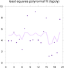
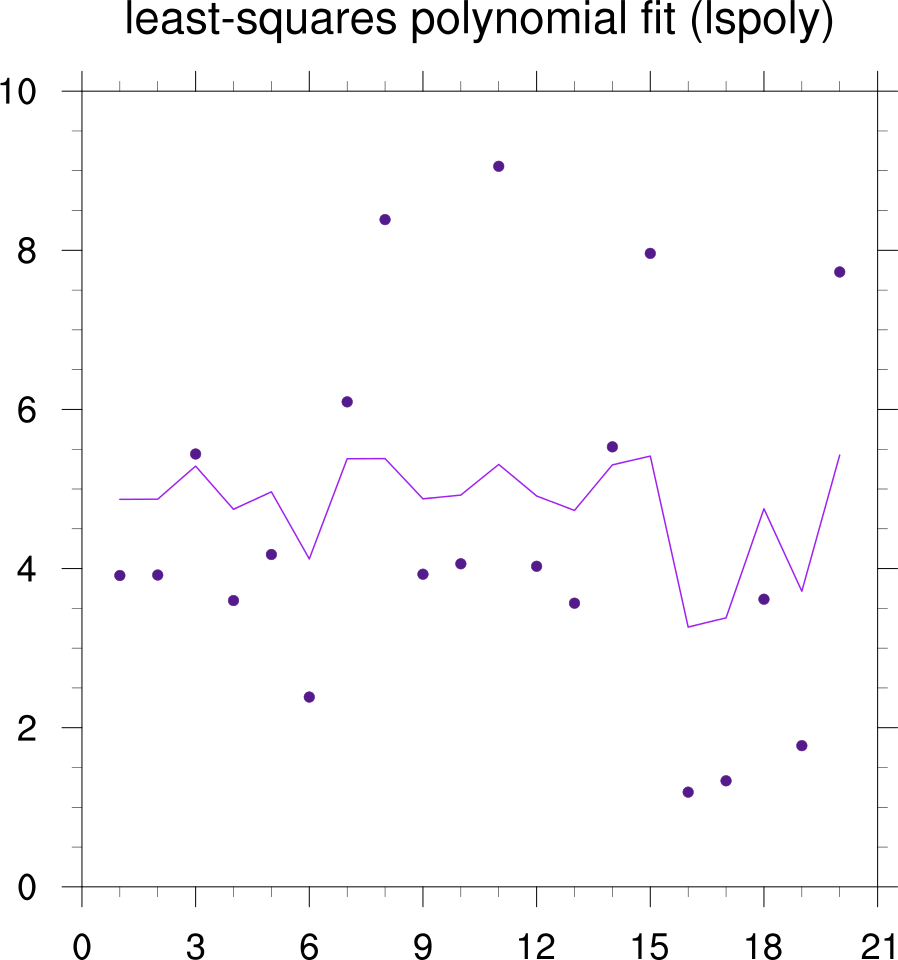 scatter_9.ncl: Demonstrates
how to use lspoly to calculate a least-squares
polynomial fit through a random set of points.
scatter_9.ncl: Demonstrates
how to use lspoly to calculate a least-squares
polynomial fit through a random set of points.
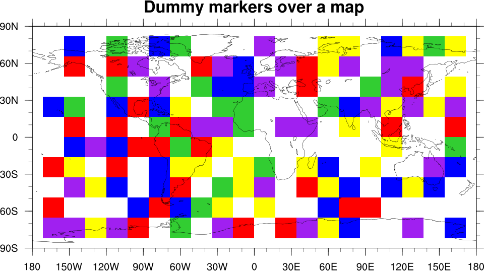 scatter_10.ncl: Demonstrates how to
overlay a scatter plot (of filled squares) on a map plot, when the
scatter plot is not in lat/lon space. The key is to use
gsn_csm_blank_plot to create a
canvas for drawing the filled polygons, making sure that the four
corners of the blank plot correspond with the four corners of the
cylindrical equidistant map plot that is created.
scatter_10.ncl: Demonstrates how to
overlay a scatter plot (of filled squares) on a map plot, when the
scatter plot is not in lat/lon space. The key is to use
gsn_csm_blank_plot to create a
canvas for drawing the filled polygons, making sure that the four
corners of the blank plot correspond with the four corners of the
cylindrical equidistant map plot that is created.
You then set tfDoNDCOverlay to True to make sure that when the blank plot is overlaid on the map plot using the overlay procedure, it simply lines up the corners of the two plots and does the draw.
In this example, the blank plot goes from 0,ny+1 in the Y direction, and 0,nx+1 in the x direction. This corresponds to the following lat/lon locations:
     x = 0    --> lon = -180
     x = nx+1 --> lon =  180
     y = 0    --> lon =  -90
     y = ny+1 --> lon =   90
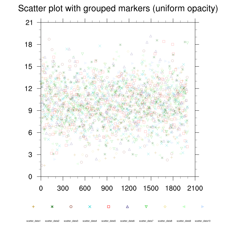
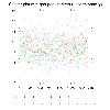
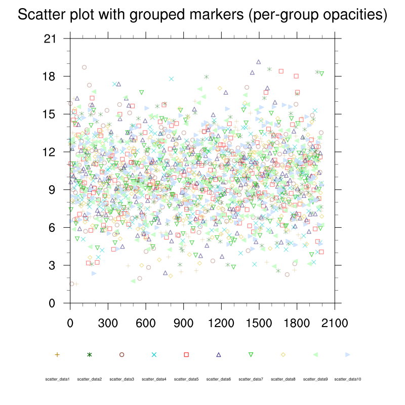 scatter_11.ncl
: Adapted from scatter_5.ncl, illustrates the use of new XYPlot
opacities resources for controlling the transparency of markers on a
scatter plot (new with NCL 6.4.0). See
xyMarkerOpacityF and
xyMarkerOpacities
scatter_11.ncl
: Adapted from scatter_5.ncl, illustrates the use of new XYPlot
opacities resources for controlling the transparency of markers on a
scatter plot (new with NCL 6.4.0). See
xyMarkerOpacityF and
xyMarkerOpacities
 scatter_12.ncl: Draw separate error
bars in the x and y directions.
scatter_12.ncl: Draw separate error
bars in the x and y directions.
Based on an ncl-talk question (11/2016) by Rashed Mahmood. He 'self-answered' his question with some example code. Alan Brammer (U. Albany) created the x and y separate procedures shown in the script.
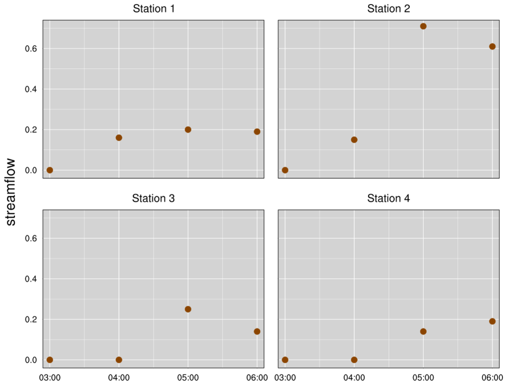 scatter_13.ncl: This script shows
how to draw a more custom scatter plot with the plot area filled in
gray and white grid lines added. This plot uses the same data and is similar
to bar_22.ncl on the bar plot page.
scatter_13.ncl: This script shows
how to draw a more custom scatter plot with the plot area filled in
gray and white grid lines added. This plot uses the same data and is similar
to bar_22.ncl on the bar plot page.
In order to draw the white grid lines under the dots, the tmGridDrawOrder resource must be set to "PreDraw". This resource was added in NCL V6.5.0. If you try to run this script with NCL V6.4.0 or earlier, the grid lines will show up on top of the filled dots and you'll get a warning that the resource is not valid.
There's quite a bit of customization going on with the tickmark labels, in order to turn them on and off for various plots.