NCL Home>
Application examples>
Special plots ||
Data files for some examples
Example pages containing:
tips |
resources |
functions/procedures
NCL Graphics: Unique Visualizations
Most of the following examples were contributed by users who have used NCL
to create some truly unique and nice looking visualizations. This page is
mainly for showing off some of those visualizations.
If you have a unique or impressive visualization you would like to see
on this page, please email the NCL
admins and include or attach the following:
- your NCL script(s)
- a PostScript file with no more than 3 frames (portrait mode, and
as large as possible)
- a brief explanation of your example (and optionally, yourself)
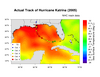
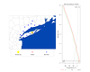
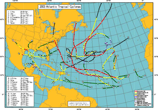
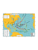 unique_1.ncl
:
A real world plot showing the best tracks for a given season storms,
including all data (subtropical storms, depressions, extratropical
lows, etc).
This script was written by Dr. Jonathan Vigh.
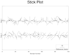 unique_2.ncl
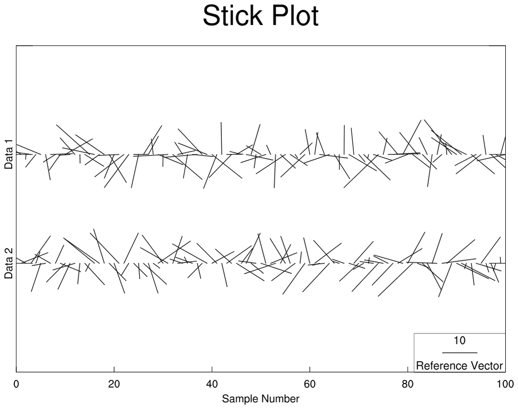
:
A stick plot created by calling
gsn_vector and by
setting the resource
vcMapDirection = False,
which allow the vectors to be in their own reference frame.
This script was written by Matt Stumbaugh of NOAA.
 unique_3.ncl
:
A lengthy script that draws three different plots on the
top half of the page. Five different colormaps are used on one page
by drawing each individual plot before the next plot is created. This is done
by setting
gsnDraw = True (which is the default) or
by calling
draw before the next plot is created.
To avoid advancing the frame,
gsnFrame is set to False; the frame
is advanced at the end of the script by calling
frame.
 unique_4.ncl
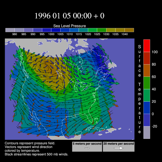
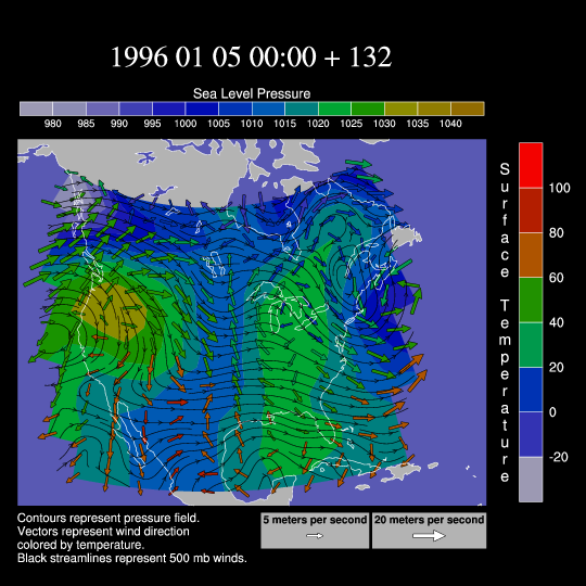
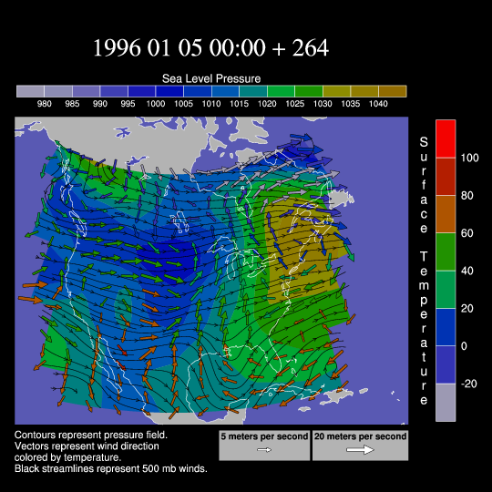
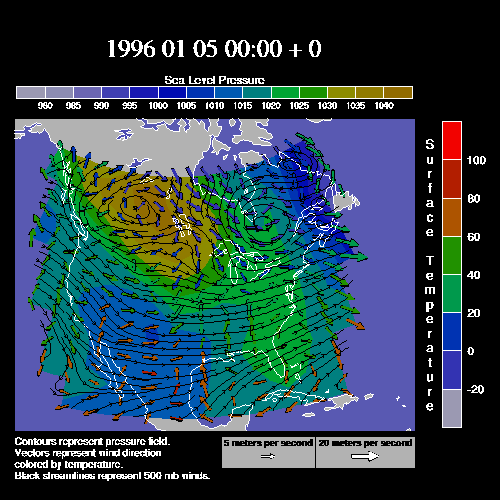
:
This script creates an animation of the January 1996 snow storm. Wind
vectors are colored by temperature and overlaid on a map along with a
500 mb streamline plot and a color-filled pressure field contour plot.
Only three of the frames are shown here.
Click here for an animation.
See example 7 on the "New Color
Capabilities" page to see this same example drawn using the new
transparency capabilities added
in V6.1.0.
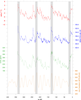
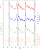
 unique_6.ncl
:
This script creates a panel plot with ten XY plots and a legend at the
bottom. Each XY plot in the panel is an overlay of three plots with a
combination of solid lines, dashed lines, and markers. The
overlay function is used to do the overlays,
and the functions
gsn_text_ndc,
gsn_add_polymarker, and
gsn_legend_ndc are used to annotate the
figure.
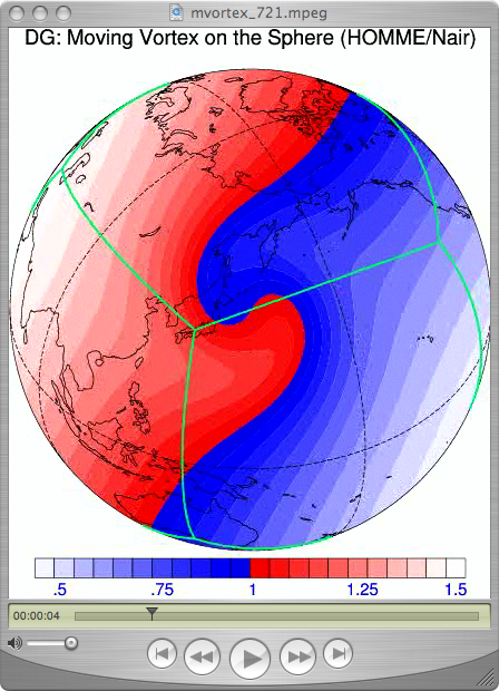
unique_7.ncl (script not available yet):
This
animation, sent to us by
Dr. Ram Nair of SCD/NCAR, is a simulation of an idealized vortex
evolution on the sphere. He presented the result at an international
seminar PDEs on Sphere 2006. This is a test-case for
advection/transport problem on the sphere.
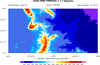
 unique_8.ncl
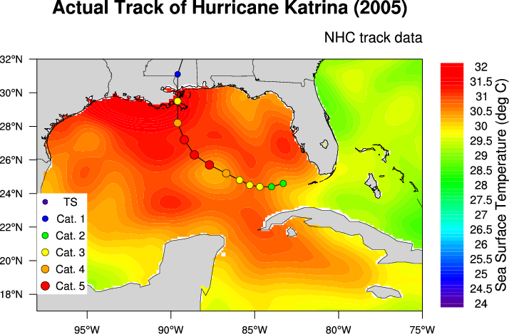
:
This script creates a contour plot of sea surface temperature and
overlays a storm track for Hurricane Katrina. It was contributed by
Kimberly Trent (a 2006
SOARS student of
NCAR/UCAR), with help from Adam Phillips and Mary Haley, also of NCAR.
The track data came from NHC reports from
the document "Tropical
Cyclone Report Hurricane Katrina" (Richard D. Knabb, Jamie
R. Rhome, and Daniel P. Brown). The SST field was
obtained from NCEP.
The storm track is done using filled and hollow circles, and
polylines. The circles are created using the
NhlNewMarker function. A legend is created using
calls to gsn_text and gsn_polymarker.
 unique_9.ncl
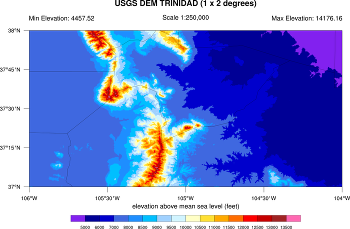
:
This script shows how to create a topographic map using a
raster contour graphic colored by elevation.
This example is also available as a Python script using
PyNGL to generate the
graphics and PyNIO
to read the data from a netCDF file. See the PyNGL
gallery for a pointer to the script.
This example was written by Mark Stevens of NCAR.
 unique_10.ncl
 /
unique_10_thicker.ncl:
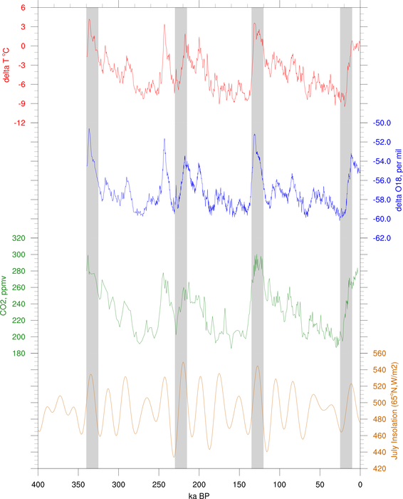
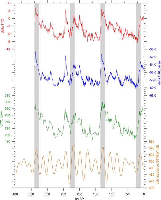
This script shows how to create a series of XY plots attached
along the X axes, with gray-filled bars added for emphasis.
The second image is identical, except with thicker plot elements for a
nicer looking image. It was created by "unique_10_thicker.ncl".
This is a typical plot that people see in papers of paleoclimate
studies.
This example was contributed by Yi Wang of PNNL.
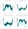
 unique_11.ncl
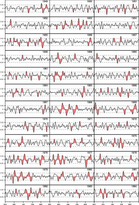
:
This script shows how to create a series of XY plots attached
along the X and Y axes, with specific areas filled for emphasis.
This script plots daily index highlighted with polygons year by
year. This is a typical plot that people see in papers of climate
studies.
The plots are paneled using gsn_panel. Because they are different sizes,
it was necessary to set gsnPanelScalePlotIndex to 1 (the top middle
plot), indicating that this plot should be used to determine the scale
factor for resizing all the plots. Otherwise, you will be unable to
see the X axis labels on the bottom three plots.
This example was contributed by Dr. Xiaofeng Li, of IAP/CAS.


 unique_12.ncl
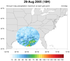
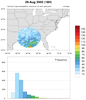
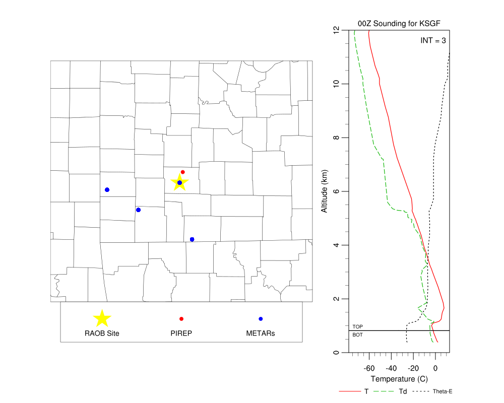
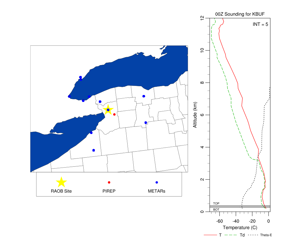
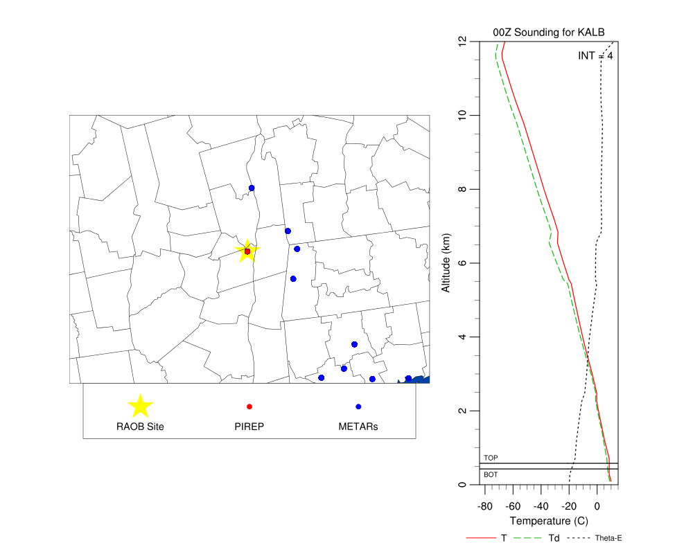
: This script shows
how to plot a map with PIREP/METAR/RAOB locations and a profile of the
sounding next to the map all on the same image. It was contributed by
Daniel Adriaansen of NCAR/RAL.
The script was developed to visualize the sounding taken when there
was a pilot report (PIREP) of icing made within a certain distance of
the sounding location. Additional METAR data were identified as well
and the locations of those sites (within a prescribed distance around
the sounding location) were added to the map. Information about the
icing in the PIREP such as the layer top and bottom (when available)
and the intensity of the icing were added to the sounding to provide a
quick look of what the layer of interest looked like. This way, for
any day data were available a user would have a quick-look plot
consisting of a map with the sounding, METAR, and PIREP location with
a plot of the sounding and theta-E, and information about the PIREP
overlaid.
This script reads data from several ASCII files, and uses command line
options to select the data set of interest. Using the datasets listed
below, you would run this script with:
ncl unique_12.ncl 'yyyymmdd="20090228"' 'hr="00"'
Here's a description of the various files:
- *_raob.txt - NOAA CLASS sounding file format
Columns:
Time,Pressure,Temperature,Dew Point Temperature,RH,Uwind,Vwind,Wind
Speed,Wind
Direction,dZ,longitude,latitude,range,angle,altitude,Qp,Qt,Qh,Qu,Qv,Quv
Sample datasets:
2009022800_001_KSGF_raob.txt
2009022800_002_KBUF_raob.txt
2009022800_003_KALB_raob.txt
2009022800_004_KALB_raob.txt
2009022800_005_KALB_raob.txt
2009022800_006_KOKX_raob.txt
- *_metar.txt - METAR and information about the sounding site
closest to the METAR site
Columns:
ID,Sounding Site ID,Sounding Site latitude, Sounding Site longitude,Hour
of METAR,Distance of METAR site from sounding, METAR site ID, METAR site
latitude, METAR site longitude, ... [additional METAR info]
Sample dataset: 2009022800_metar.txt
- *_pirep.txt - Decoded Pilot Report (PIREP) and other info
Columns:
ID,Distance of PIREP from sounding, PIREP UNIX time, PIREP latitude,
PIREP longitude, ... [additional PIREP info]
Sample dataset: 2009022800_pirep.txt
- *_sites.txt - A list of sounding sites for corresponding
hour and date that had a PIREP nearby
Columns:
ID,Sounding Site ID, Sounding site latitude, Sounding site longitude
Sample dataset:
2009022800_sites.txt
 unique_13.ncl
: This script shows
how to plot multiple time series plots inside a larger time series plot.
It was contributed by Hongmei Li of Max Planck Institute for Meteorology
in Hamburg.
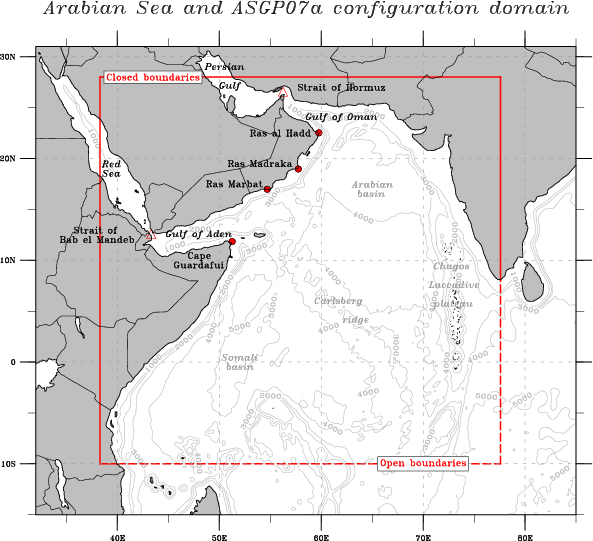
 arabian_sea.ncl
: This script
shows how to draw the Arabian Sea with bathymetric features, ridges
and basins, geopolitical boundaries, seas and gulfs, and straits and
capes. This is known as a schematic map.
This script was contributed by Clément Vic, a PhD student at
Laboratoire de Physique des Océans, Brest (FRANCE)
 unique_14.ncl
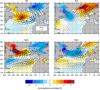
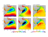
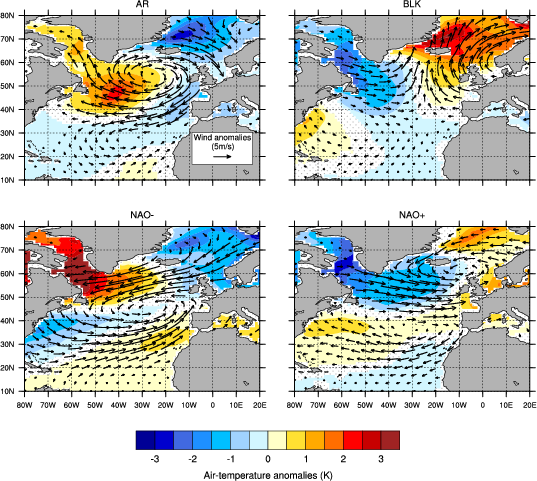
: This script shows
how to nicely overlay quiver and filled contour plots, and how to
stipple non-significant areas. The figure shows the
air-temperature/wind anomalies composites for the so-called winter
weather regimes. The significance of the composites was computed using
the NCL function
ttest. Non-significant
air-temperature have been stippled while non-significant wind arrows
have been dismissed.
This script was contributed by Nicolas Barrier, a PhD student at
Laboratoire de Physique des Océans, Brest (FRANCE)
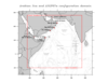
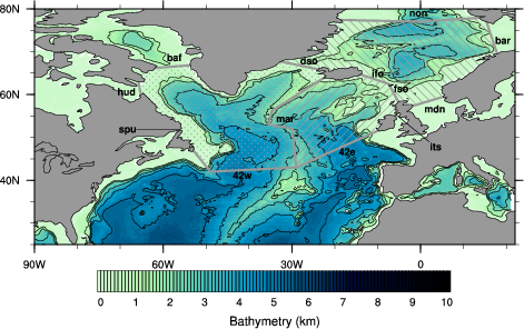
 plot_bathy.ncl
: This script draws
the bathymetry of an ocean model (in kilometers). The colorbar has
been imported from Python. We overlay on top of the rasterfill
contours line contours that correspond to integer values (0, 1,
2,... 10 km). We also add lines
(
gsn_add_polyline) that correspond
to the default North Atlantic Section of the PAGO tool
(
http://www.whoi.edu/science/PO/pago/output.html).
The sections encompass three different domains that are emphasized by
hatched polygons (
gsn_add_polygon).
Finally, the names of the sections are added
(
gsn_add_text).
This script was contributed by Nicolas Barrier, a PhD student at
Laboratoire de Physique des Océans, Brest (FRANCE)
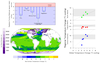
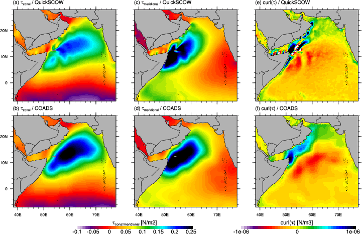
 compare_wind_fields.ncl
:
This script compares two wind fields (in this case, to evaluate the
impact of the wind forcing on a model). The two wind fields are
QuickSCOW (climatology based on QuiskSCAT), and COADS (Comprehensive
Ocean Atm DataSet) and they are both interpolated on the same model
grid. In order to better catch the differences between the two fields,
we draw not only the wind stress but also the wind curl, which is of
dramatic importance in the Sverdrup response of the ocean. This
requires having two separate labelbars because of the different units
and ranges.
This script was contributed by Clément Vic, a PhD student at
Laboratoire de Physique des Océans, Brest (FRANCE)
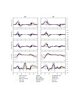
 mkZmean.ncl
:
This script creates a panel of four XY plots, with filled curves and a
custom legend added to the bottom right plot. It was contributed by
Dustin Swales, an associate scientist at NOAA/PSD.
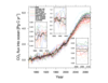
 box_8.ncl
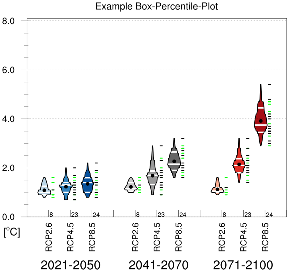
:
This example shows how to create a box percentile plot, which is based on
Esty WW, Banfield J: The box-percentile plot. J Statistical Software 8 No. 17, 2003. (http://www.jstatsoft.org/v08/i17).
You must download the
box_percentile_plot.ncl
script in order to run this example.
This code was contributed by Frank Kreienkamp of DWD, which is based on
code contributed by Carl Schreck and Adam Phillips.
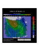
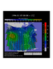
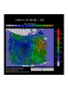
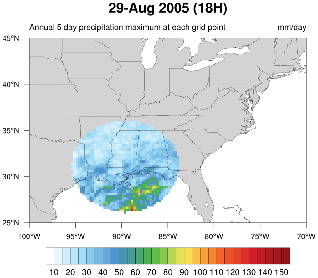
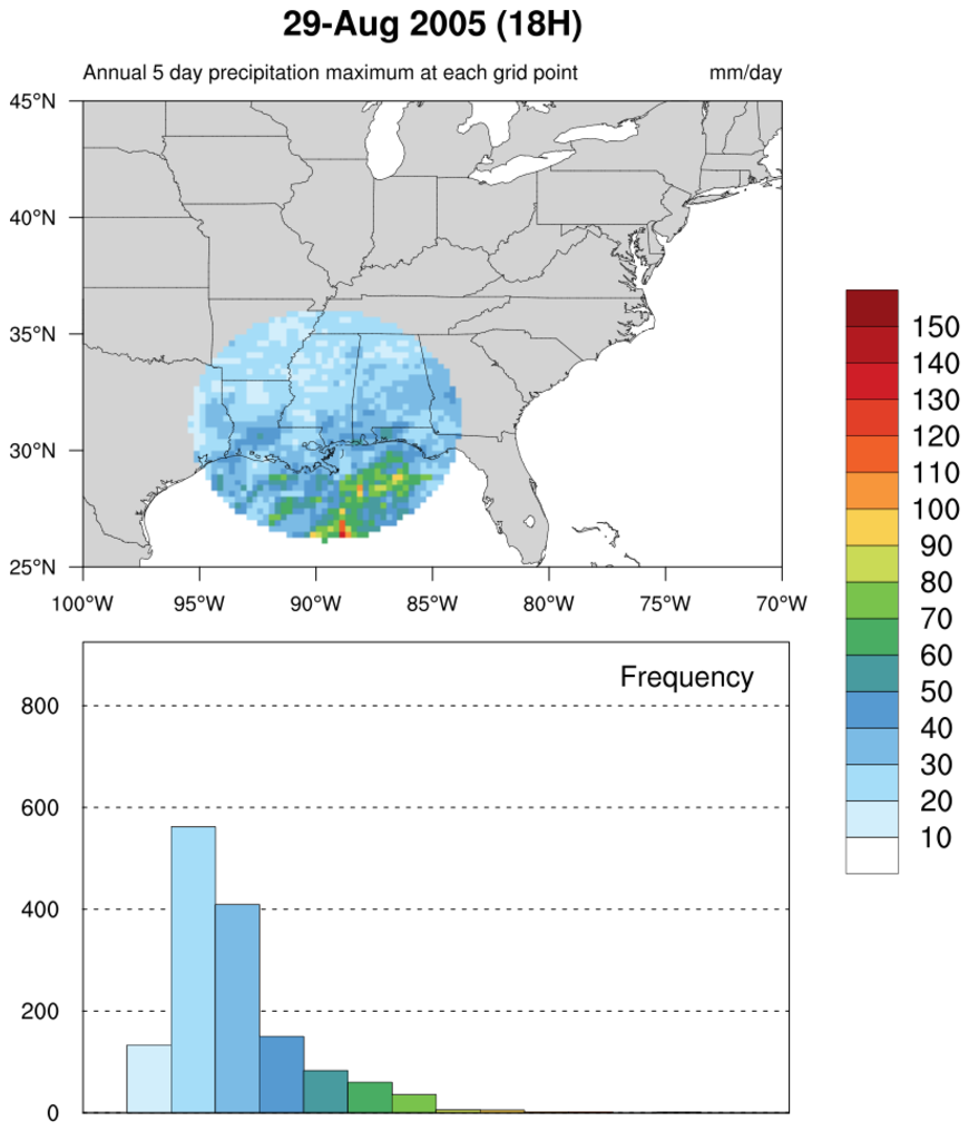
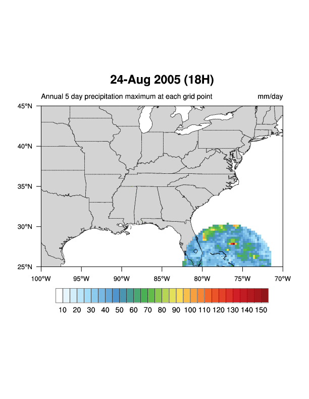
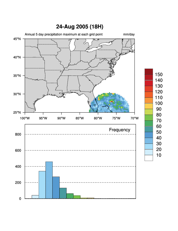
 Katrina_circle.ncl
 /
Katrina_circle_hist.ncl:
The first script plots the 5-day running average of precipitation for
an entire year (2005). The second script plots the same contour plot,
but with a histogram showing the distribution of values for each
contour level. This can be a useful debugging tool.
Both scripts show a unique way of displaying filled contours, by
using nggcog in conjunction
with gc_inout to mask data inside a great circle.
The still images shown are from one of the time steps. An animation
across all time steps for both
the contour plot and
the contour plot with the
histogram was created using
ImageMagick's "convert"
utility.
The contour plot code was contributed by Jake Huff, a Masters student in the
Climate Extremes Modeling Group at Stony Brook University.
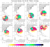
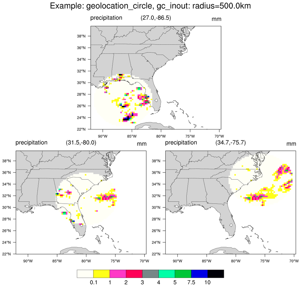
 polyg_29.ncl
:
Use
geolocation_circle to generate concentric latitude/longitude locations about three central locations.
Use
gc_inout to mask grid points outside the circles. A consistent map backround is used.
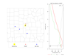
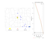
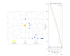
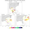
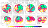
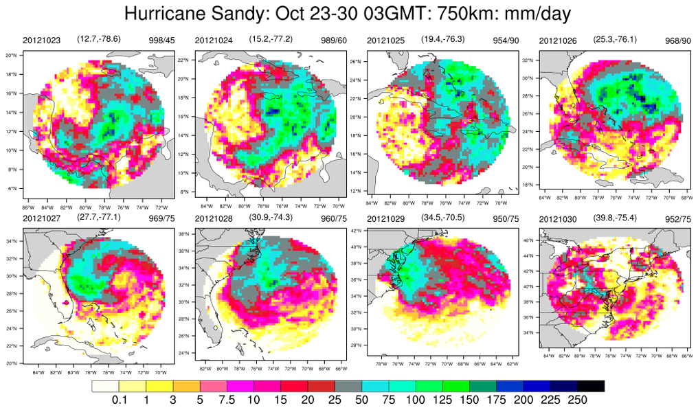
 polyg_30.ncl
:
Use Hurricane Sandy locations at 0300GMT on 8 days (23-30 October 2012):
Use
geolocation_circle to create areas spanning 750km
on each day and plot the total daily precipitation for each day. The title indicate the date, the central
location and the central pressure and maximum wind speed (mph). The background map is consistent with
all the plots.
 polyg_31.ncl
:
Similar to
polyg_30 except the background map is allowed to change with each storm location.


Karin Meier-Fleischer of DKRZ
(Deutsches Klimarechenzentrum) has created an NCL User Portal
containing several
special plots, including:
- a "spiral animation" of multi-year monthly mean temperature change
data of the northern hemisphere similar to Ed Hawkins's spiral
animation
(https://www.climate-lab-book.ac.uk/spirals/)
- a "stacked and tilted image" of three contour plots
- a special "overlay plot" that highlights an area of interest


