NCL Home>
Application examples>
Special plots ||
Data files for some examples
Example pages containing:
tips |
resources |
functions/procedures
NCL Graphics: Working with RGBA color
NCL
V6.1.0 introduced a new
color model in which color is specified in a natural and flexible
manner. Colors may have degrees of transparency, and there is no
longer a limit of 256 colors in a plot. Backwards compatibility with
the previous color model is also retained. This new color model
is limited to PS, PDF, PNG, and X11 output.
In versions of NCL prior to v6.1.0, colors are specified relative to
a colortable that is associated with the workstation. Most commonly,
a color-resource is assigned the index into the colortable of the
desired color. Alternatively, a named-color or an RGB-triplet may be given
to designate a specific color; the color is added to the lookup table
if there is room, or the most similar color in the table is used.
The workstation colortable has a limit of 256 entries, and those are
the only colors that may appear in a plot.
In the new model, color may -- and should -- be used independently of a workstation
colormap. Users choose colors directly by names or RGB-triplets,
without appeal to a workstation colormap. Colors might even be
computed dynamically based upon a data source. There is no practical
limit on the number of colors that may be used in a plot.
Colors may also be partially transparent, by specifying an opacity
value (sometimes referred to as alpha in computer graphics
parlance). Opacity is given as a floating-point in the range [0.,1.],
where 0. means completely transparent, and 1. means fully
opaque. Opacity values may be given for individual colors by
specifying a 4-tuple, in which the components are red, green, blue, and
opacity values. Alternatively, newly introduced resources can set the
opacity for entire classes of graphical primitives (described below).
Finally, to maintain backwards compatibility, the one exception to the
foregoing discussion is that if color is ever specified as an integer
index, it is interpreted to be a color relative to the workstation's
colormap. Workstations still have an associated colormap that may be
changed and manipulated as before, however this usage is discouraged for
new scripts.
Specifying Opacity
Again, opacity values range from 0. to 1.
The opacity of individual colors can be specified by giving a 4-tuple
of red, green, blue, opacity values. For example:
res@gsLineColor = (/ 1., 0., 0., .5 /)
specifies a partially transparent red color.
New resources are available to specify the opacity of classes of
graphical elements:
Import note: in NCL V6.3.0 and
earlier, there's a bug in which the labelbar does not reflect the same
opacities as filled contours or vectors that
have cnFillOpacityF
or vcGlyphOpacityF set. This bug
was fixed in NCL V6.4.0. If this fixed behavior is not desired, set
lbOverrideFillOpacity to True.
A new perspective on colormaps
While the use of a workstation colormap is no longer necessary,
color lookup tables are a useful means to map color onto data, such as in a
contour plot or vector plot. The following new resources can be
used to define a colormap for particular plot:
You can also use existing color resources to set colors via an
RGB
or RGBA array:
Colormaps used in this fashion are still limited to 256 colors, but each
instance of these plot types may have its own colormap. Thus for example, multiple contour
plots appearing in a panel plot may employ differing colormaps. Or
several plots using distinct colormaps incorporating partial
transparency may be overlain to depict multiple data aspects,
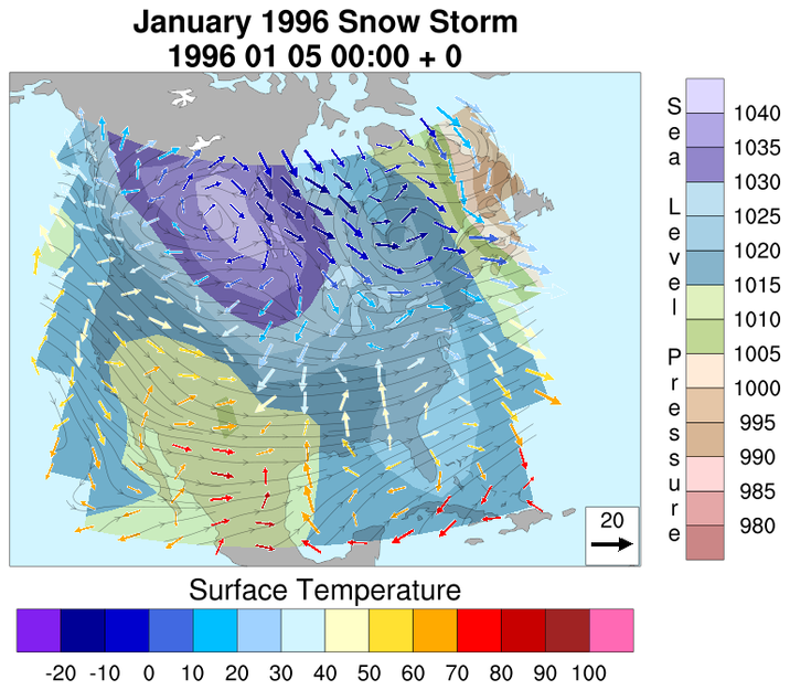
as in the example) below.
A new function, read_colormap_file is
available to make it easy to load existing
NCL system colormaps, or
user-created
colormaps. Note that this function always returns 4-component
colors, comprised of red, green, blue, opacity values; the opacity
defaults to 1 (fully opaque) where ever it is not explicity given. User created
colormaps may freely intermix 3-component and 4-component
tuples.
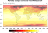
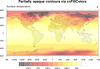
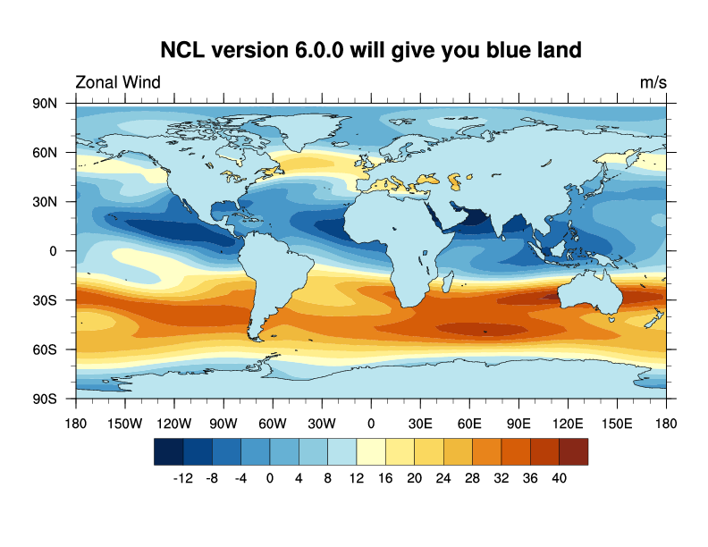
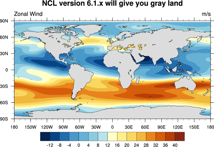
 newcolor_1.ncl
: This example
simply illustrates that with V6.1.0 of NCL, you no longer need to add
named colors to your color map in order to use them. This example uses
a 256-color map
(
BlueYellowRed)
that contains no gray in it.
The first frame shows what the graphic would look like if you ran this
script with NCL version 6.0.0 or earlier. You get a bluish color for the land,
because this was the closest match to gray that NCL found in the workstation color map.
The second frame shows the graphic as generated by NCL versions 6.1.0
or later, in which you should see gray-filled land.
Internally, the land areas are being filled with "LightGray".
 newcolor_2.ncl
:
A simple example showing possibilities with text opacity resources.
txFontOpacityF is set to 0.10 to
produce a highly-transparent text string.
 newcolor_3.ncl
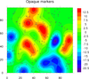
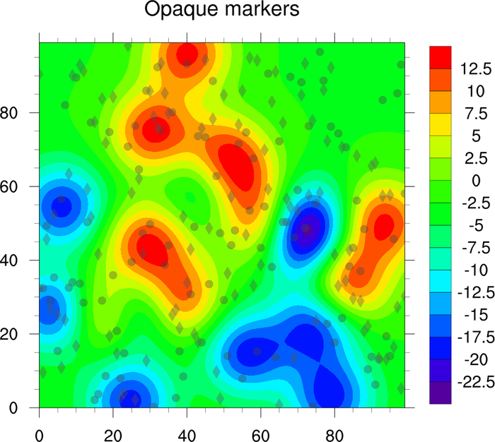
: Re-creates the original
opaque markers example that
showed how to achieve transparency effects with previous versions of NCL, in combination
with external tools. Here, its simply a matter of using the new
gsMarkerOpacityF
resource to achieve the desired effect.

 newcolor_4.ncl
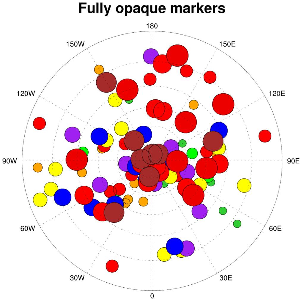
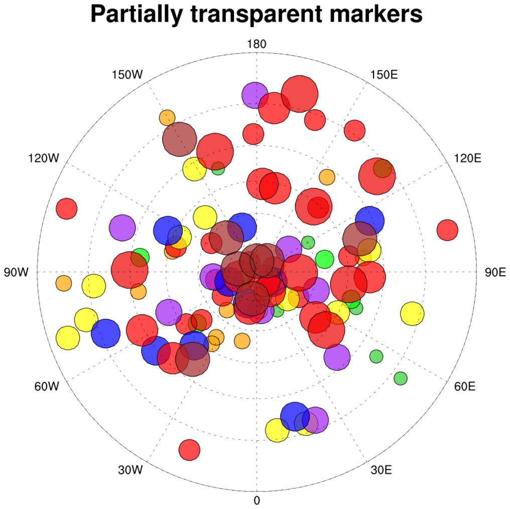
:
Adapted from an example
of
scatter plots.
The original plot is re-created using the new
color model idioms, and a second version is drawn using partially
transparent colors. Notice how markers that are obscured in the first
version are visible in the second plot.

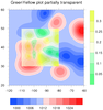
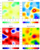
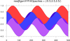
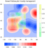 newcolor_5.ncl
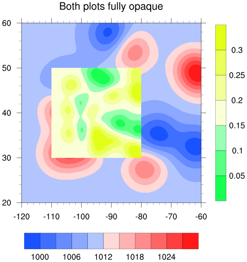
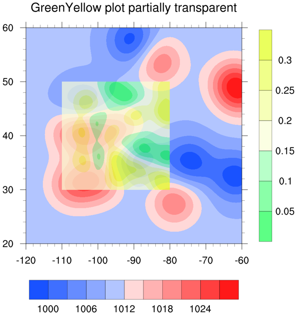
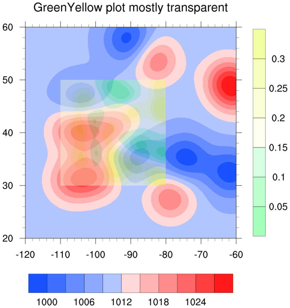
: This example
shows how to use two large color maps in the same contour plot,
both containing 254 colors
(
BlueRed
and
GreenYellow).
The three frames show how to make the GreenYellow contours
increasingly more transparent.
To do this, you first need to set the new resource
cnFillPalette to the desired
colormap (NCL will automatically span it).
To control then opacity, set the new
cnFillOpacityF resource
to 1.0 for a fully opaque plot, and 0.4 for a mostly transparent plot.
A value of 0.0 is fully transparent.
Important note: in NCL V6.3.0 and earlier, there's a bug in which the
colors in the labelbar do not correctly reflect the opacity applied
to the filled contours. This bug has been fixed in NCL V6.4.0. See
the next example for more information.
newcolor_5.ncl: This example
is identical to the previous one, except it shows what the
labelbar will look like in NCL V6.4.0, now that the colors
reflect the same opacity values reflected in the filled contours.
If you do not want the labelbar to show the same fill opacities as the
color contours, set
lbOverrideFillOpacity
to True.
 newcolor_6.ncl
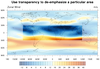
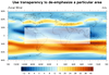
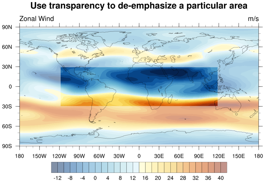
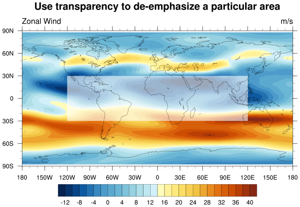
 - Shows how to
use transparency to de-emphasize a particular area in a plot.
In the first frame, cnFillOpacityF
is used to first draw the full plot with a transparency of 0.5,
and then the second subsetted plot is drawn with no transparency.
In the second
frame, gsFillOpacityF is used to
draw a partially transparent filled box over an area to "hide" it.
Important note: in NCL V6.3.0 and earlier, there's a bug in which the
colors in the labelbar do not correctly reflect the opacity applied
to the filled contours. This bug has been fixed in NCL V6.4.0. See
example newcolor_5.ncl for more information.
 newcolor_7.ncl
:
Adapted from an example on
overlay techniques.
Here the original plot is created using
multiple and independent colormaps for the contours, vectors, and
streamlines. Then two additional versions of the plot are generated,
varying the levels of opacity of the contours and streamlines. Notice
how opacity can be used to (de)emphasize or declutter overlain
graphics.
Other concepts illustrated are the use of new resources
cnFillPalette and
vcLevelPalette
to load desired colormaps, and the direct specification of color for
the map backgrounds, rather than by giving colormap indices.
In the script, code using constructs of the previous color model has been
commented out with special annotations, and is followed immediately by
equivalent idioms in the new model, to contrast the different usages.
Important note: in NCL V6.3.0 and earlier, there's a bug in which the
colors in the labelbar do not correctly reflect the opacity applied
to the filled contours. This bug has been fixed in NCL V6.4.0. See
example newcolor_5.ncl for more information.
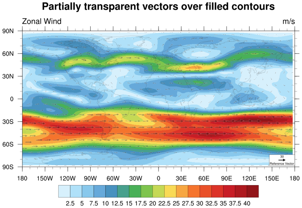
 newcolor_8.ncl
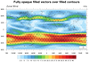
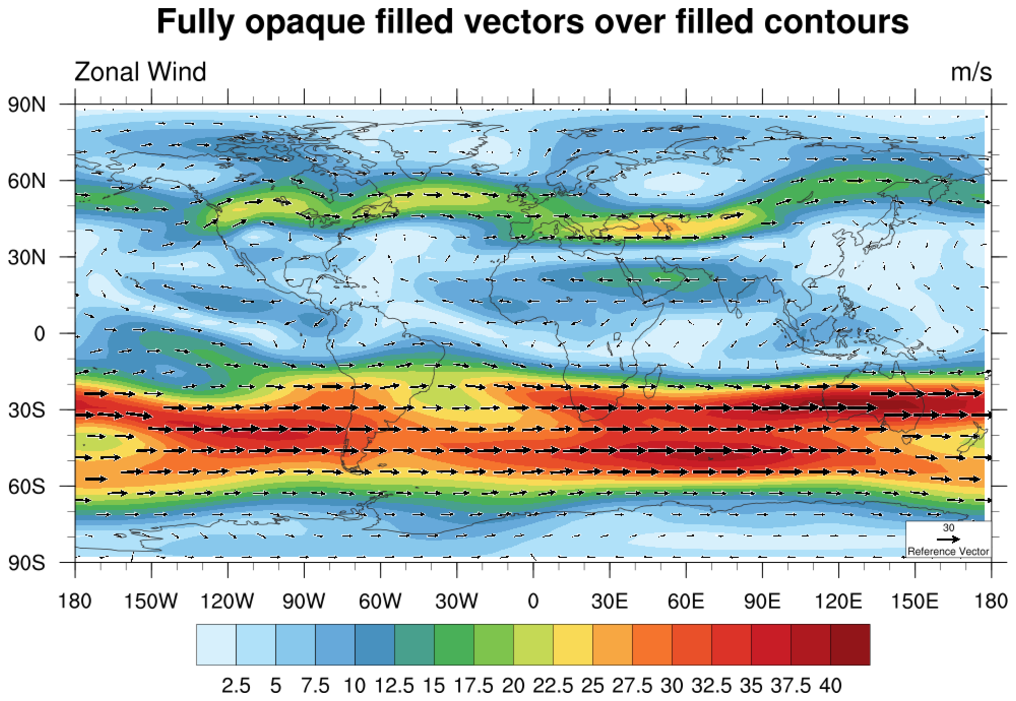
: This example
shows how to draw partially transparent filled vectors over filled
contours. The vectors are drawn fully opaque in the first frame. In
the second frame,
vcGlyphOpacityF
is set to 0.3.
This example also shows another method for subscripting a color
palette, if you don't want to use the whole thing. It first
uses read_colormap_file
to get an RGBA array, and then passes a subset of it
cnFillPalette.
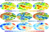
 newcolor_9.ncl
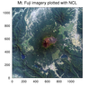
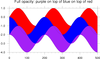
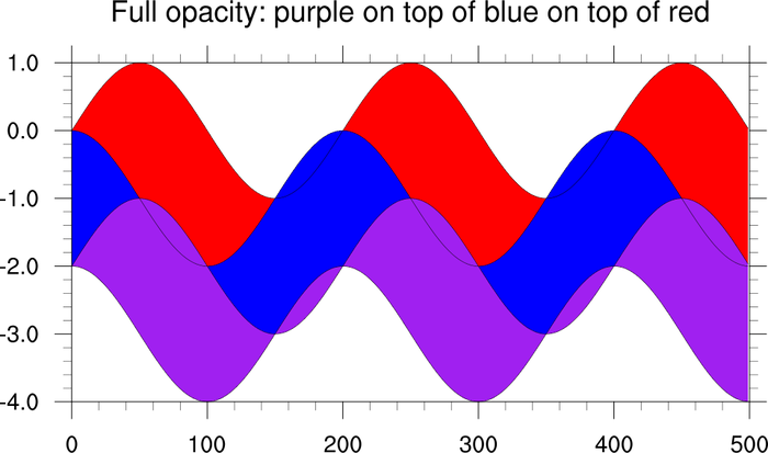
:
This example makes use of overlays and opacity to plot full color
imagery. The red, green, and blue channels of a source image are
plotted separately as "contour maps". The red channel is plotted with
full opacity, while the green and blue channels are plotted as
completely transparent.
When the green and blue channels are overlain on top of the red
image, the colors combine to recreate the colors of the image, but
upper layers do not obscure lower ones due to their transparency.
Notice that the colormaps for the red, green, blue contour maps are computed
as a ramp-function, from 0. to 1.
The open source tool gdal_translate was
used to convert an original image (in .png, .jpg, .gif, etc.),
into a NetCDF file with the color-channels pre-separated:
gdal_translate -ot Int16 -of netCDF fuji_orig.jpg fuji.nc
This example only works for "x11" or "png" output, and not with
"ps" and "pdf" output.
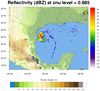
 newcolor_10.ncl
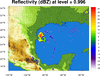
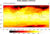
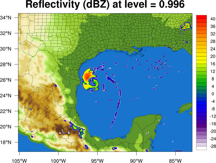
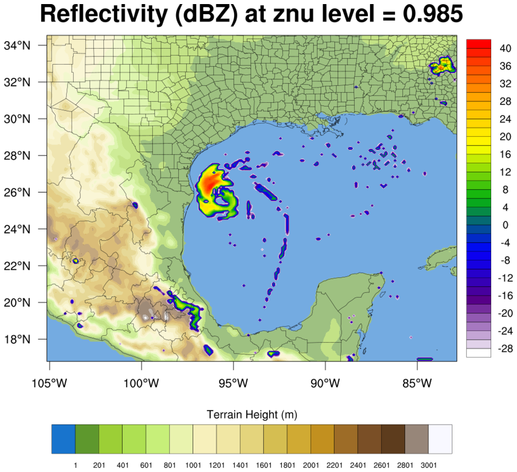
:
This example shows how you can use the 256-color
OceanLakeLandSnow
color table to draw filled terrain from a WRF output file, and then
use the
103-color
WhViBlGrYeOrRe
color table to overlay filled contours showing reflectivity.
The cnFillPalette resource
is used to set the color palette.
The first color for reflectivity is set to transparent by setting the
"A" component of the RGBA color array to 0.0.
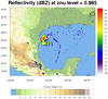
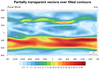
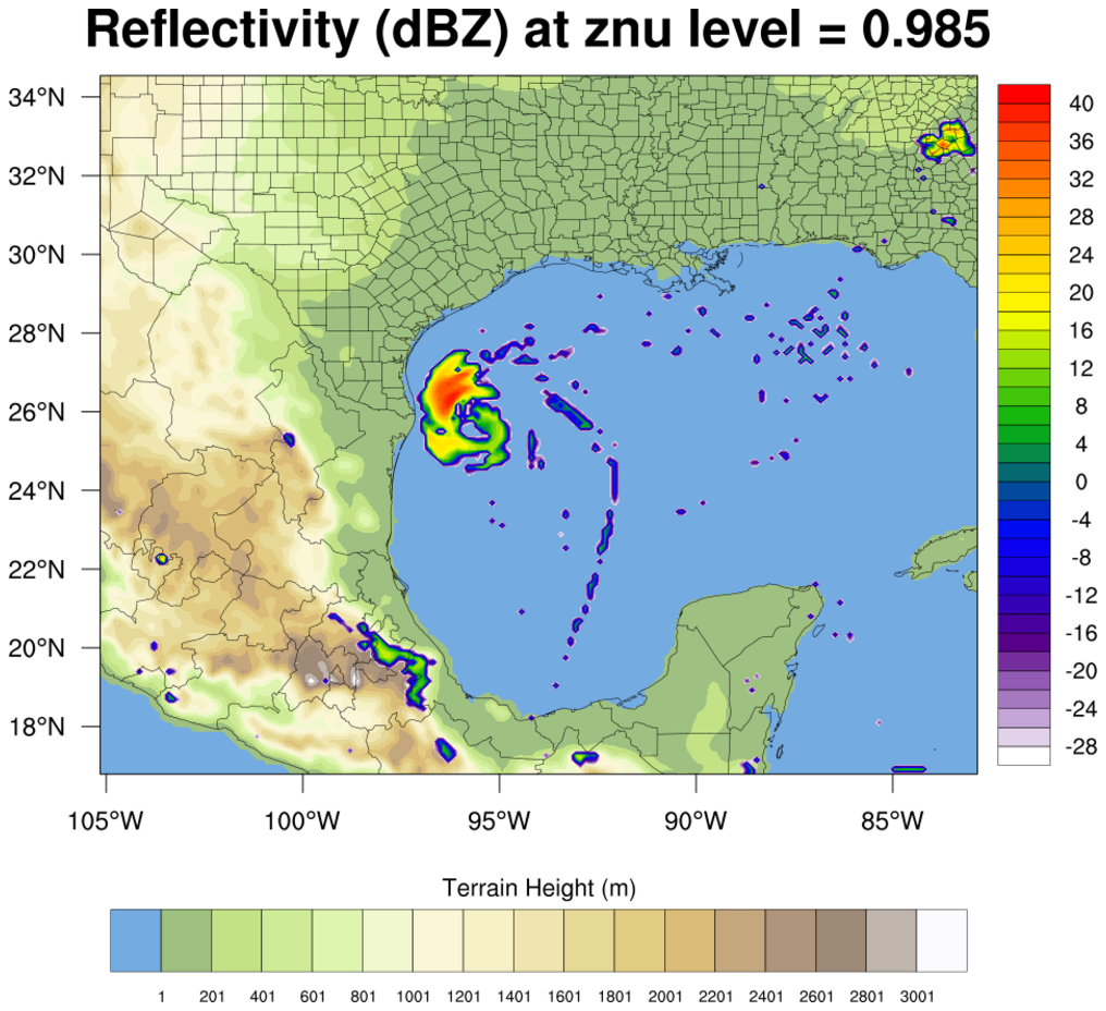
 overlay_12.ncl
:
This example is very similar to the
previous
newcolor_10.ncl example, except the
labelbar for the terrain plot is also drawn.
Important note: In NCL V6.3.0 and earlier the labelbar does not
reflect the same opacities as the filled contours; this bug was fixed
in NCL V6.4.0. A new resource
called lbOverrideFillOpacity was
introduced in NCL V6.4.0 which allows you to keep the labelbar colors
fully opaque independent of the opacity of the filled contours.
The first frame shows the partially opaque labelbar, and the
second frame shows a fully opaque labelbar created
by setting lbOverrideFillOpacity
to True.

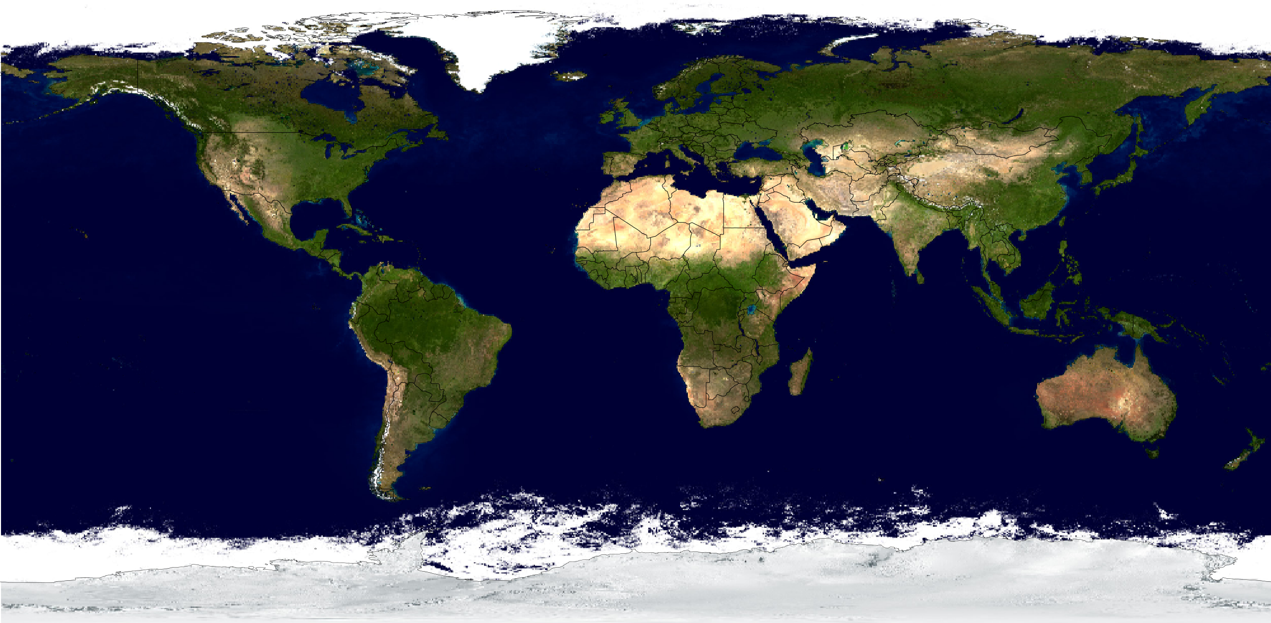
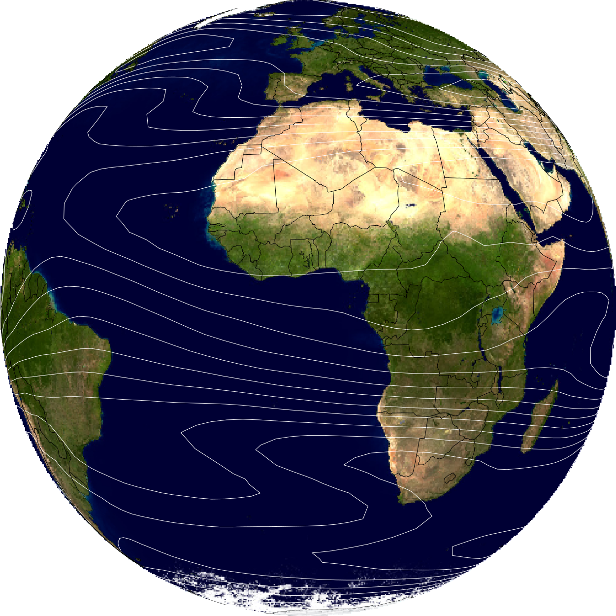
 newcolor_11.ncl
: This example is
similar to example #9. It recreates a JPEG image using overlays and
opacity. It then attaches lat/lon information to the jpeg image,
allowing us to change the projection to "satellite", and overlay map
outlines and contour lines.
As with example #9, the open source
tool gdal_translate was used to convert
the jpeg file to a NetCDF file:
gdal_translate -ot Int16 -of netCDF EarthMap_2500x1250.jpg EarthMap_2500x1250.nc
This example only works for "x11" or "png" output, and not with
"ps" and "pdf" output.
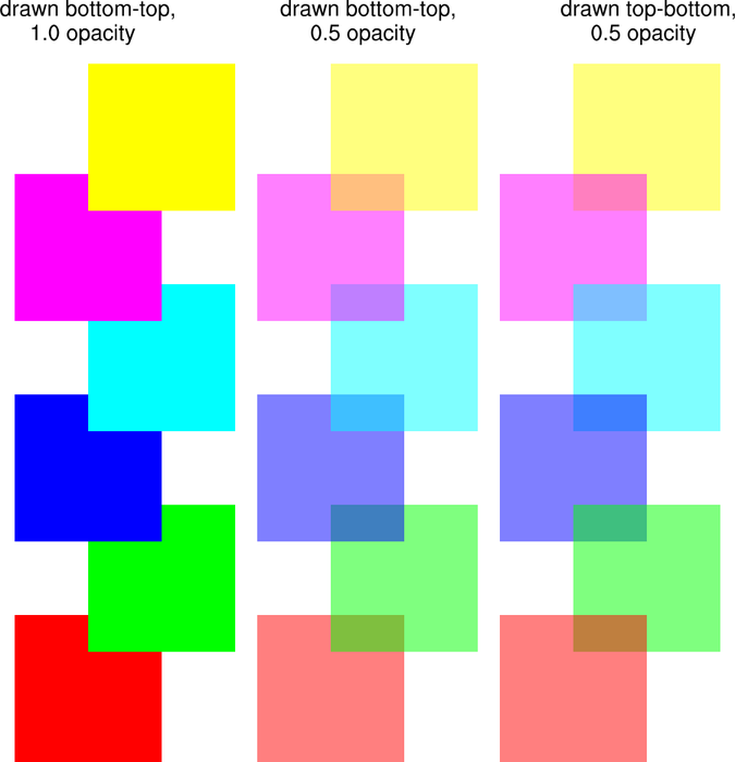
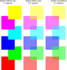 newcolor_12.ncl
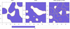
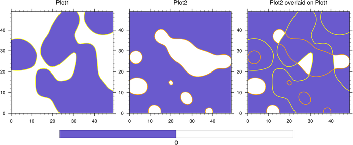
:
This example shows how to draw partially transparent filled polygons
using
gsFillOpacityF.
The point of this example is to show how various boxes look when they
overlaid in a different order. The middle column was drawn starting
with the red box starting first. The right column was drawn with the
yellow box starting first.
 newcolor_13.ncl
:
This example shows how to draw four panelled contour plots,
each with a different color map. With older versions of NCL,
you had to draw each plot before you changed the color map,
or you had to merge all color maps into one single color map
that was fewer than 256 colors.
With NCL V6.1.0 and later, you can use
the cnFillPalette resource to
define a color palette for each filled contour plot.
 newcolor_14.ncl
:
This example is similar to example 13, in that it shows you how to
draw three sets of panelled contour plots, each with a different color
map. This example is identical to
panel
example #26 except it shows you the easier way to do this
using
cnFillPalette.
 newcolor_16.ncl
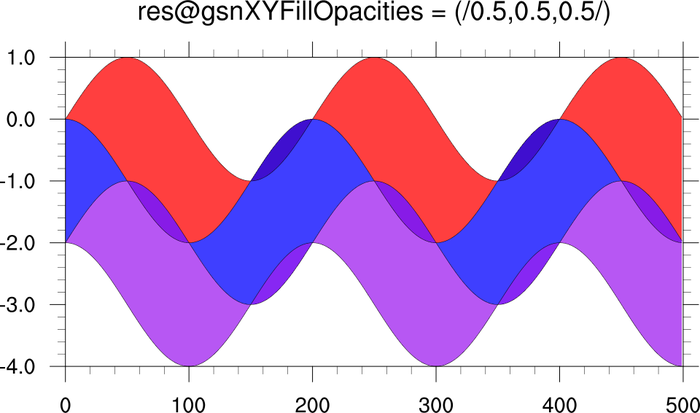
:
This example overlays three filled XY plots. In the second frame, it
uses
gsnXYFillOpacities (a new resource
that was added after V6.1.2 was released) to specify an opacity for
each of the filled areas.
In order to use this new resource with NCL V6.1.0, 6.1.1, or 6.1.2,
you must download
the fill_opacities_fix.ncl
file and load it in your script after "gsn_csm.ncl" is loaded:
load "$NCARG_ROOT/lib/ncarg/nclscripts/csm/gsn_code.ncl"
load "$NCARG_ROOT/lib/ncarg/nclscripts/csm/gsn_csm.ncl"
load "./fill_opacities_fix.ncl"
 newcolor_17.ncl
:
This example uses transparency in order to show where positive and negative
contours in two different plots overlap.
cnLevels is set to 0.0 so that we
only have two contour levels (< 0 and > 0). Then,
cnFillColors is set to
RGBA values so we can set the
opacity for each contour fill color for each plot:
base plot:
res@cnFillColors = (/(/0.60,0.60,0.60,1./),(/1.,1.,1.,1./)/)
overlay plot:
res@cnFillColors = (/(/0.60,0.60,0.60,1./),(/1.,1.,1.,0./)/)
By setting the white contours in the overlay plot to fully transparent, this
means that you only see white in locations where both datasets are positive.
The contour lines are drawn in different colors just so you can see where
the contours actually are in the overlay.
 newcolor_18.ncl
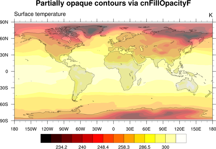
:
The purpose of this example is to show a work-around for a bug in NCL
V6.3.0 and earlier, in which the labelbar colors do not reflect the
same transparency as the filled contours
when
cnFillOpacityF is used to
set the opacity.
This bug has been fixed in NCL V6.4.0. If you do not want the labelbar
to reflect the same opacities, you can set
the lbOverrideFillOpacity resource to
True.
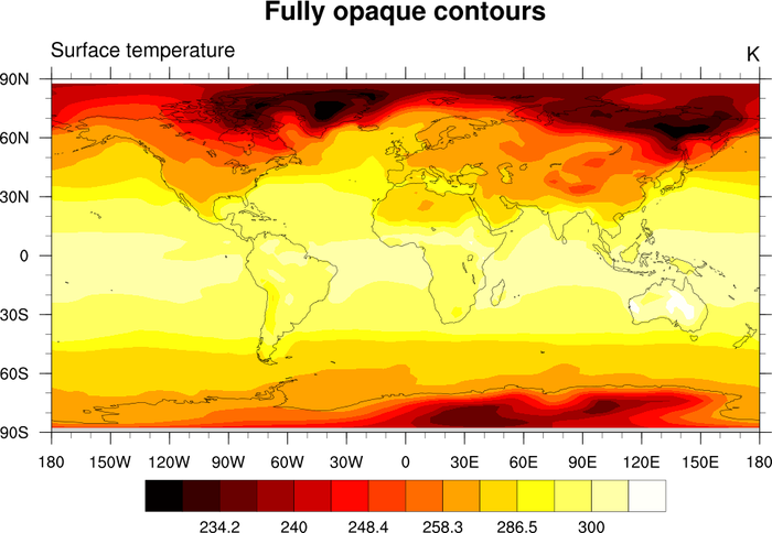
The first frame of this example draws a fully opaque contour plot,
using cnFillPalette to specify
the colors to use.
The second frame draws a partially opaque contour plot by setting
cnFillOpacityF to 0.5. If you
have NCL V6.3.0 or earlier, you will note that the labelbar colors
do not reflect the same opacities.
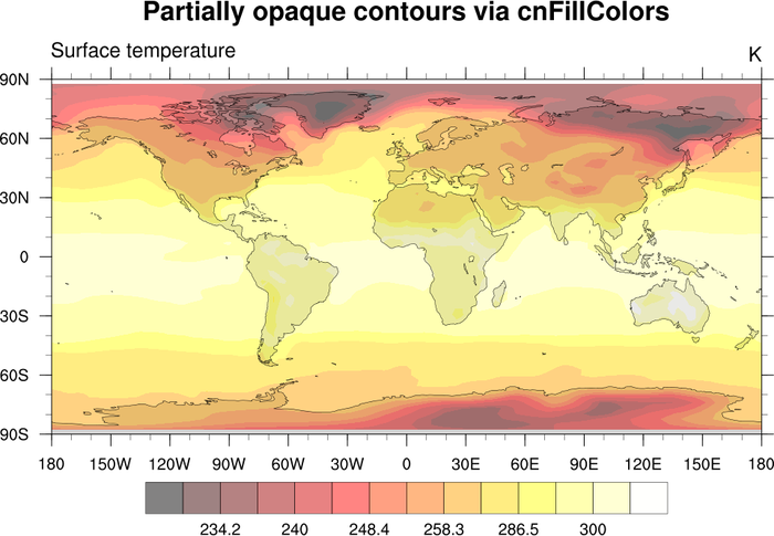
The third frame shows a work-around. It draws the same partially
opaque contour plot, except by 1)
calling span_color_indexes to generate a set of
integer indexes that fully span the "GMT_hot" color table, 2) using
these indexes in an RGBA array (254 x 4) generated by
calling read_colormap_file, and 3) setting the "A"
component of this RGBA array to 0.5. This has the same effect as
setting cnFillOpacityF to 0.5,
except now the labelbar colors also appear partially opaque.
