Hints to NCL graphics exercises
- Basic graphics exercise hints
- Color table exercise hints
- Title exercise hints
- XY plot exercise hints (set 1)
- XY plot exercise hints (set 2)
- Contour plot exercise hints
- Contours over maps exercise hints (set 1)
- Contours over maps exercise hints (set 2)
- Vector plot exercise hints
- Primitives exercise hints (set 1)
- Primitives exercise hints (set 2)
- Primitives exercise hints (set 3)
- Paneling exercise hints
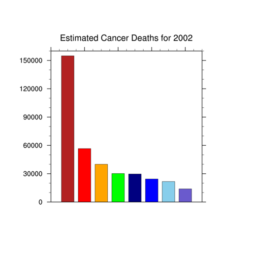
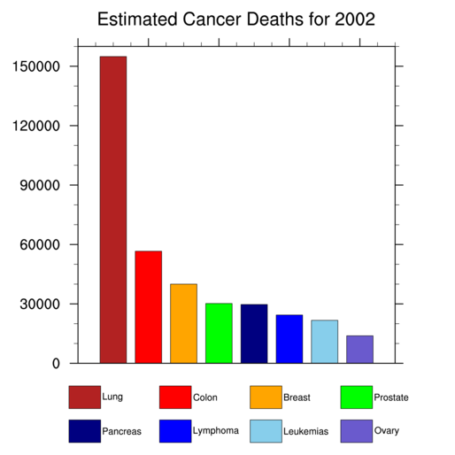
Basic graphics exercise hints
- You can change the size of the X11 window
in one of two ways: inside the script or via the
".hluresfile" file.
Doing it inside the ".hluresfile" is recommended if you always want
this size for your X11 window.
The script below shows how to do it inside the script itself, using the resources wkWidth and wkHeight.
[Answer script] [Image]
- To have the script send the graphical
output to a PS, PDF, or PNG file, change "x11" to "ps", "pdf", or
"png" in the call
to gsn_open_wks. The second
argument will be the filename (with the appropriate ".ps", ".pdf".
or ".png" appended).
[Answer script] [Image]
- To rotate the image for PS or PDF output,
you need to use the
resource wkOrientation. Read
the documentation on gsn_open_wks
for information on how to set this resource.
[Answer script] [Image]
- Setting gsnMaximize to True forces the plot to be
maximized in the output device you're using. This means if you are
drawing to a PS file that will be sent to an 8-1/2 x 11 piece of
paper, the plot may be rotated to landscape mode if the
plot is wider than it is high.
Note that you must make sure the resource variable ("res" in the answer script below) is set to True in order for any resources to take effect.
[Answer script] [Image]
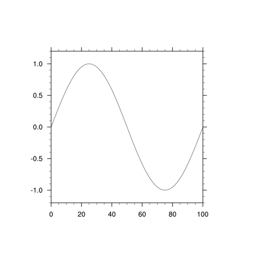
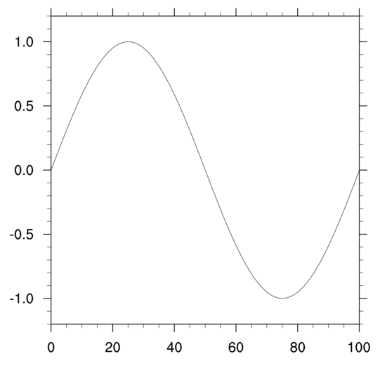
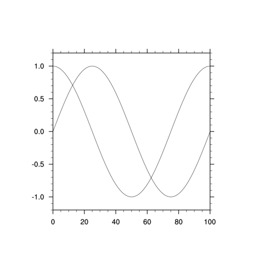
- Drawing another plot is simple. Just
add another call to gsn_csm_y,
and pass it the new set of y points.
Note that if your output is going to an X11 window, then when you run the script, you will need to click on the X11 window with your left mouse button to advance the frame to the second picture, and then to close the window.
If your output is going to a PS, PDF, or PNG file, each plot will appear on a separate page.
[Answer script] [Image 1] [Image 2]
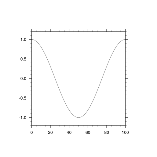
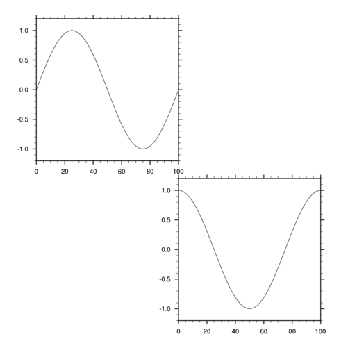
- Setting gsnFrame to False causes the frame not to be
advanced, and hence if you draw a second plot, it will be drawn on the
same frame (or page), as the previous plot.
To set gsnFrame to False for one plot and not the other, set it to False before the first call, and then back to True for the second call. Or, you can just delete it before you generate the second plot.
If your output is going to an X11 window, you will only see one X11 window pop up, and the second plot will be drawn to the same window.
If your output is going to a PS, PDF, or PNG file, both plots will be draw on the same page.
[Answer script] [Image]
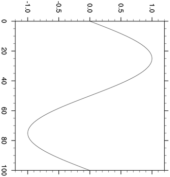
- Use vp resources to
reposition and resize individual plots.
To advance the frame manually, call the frame procedure. You must advance the frame after you are done drawing to it, because otherwise the PS, PDF or PNG file will not be closed properly.
For an X11 window, if you leave out the frame call, you will see a window pop up and then disappear. When you include the frame call, it waits for you to click on it before it disappears.
Note that when you use "vp" resources to position plot(s) on a page, the gsnMaximize resource will no longer have effect.
[Answer script] [Image]
Tip: if your plots are the exact same size, and you want to panel them on a page, then use gsn_panel to do this.
Color table exercise hints
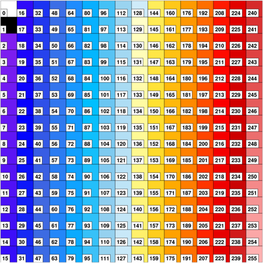
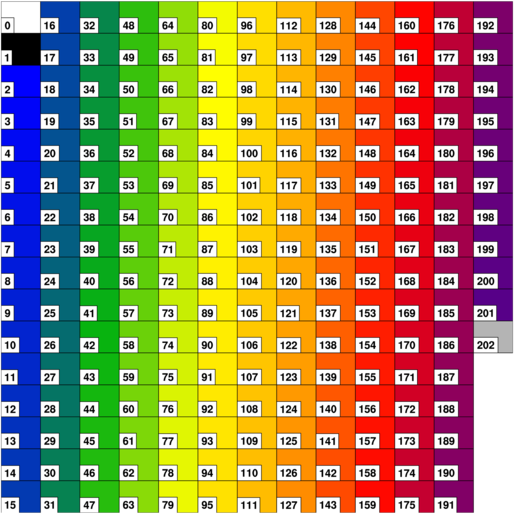
- Use the
procedure gsn_draw_colormap to draw
the color table associated with the current workstation. Each color
will have its corresponding index included. Color index 0 represents
the background color, and 1 represents the foreground color.
[Answer script] [Image]
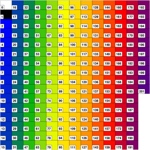
- Use the procedure gsn_define_colormap to change the color
table (also known as a "color map"). It is recommended that you
call this procedure immediately after calling
gsn_open_wks. It is generally a good
idea to have only one color table defined per frame (page).
Note: as of NCL V6.1.0 and later, the use of gsn_define_colormap may not be as necessary. This is because you can now set color tables for contours and vectors directly via contour and vector resources; see the "tip" below.
[Answer script] [Image]
- Use the function
NhlNewColor to add a new color to a color
table. The existing color table must have less than 256 colors, as
this is the maximum number of colors you can have. The color
will be added to the end of your color table.
The color gray is represented by RGB triplets that have the same values, like (0.1,0.1,0.1) or (0.85,0.85,0.85). The larger the values, the lighter the shade of gray.
Note: in NCL versions 6.0.0 and earlier, one of the main purposes of NhlNewColor was to add "named" colors to a color map, so you could reference them later. For example, in order to use "red" as a color, you had to make sure the RGB triplet (1.,0.,0.) was in your workstation color map. This is no longer required in NCL V6.1.0 and later.
[Answer script] [Image]
Tip: to replace a color in an existing color table, you can use NhlSetColor.
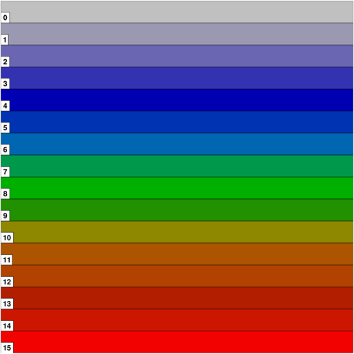
- Use the procedure gsn_define_colormap to create a
new color table using RGB triplets.
[Answer script] [Image]
There are other ways to create your own color table. For more information, see the short write up on creating your own color table.
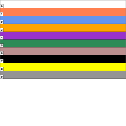
- Use the procedure gsn_define_colormap to create a
new color table using named colors.
To see all the color names and their corresponding colors, see the named colors gallery. You can use the gsn_draw_named_colors procedure to quickly draw a set of named colors to see how they look on your screen.
[Answer script] [Image]
Title exercise hints
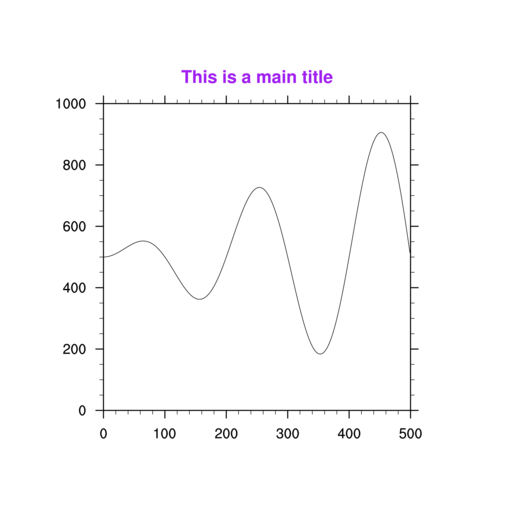
- Resources for changing attributes of the
main title start with "tiMain" and are listed alphabetically in the title resource page.
[Answer script] [Image]
- Resources for changing attributes of the
X or Y axis titles start with "tiXAxis" and "tiYAxis". The resources
for the main title, X axis title, and Y axis title have the same
structure, i.e. "tiMainFont", "tiXAxisFont", and "tiYAxisFont".
This makes it easier to remember resource names.
[Answer script] [Image]
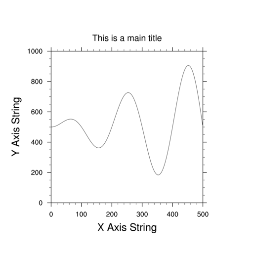
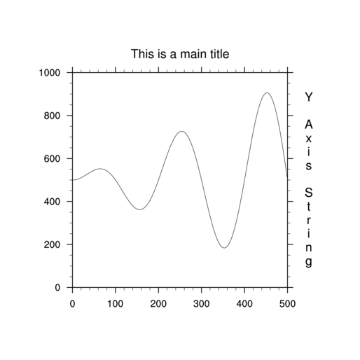
- If you change the orientation of text,
this may also change the direction of the text. This means you need to
set two resources in order to change the orientation of the Y axis
title. You unfortunately can't have a title on both Y axes using the
"ti" resources. You would need to use gsn_add_text if you wanted to add an
additional title to one of the axes.
[Answer script] [Image]
XY plot exercise hints (set 1)
- Resources for changing attributes of an XY
line start with "xyLine" and are listed alphabetically in the XY resource page.
[Answer script] [Image]
- All line thickness resources have names like
xyLineThicknessF, xyLineThicknesses, cnLineThicknessF, cnLineThicknesses, gsLineThicknessF, etc. The default is
usually 1.0, so a value of 2.0 makes the line twice as
thick. Sometimes you need to make lines thicker so they'll look better
in a PS, PDF, or PNG file.
[Answer script] [Image]
- Changing an XY plot so that markers are used
instead of lines involves changing a "Mode" resource. To then change
the look of a marker, there are a series of "xyMarker" resources you
can set. You can see a list of predefined markers in the marker table.
[Answer script] [Image]
Try playing with these and other xyMarker resources to change the marker, color, size, etc.
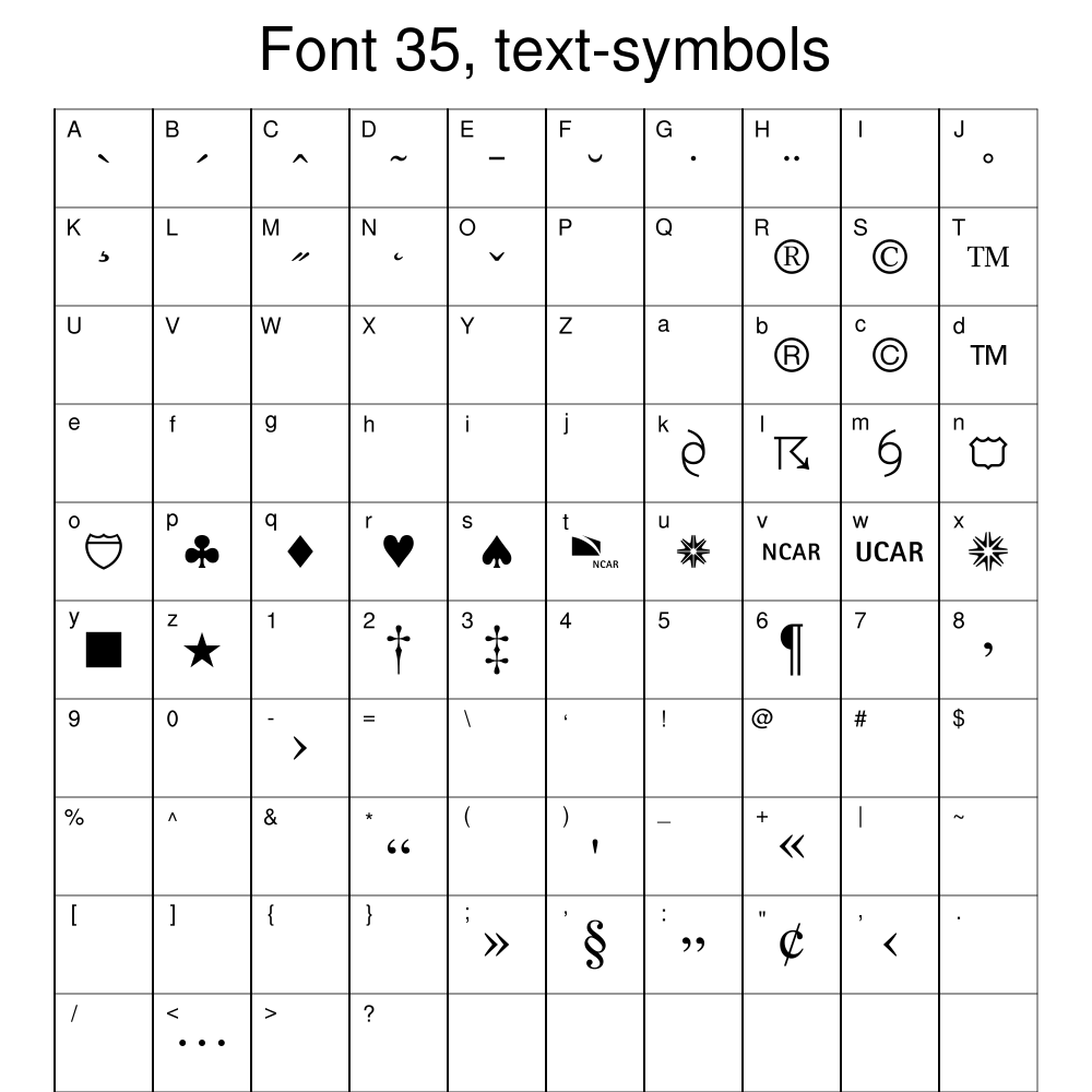
- If you don't like any of the predefined markers, you can
define your own using NhlNewMarker. This function
allows you to use any of the characters in any of the font tables as a
marker. In the script below, the character "p" is used from
font table 35.
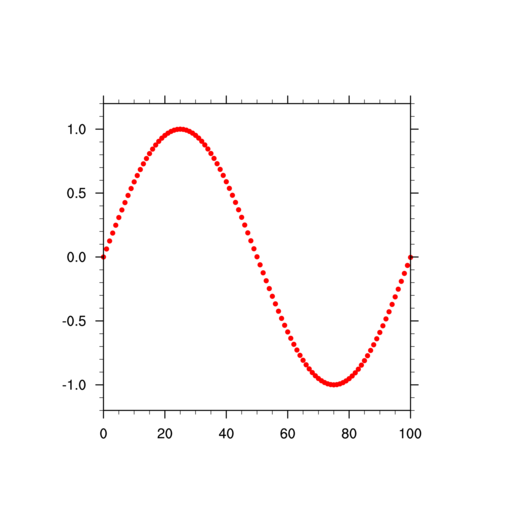
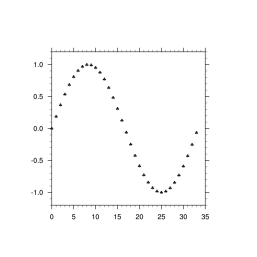
If you don't want to plot every value, you can use the "::" syntax to subscript your data array. Using "::2" will grab every other point, while, "::3" will grab every third point.
[Answer script] [Image]
Try playing with these and other xyMarker resources to change the marker, color, size, etc.
XY plot exercise hints (set 2)
- Use fspan to generate
the X array. In order to use it in a call to gsn_csm_xy,
it must be the same length as its corresponding Y array.
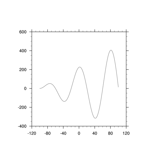
[Answer script] [Image]
- You can reorder the dimensions by naming
both dimensions of "y", and then using NCL's reorder syntax to
transpose the dimensions.
[Answer script] [Image]
- Whenever you have a single and plural
version of a resource, like "xyLineColor" and "xyLineColors", there's usually a
corresponding "Mono" resource ("xyMonoLineColor") that takes a logical
True/False value. This allows you to specify whether to use the
singular or plural version of the resource to apply to that specific
plot feature.
You need to know whether the corresponding Mono resource's default is True or False to know whether you need to change it.
[Answer script] [Image]
- Changing the area that the data is
displayed in involves a transformation of the data to a new "data
space", so you need to
use Transformation
resources to change the axes limits.
[Answer script] [Image]
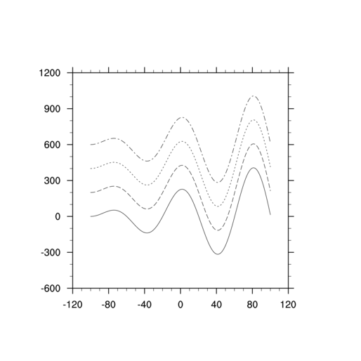
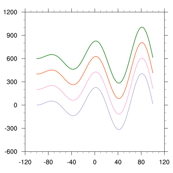
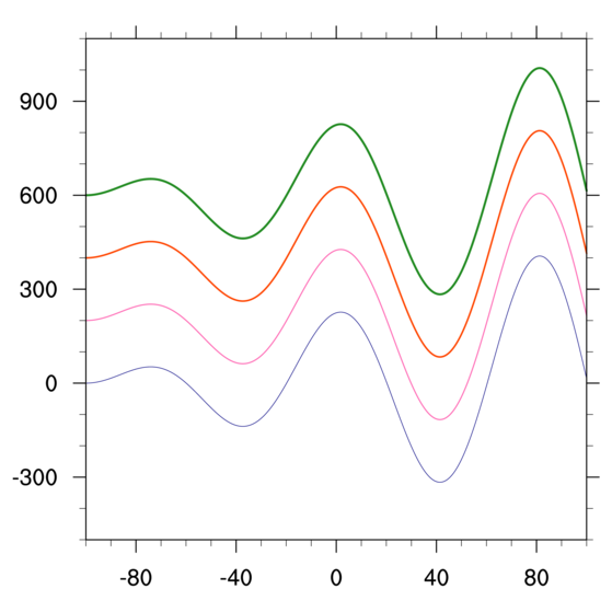
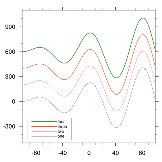
- Adding a legend involves using a PlotManager resource
called pmLegendDisplayMode. The
PlotManager is something that manages additional annotations of a
plot, like labelbars, titles, and legends.
[Answer script] [Image]
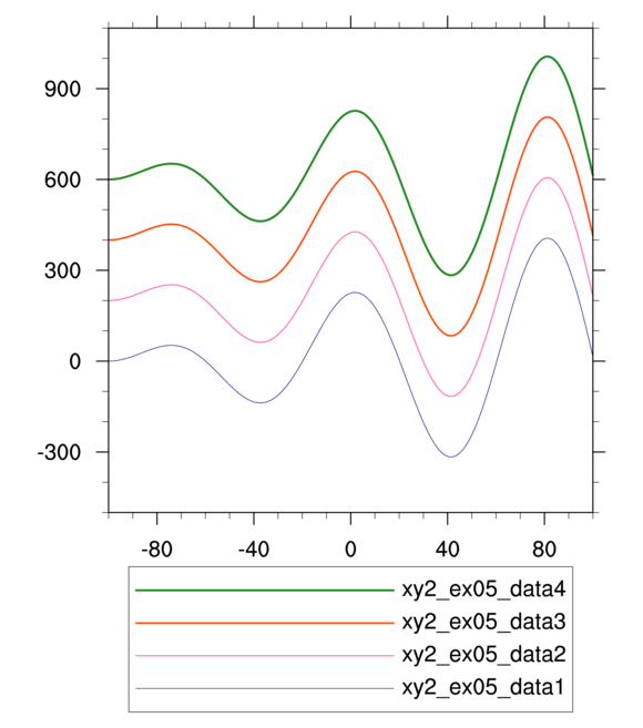
- Legends are somewhat confusing in NCL. To
change various aspects of a legend, you may need to use xy, pm, and lg resources. For
this particular exercise, no "lg" resources are involved.
[Answer script] [Image]
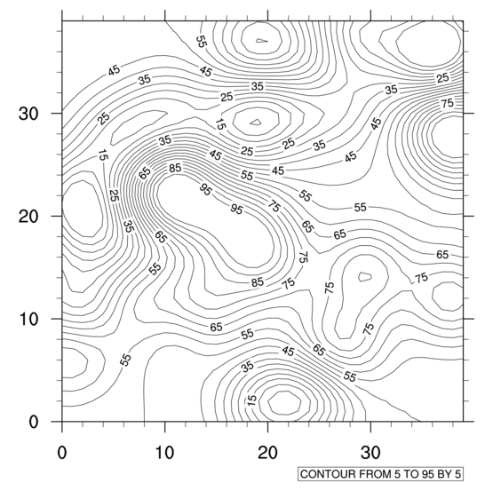
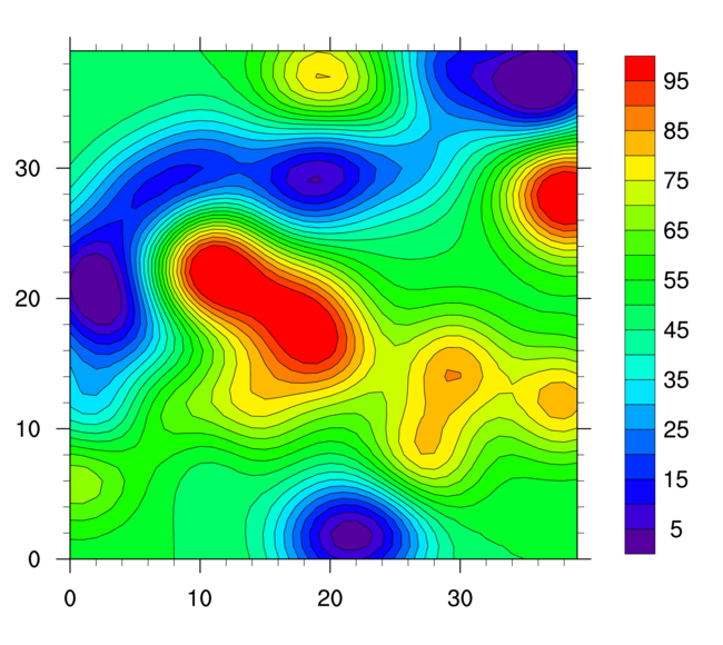
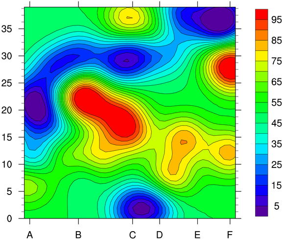
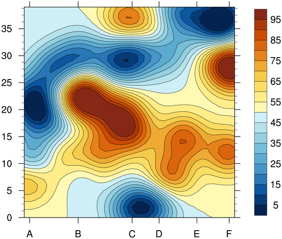
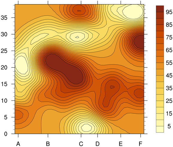
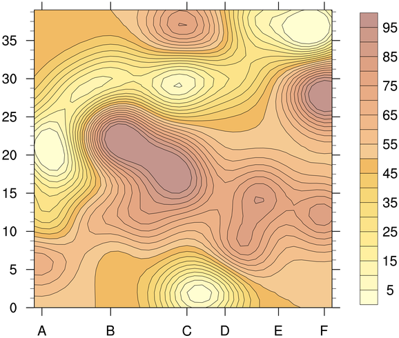
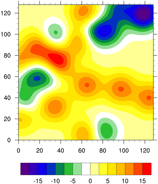
Contour plot exercise hints
- There are three ways you can set
contour levels: 1) let NCL do it automatically, 2) set a minimum
level, maximum level, and a level spacing, or 3) set an array of
contour levels.
The default behavior is #1. To do #2 or #3, you need to set the cnLevelSelectionMode resource to the "mode" you want, and then set the other resources depending on the mode you choose. The #3 method should be used if you need to use irregularly spaced contour levels.
[Answer script] [Image]
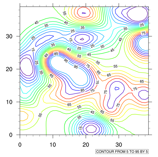
- The default is for each contour line to
be the same color. To change this, see the cnMonoLineColor resource. Other contour line
resources start with "cnLine".
Note: as of NCL V6.1.0 and later, it is better to use named colors like "blue", "red", "forestgreen" for color, rather than index values, because then you don't need to worry about using the correct color table.
[Answer script] [Image]
See "contour_ex02_namedcolors ncl" for a way of doing this using named colors.
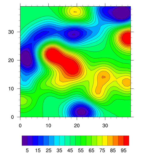
- When you turn contour fill on, the
current colormap in use will be spanned.
Note: if you only want a particular part of your color map spanned, then you set the resources gsnSpreadColorStart and gsnSpreadColorEnd to the desired start and end color indexes. See a later example below for another way to do this using cnFillPalette.
[Answer script] [Image]
- A labelbar is added automatically when
contour fill is set. If there are lots of contour levels, then your
labelbar labels will automatically be strided (this wasn't the case in
versions 6.0.0 or earlier.) For a vertical labelbar, look at
the labelbar
resources, which start with "lb". Look for the word "orientation".
[Answer script] [Image]
- Tickmark resources
can be set for XY, vector, streamline, and contour plots, and hence
they have their own set of resources that start with the letters "tm".
There are three ways you can change the labels on a tickmark axis: 1) let NCL do it automatically, 2) set a minimum and maximum tickmark value and a tickmark spacing, or 3) set arrays of tickmark values and labels you want at those values. For this exercise, you will use #2 for the Y axis, and #3 for the X axis.
Each of the four axes has its own set of tickmark resources. By default, however, the right/left axes will use the same resources values, as will the top/bottom axes (unless instructed otherwise). To set explicit labels for the bottom X axis, look for the "tmXB" resources, and for the left Y axis, look for "tmYL".
[Answer script] [Image]
-
Use the cnFillPalette
resource to set a color map for color contours. This
resource was added in NCL V6.1.0.
[Answer script] [Image]
- Use
the read_colormap_file function to
read in a predefined color table as an array
of RGBA quadruplets
(ncolors x 4). You can then subscript the array as desired to only use
part of it.
[Answer script] [Image]
- The "A" part of the RGBA array is an
alpha value that you can set to make colors more transparent (they are
fully opaque by default). Use values between 0 and 1 (inclusive) to
control the transparency level.
[Answer script] [Image]
Contours over maps exercises (set 1)
- If you add
"printVarSummary(t)" to the script, you will see
that "t" already has latitude and longitude coordinate information
attached to it. If you further do a
"printVarSummary(t&lat)" you will see that the
latitude coordinate array has units of "degrees_north" which is also
required for overlaying data on a map. (Same for the "lon"
array).
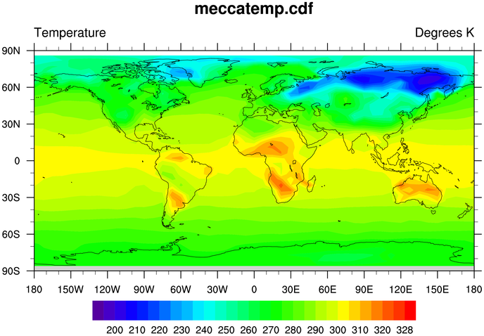
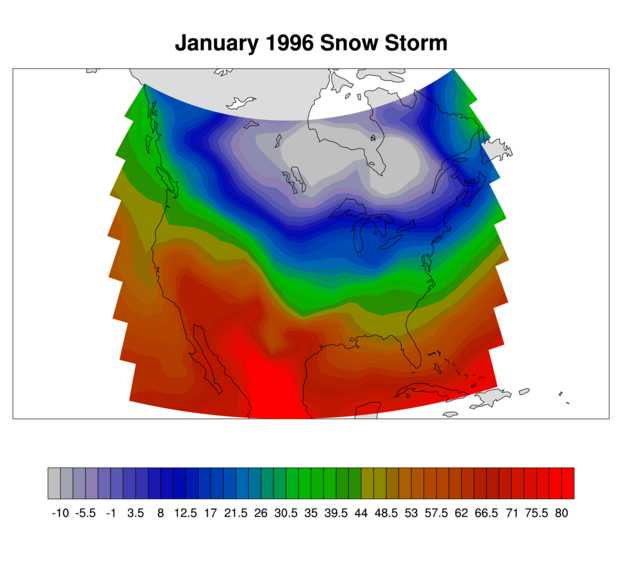
Thus, all you need to do to draw your contours over a map is to call gsn_csm_contour_map instead of gsn_csm_contour. This function defaults to a cylindrical equidistant map projection.
[Answer script] [Image]
- If you have global data, then it may
or may not have a longitude "cyclic" point. The gsn_csm_xxxx
scripts try to determine if your data is cyclic or not, but sometimes
you have to help by setting the gsnAddCyclic resource to True or False, to
indicate whether the cyclic point should be added for you. gsnAddCyclic is set to True for global data, so
if your data is already cyclic, you need to set this to False. [Note:
gsnAddCyclic is set to False if you have
two-dimensional latitude/longitude arrays, which is not covered
here.]
[Answer script] [Image]
- Most of the resources used for this
example were discussed in the contour
plot exercises section above.
[Answer script] [Image]
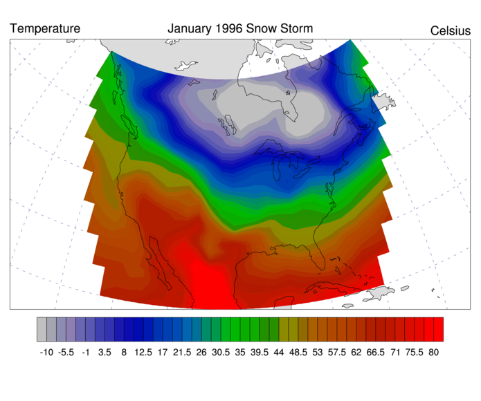
- Most of the resources used for this
example were discussed in the contour
plot exercises section above. The main title was
discussed in the title exercises.
[Answer script] [Image]
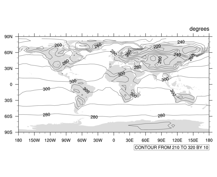
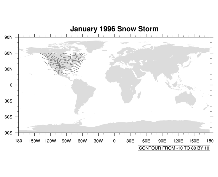
Contours over maps exercises (set 2)
- To attach coordinate arrays to
a variable, you need to name each variable dimension, assign
each one a coordinate array, and, for lat/lon coordinate arrays,
make sure the "units" attributes are set to "degrees_north"
and "degrees_east" respectively.
[Answer script] [Image]
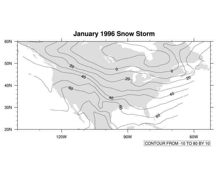
- There are several ways to zoom in
on a map. See the documentation for mpLimitMode for more information. For
gsn_csm_contour_map, if the default
projection (cylindrical equidistant) is used, the default limit mode
is "LatLon".
[Answer script] [Image]
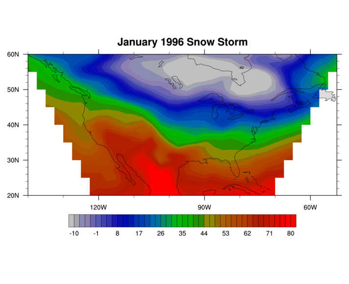
- Most of the resources used for this
example were discussed in the contour
plot exercises section above. Note that in this case, we are not
setting a minimum or maximum contour level; we are only setting the
spacing. This is possible when you use a cnLevelSelectionMode setting of
"ManualLevels".
[Answer script] [Image]
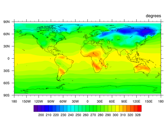
- Use the
mpProjection resource to
change the map projection. Once you do this, the limit
mode is no longer "LatLon" as described for the previous
example, so you'll need to set this resource. Also,
the map projection may not look right, so you need to
change the center latitude and longitude values as well.
[Answer script] [Image]
- The gsnXXXString resources allow
you to add smaller subtitles to the top of your plot, which will
appear under the main title
(tiMainString). To turn on lat/lon grid
lines, visit the
"mp" resource
page, and look for the "mpGrid" resources.
[Answer script] [Image]
- This example introduces the use of
the DrawOrder resources in order to control what order aspects of the
plot get drawn in. For example, you can change the draw order of
contour lines, filled contours, map grid lines, and map outlines. For
changing the lat/lon grid, see the "mp" resource page and
look for the "mpGrid" resources.
[Answer script] [Image]
Vector plot exercise hints
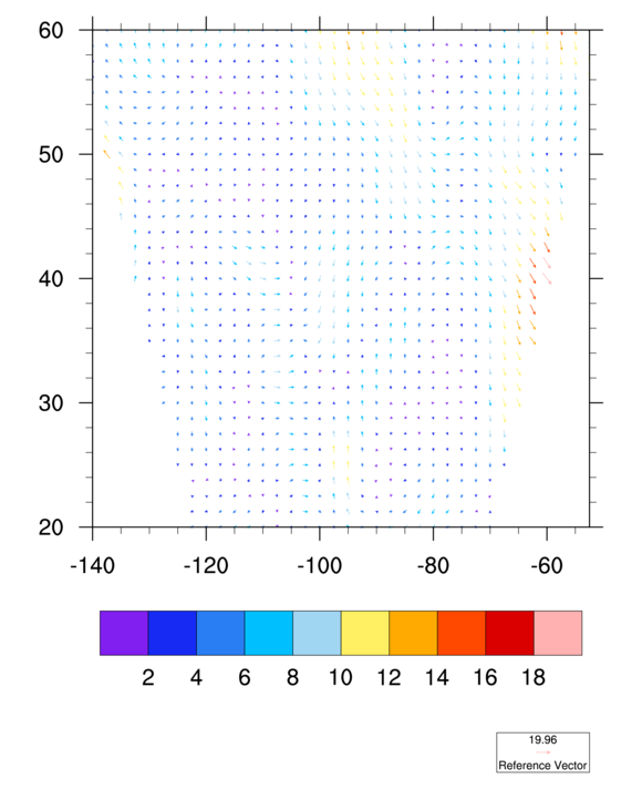
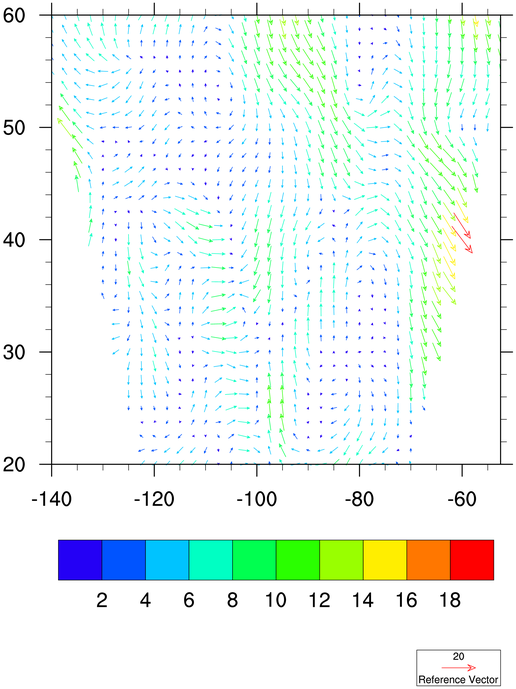
- Making the vectors multi-colored
involves the use of one of the "vcMono" resources.
[Answer script] [Image]
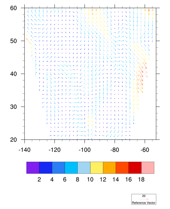
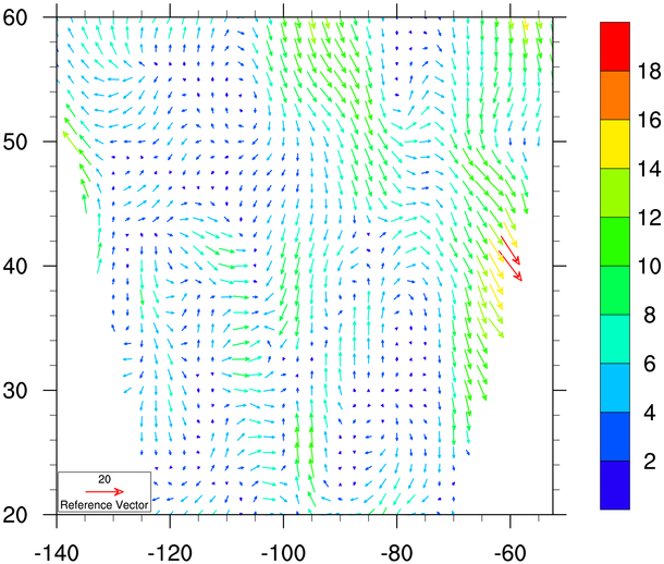
- Changing the reference magnitude is
probably one of the most common things you'll want to do to a vector
plot. Check out the vcRefMagnitudeF resource as a start.
[Answer script] [Image]
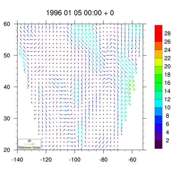
- Use
the vcLevelPalette resource to set
a color map for the vectors. See
the contour exercises above to see
how to span only certain sections of a color map.
[Answer script] [Image]
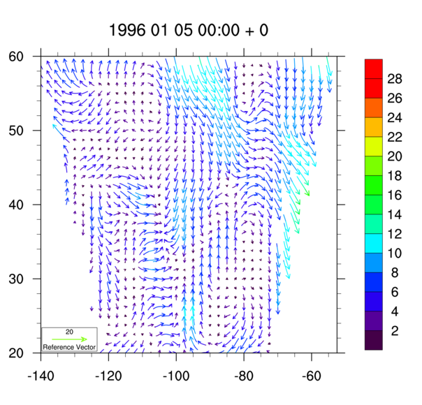
- Moving the reference annotation box
involves the use of a vector orthogonal resource to move
the box up and down, and a parallel resource to move the box left
and right. Generally you have to use trial and error to get
the box where you want it.
To reorient the labelbar, visit the labelbar resources and look for the word "orientation".
[Answer script] [Image]
- The
default "mode" for setting vector levels is "AutomaticLevels",
where NCL tries to pick "nice" levels based on the magnitude
of your data. In order to set the levels yourself,
see the vcLevelSelectionMode
resource.
Use tiMainString to change the title. See the related function code resource for changing the function code from a ":" to a "~".
[Answer script] [Image]
- The default vector style is straight
line vectors. To change to curly vectors or wind barbs, see
the vcGlyphStyle resource.
[Answer script] [Image]
- There are 64 timesteps on the file.
Instead of going to an "x11" window, then, it might be better to go to
an NCGM file and use idt to
animate the NCGM file.
Use the ismissing function to test for missing data.
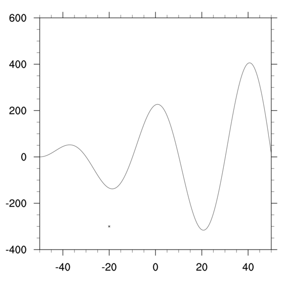
Primitives exercise hints (set 1)
- You need to set gsnFrame to False so that you can draw the marker
before the frame is advanced. Use the gsn_polymarker procedure to add the marker
using plot coordinates.
[Answer script] [Image]
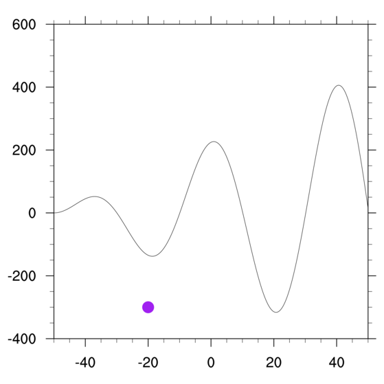
- To set some marker resources, use
the "gs"
(GraphicStyle) resources that start with "gsMarker".
[Answer script] [Image]
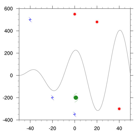
- You can use the same resource list
("mkres") to change the markers for each set that you draw. To draw
more than one marker of the same style, size, and color, pass an array
of X and Y values to gsn_polymarker.
[Answer script] [Image]
- This exercise produces the
exact same plot as the previous exercise, only using
a slightly different method. When you use any
of the "gsn_add_polyxxx" functions, you must
use a unique variable on the lefthand side for each
call.
You should also turn off the initial drawing of the plot and draw the plot manually after you add the markers.
[Answer script] [Image]
Primitives exercise hints (set 2)
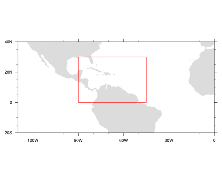
- Use the gsn_add_polyline function to add the lines
using lat/lon coordinates. You need to set gsnFrame to False so that you can draw the lines
before the frame is advanced. To set some lines resources, use the "gs" (GraphicStyle)
resources that start with "gsLine".
[Answer script] [Image]
- Use the gsn_add_polygon function to draw the
polygon. You can use the same lat/lon coordinates that you used for
the box lines. To set polygon resources, use the "gs" (GraphicStyle)
resources that start with "gsFill".
[Answer script] [Image]
- Use
the gsFillOpacityF resource,
which was added in NCL version 6.1.0.
[Answer script] [Image]
- As with the above exercise, you can use
"gsFill" resources to change the fill pattern and color of your
polygon. To see a table of the available fill patterns, go to http://www.ncl.ucar.edu/Document/Graphics/Images/fillpatterns.png.
[Answer script] [Image]
- Use the gsn_add_polymarker function to add the
polymarkers. Note that when you use the "gsn_add" functions, the
variables on the lefthand side must be unique, and they must not be
deleted.
[Answer script] [Image]
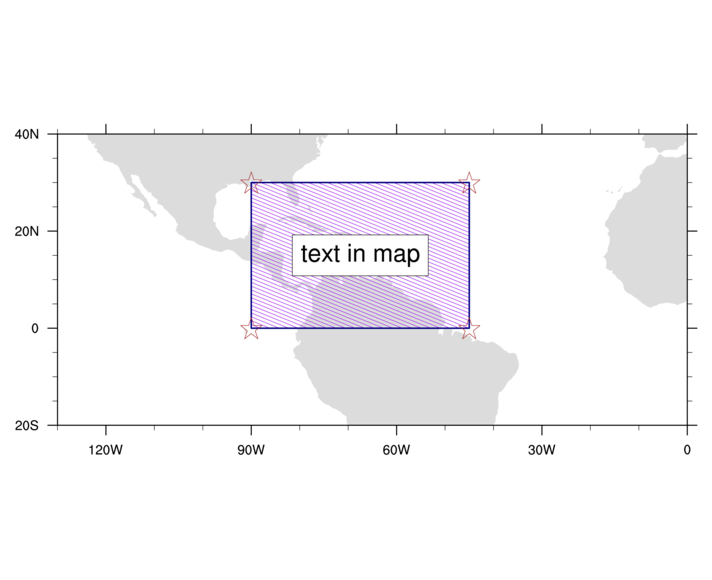
- Use the gsn_add_text function to add the text. The
text resources start with "tx" (TextItem).
Again, the variable on the lefthand side must be unique.
[Answer script] [Image]
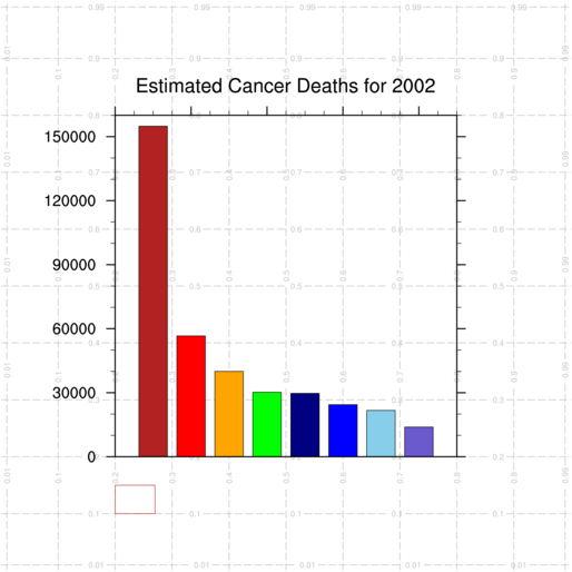
Primitives exercise hints (set 3)
- Use one "tmXB" resource to
accomplish this. You can remove the other tmXB resources being set.
[Answer script] [Image]
- All NCL plots are drawn in a unit square,
using NDC
coordinates. The drawNDCGrid procedure is in the shea_util.ncl
script, so before you can use this procedure, you need to load this
script with:
load "$NCARG_ROOT/lib/ncarg/nclscripts/csm/shea_util.ncl"
This procedure should be called before you draw anything else, so it doesn't cover up your plot.[Answer script] [Image]
- Use the gsn_polyline_ndc procedure to draw the
box. Note that there is no "function" version of this procedure, like
with gsn_add_polyline. Use one of
the "gsLine*"
resources to change the line color.
You will need to set gsnFrame to False so that you can draw the lines before the frame is advanced. Of course, you could draw the lines before the plot was drawn, but then your plot would obscure the lines. It's usually better to draw the plot first, and then any primitives that you want.
[Answer script] [Image]
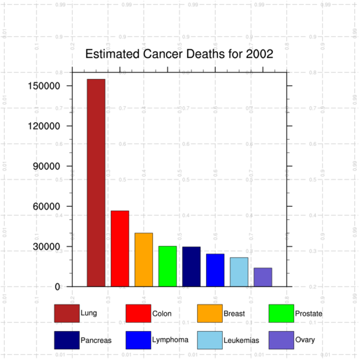
- Instead of xpos and
ypos being scalars, turn them into arrays of eight elements
each, and then loop across each element to draw each box in a
different color.
[Answer script] [Image]
- Use the gsn_text_ndc procedure to draw the text
strings. Use txFontHeightF to change
the font height.
The NCL default is to position the text based on the dead center of the box that contains the text string. Since we want the text to be left-justified to the right of each box, use the txJust resource to change the justification from "CenterCenter", to "CenterLeft".
[Answer script] [Image]
- Use
the gsn_polygon_ndc procedure to
draw a filled box,
and gsFillColor to set the fill
color.
[Answer script] [Image]
- Use four vp resources to
reposition and resize the bar plot. All plots are positioned
using the upper left corner of the plot box (in this case,
this position is currently at (0.2,0.8)). A good position
to start with is (0.17,0.9).
[Answer script] [Image]
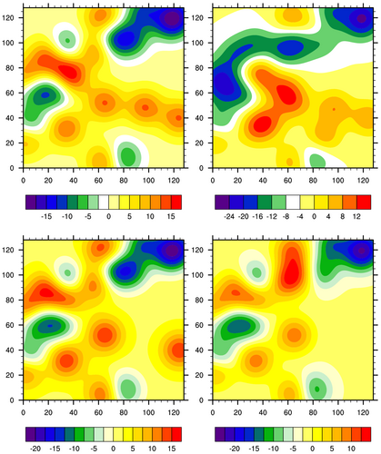
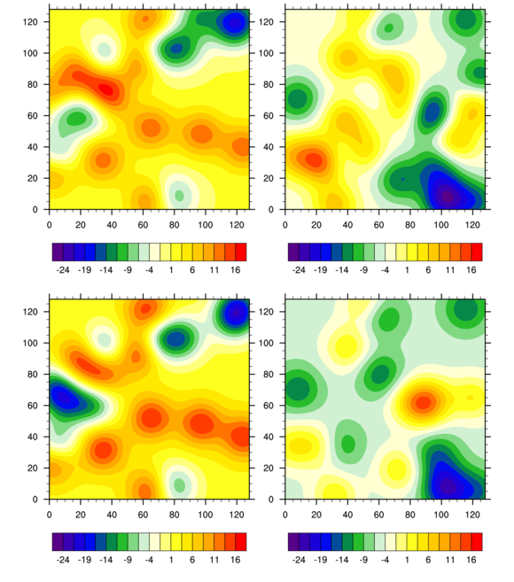
Paneling exercise hints
- Turn the "plot" variable
into an array of 4 elements of type "graphic". To make
sure each dataset is unique, you can use
a different seed in the generate_2d_array function.
[Answer script] [Image] (only first image shown)
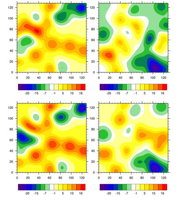
- Use the gsn_panel to panel the individual plots.
[Answer script] [Image] (only last image shown)
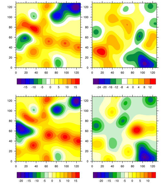
- The gsnDraw and gsnFrame resources control the drawing of
the individual plots.
[Answer script] [Image]
- See the resource cnLevelSelectionMode.
[Answer script] [Image]
- This example also
uses the cnLevelSelectionMode
resource, but sets it to a different value.
[Answer script] [Image]
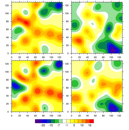
- To turn off individual labelbars, see
lbLabelBarOn. To turn on a common
labelbar in a panel plot, see gsnPanelLabelBar. A few other resources are added in
this script to turn off the individual informational labels, and
to set the label auto stride for the labelbar in the panel plot.
[Answer script] [Image]
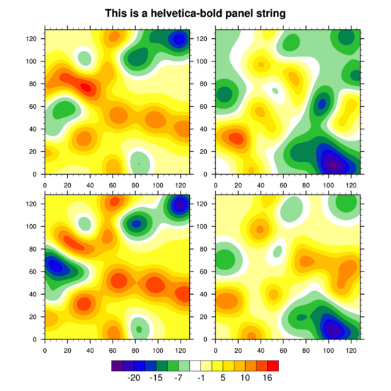
- Normally, you would use the title
resource tiMainString to add a title,
but for paneled plots which don't recognize the "ti" resources, you
can use txString instead. gsn_panel is set up to recognize txString as a special resource.
Note that in this script, the main title font is changed to font 22 (helvetica bold) using the "F" text function code.
[Answer script] [Image]
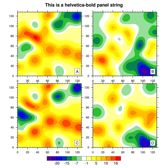
- See the resources
gsnPanelFigureStrings and
gsnPanelYWhiteSpacePercent.
Note there is a similar resource for white space in the
X direction.
[Answer script] [Image]
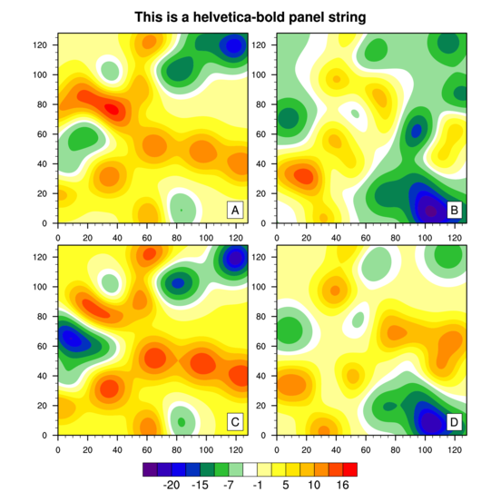
- To turn off tickmarks, you need to
set tickmark resources for the individual plots. See
tmXTOn and
tmYROn.
[Answer script] [Image]