NCL Home>
Application examples>
Maps and map projections ||
Data files for some examples
Example pages containing:
tips |
resources |
functions/procedures
NCL Graphics: Map only plots
Map Only Templates
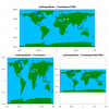
Sample of all the
NCL map projections with contours overlaid
There are two main NCL functions for creating just maps:
gsn_csm_map
gsn_csm_map_polar
There's a third function
called gsn_csm_map_ce, but it simply
calls gsn_csm_map under the hood,
which defaults to a cylindrical equidistant map projection unless
mpProjection is set to something else.
This page shows the various map projections you can create in NCL.
Any of these maps can be used to overlay contours, vectors, streamlines, markers,
lines, and polygons. If you need more map outlines than what NCL provides,
then see the Shapefiles example page.
See the description at the top of the Map
outlines examples page for information about a change to the
behavior of the mpDataBaseVersion
resource in NCL V6.4.0.
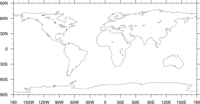
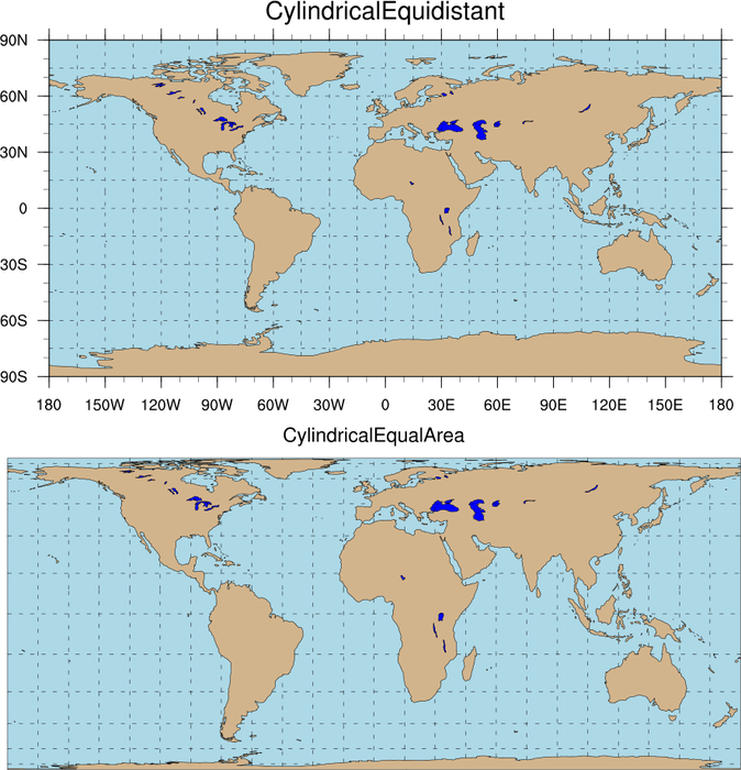
 maponly_1.ncl
:
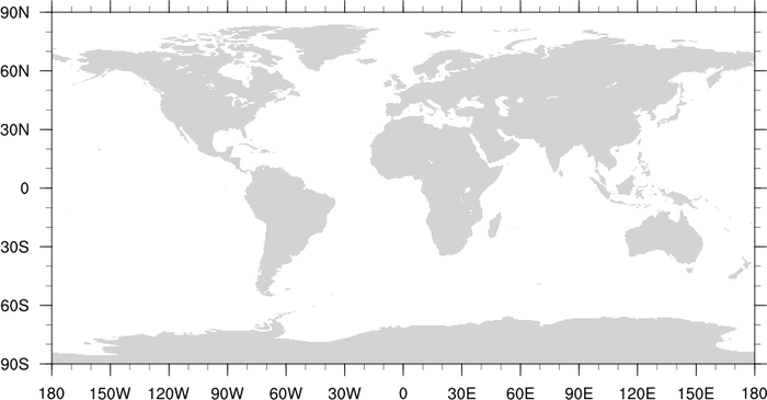
A cylindrical equidistant global map.
gsn_csm_map is the plot templates
that draws a cylindrical equidistant map.
Note that the default behavior is gray filled continents.
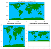
 maponly_2.ncl
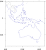
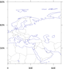
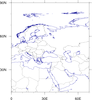
:
A subregion map with a few modifications. Note that the first two
images will now look different in NCL V6.4.0 and later. See the next
section to compare the images.
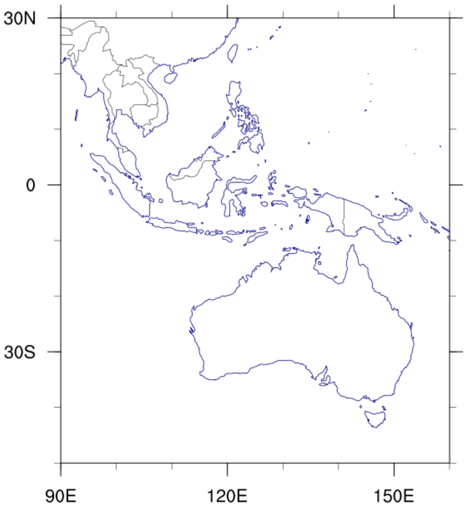
First frame: shows Australia and parts of south-east Asia.
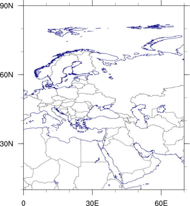
Second frame: centered on Western Eurasia.
Third frame: demonstrates how to get more up-to-date country
boundaries for this region along with higher resolution.
The following resources were used for this example:
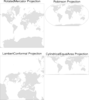
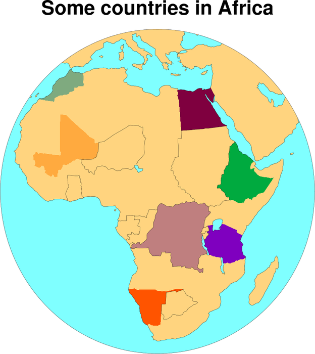
 maponly_6.ncl
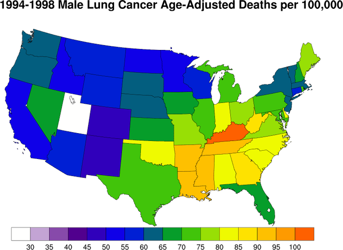
:
An example of drawing the U.S. and filling each state with a data value.
GetFillColorIndex will assign a
color to a polygon based on an array of color indices.

 maponly_7.ncl
:
Demonstrates how to remove portions of a map. The first plot shows the
default mapfill, and the second plot has had all "SmallIslands"
removed. These include the Lesser Antilles, Hawaii, the Phillipine
Islands etc.
mpAreaMaskingOn turns on the area
masking so that the regions specified in mpMaskAreaSpecifiers will not be filled. Note
that if we did not turn off the map outline with mpOutlineOn, we would still see the outline,
but it would not be filled.
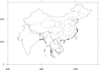 maponly_8.ncl
:
Demonstrates how to draw only certain portions of map when there is no
map fill.
This technique differs lightly from that demonstrated in example 7. In
that example we exclude only the desired features. In this method we
only draw the desired features.
mpOutlineBoundarySets
="NoBoundaries", indicates not to draw any boundary other than what is
set by mpOutlineSpecifiers
This method can thus be used to draw only those countries or boundaries that are specified in
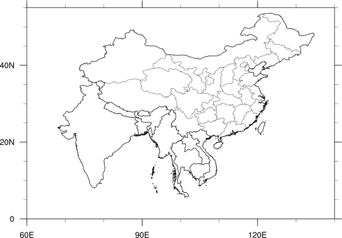
mpOutlineSpecifiers. In the third frame, China, Chinese provinces, India,
and various other southeastern countries are drawn. To draw the Chinese provinces,
mpDataSetName must be set to "Earth..4"
and mpDataBaseVersion must be set to "MediumRes".
 maponly_9.ncl
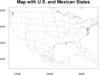
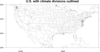
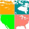
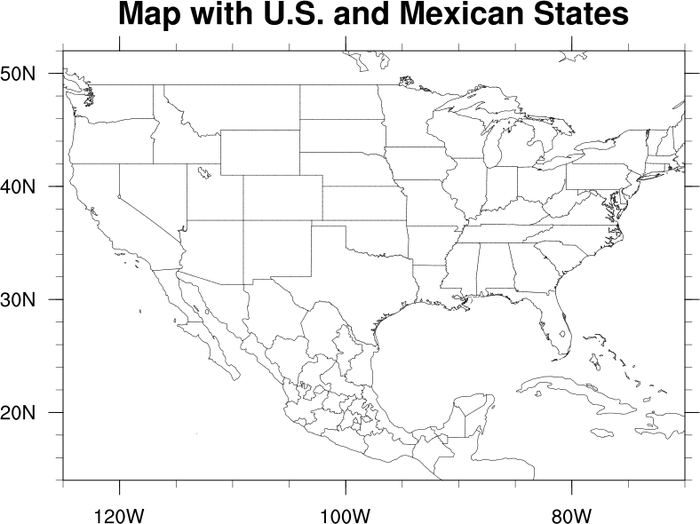
:
Demonstrates how to draw both US States and Mexican States. This
method requires that the plot be drawn first an then the values for
the Mexican States retrieved and added to the plot.
 maponly_10.ncl
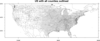
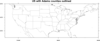
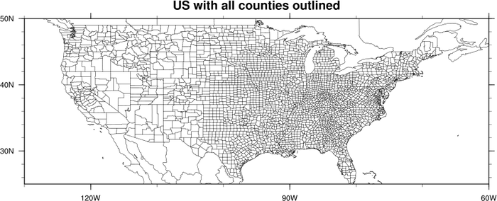
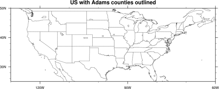
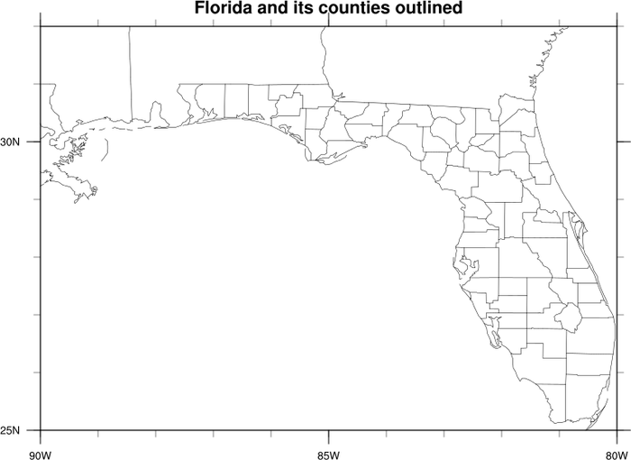
:
Demonstrates how to draw all of the counties in the US, how to draw
just the counties with the name "Adams", and then how to draw only the
counties in Florida by listing them by name.
The resource mpDataSetName needs to
be set to "Earth..2" in order to have access to the US counties.
 maponly_11.ncl
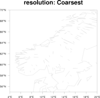
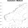
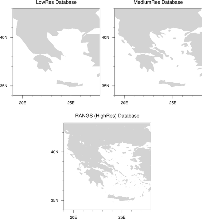
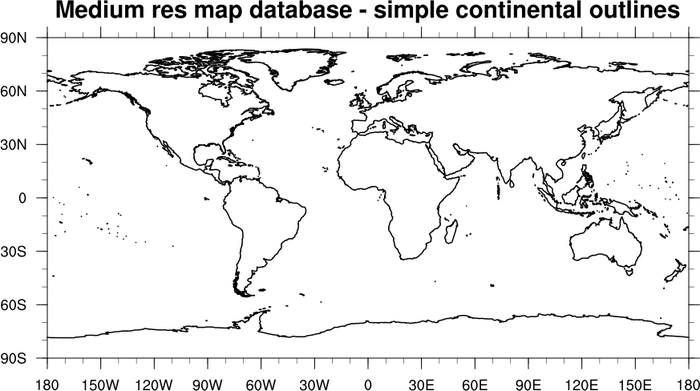
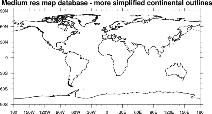
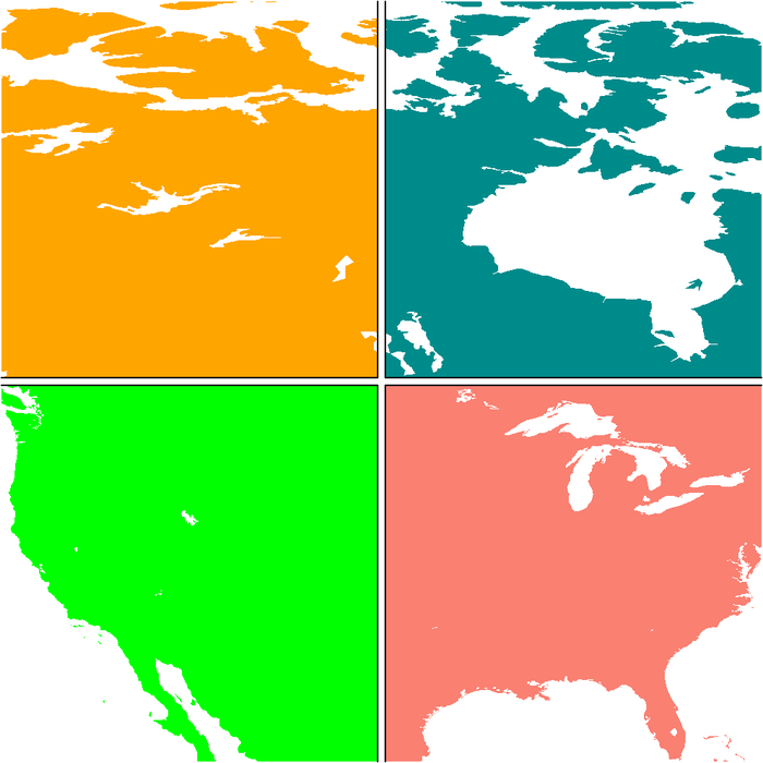
:
Demonstrates the difference in resolution between the three available
map databases in NCL.
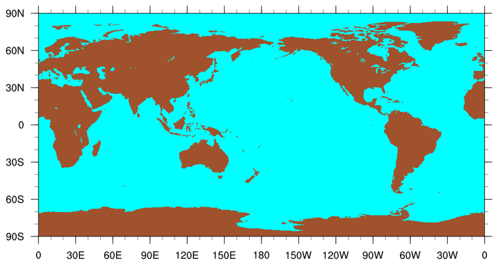
mpDataBaseVersion is used to set the database
that NCL uses to draw the basemap. By default,
mpDataBaseVersion is set to "LowRes". The
upper left panel shows the country of Greece with this setting. The
upper right panel shows the same area with a database setting of
"MediumRes". The bottom panel is drawn with a database setting of
"HighRes".
If you want to use the "HighRes" map database, you will have to download the RANGS database.
 maponly_12.ncl
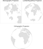
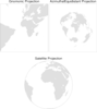
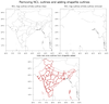
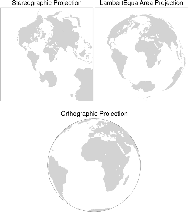
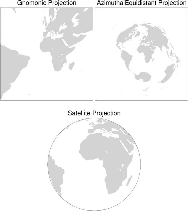
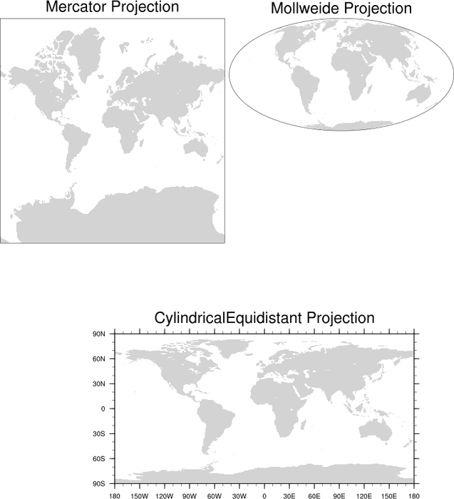
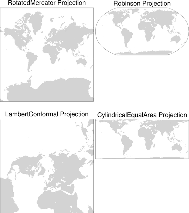
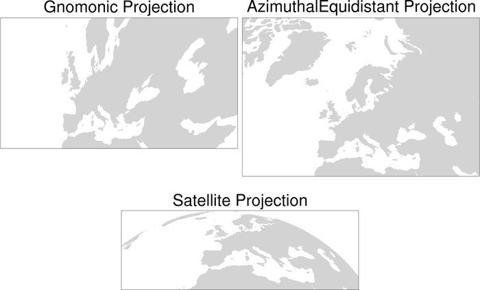
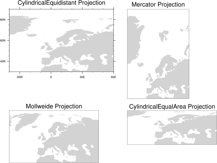
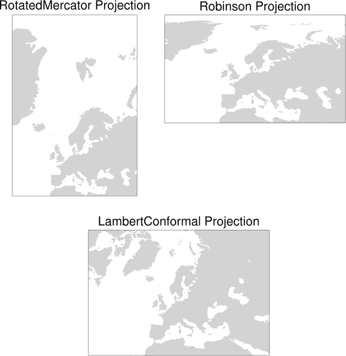
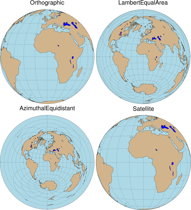
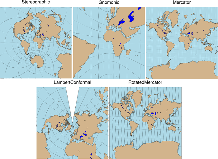
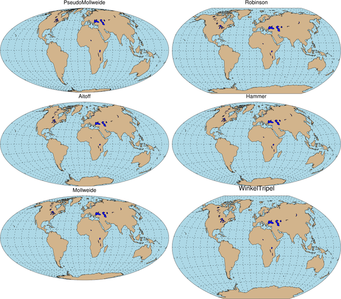
:
This script demonstrates the use of the resource
mpProjection, which sets the map
projection. There are 13 map projections available; each is shown
here. Resources are not set to limit the map area, and thus the
default area (whole globe) is shown.
The resources mpGridAndLimbOn and
mpPerimOn are turned on and off
throughout the program depending on whether the projection looks best
with the perimeter drawn or with the earth's outline drawn.
By default, NCL does not draw a line outlining the earth for the
Orthographic, Satellite, Mollweide, and Robinson projections. To trick
NCL into drawing the outline for these projections, the following
resources should be set:
mpGridAndLimbOn = True ; turn on lat/lon
lines.
mpGridLatSpacingF = 90; change latitude line spacing
mpGridLonSpacingF = 180. ; change longitude line spacing
mpGridLineColor = "transparent"
; trick ncl into drawing earth's outline
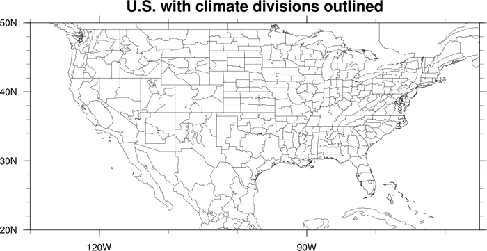
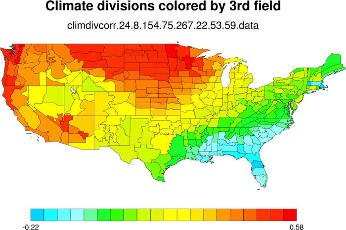
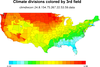 maponly_15.ncl
:
The first frame demonstrates how to draw climate divisions, by
setting the resources
mpDataSetName
to "Earth..3",
mpDataBaseVersion
to "MediumRes", and
mpOutlineBoundarySets
to "AllBoundaries".
The second frame shows how to color the climate divisions by a third
field. The climate divisions already have their own default color
indexes (called "group ids") that you can use to color the climate
areas such that adjacent areas will not have the same color. These
default values are retrieved (via the mpDynamicAreaGroups resource) so that you can
replace them with new color indexes based on this third field.

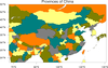
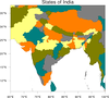 maponly_16.ncl
:
This example demonstrates how to use the map database, "Earth..4",
to generate divisions for other countries.
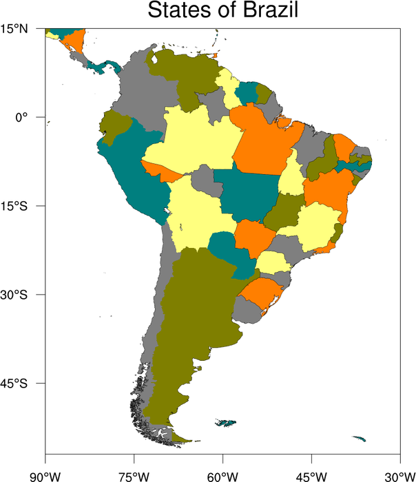
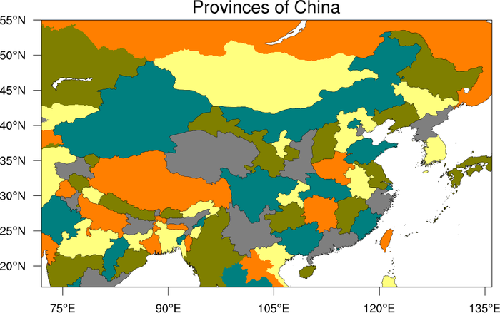
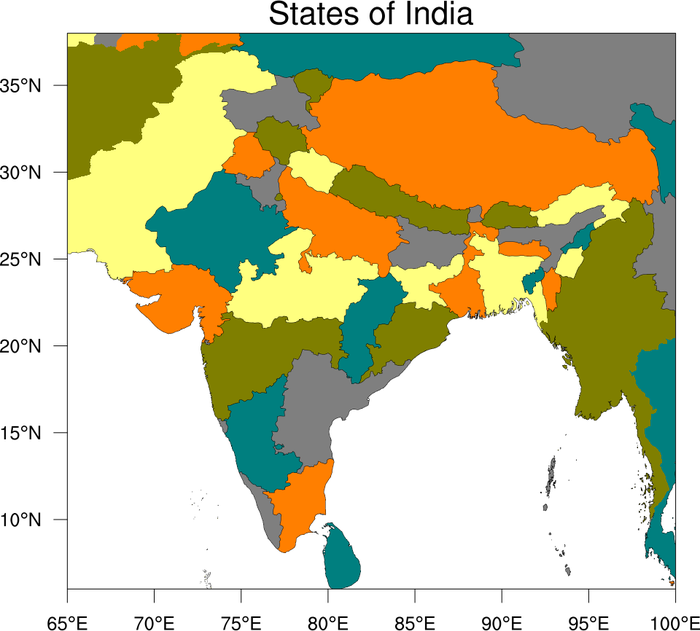
This example in particular shows how to draw the states of Brazil, the
provinces of China, and the states of India. You must set the
resources mpDataSetName to "Earth..4"
and mpDataBaseVersion to
"MediumRes". In addition, by using special quantifiers like
"China:states", you can get these new divisions either as outlines
(via
mpOutlineSpecifiers) or as filled
areas (via mpFillAreaSpecifiers).


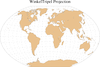 maponly_17.ncl
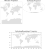
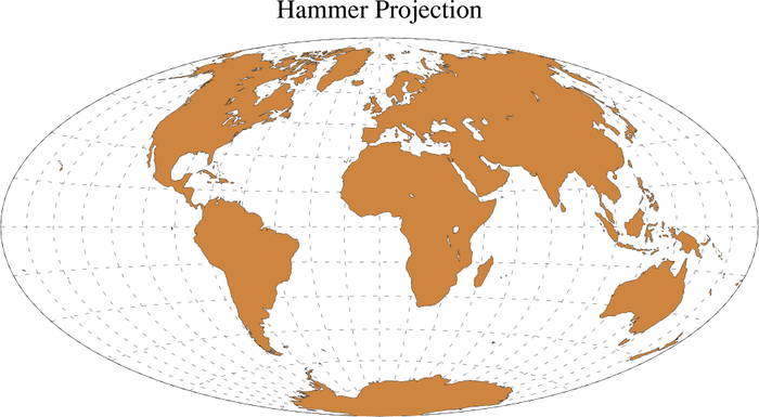
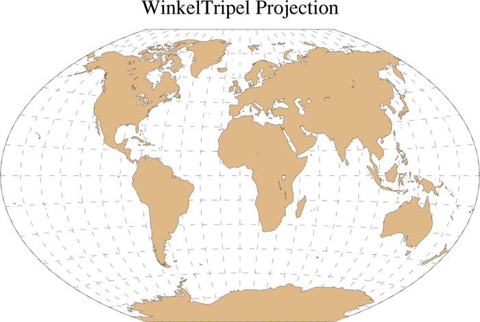
:
This example shows three map projections that were added
in
V5.1.0: Hammer, Aitoff,
and Winkel Tripel. There's also a new-and-improved Mollweide (see the
next box for an example of this) that replaces the old one.
 maponly_18.ncl
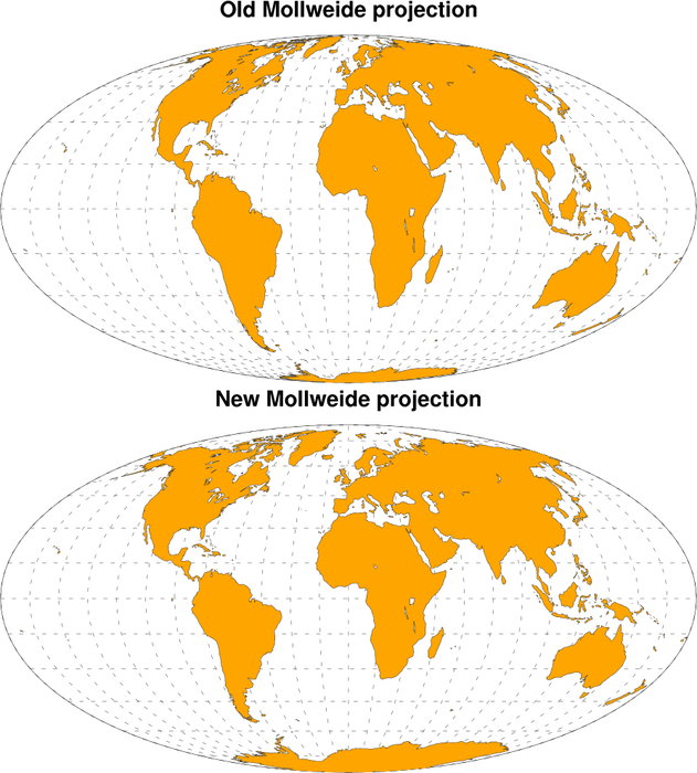
:
This example compares the new-and-improved Mollweide projection that
was added in
V5.1.0 to
replace the old Mollweide projection. The old Mollweide, like a true
Mollweide, has an elliptical perimeter twice as wide as it is high
(though with different dimensions) and its parallels are straight and
horizontal, as in a true Mollweide, but the shapes of the land masses
are noticeably different.
To get the old Mollweide projection, set mpProjection to "PseudoMollweide".
 maponly_19.ncl
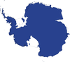
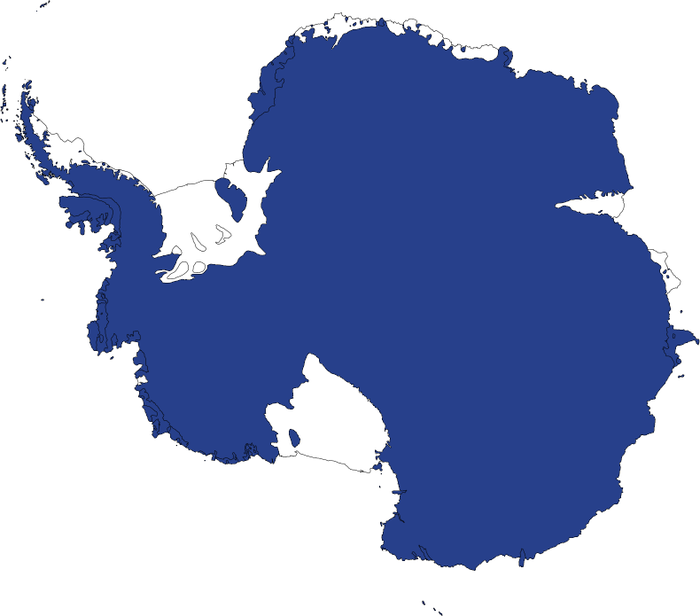
:
This example shows how to draw Antarctica with the new ice shelves
that were added in
V5.1.0.
 maponly_20.ncl
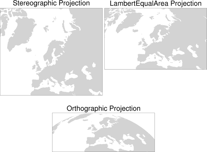
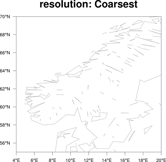
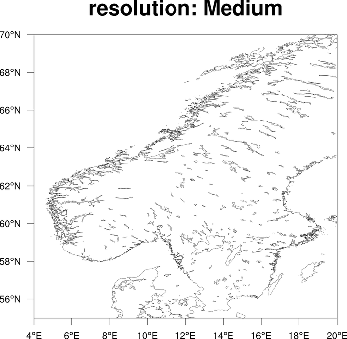
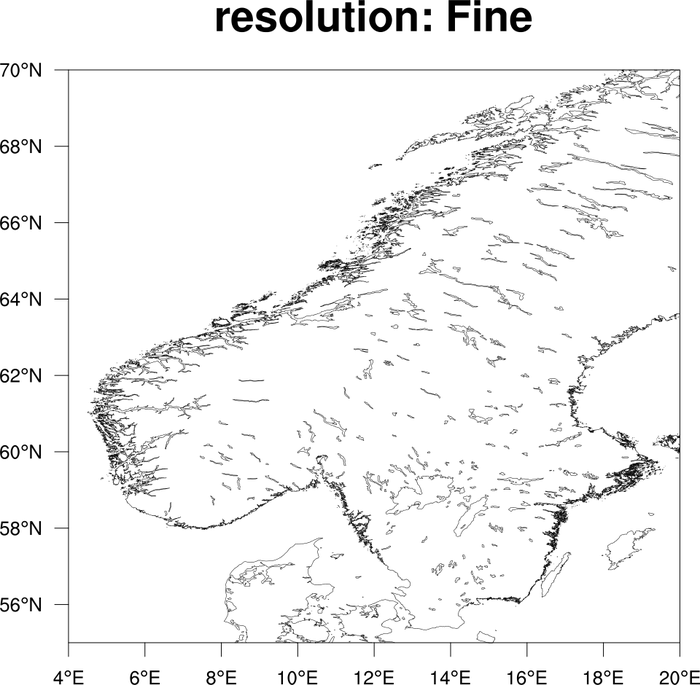
:
This example shows how to draw different resolutions of the coastal
outlines when you use the "HighRes" map database. The resource is
mpDataResolution, and the possible
values are "Coarsest", "Coarse", "Medium", "Fine" and "Finest".
If you don't set this resource, then the default behavior is to
determine which resolution to use based on the size of your plot and
the range of your map. (This is the "Unspecified" setting.)
You should only use "Fine" or "Finest" if you are zoomed in pretty far
on the map. They can take a long time to draw.
If you want to use the "HighRes" map database, you will have to download the RANGS database.
 maponly_21.ncl
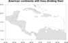
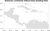
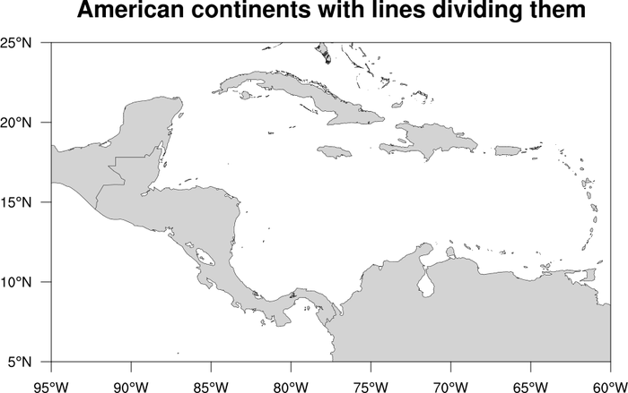
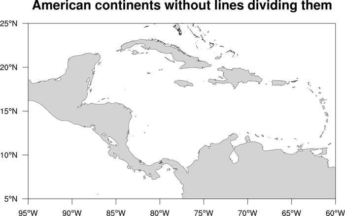
:
Demonstrates how to remove the lines that separate North America from Central
America, and Central America from South America. All 7 continents are outlined when
mpOutlineBoundarySets = "Geophysical" (the default), as are
all boundaries separating land from ocean.
To remove those lines you need to set the following resources:
mpOutlineBoundarySets = "NoBoundaries"
mpOutlineSpecifiers = "Land"
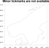
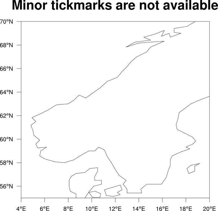
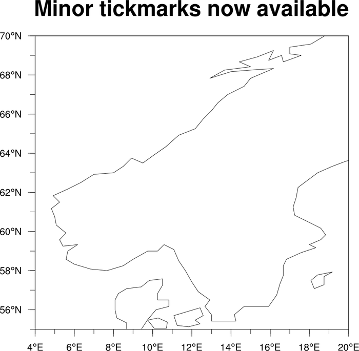
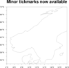 maponly_24.ncl
: Shows how to
add minor tickmarks to a map that only has major tickmarks. This
method only works if you have a rectangular projection and are
setting
pmTickMarkDisplayMode
to "Always".
The gsn_blank_plot function is used
to create a tickmark object with minor tickmarks, and this is then
overlaid on the map using overlay.
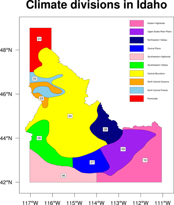
 maponly_25.ncl
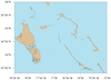
: Shows how to
fill the climate divisions in the state Idaho, and annotate the map
with a labelbar and text strings.
 maponly_26.ncl
: Shows how to turn
on the medium resolution map database and get better outlines for the
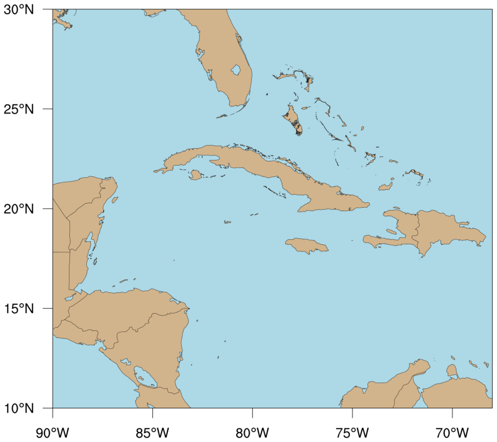
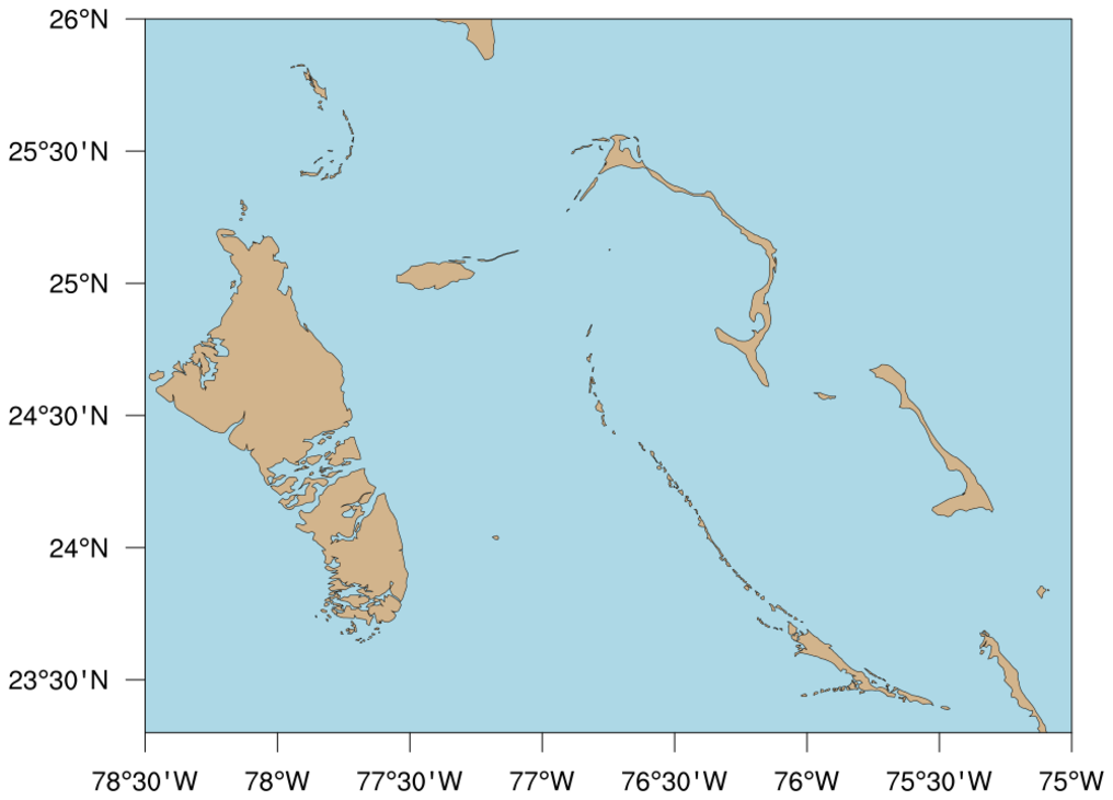
Caribbean Islands.
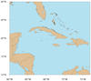
 maponly_27.ncl
: Shows how draw
a map in four quadrants, using a lat/lon slice. The land fill
is set to a different color for each quadrant, and certain
borders are turned off depending on which quadrant you're in.
 maponly_28.ncl
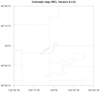
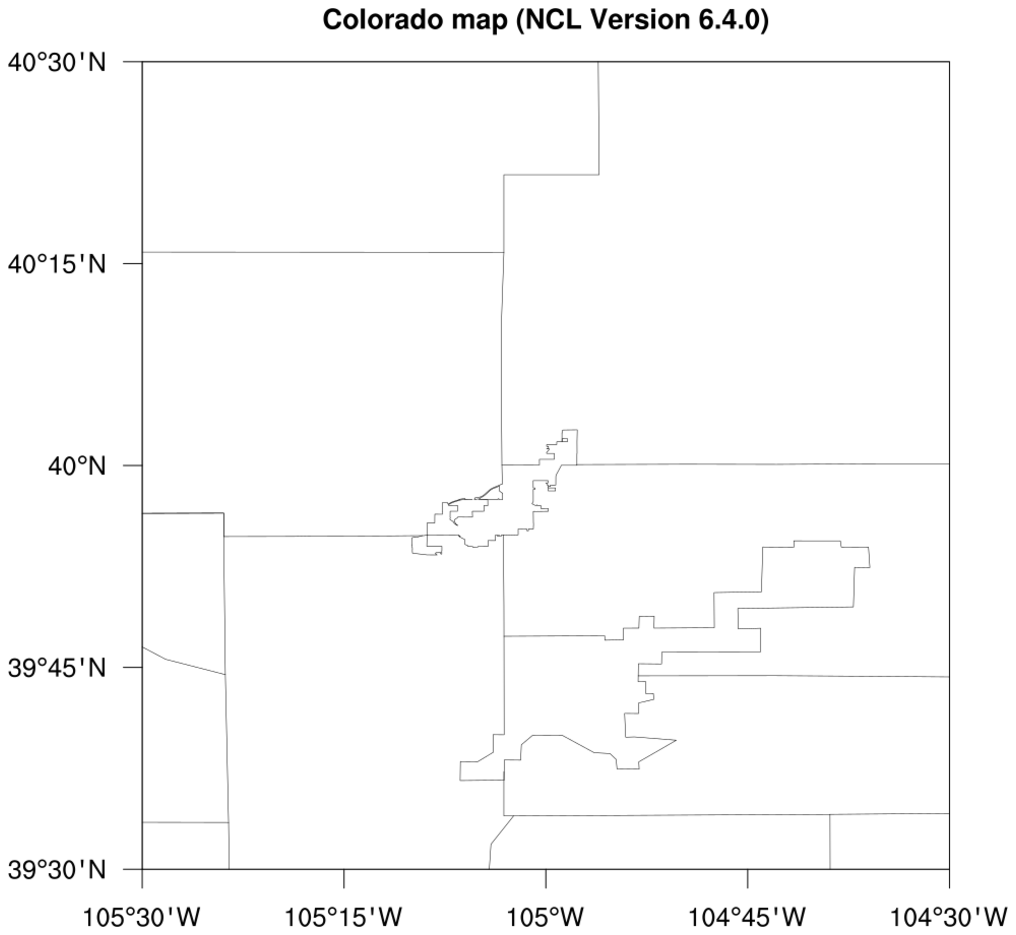
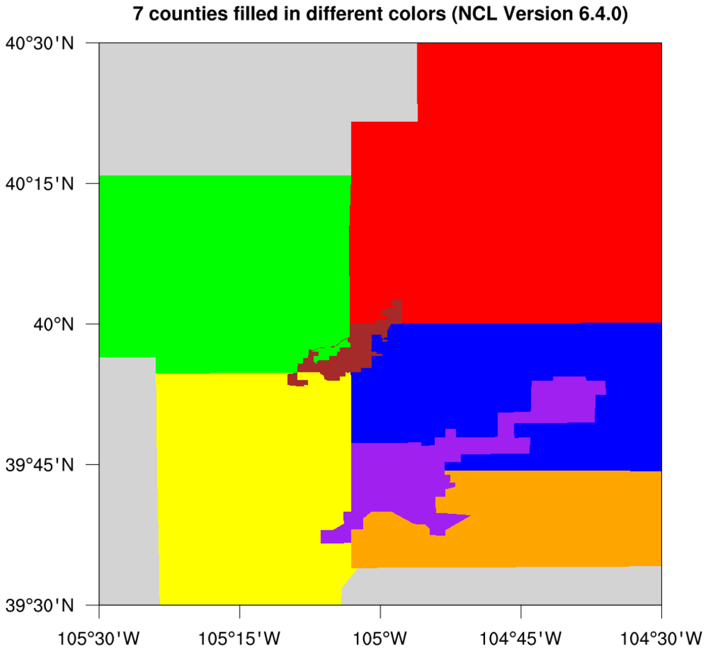
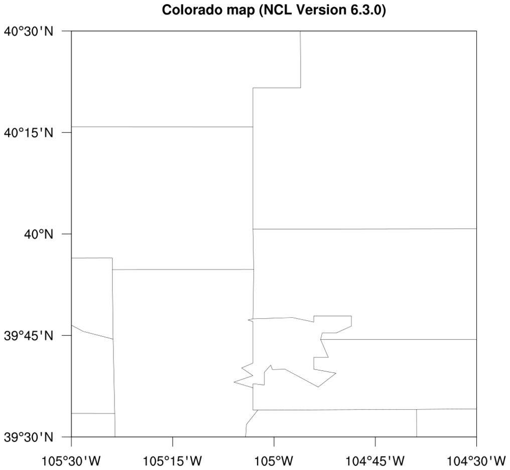
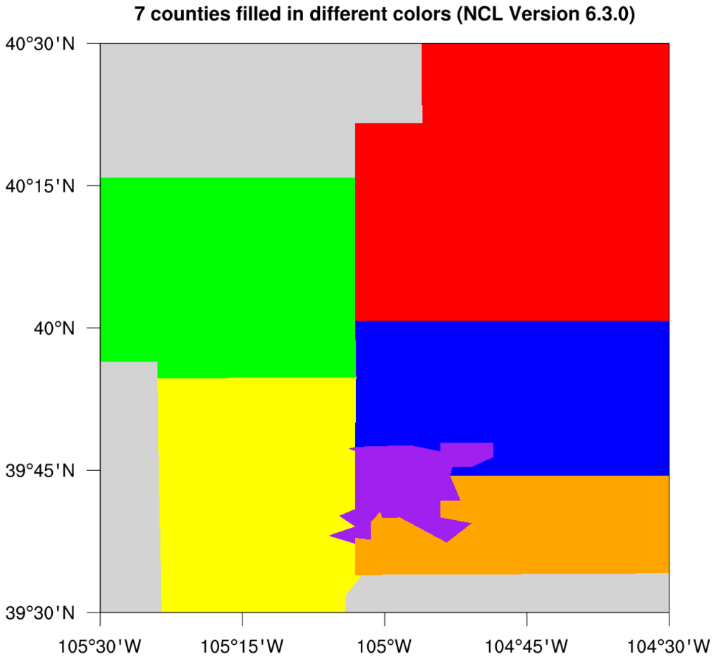
: This example shows the
updates to counties in Colorado that were added in NCL V6.4.0.
The first two images show the updated counties, and the second two images show
the outdated counties, if you use NCL V6.3.0 or earlier.
For an example that compares these new county outlines to shapefile
outlines, see example
shapefiles_15.ncl on the
Shapefiles
example page.
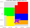
 maponly_29.ncl
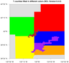
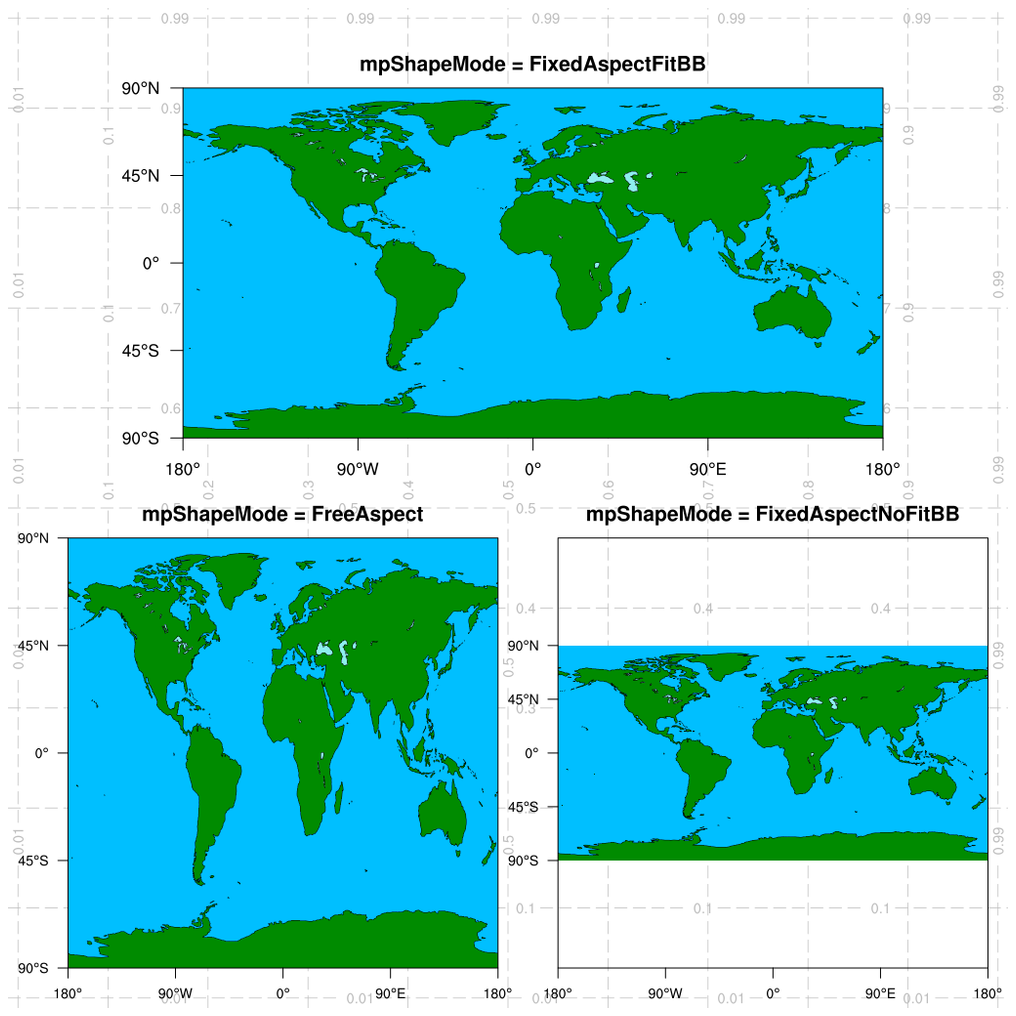
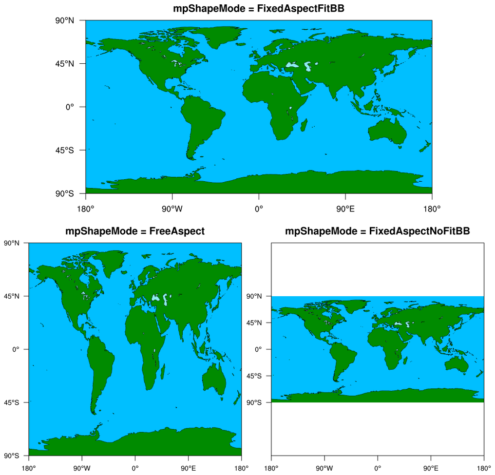
: This script
demonstrates the use of all three settings of the
mpShapeMode resource, which
affects aspect ratios and bounding boxes of the plots:
- FixedAspectFitBB: Maintains aspect ratio of the map.
This is the default.
- FreeAspect: Skews the map to fit the user-specified
vpWidthF and
vpHeightF viewport
resources, and hence does not maintain aspect ratio.
- FixedAspectNoFitBB: Maintains aspect ratio,
and places map in a box with width and height specified by
the vpWidthF and
vpHeightF viewport resources.
Next, it illustrates how to panel plots manually
using viewport resources, which is easier than calling
gsn_panel when the plots are
different sizes, as in this script.
Finally, it demonstrates the use of the function
drawNDCGrid to draw a grid
of NDC coordinates on the plot, which is used for debugging
purposes, and to help choose values for the vpXXX (viewport) resources.
For a similar example of using these resources when contouring data,
see example
dataonmap_14.ncl
on
the Plotting
data on a map examples page.
 maponly_30.ncl
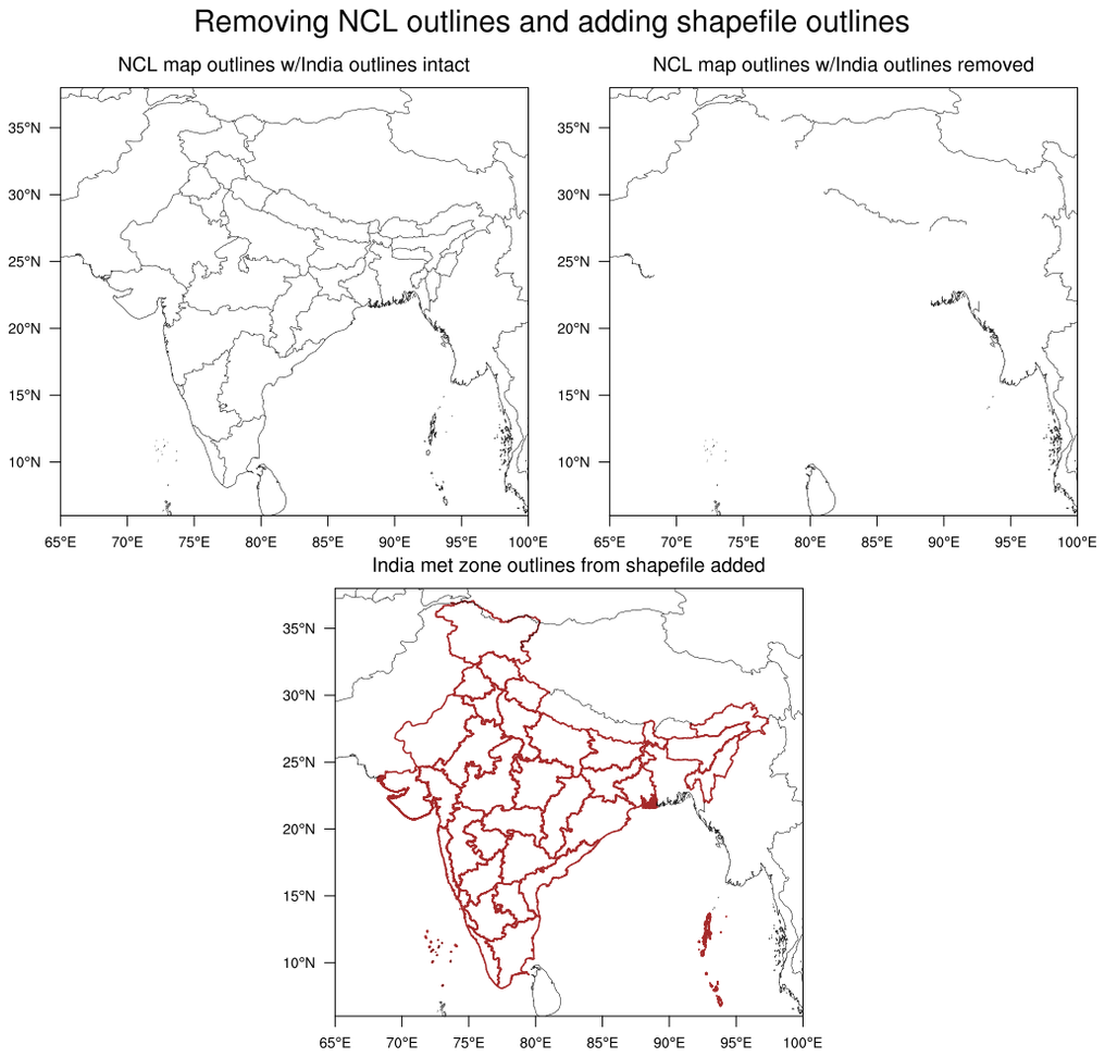
: This script
shows how to use the
mpMaskOutlineSpecifiers
to remove the outlines of India, while keeping outlines from surrounding
countries. In the third plot, meteorological subdivisions of India
were added using a shapefile downloaded off the web.


