NCL Home>
Application examples>
gsn_csm graphical interfaces ||
Data files for some examples
Example pages containing:
tips |
resources |
functions/procedures
XY Plots
XY Plotting Functions
gsn_csm_xy
gsn_xy (generic routine)
gsn_csm_xy2
gsn_csm_xy3
gsn_csm_x2y2
gsn_csm_x2y
gsn_polyline
gsn_add_polyline
Related Pages
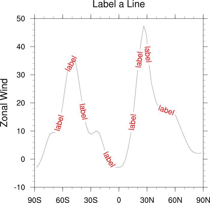
- Bar chart - how to turn XY plots into
bar plots
- Legends - how to add legends to
an xy plot
- Drawing primitives - how to add
additional lines, text, markers, and polygons to a plot
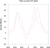
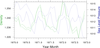
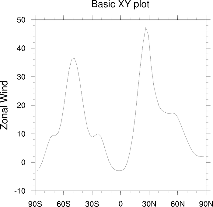
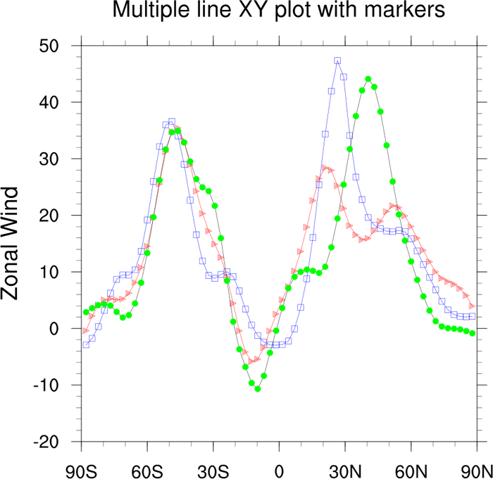
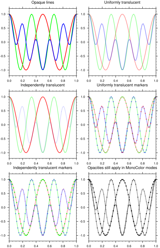
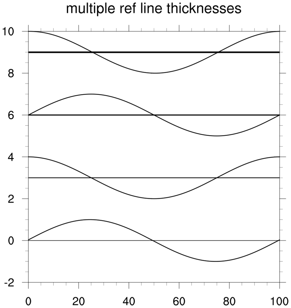
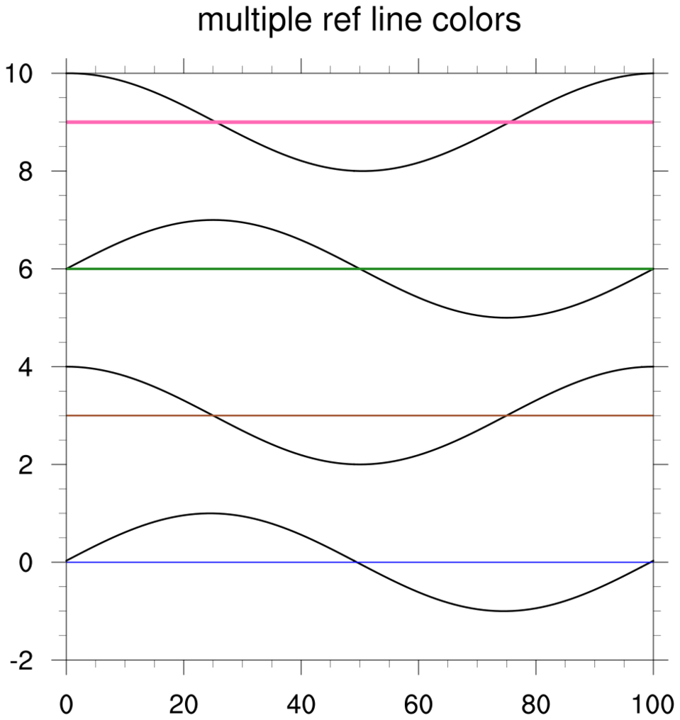
 xy_2.ncl
:
Multiple line plot with varying colors, thicknesses, and markers.
xyLineThicknesses allows the user to
change the thickness of individual lines in the array, while xyLineThicknessF allows the user to set one
value that changes the thickness of all the lines in the array.
You can set the color of your lines with xyLineColors.
xyMarkLineMode allows the user to
set the "mode" ("Lines", "MarkLines", "Markers") for all lines.
You can change colors and marker styles with xyMarkerColors and xyMarkers.
There are numerous marker styles to
choose from. See example 4 for an example
of creating your own markers.
A Python version of the two curve XY plot projection is available here.
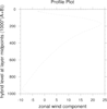
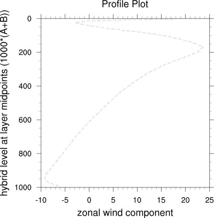
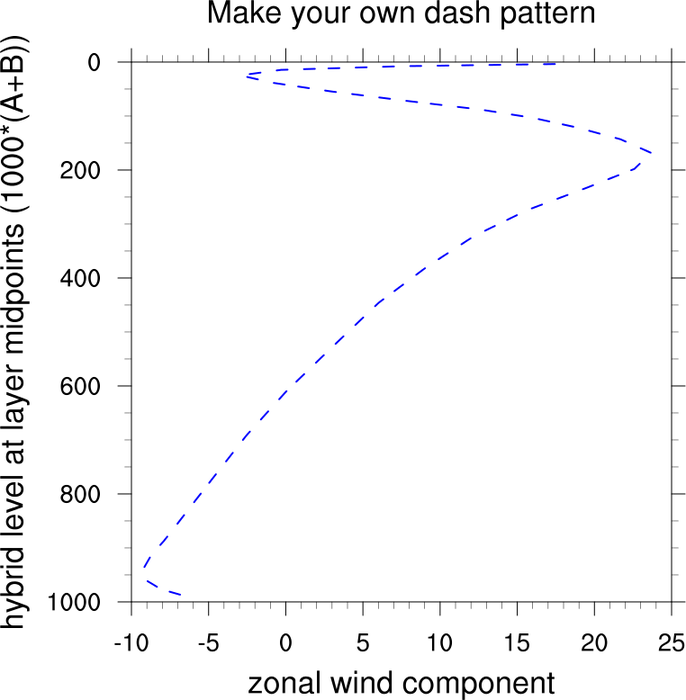
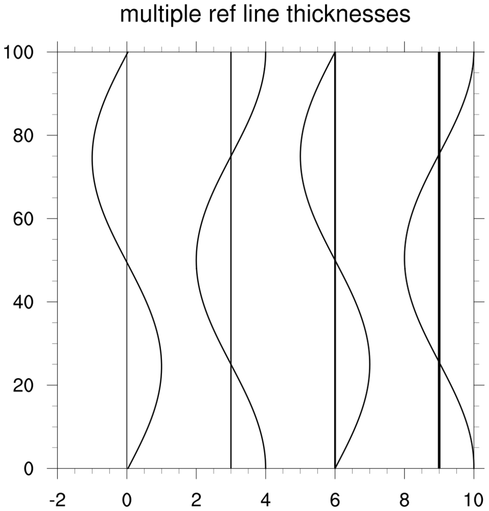
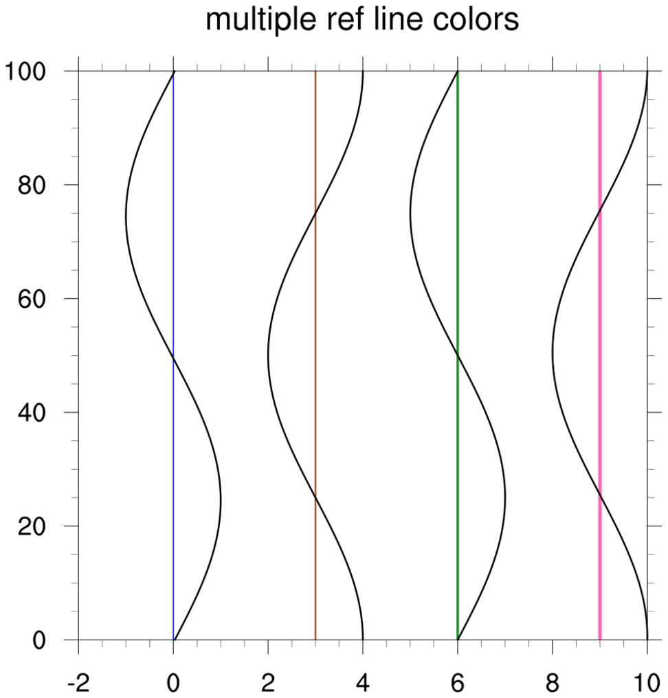
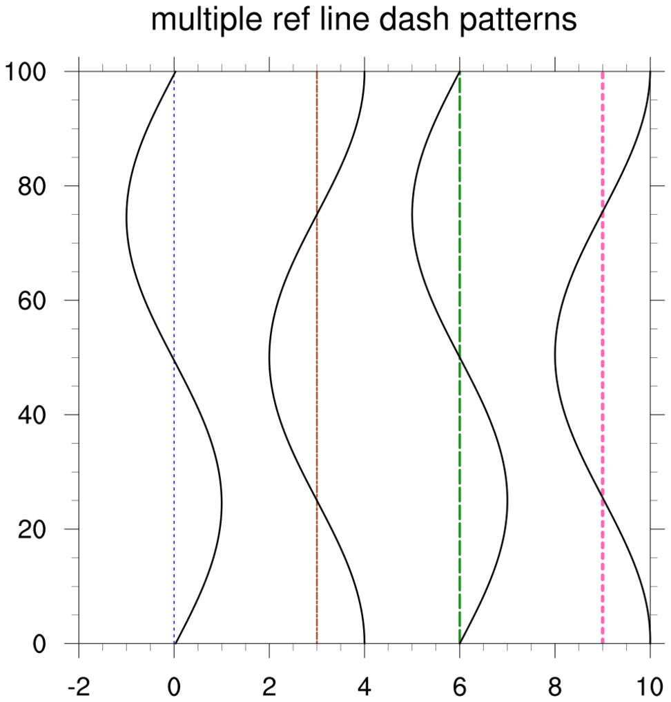
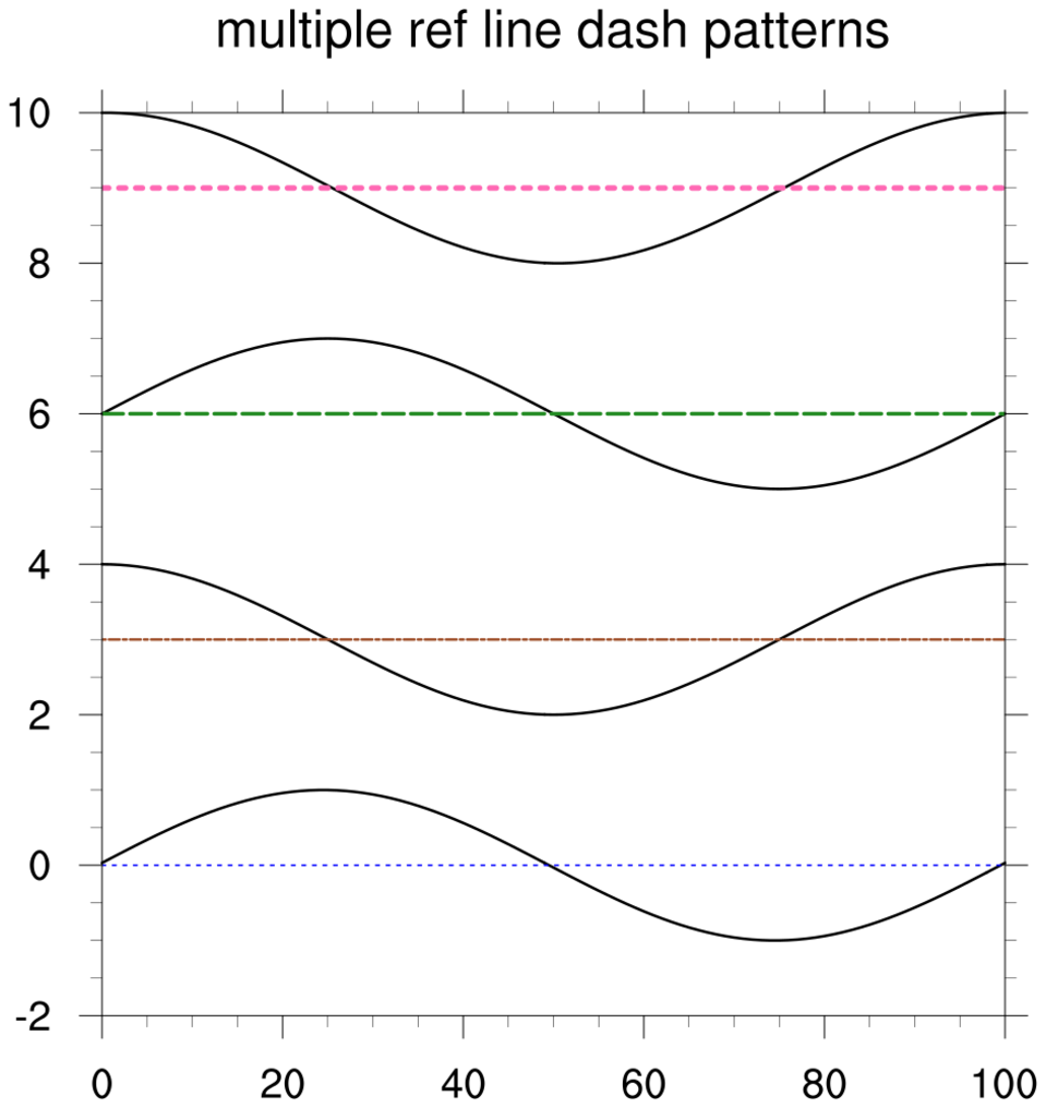
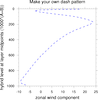 xy_3.ncl
:
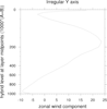
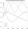
Profile plot with y-axis reversed. Demonstrates how to change the
line dash pattern.
First Plot: Use predefined dash pattern: xyDashPatterns allows you to select from one
of the following dashed
patterns. Note that in a multi-line plot, the default is to make
the first line the first pattern, the second line the second pattern
etc.
trYReverse, reverses the
y-axis.
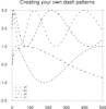
Second Plot: Create your own dash pattern: As of NCL version
4.2.0.a030, you can make your own marker using
NhlNewDashPattern. You give the function a string
representing the pattern you want. See script and function
documentation for examples. The function returns a dash pattern index
that can be used with xyDashPatterns
A Python version of the profile plot projection is available here.
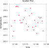
 xy_4.ncl
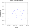
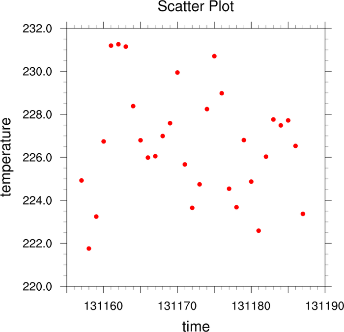
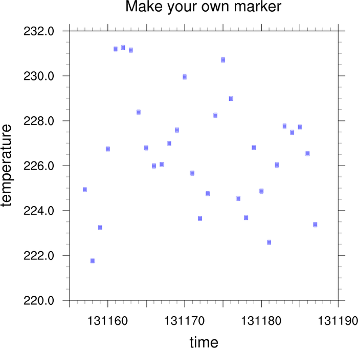
: Scatter plot
First Plot: Use predefined markers
xyMarkLineModes, xyMarkers, xyMarkerColor, and xyMarkerSizeF are used to control the markers
in an XY plot.
Second Plot: Make your own marker
As of NCL version 4.2.0.a030,
you can make your own marker using
NhlNewMarker. You give the function the character
and font table you want the marker taken from, and provide sizing and
placement values. The function returns a marker index that can be used
with xyMarkerColor.
A Python version of the scatter plot projection is available here.
 xy_5.ncl
:
Adding a polyline and shading above and below it: both color and b&w.
Limit axis.
gsn_polyline is the function that
will add the polyline. Note that you can not panel plots made with
this function. If you need to panel, use gsn_add_polyline. See polyline example 4 on how to use this
function. It is slightly different than
gsn_polyline.
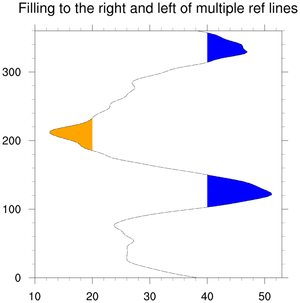
gsnYRefLine, gsnAboveYRefLineColor, gsnBelowYRefLineColor will draws a reference line
and determines the color for the shaded regions.
vpHeightF and vpWidthF will changes the aspect ratio of the
plot. Since we stretch the plot, we also moved it slightly to the
left using vpXF.
trYMinF, trYMaxF can be used to limit the
extent of the y-axis. There are corresponding resources for the
x-axis.
A Python version of this projection in color is available here.
 xy_6.ncl
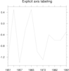
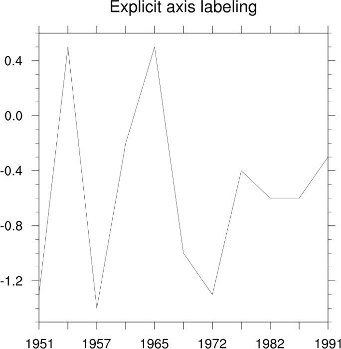
: Explicit axis labeling
tmXBMode = "Explicit", tmXBValues, adn tmXBLabels will allow the user to explicitly
set the tick mark labels for the bottom x (XB) axis. Similar resources
exist for the left y (YL) axis etc.
ind returns the indexes of the input where it is
True.
ispan allows the user to create an integer
array. This is frequently used when creating the x-array in an XY
plot.
 xy_7.ncl
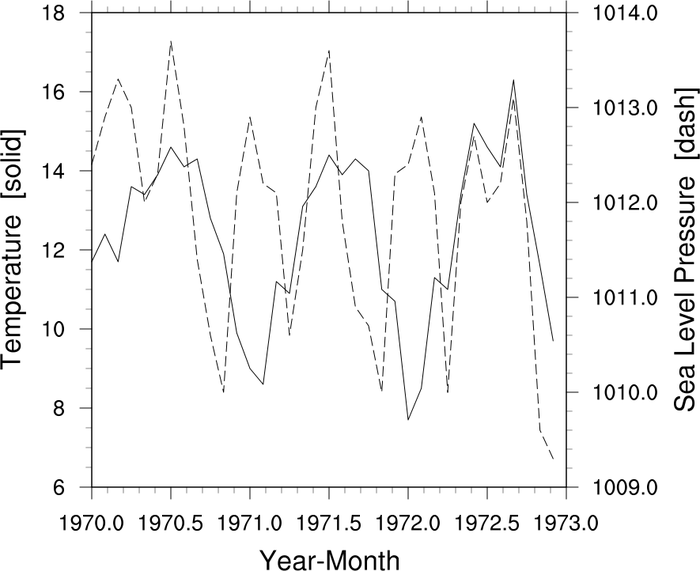
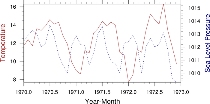
:
An example of a double y plot: two separate line with their own
unique axis.
gsn_csm_xy2 allows the user to
draw two lines each with their own separate Y-axis.
A Python version of the xy_7_2 projection is available here.
 xy_8.ncl
:
Additional axis explicitly set by the user.
tmXUseBottom= False, tmXTOn, and tmXTLabelsOn allows the user to set a top
X-axis in addition to the bottom X-axis. We could have done the same
for the right Y-axis using the corresponding YR resources.
As in example 6 above, we can now use
the explicitly labeling resources
tmXTMode = "Explicit",
tmXTValues, and
tmXTLabels to label the axis.
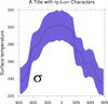 xy_10.ncl
: Demonstrates Greek characters
into a text string and drawing a polygon around a xy line.
There are numerous
fonts/character sets
in NCL. As this example demonstrates, you change between sets by using
a
function code.
The default code is a ":", but since this is a character that people
often put into their strings, we recommend changing that to a non-used
character like a "~". You can change this on the fly as demonstrated
in this example, or in your
.hluresfile.
A Python version of this projection is available here.
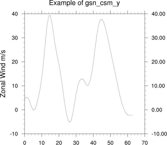
 xy_11.ncl
: Demonstrates the use of the
function
gsn_csm_y (available since
NCL version 4.2.0.a023) which creates a line plot with no defined
x-axis except for array index values.
This example also demonstrates how to set the precision of an
additional axis.
tmYRLabelsOn
turns on the labels, tmYUseLeft =
False, will sure than any settings, such as precision used by the left
axis are not used for the right axis. tmYRAutoPrecision = False, turns off the
auto precision for the right axis and finally, tmYRPrecision sets the desired precision.
 xy_12.ncl
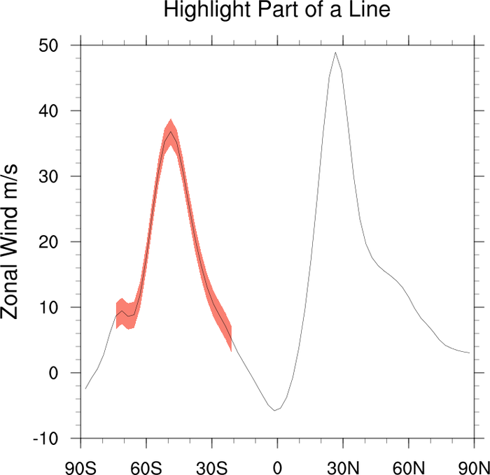
: Emphasize part of a line.
Method 1: Break the line up into different parts and draw as it it were
multiple lines. This way you can specify the color and style of each
segment.
Method 2: Similar to example 14, but demonstrates how to create a
polygon around a portion of a xy line in order to highlight it.
A Python version of both projections is available here.
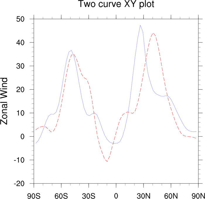
 xy_15.ncl
:
Turn off borders and tickmarks on selected sides and demonstrates
how to draw tickmarks inward.
tmYRBorderOn = False, will turn off
a border while tmYROn = False, will
turn off the tickmarks for that side. Corresponding resources exist
for the other sides.
tmXBMajorOutwardLengthF set to 0.0
will draw the tickmarks inward. You must do this for the minor
tickmarks as well. Separate resources exist for each axis.
 xy_16.ncl
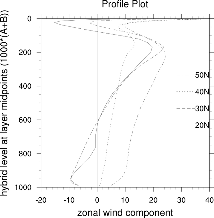
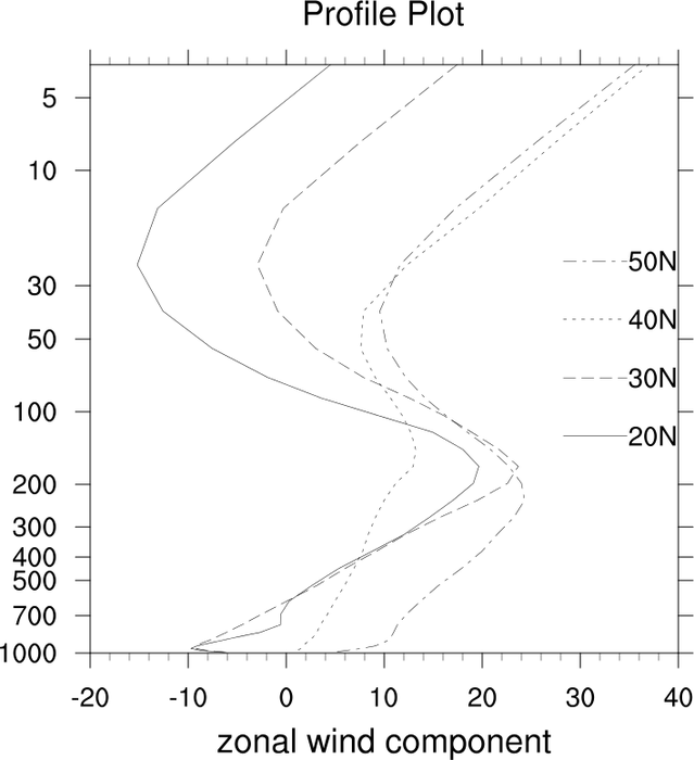
:
Profile plot with polyline, legend and log scaling with explicit labeling.
See the legend example page for a
description of the legend resources used in this example as well as
other legend resources.
A Python version of the first example profile plot projection is available here.
 xy_18.ncl
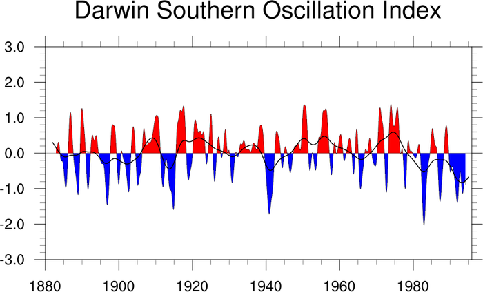
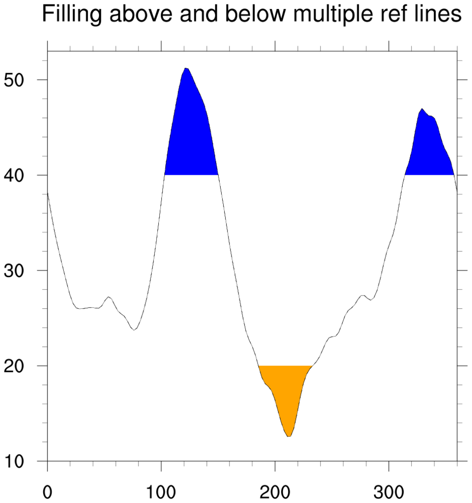
:
Demonstrates how to use the special "gsn" resource
gsnXYFillColors to fill the area between two
curves. Also shows how to manually attach a legend and extra text and
the top of the plot.
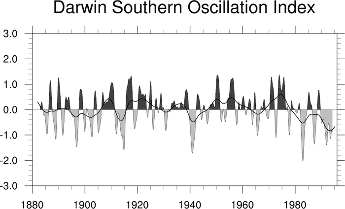
After all the plot elements are created and attached, this script
calls maximize_output to maximize
the size of the plot in the frame. This only applies for PS/PDF
output.
A Python version of this projection is available here.
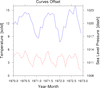
 xy_22.ncl
:
Draw a single curve with the left Y axis shifted to the left. This
kind of plot can be done multiple ways. In this case, it is done by
basically drawing the same plot twice, the second time with the plot
shifted to the left and everything turned off but the left Y axis.
 axes_3.ncl
: Shows various ways that
you can control all four axes of a plot. Although this is an XY plot,
these techniques apply for contour and vector plots as well.
 xy_23.ncl
: Shows how to
use
gsn_attach_plots and the
resource
gsnAttachPlotsXAxis to attach
multiple XY plots along the bottom X axes, and how resizing the base
plot will automatically cause all plots to be resized.
Several "tmYR"
tickmark resources are set to control the ticks and the labels on
the right Y axis. The default is to put tickmarks and labels only on
the left axis. To put them on the right only, you need to set (for
one) tmYUseLeft to False. The
resource tmYRLabelDeltaF is set to
2.0 to move the labels further away from the right tickmarks,
and tmYRLabelJust is set to
"CenterRight" to right-justify the labels.
 xy_24.ncl
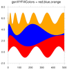
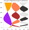
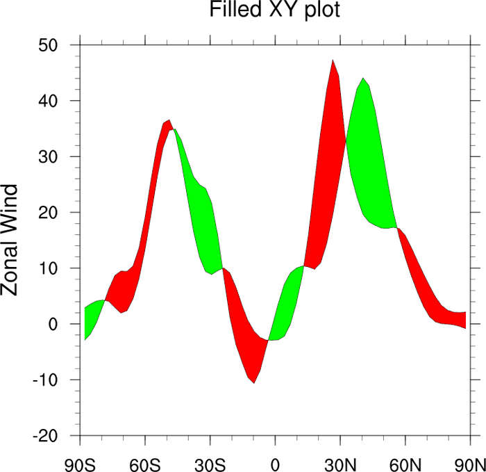
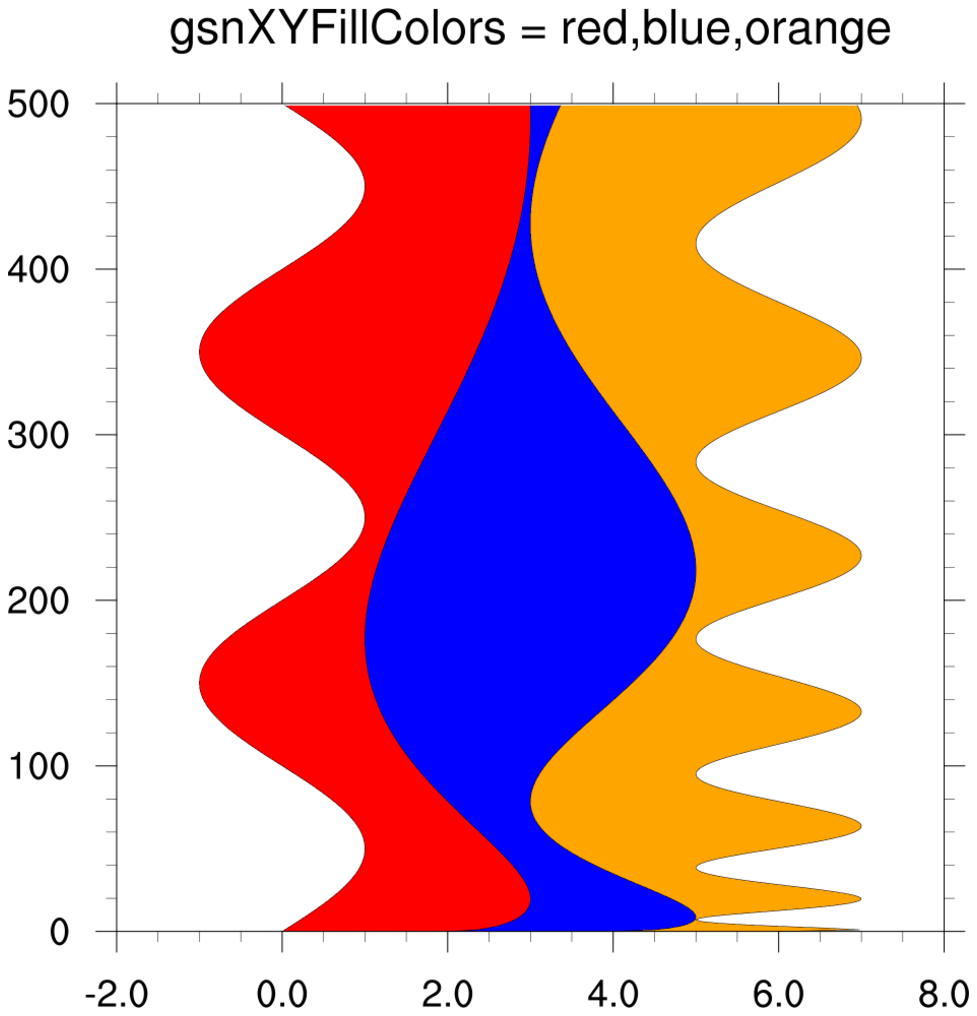
: Shows how to use special
"gsn" resources to fill areas between curves.
The first frame shows how to fill areas between adjacent curves that
don't intersect, using gsnXYFillColors.
This resource can be an array of color indexes or color names, and
should have one fewer colors than you have curves.
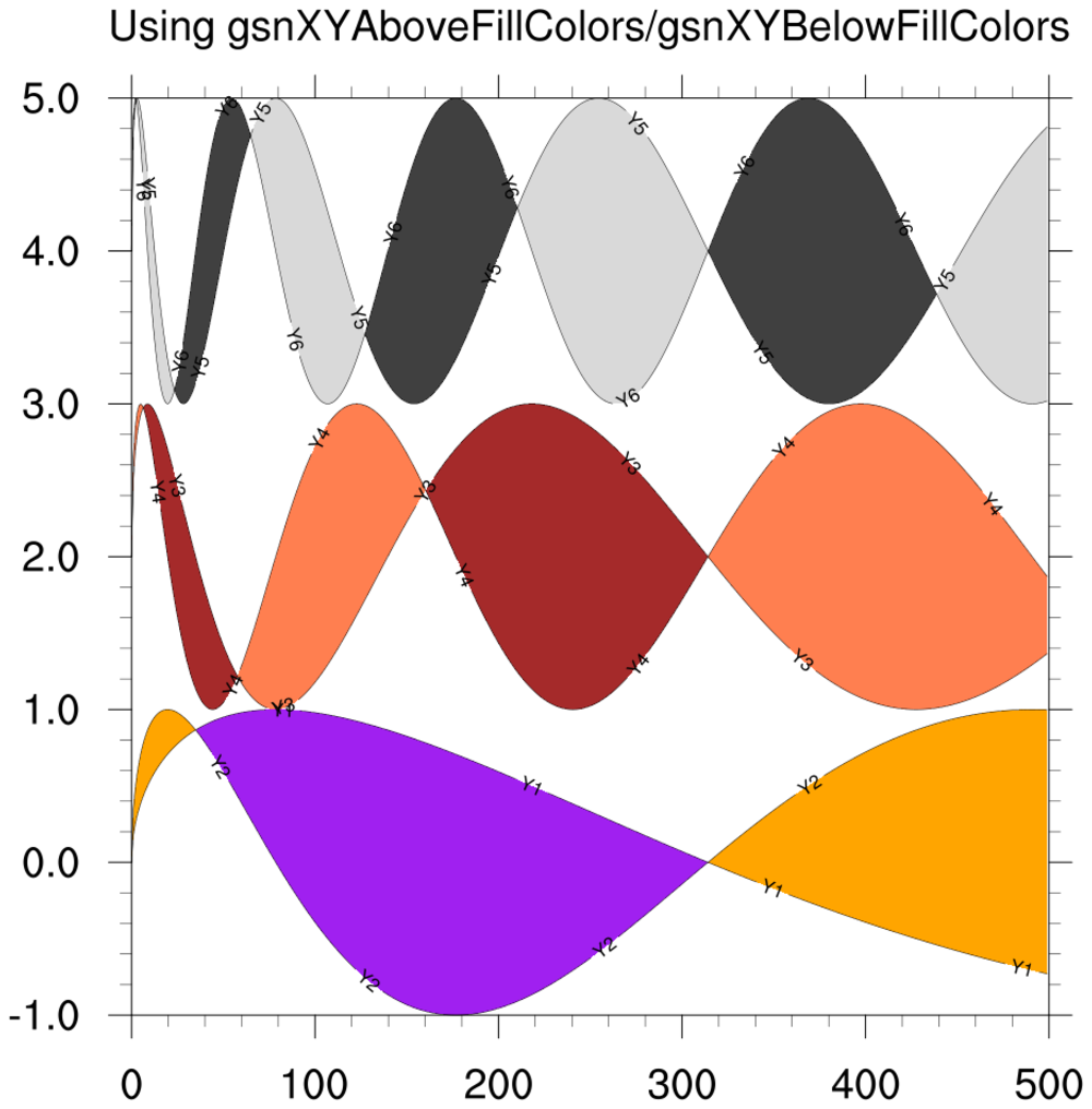
The second frame shows how to fill areas between adjacent curves that
intersect, using gsnXYAboveFillColors and
gsnXYBelowFillColors to indicate the colors
where one curve is above or below the other curve. For any areas you
don't want filled, you can use "transparent" or -1.
Available in version 5.1.0 and later.

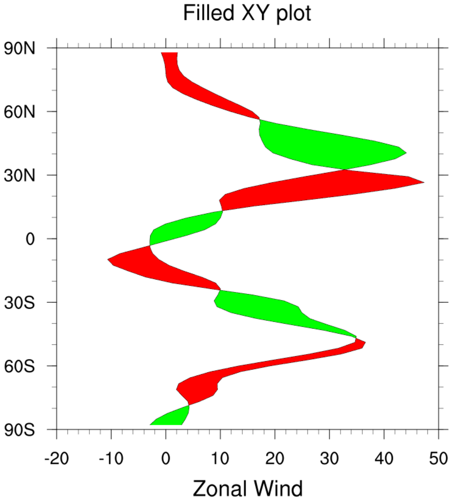
 xy_vert_24.ncl
: This example
is similar to xy_24.ncl, except it shows how to fill between curves
that are vertically oriented. This feature was added in NCL V6.4.0.
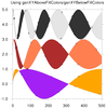
In the first frame, the gsn_csm_xy
function detects that your X values are the multi-dimensional array, so
the gsnXYFillColors are applied between the
X curves.
The second frame shows how to fill areas between adjacent curves that
intersect, using gsnXYRightFillColors and
gsnXYLeftFillColors to indicate the colors
where one curve is to the right or left of the next curve.
These resources were added in NCL V6.4.0.
 xy_25.ncl
: Shows how to add data (curves)
to an existing XY plot.
The first frame shows an XY plot created using
gsn_csm_xy2, and the second frame
shows a new curve that was added to the plot represented by the
right Y axis.
The point of this example is to show how to use the relatively unknown
NhlAddData function to add data to an XY plot.
This example uses some of the normally-hidden object-oriented features
of NCL to create a new data object, and to set additional resources.
You need to use the special "xy2" attribute that is returned from the
gsn_csm_xy2 call.
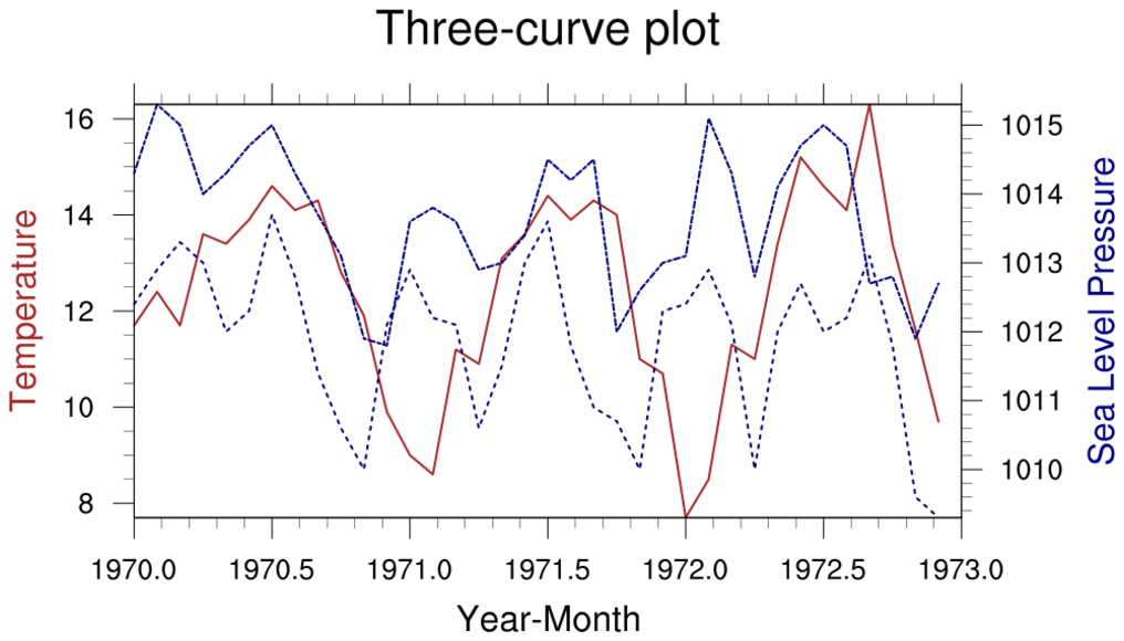
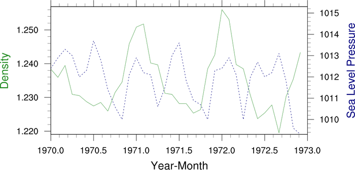
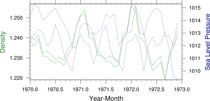
 xy_overlay_25.ncl
: This
example is similar to xy_25.ncl, except it shows how to add the third
curve by creating another XY plot and overlaying it on the existing
two-curve plot.
- first frame - the original two-curve plot
- second frame - the third curve in its own plot
- third frame - the third curve plot overlaid on the two-curve plot
Note that additional code had to be added to turn off the titles
before drawing the three-curve plot.
The third curve is in the same data space as the blue curve of the
two-curve plot, which is represented by the "xy2" attribute. When you
call overlay, you need to use this attribute
as the base plot to overlay on.
 xy_26.ncl
: This plot
is similar to example 25. It shows another method for adding curves
to an existing XY plot that has two different Y axes.
The first frame shows an XY plot created using
gsn_csm_xy2, and the second frame
shows how to add a curve to the data space represented by both
Y axes using gsn_add_polyline.
To add curves to the data space of the right Y axis, you need to use
the special "xy2" attribute that is returned from the gsn_csm_xy2 call.
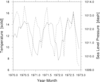
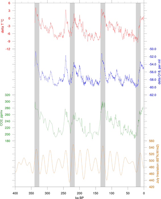
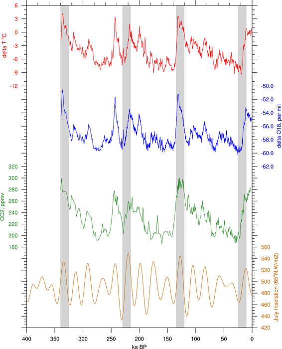
 unique_10.ncl
 /
unique_10_thicker.ncl:
This script shows how to create a series of XY plots attached
along the X axes, with gray-filled bars added for emphasis.
The second image is identical, except with thicker plot elements for a
nicer looking image. It was created by "unique_10_thicker.ncl".
This is a typical plot that people see in papers of paleoclimate
studies.
This example was contributed by Yi Wang of PNNL.
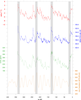
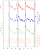
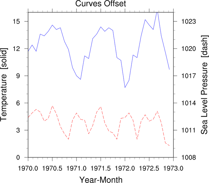
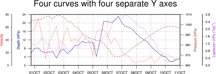
 xy_27.ncl
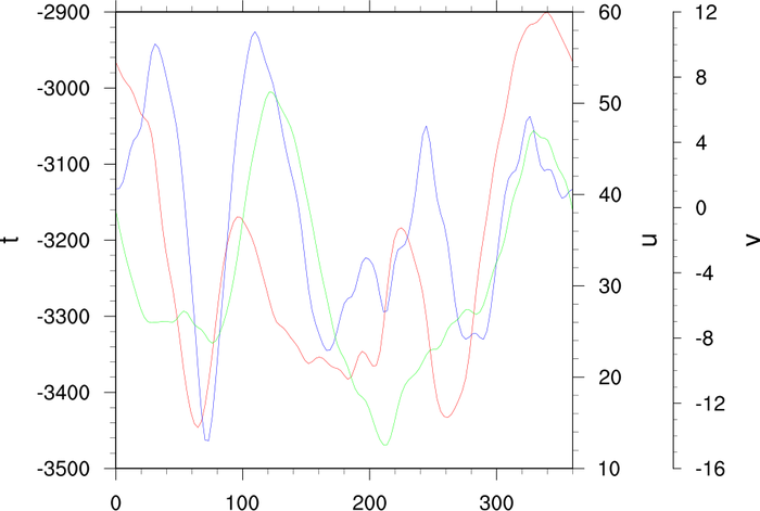
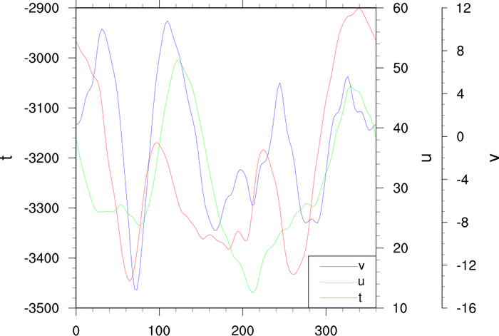
: This plot
shows how to create an XY plot that contains four curves,
each with a separate Y axis. Two of the axes are
drawn outside of the plot as single vertical lines.
gsn_csm_xy3 is used to
draw the first three curves. The fourth curve is created separately,
and added as an annotation using NhlAddAnnotation
The Y axis for the fourth curve is also added as an
annotation. This allows to you resize the original "plot", and
all four curves will be resized accordingly.
Michel Mesquita of the Bjerknes Centre for Climate Research gave us
permission to include his script.
 xy_28.ncl
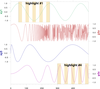
: This script
shows how to draw a hodograph plot, which is a suitable approach in
describing diurnal variations in the wind vector
at a given point.
This script was contributed by Haoming Chen from LASG/IAP in Beijing,
China.
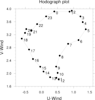
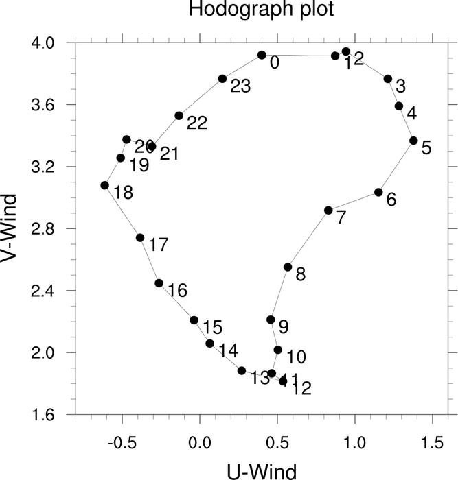
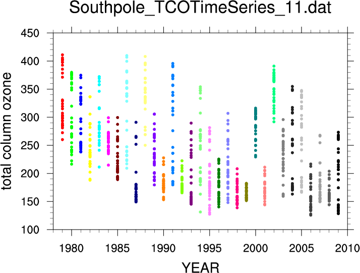
 xy_29.ncl
: This script
demonstrates a use of polymarkers. Each file had approximately
30 years of observations. Observations were available for only
few days each year. This displays the range of values each year
for one selected ascii file (South Pole).
This script was contributed by Birgit Hassler (NOAA).
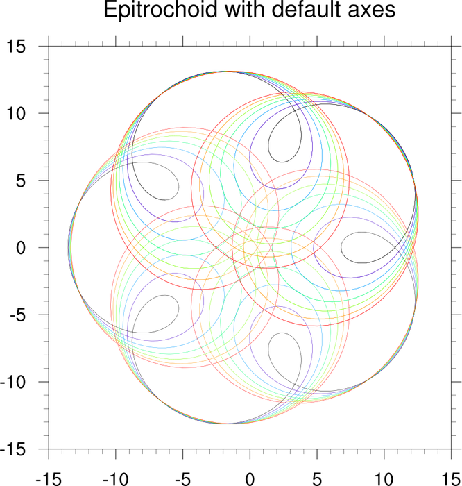
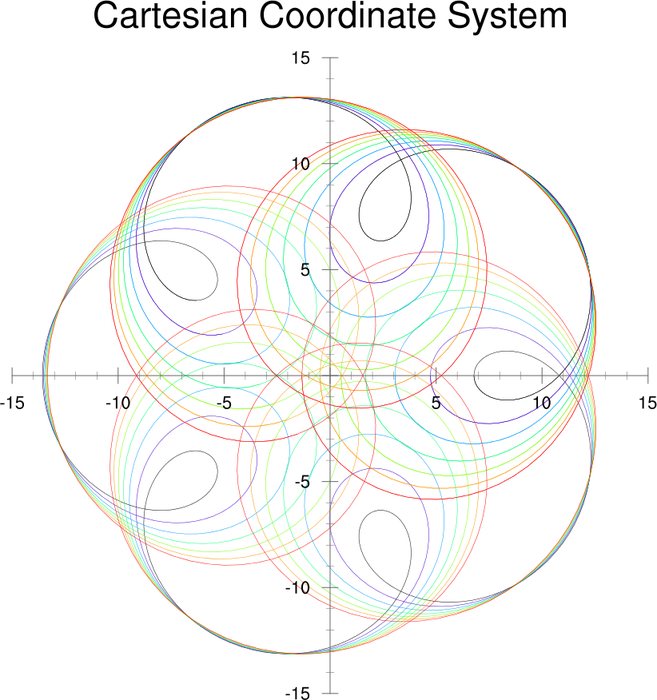
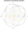 axes_4.ncl
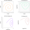
: This script shows how to
replace the default axes in an XY plot with a cartesian coordinate
system. This method should also work for contour and vector plots.
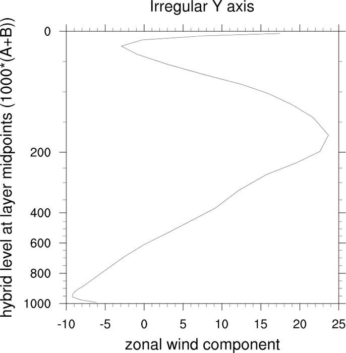
 xy_30.ncl
: This script demonstrates
how to make the Y axis irregular by overlaying it on a "blank" plot
created with
gsn_csm_blank_plot. You
need to set
trYCoordPoints
to the array of irregularly-spaced Y values you want on the Y axis.
gsn_csm_blank_plot won't be
available until version
6.0.0, so it's included in this example.
The first frame of this example shows the default plot with a
linearly-spaced Y axis, and the second frame shows how to make this
axis irregularly spaced.
The "ypts" variable is the array that defines the new spacing on the Y
axis.
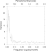
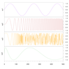
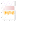
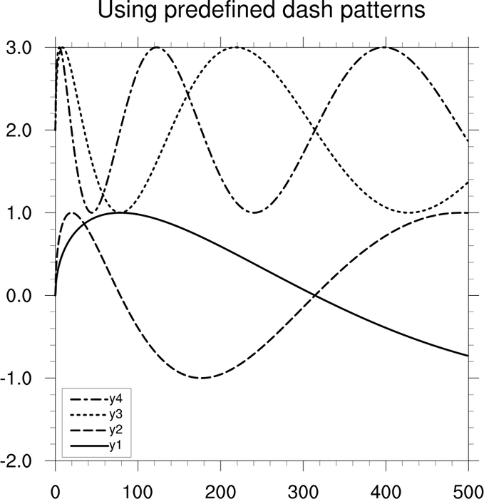
 xy_31.ncl
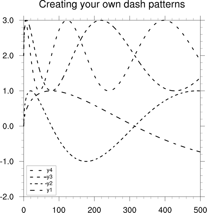
: This example
shows how to create several of your own dash patterns.
The first frame
uses predefined
dashed patterns, which can be hard to distinguish if you make the
lines really thick.
The second frame uses dash patterns created with the
NhlNewDashPattern function.
Here's what the strings look like for the predefined dash patterns:
  0   "$$$$$$$$$$$$$$$$$$$$$$$$$$$$$$$$$$$$$$$$$$$$$$$$"
  1   "$$$$__$$$$__$$$$__$$$$__$$$$__$$$$__$$$$__$$$$__"
  2   "$__$__$__$__$__$__$__$__$__$__$__$__$__$__$__$__"
  3   "$$$$__$__$$$$__$__$$$$__$__$$$$__$__$$$$__$__"
  4   "$$$$__$_$__$$$$__$_$__$$$$__$_$__$$$$__$_$__"
  5   "$$_$$_$$_$$_$$_$$_$$_$$_$$_$$_$$_$$_$$_$$_$$_$$_"
  6   "$$$_$$$_$$$_$$$_$$$_$$$_$$$_$$$_$$$_$$$_$$$_$$$_"
  7   "$_$$_$_$$_$_$$_$_$$_$_$$_$_$$_$_$$_$_$$_$_$$_$_$$_"
  8   "$_$$$_$_$$$_$_$$$_$_$$$_$_$$$_$_$$$_$_$$$_$_$$$_"
  9   "$$_$$$$_$$_$$$$_$$_$$$$_$$_$$$$_$$_$$$$_$$_$$$$_"
  10  "$$$$_$$_$_$$_$$$$_$$_$_$$_$$$$_$$_$_$$_$$$$_$$_$_$$_"
  11  "$$__$$__$$__$$__$$__$$__$$__$$__$$__$$__$$__$$__"
  12  "$$$$$$__$$$$$$__$$$$$$__$$$$$$__$$$$$$__$$$$$$__"
  13  "$$$_$$$__$$$_$$$__$$$_$$$__$$$_$$$__$$$_$$$__"
  14  "$$___$$___$$___$$___$$___$$___$$___$$___$$___$$___"
  15  "$_$___$_$___$_$___$_$___$_$___$_$___$_$___$_$___"
  16  "$$$$$_____$$$$$_____$$$$$_____$$$$$_____$$$$$_____"
 xy_32.ncl
: This example shows how to
draw a 8-curve XY plot with 4 legends stacked side-by-side.
In order to do this, it is necessary to create 4 XY plots, each with
two curves and two items in its legend. The legend for each plot is
moved to the right or left slightly so they don't overlap. The plots
are then all "connected" into one plot using
the overlay procedure.
 xy_33.ncl
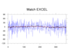
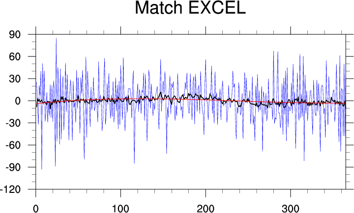
:
An ncl-talk question wanted to reproduce a plot created by Excel.
This required fairly basic steps: (a) read values from
an ASCII (text) file via
asciiread; (b) apply a
13-point running average
runave; (c) fit
a 3rd degree least squares polynomial using
lspoly
(or
lspoly_n) to the output from
the running average function; and, (d) plot all three series
using a common ordinate array.
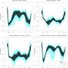 mkZmean.ncl
:
This script creates a panel of four XY plots, with filled curves and a
custom legend added to the bottom right plot. It was contributed by
Dustin Swales, an associate scientist at NOAA/PSD.
 xy_34.ncl
: This
plot is similar to the one generated by
xy_23.ncl. It shows how to draw
a series of stacked plots, with the Y axes labeled
alternatively on the left and right, and with areas
of the first and fourth plots highlighted with filled
boxes and text.
The Y location of each plot is changed by setting
the vpYF value.
The highlighting is done with calls to
gsn_add_polygon,
gsn_add_polyline,
and gsn_add_text.


