NCL Home>
Application examples>
gsn_csm graphical interfaces ||
Data files for some examples
 hov_1.ncl:
Default black and white Hovmueller plot.
hov_1.ncl:
Default black and white Hovmueller plot.
 hov_2.ncl: Reverses Y-axis to
indicate elapsed time and changes the angle of the contour labels,
and draws a zero line contour.
hov_2.ncl: Reverses Y-axis to
indicate elapsed time and changes the angle of the contour labels,
and draws a zero line contour.
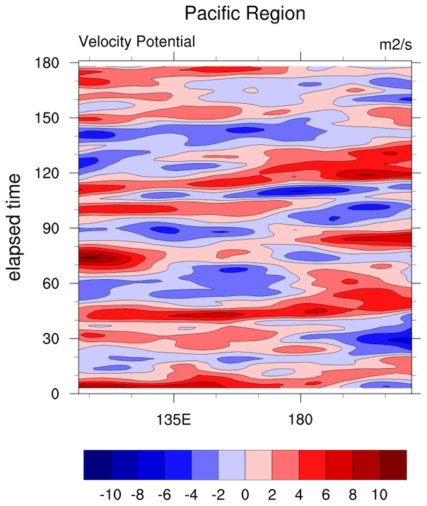
 hov_3.ncl: Select Pacific region
through coordinate subscripting, and hatches all contours, and
draws a zero line contour.
hov_3.ncl: Select Pacific region
through coordinate subscripting, and hatches all contours, and
draws a zero line contour.
 hov_4.ncl:
Manually sets the contour labels and explicitly defines x-axis.
hov_4.ncl:
Manually sets the contour labels and explicitly defines x-axis.
 hov_5.ncl: Creates a color plot.
 hov_6.ncl: Creates a plot with the
longitudes centered at 90W vice 180.
hov_6.ncl: Creates a plot with the
longitudes centered at 90W vice 180.
 hov_7.ncl: Creates a plot with special
month labels on the Y axis.
hov_7.ncl: Creates a plot with special
month labels on the Y axis.
In this example, the minor tickmarks are treated as major tickmarks and vice versa. Several tickmark resources are used to place month labels inbetween the minor tickmarks.
[an error occurred while processing this directive]
Example pages containing:
tips |
resources |
functions/procedures
NCL Graphics: Time vs. Longitude (Hovmueller)
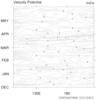
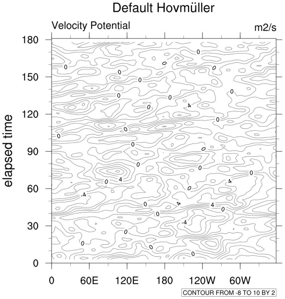 hov_1.ncl:
Default black and white Hovmueller plot.
hov_1.ncl:
Default black and white Hovmueller plot.
gsn_csm_hov is the plot interface that creates Hovmueller diagrams.
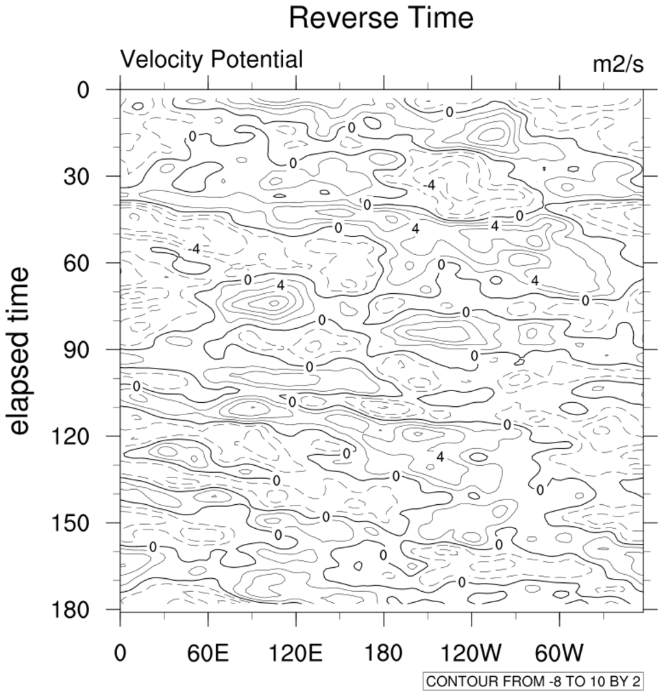 hov_2.ncl: Reverses Y-axis to
indicate elapsed time and changes the angle of the contour labels,
and draws a zero line contour.
hov_2.ncl: Reverses Y-axis to
indicate elapsed time and changes the angle of the contour labels,
and draws a zero line contour.
trYReverse = True, Reverses the y-axis.
cnLineLabelAngleF = 0.0, Changes the angle of the contour labels.
gsnContourZeroLineThicknessF doubles the thickness of the zero contour.
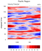
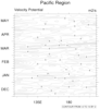
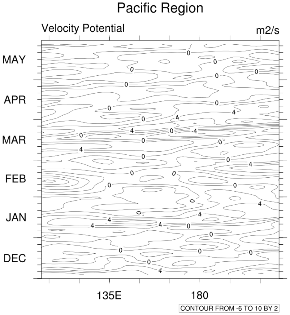
 hov_3.ncl: Select Pacific region
through coordinate subscripting, and hatches all contours, and
draws a zero line contour.
hov_3.ncl: Select Pacific region
through coordinate subscripting, and hatches all contours, and
draws a zero line contour.
ShadeLtGtContour is the shea utility function that shades the contours from -4 to 4. Note: ShadeLtGtContour has been superceded by the more versatile gsn_contour_shade. We recommend you use this instead.
A Python version of this projection is available here.
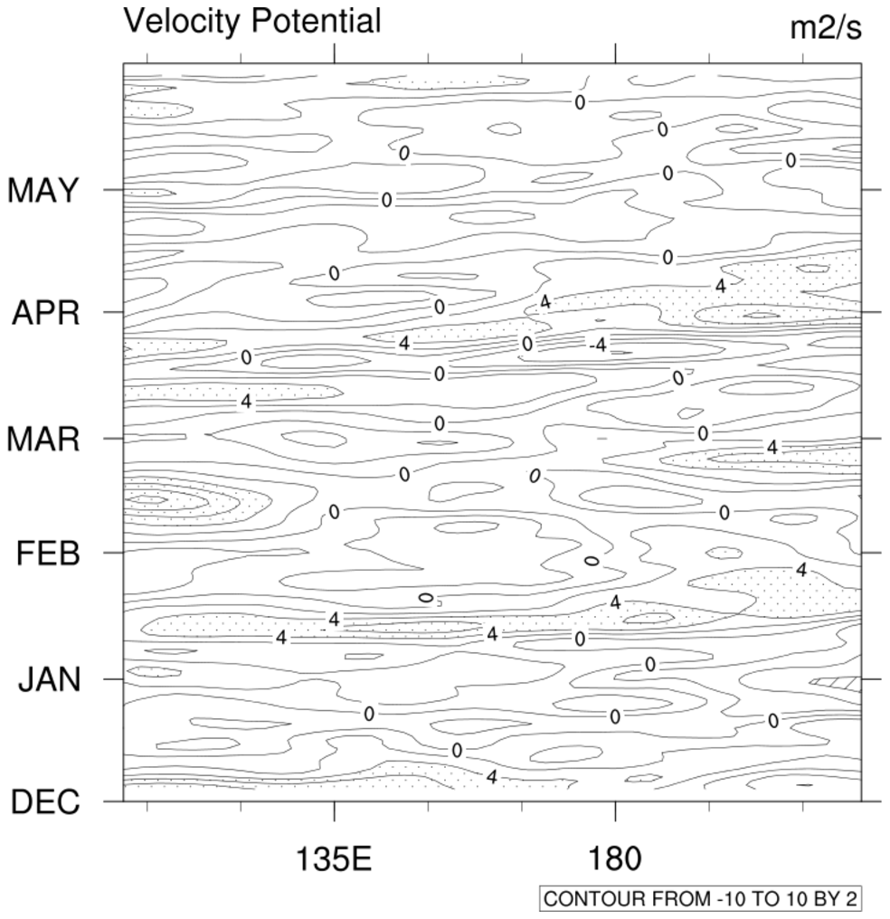 hov_4.ncl:
Manually sets the contour labels and explicitly defines x-axis.
hov_4.ncl:
Manually sets the contour labels and explicitly defines x-axis.
cnLevelSelectionMode = "ManualLevels"
cnMinLevelValF = -10.
cnMaxLevelValF = 10.
Manually sets the contour labels.
tmYLMode = "Explicit"
tmYLValues = (/ 0. , 30., 61., 89., 120., 150. /)
tmYLLabels = (/"DEC","JAN","FEB","MAR","APR","MAY" /)
Explicitly sets the x-axis labels.
hov_5.ncl: Creates a color plot.
cnFillOn = True, Turns on the color fill.
See the color example page for lots of ways of dealing with color.
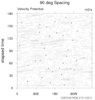
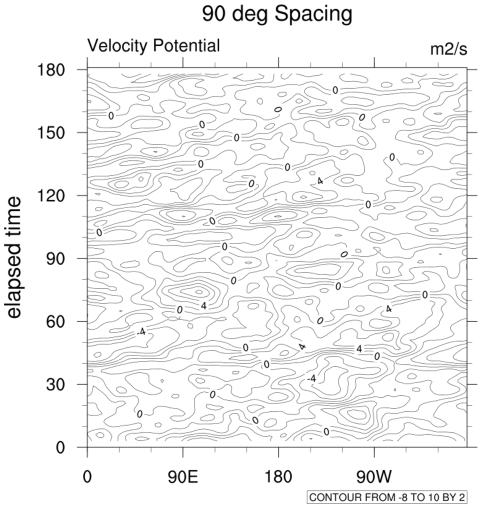 hov_6.ncl: Creates a plot with the
longitudes centered at 90W vice 180.
hov_6.ncl: Creates a plot with the
longitudes centered at 90W vice 180.
gsnMajorLonSpacing = 90.
Spaces out the longitude labels every 90 degrees. The default for this
plot would be 60 degrees.
 hov_7.ncl: Creates a plot with special
month labels on the Y axis.
hov_7.ncl: Creates a plot with special
month labels on the Y axis.
In this example, the minor tickmarks are treated as major tickmarks and vice versa. Several tickmark resources are used to place month labels inbetween the minor tickmarks.