NCL graphics exercises
Many of the scripts in this set of exercises depend on NCL version 6.2.0 or later.To run any one of the scripts below, you need to open a terminal window on your computer, and type the following:
ncl the_script.ncl
where the_script.ncl needs to be replaced with the name of the script you want to run.
If the script is set up to send the graphics to an X11 window, then when you run the script, a window should pop up with the plot in it. To close this window or advanced to the next frame, click anywhere in the middle of the plot with your left mouse button.
- Basic graphical exercises
- Color table exercises
- Title exercises
- XY plot exercises (set 1)
- XY plot exercises (set 2)
- Contour plot exercises
- Contours over map exercises (set 1)
- Contours over map exercises (set 2)
- Vector plot exercises
- Primitives exercises (set 1)
- Primitives exercises (set 2)
- Primitives exercises (set 3)
- Paneling exercises
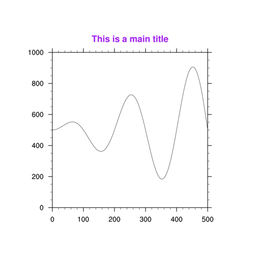
Basic graphical exercises
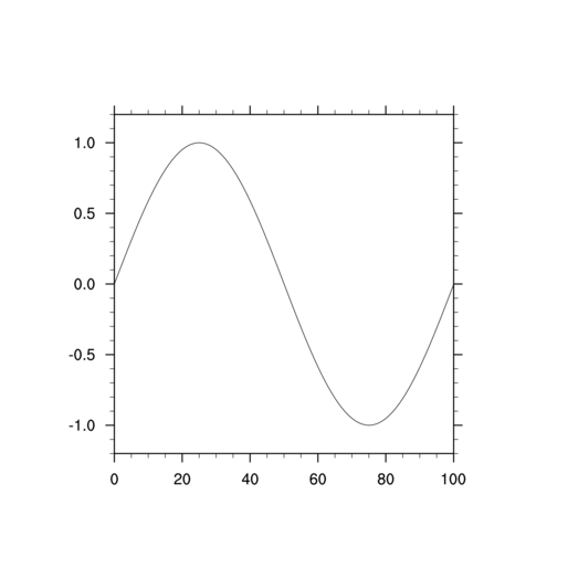
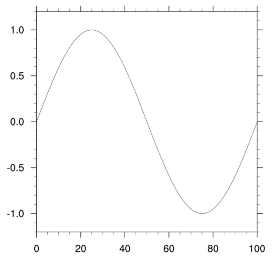
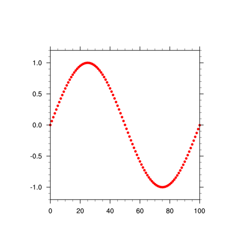
The purpose of this group of exercises is to familiarize you with sending NCL graphics to an X11 window or a file. It also familiarizes you with the concept of a "frame" advance, and positioning plots on a page.The basic_ex.ncl script generates dummy data to draw a simple line plot (also known as an "XY plot"). Use this script for the following exercises:
- Make the size of the X11 window that pops up when you run this
example larger. The default is 512 x 512 pixels. This can be useful
if you switch monitors and need to make the window smaller or
larger.
[Hint] [Answer] [Image] - Modify the basic_ex.ncl script
to change the graphical output to go to a PostScript, PDF, or a PNG
file.
[Hint] [Answer] [Image] - Using the script from the previous exercise, force the orientation
of the plot to be "landscape" instead of
"portrait".
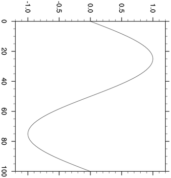
[Hint] [Answer] [Image] - Using the script from the previous exercise, try setting
the gsnMaximize resource to True to see
what this does to the plot.
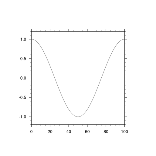
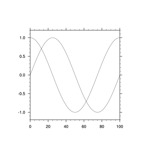
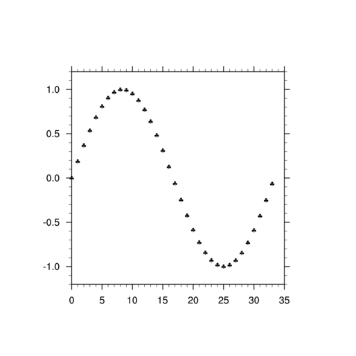
[Hint] [Answer] [Image] - Modify the basic_ex.ncl script
to generate a second set of points using the cos
function. Use these points to create a second XY plot.
Try it first with the output going to an X11 window, and then with the output going to a PostScript file.
[Hint] [Answer] [Image 1] [Image 2] - Using the script from the previous exercise, set the gsnFrame resource to False for the first plot
only, to see what happens to the plots.
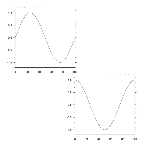
[Hint] [Answer] [Image] - Take the script from the previous exercise and set the gsnFrame resource to False for both plots so they
are both drawn in the same frame. Also, draw the two plots in
different locations on the frame so you can see both of them. In
order for a valid graphical image to be created, the frame needs to be
advanced manually, so add a call to do this.
[Hint] [Answer] [Image]
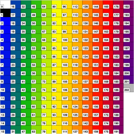
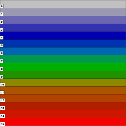
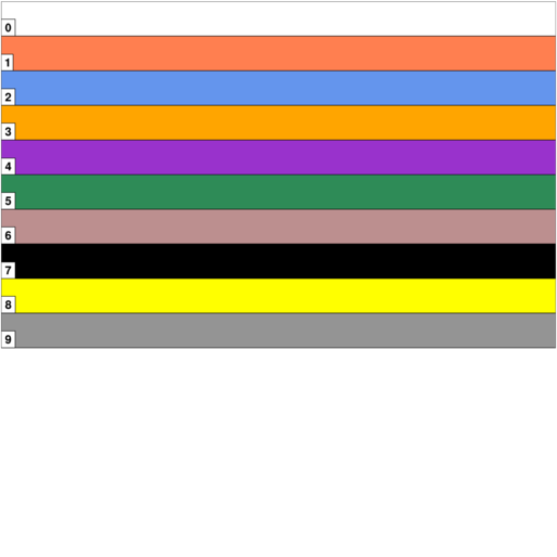
Color table exercises
The purpose of this group of exercises is to familiarize you with using color tables in NCL, including creating your own. Note that "color tables" and "color maps" mean the same thing.Note that in NCL V6.1.0, the use of color in NCL was enhanced, and hence some of these exercises are not as meaningful. We indicate this where appropriate.
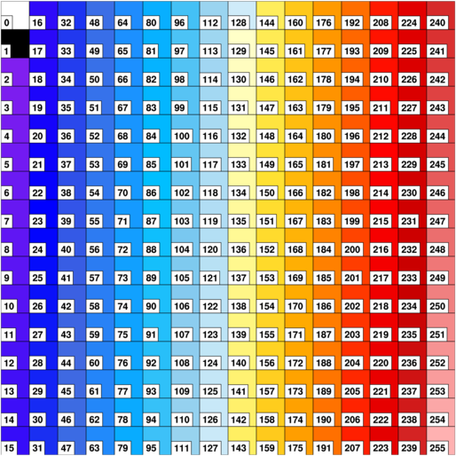
- NCL provides a default color table. Sometimes, for debugging
purposes, it is useful to draw the current color table. Write a script
to draw the default color table.
[Hint] [Answer] [Image] - Using the above script you wrote, change the color table to "BlGrYeOrReVi200".
[Hint] [Answer] [Image]Try drawing some other predefined color tables. You can see the full list of available color tables in the color table gallery.
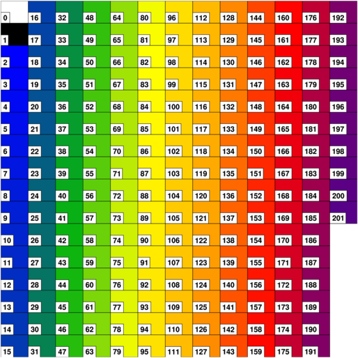
- Keeping the "BlGrYeOrReVi200" color table, add gray to it.
[Hint] [Answer] [Image]Try adding other colors, using different RGB triplets.
- Create your own color table using RGB triplets.
[Hint] [Answer] [Image] - Create your own color table using named colors.
[Hint] [Answer] [Image]
Title exercises
The purpose of this group of exercises is to familiarize you with modifying the main title and/or the X/Y axis titles on a plot.Look at the title_ex.ncl script that sets a main title. Use this script for the following exercises:
- Add two title
resources to change the font and the color of the main title. Try using
both a named color and a color map index value.
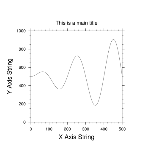
[Hint] [Answer] [Image] - Add titles to the X and Y axes, and increase the font height
of both.
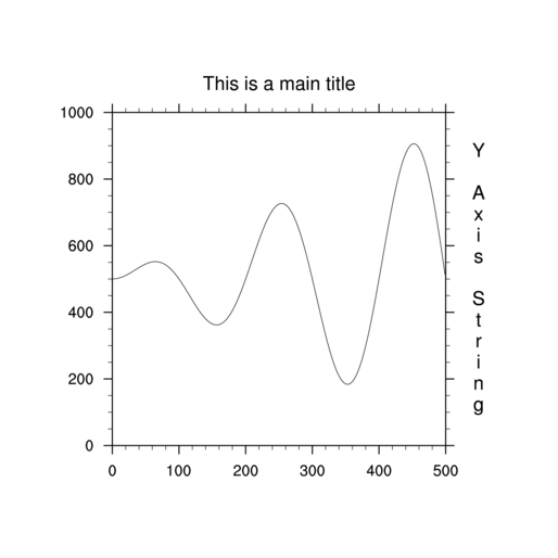
[Hint] [Answer] [Image] - Add a Y title to the right axis and change the orientation of the text
so it is right side up.
[Hint] [Answer] [Image]
For more title examples, see the title applications page.
XY plot exercises (set 1)
The purpose of this group of exercises is to familiarize you with modifying the look of lines or points in an XY plot.Use the xy_ex.ncl XY plot script as a base for the following exercises:
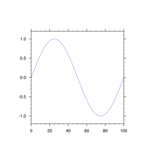
- Add an xy
resource to change the line color. Try using both a named color and
then a color map index value.
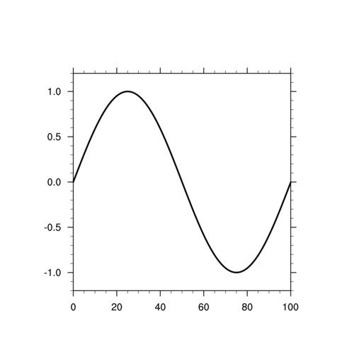
[Hint] [Answer] [Image] - Add an "xy" resource to make the line four-and-a-half times as
thick.
[Hint] [Answer] [Image] - Add three "xy" resources to 1) change to "marker" mode, 2) make
the marker a filled dot, and 3) change the marker color to "red".
When you use markers for an XY plot, this is often called a "scatter"
plot.
[Hint] [Answer] [Image] - Using the script from the previous exercise, use
NhlNewMarker to define your own XY marker,
and use this instead. Subscript the "y" data array so that only
every third value is plotted.
[Hint] [Answer] [Image]
XY plot exercises (set 2)
The purpose of this group of exercises is to familiarize you with modifying XY plots that contain multiple curves.
You will need to download the xy2.txt ASCII file to do these exercises.
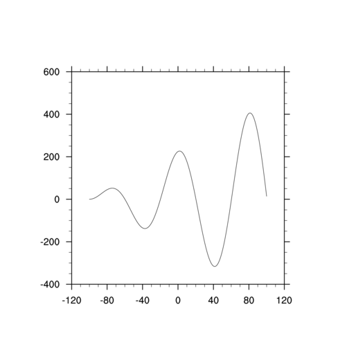
- Modify the xy2_ex.ncl XY plot
script to add an X array with 500 points that goes from -100 to 100.
Change the gsn_csm_y call to
gsn_csm_xy and pass it this new X
array.
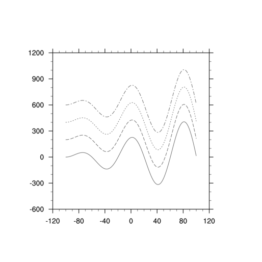
[Hint] [Answer] [Image] - Using the previous script, plot the full "y" array as four
separate curves. In order to do this, the array needs to be
dimensioned ncurves (4) x
npts (500), which means it needs to be reordered first.
[Hint] [Answer] [Image] - Note how each of the four curves from the previous exercise are
different dash patterns. Modify the script so the curves are all
solid, but have different line thicknesses and colors. Also, maximize
the plot in the frame.
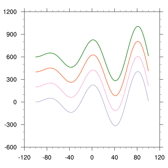
[Hint] [Answer] [Image] - Using the previous script, change the limits of the X and Y axes
so that the X axis goes from min(x) to
max(x), and the Y axis goes from -500 to
1100.
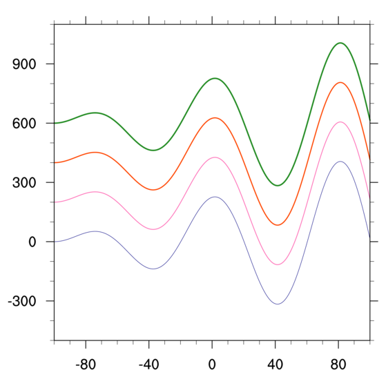
[Hint] [Answer] [Image] - Using the previous script, add a legend to the XY plot.
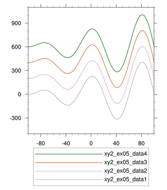
[Hint] [Answer] [Image] - Using the script from the previous exercise, change the labels in
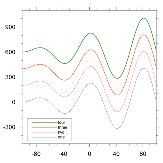
the legend, and also make the legend box smaller and move it inside
the plot.
[Hint] [Answer] [Image]For more legend plot examples, see the legend applications page.
For more XY plot examples, see the XY applications page.
Contour plot exercises
The purpose of this group of exercises is to familiarize you with modifying a basic contour plot.Use the contour_ex.ncl contour plot script as a base for the following examples:
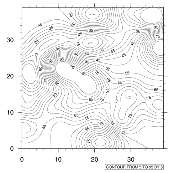
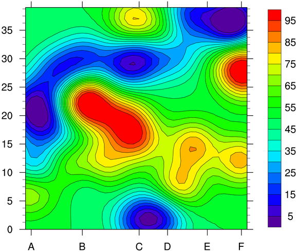
- Add some contouring resources to change the contour levels
to start at 5 and go to 95 in steps of 5.
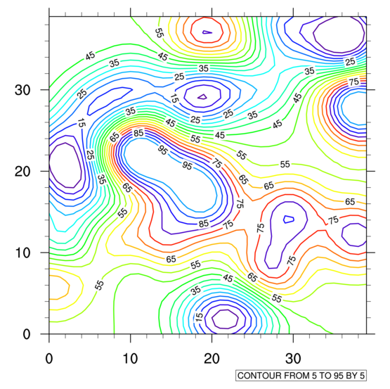
[Hint] [Answer] [Image] - Using the script from the previous example, make each contour line
three times as thick and a different color. Use the "rainbow" color
map.
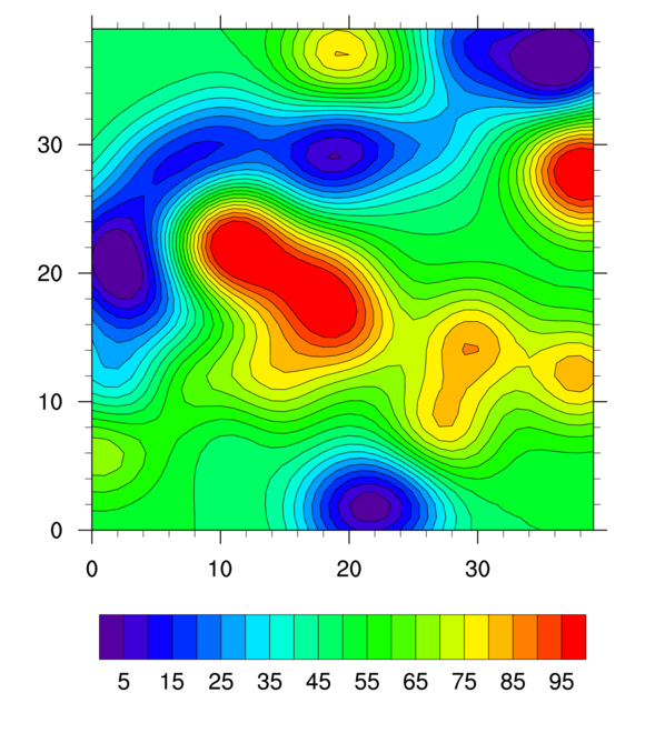
[Hint] [Answer] [Image] - Using the script from the previous example, turn on contour
fill. Note that the color map is automatically spanned.
This was not the case in V6.0.0 or earlier of NCL.
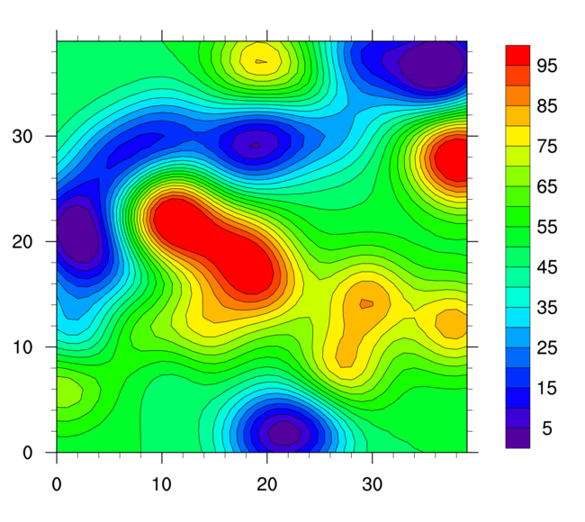
[Hint] [Answer] [Image] - Using the script from the previous example, make the
labelbar vertical.
[Hint] [Answer] [Image] - Using the script from the previous example, change the major
tickmark spacing on the Y axis to 5, and explicitly label the bottom
axis tickmarks at values 5, 10, 20, 25, and 35 with the labels "Jan",
"Feb", "Mar", "Apr", and "May".
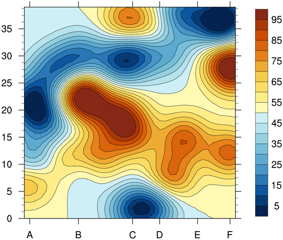
[Hint] [Answer] [Image] - Using the script from the previous example, remove
the gsn_define_colormap call and
instead use a "cn" resource to set the color map for the color
contours. Use the "BlueYellowRed" color map for this example.
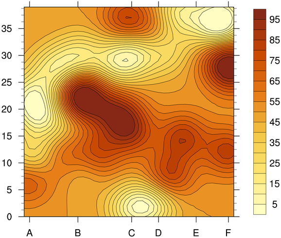
[Hint] [Answer] [Image] - Using the script from the previous example, subset the
"BlueYellowRed" color map so that only the yellow-to-red part of the
color map is used.
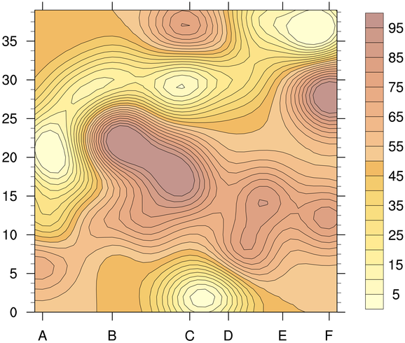
[Hint] [Answer] [Image] - Using the script from the previous example,
change the color map so that the half the subsetted
color map is 3/4 transparent, and the other half
is 1/4 transparent.
[Hint] [Answer] [Image]
There are many contouring examples. To see a list of them, see the main applications page. Here's a list of some of the pages of interest:
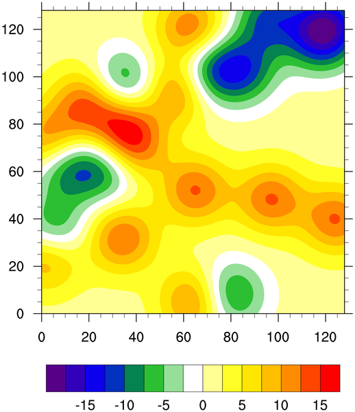
Contours over maps exercises (set 1)
The purpose of this group of exercises is to familiarize you with drawing contours over maps.
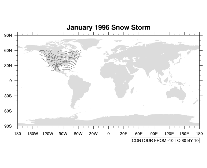
- Change the contourmap_ex.ncl script so that
the contours are overlaid on a cylindrical equidistant map (note: the
data already contains the necessary coordinate arrays for overlaying
on a map).
Ignore the warning messages for now. The plot will be incorrect; see the next exercise where we fix it.
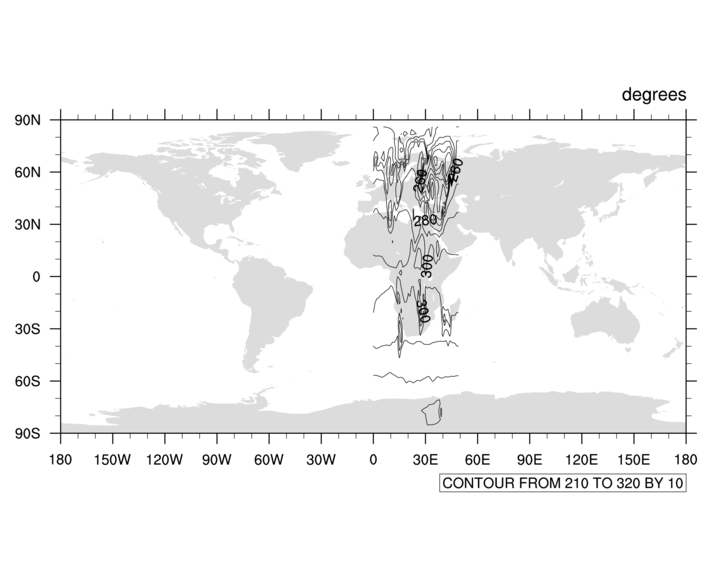
[Hint] [Answer] [Image] - Note that when you run the contourmap_ex01.ncl script, you
get several error messages of the form:
warning:_NhlCreateSplineCoordApprox: Attempt to create spline approximation
for X axis failed: consider adjusting trXTensionF value
Also note that it suggests you do the following:(0) gsn_add_cyclic: Warning: The range of your longitude coordinate array is at least 360. (0) You may want to set gsnAddCyclic to False to avoid a warning (0) message from the spline function.Try setting this resource as suggested, and rerun the script.
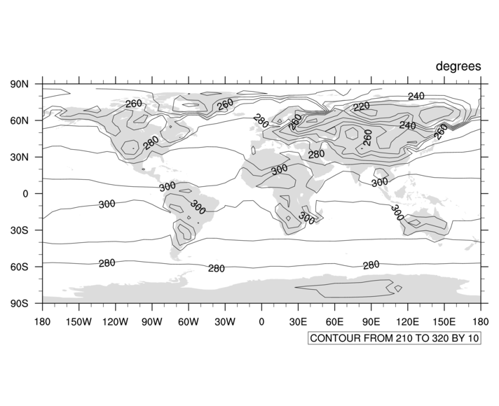
[Hint] [Answer] [Image] - Using what you learned from the contour plot exercises, edit the
script from the previous exercise to do the following:
- Set the colormap to "rainbow" using a "cn" resource.
- Manually set the contour levels to go from 195 to 328 in steps of 5.
- Turn on contour fill and turn off contour lines.
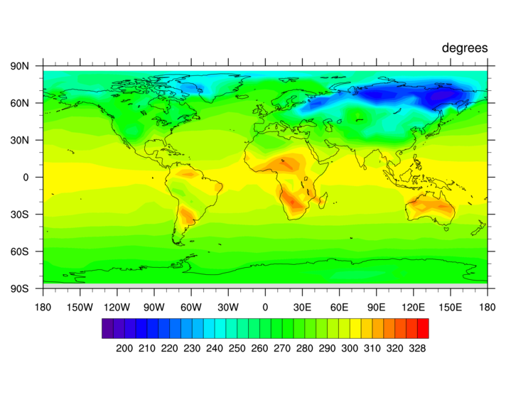
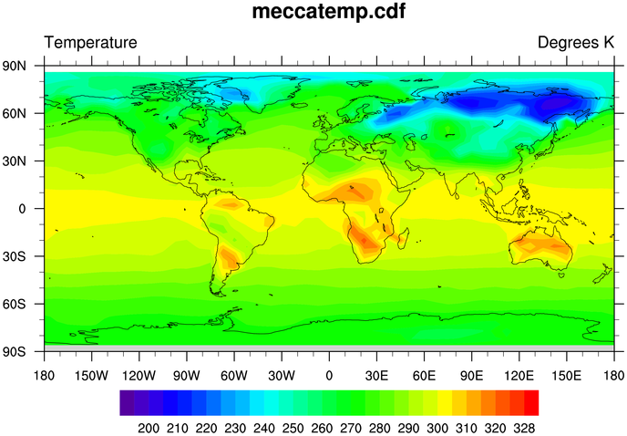
[Hint] [Answer script] [Image] - Using the script from the previous exercise, do the following:
- Change the data's "units" attribute to be "Degrees K"
- Add a main title that contains the name of the NetCDF file used.
- Add a left subtitle "Temperature".
- Turn off the labelbar box lines
[Hint] [Answer script] [Image]
Contours over maps exercises (set 2)
The purpose of this group of exercises is to show you how add coordinate arrays to a variable that has none, and how to further customize a map plot.
- Change
the contourmap2_ex.ncl script
to plot the data over a map. First run this script and notice the
output from the print and
printVarSummary calls. The "t" variable has no
coordinate information attached to it. This is because we did a
numerical calculation on the original data, which causes metadata
(attributes and coordinate arrays) to be stripped from the
variable.
There are latitude and longitude variables on the file, so use these to attach latitude/longitude coordinate information to "t". This will allow us to overlay the contours on a map. You will also need to turn off the automatic addition of a cyclic point, because this data is not global.
Note that only a small area of the map has contours over it. We will deal with this in the next exercise.
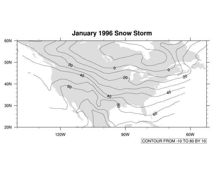
[Hint] [Answer] [Image] - Using the script from the previous example, zoom in on the area
defined by the latitude/longitude arrays (it's an area that
encompasses the United States).
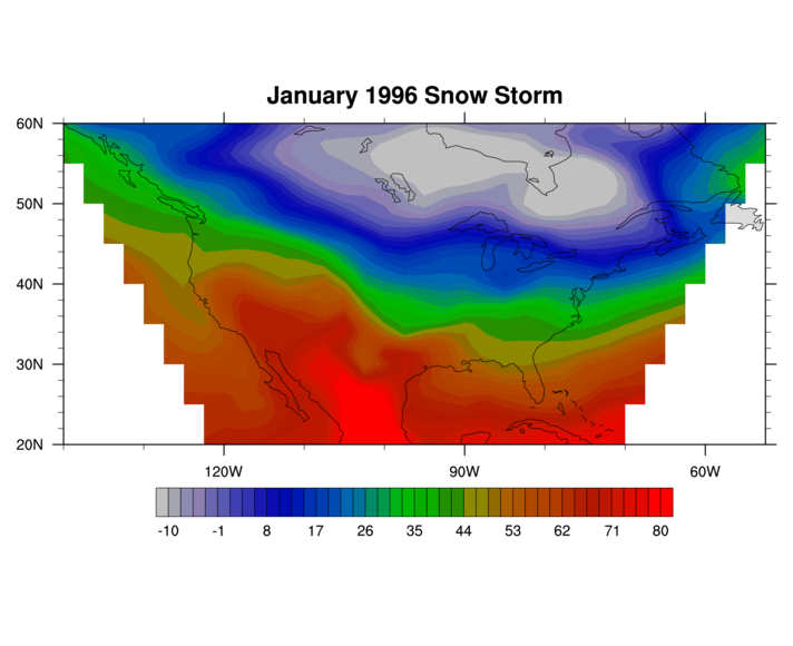
[Hint] [Answer] [Image] - Using the script from the previous example and resources that you
learned from previous examples, 1) change the color map to "temp1", 2)
turn on contour fill, 3) turn off the contour lines, and 4) set the
contour level spacing to 2.25.
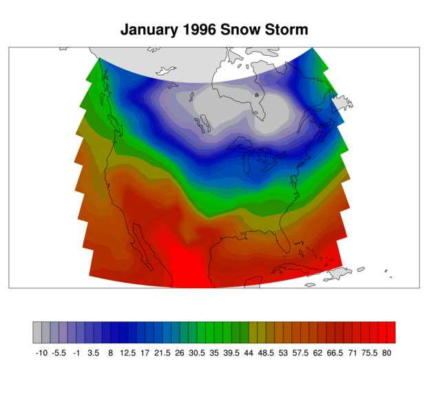
[Hint] [Answer] [Image] - Using the script from the previous example, change the projection
to "LambertConformal". This will require tweaking the center
latitude/longitude, and setting the map limit mode.
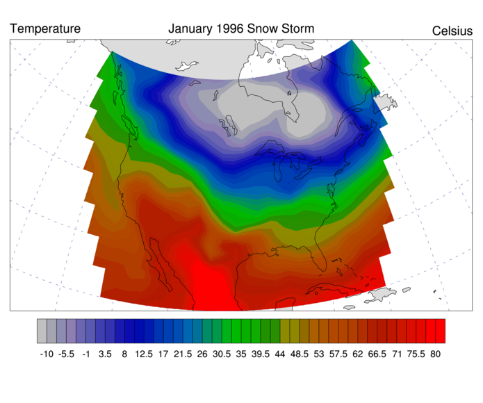
[Hint] [Answer] [Image] - Using the script from the previous example, use the gsnLeftString, gsnCenterString, and gsnRightString subtitle resources to create
titles of "Temperature", "January 1996 Snow Storm", and "Celsius",
respectively. Remove the settig of tiMainString. Also, turn on a latitude/longitude
grid and change the dash pattern of the lat/lon lines.
[Hint] [Answer] [Image] - Using the script from the previous example, set some resources to
mask the lat/lon grid lines over land, increase the grid spacing to
10, decrease the grid thickness, and to change their color.
[Hint] [Answer] [Image]
- contours over cylindrical equidistant maps
- contours over polar stereographic maps
- contours on native map grid
Vector plot exercises
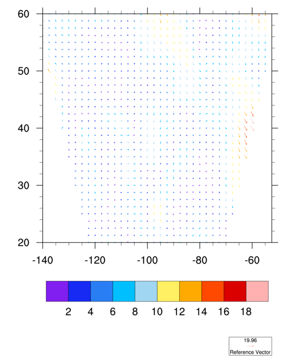
The purpose of this group of exercises is to familiarize you with modifying vector plots.Use the vector_ex.ncl vector plot script as a base for the following examples:
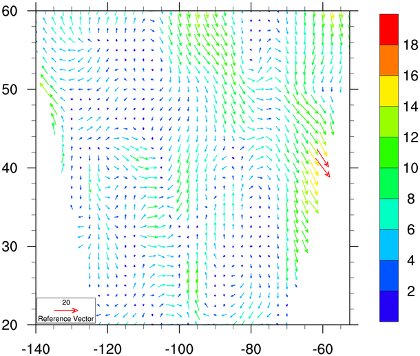
- Add a single vector resource to make the vectors multi-colored.
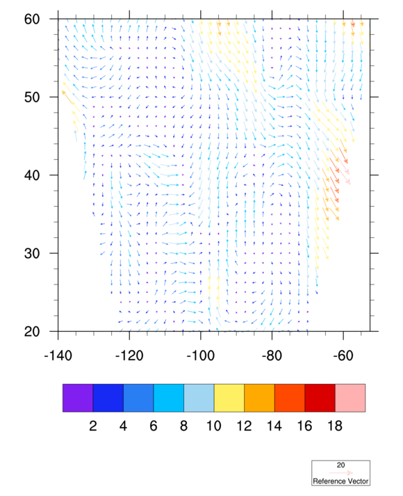
[Hint] [Answer] [Image] - Using the script from the previous example, set the reference
magnitude and increase the length of it.
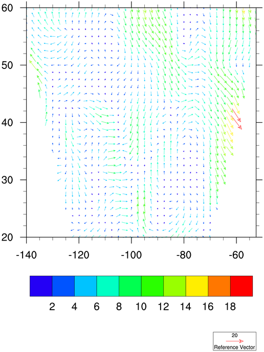
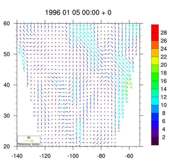
[Hint] [Answer] [Image] - Using the script from the previous example, change the color map
to "rainbow", but start at color index 16.
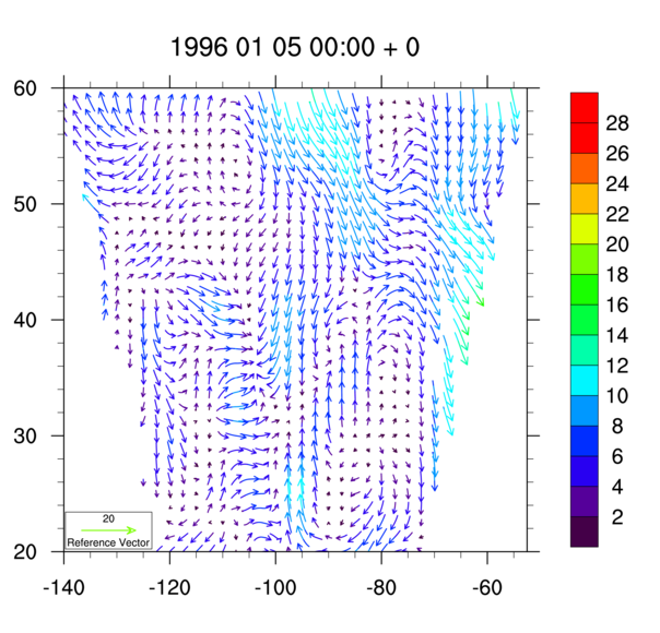
[Hint] [Answer] [Image] - Set some vector resources to double the thickness of the
line arrows, and to move the little reference annotation box to
inside the plot area, flush left and bottom. Set a labelbar
resource to make the labelbar vertical.
[Hint] [Answer] [Image] - Set some resources to set the vector levels to a fixed array,
and to set the main title to a concatenation of the
"reftime" on the file, and the appropriate "timestep".
[Hint] [Answer] [Image] - Set a resource to get curly vectors instead of straight vectors.
Some people think curly vectors show a lot more information
than straight vectors. You can also get wind barbs via
the same resource.
[Hint] [Answer] [Image] - Tweak the previous example to generate a vector plot at
each timestep, but skip over the fields that are all
missing values in either u or v. Make sure the title
changes with each timestep.
[Hint] [Answer] [Animation]
For more vector plot examples, see the vector applications page.
Primitives exercises (set 1)
The purpose of this group of exercises is to show how to add markers to an existing plot (in this case, an XY plot).
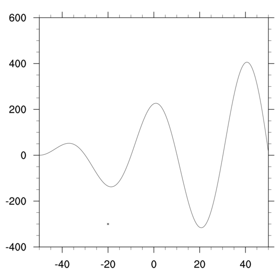
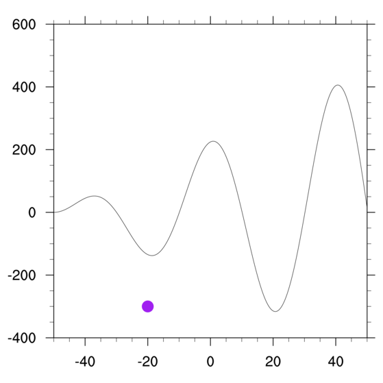
- Using the poly_ex.ncl script
that draws a single-curve XY plot, add a marker (also called a
"polymarker") at the point (-20,-300). To do this, you will need to
turn off the automatic frame advance so the page won't advance
before you draw the marker.
[Hint] [Answer] [Image] - Note that it is hard to see the marker from the previous exercise.
Using this same script, change the marker to a purple filled dot that
is larger than the default size.
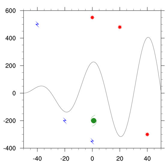
[Hint] [Answer] [Image] - Use the script from the previous exerise. Create three new markers
using the NhlNewMarker function and selecting a
marker from the weather2 font table.
Draw three groups of markers using these new markers, each one a different color and size. Also, draw multiple markers for each group.
- Use the script from the previous exerise. Instead of
using gsn_polymarker,
use gsn_add_polymarker
to attach the markers to the plot.
When you do this, the markers become part of the plot, and won't be drawn until the plot is drawn. This is useful if you later plan to resize the plot, or pass a series of these plots to gsn_panel.
Primitives exercises (set 2)
The purpose of this group of exercises is to show how to add markers, lines, polygons, and text to an existing plot (in this case, a map plot).
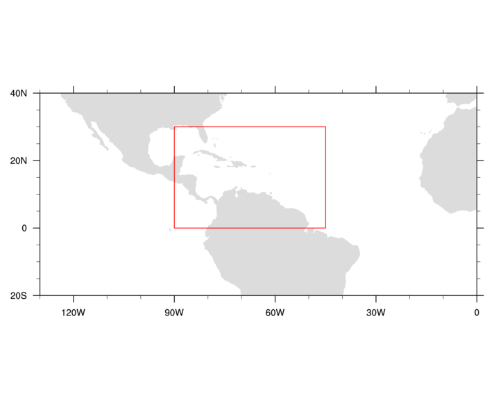
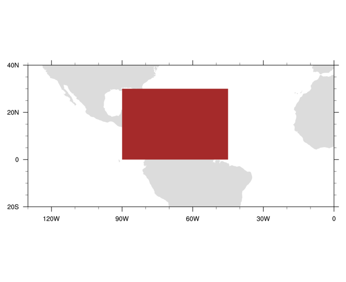
- Using the poly2_ex.ncl script
that draws part of a cylindrical equidistant map, add some lines (also
called "polylines") to make a box at the lat/lon coordinates (30,-90),
(30,-45), (0,-45), and (0,-90). Make the lines red and twice as thick
as the default.
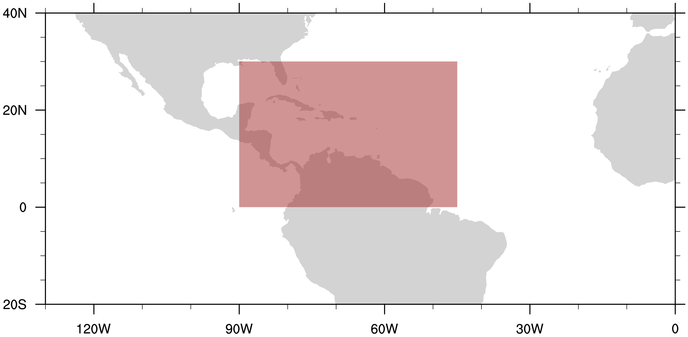
[Hint] [Answer] [Image] - Using the same code from the previous example, change the lines
to a brown filled polygon.
[Hint] [Answer] [Image] - Using the same code from the previous example, make
the brown filled box partially transparent so you can see
the map underneath it.
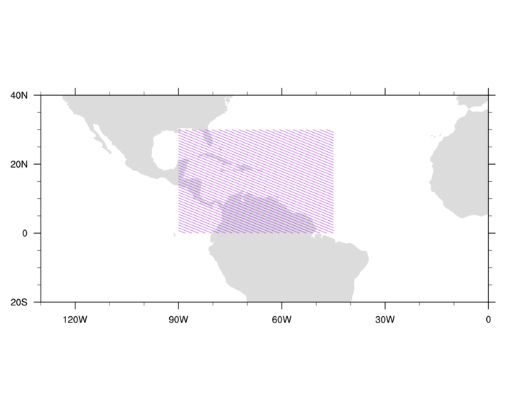
[Hint] [Answer] [Image] - Use the script from the previous exerise. Change the solid fill to
a purple pattern fill, and increase the density of the fill pattern.
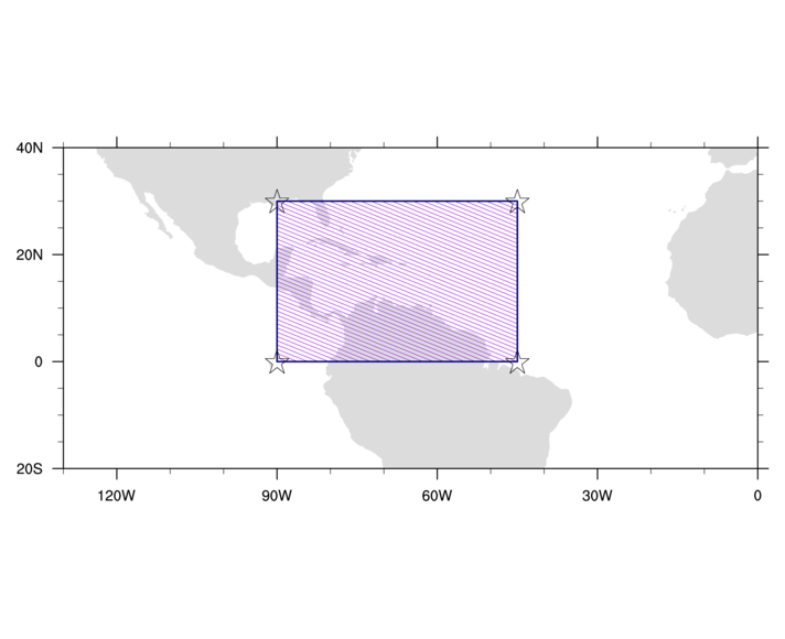
- Using the previous exercise and the one from example 1, draw the
polygon and then outline the polygon with lines. Add markers at all
four corner of the boxes. Try playing with "gs" resources to change
things like color, sizes, thickness, and fill patterns.
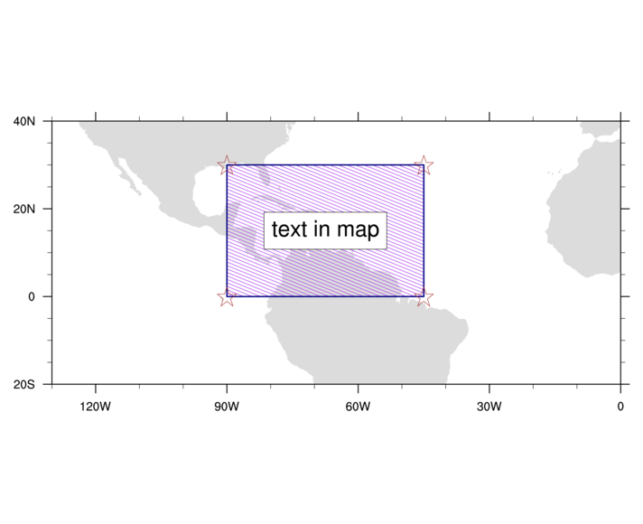
- Using the script from the previous exercise, add a text box in the
middle of the polygon.
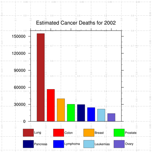
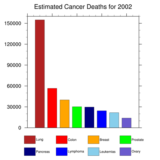
Primitives exercises (set 3)
The purpose of this group of exercises is to show how to annotate plots with polylines, polygons, and text outside the plot area.
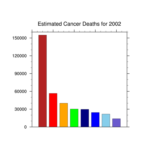
- Using the poly3_ex.ncl script
that draws a bar chart (see image),
remove the bottom axis tickmarks and labels. This is in preparation for
adding a custom legend.
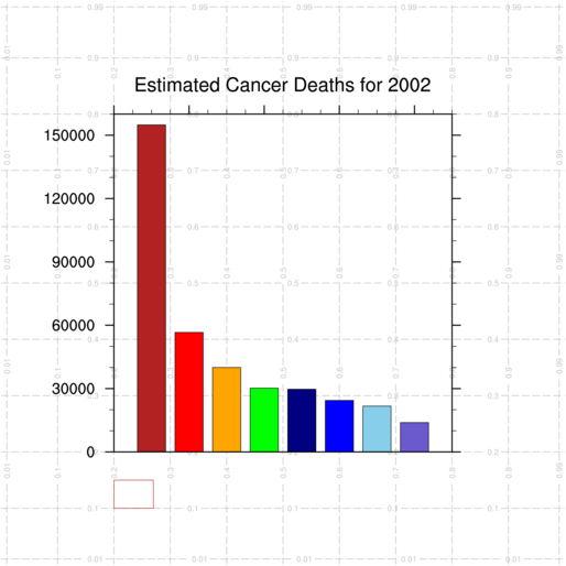
- Call the special drawNDCGrid
procedure to draw an NDC grid. This is a very handy procedure to use
when selecting NDC values of where to put boxes and text outside any
plot.
- Using the script from the previous exercise and the NDC grid to
guide you, add a firebrick-colored
box outline at NDC corners (0.2,0.1), (0.27,0.1), (0.27,0.15), and
(0.2,0.15).
- Using the script from the previous exercise, add seven more boxes
of equal size outside the plot area. Draw four of them using the same
Y position, and then draw four more under the first four, using the
same X positions. Start the first box at X position 0.15 instead of
0.20.
Make the box outlines three times as thick, and use the same colors that are used for the bars.
- Using the script from the previous exercise, add text strings to
the right side of each box. The original text strings used on the
bottom X axis are a bit long, so create a new array of strings that
contain shorter labels (like "Lymphoma" instead of "Non-Hodgkin's
Lymphoma"). You will need to make the size of the text font smaller.
- Using the script from the previous exercise, change the boxes to be
filled, using the same color as the outline. Change
the box outlines to black. Remove the code that sets the line
thickness (we don't want the outlines too thick).
- Using the script from the previous exercise, move the bar plot
slightly up and to the left in order to make more room, and then make
it slightly wider and higher so that it uses more of the NDC unit
square. You can use the NDC grid lines for guidance.
Once you have the plot moved and resized, clean up the script by removing the call to drawNDCGrid.
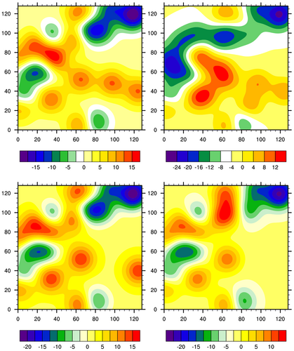
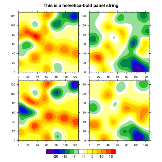
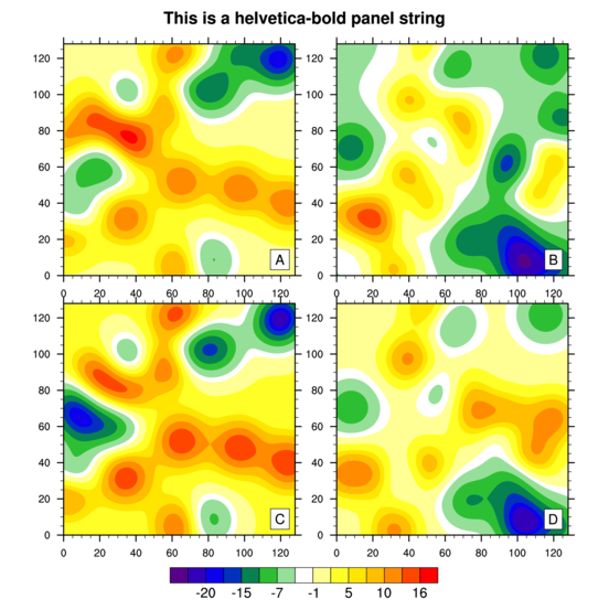
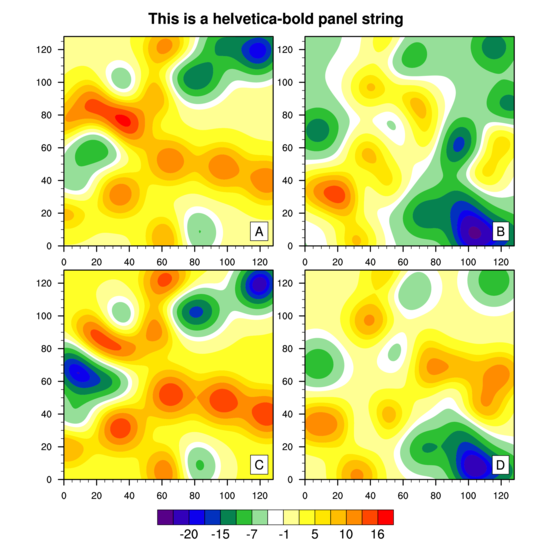
Paneling exercises
The purpose of this group of exercises is to show how put multiple plots (of the same size) on a single frame. This concept is known as "panelling".
- Using the panel_ex.ncl script
that draws a contour plot using dummy data, create three more individual
contour plots, using generate_2d_array to generate
three more dummy arrays.
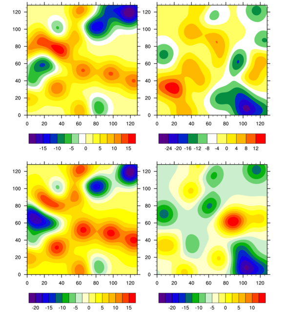
[Hint] [Answer] [Image] (only first image shown)
- Modify the script from the previous example to panel the four
plots into two rows and two columns in one frame.
[Hint] [Answer] [Image] (only last image shown)
- Modify the script from the previous example to turn off the
drawing of the individual plots (leave the paneled plots as is).
- The labelbars in the previous script all have different
ranges. Modify the script from the previous example
to make the labelbars use the same range, by setting a minimum and
maximum contour level, and a spacing.
- Modify the script from the previous example to set the contour
levels via an explicit array of levels that are not equally spaced.
- Modify the script from the previous example to turn off the
individual labelbars for each plot, and then set a common labelbar in
the paneled plots.
- Modify the script from the previous example to add a single title
to the paneled plots.
- Modify the script from the previous example to add a single figure
string to each plot, and to decrease the amount of white space between
the two rows of plots.
- Modify the script from the previous example to turn off the top
and right tickmarks for the individual plots. It will no longer be
necessary to use the gsnPanel resource you set in the previous script
to decrease the white space.